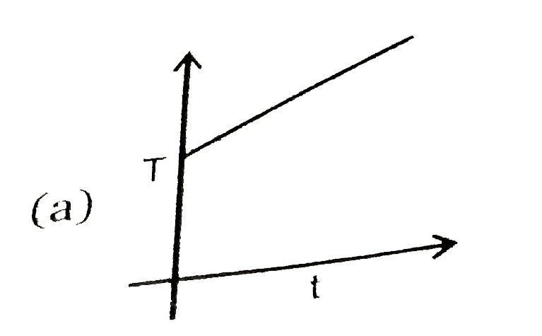
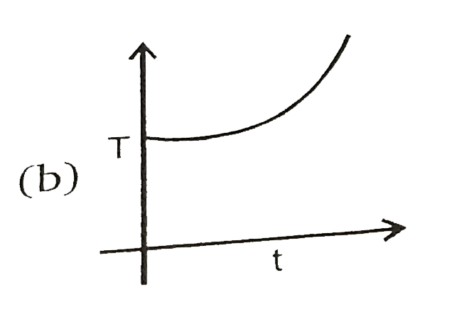
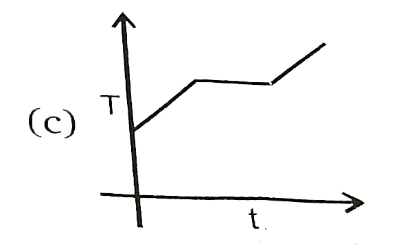
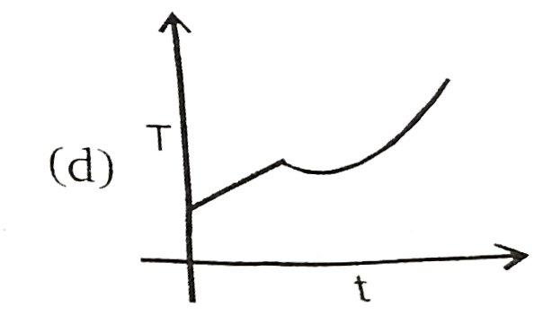
If liquefied oxygen at 1 atmospheric pressure is heated from 50K to 300k by supplying heat at constant rate. The graph of temperature vs time will be


The correct Answer is:C
To solve the problem of how the temperature of liquefied oxygen changes over time when heated at a constant rate from 50 K to 300 K, we can break it down into several steps:
1. Identify the Initial and Final States:
- The initial temperature of liquefied oxygen is 50 K.
- The final temperature is 300 K.
2. Determine the Boiling Point of Oxygen:
- The boiling point of oxygen is approximately 90 K. This is a crucial point where the state of the substance will change from liquid to gas.
3. Heating the Liquid Oxygen:
- As the oxygen is heated from 50 K to 90 K, the temperature will increase steadily. This portion of the graph will be a straight line as the temperature rises with time.
4. Phase Change at the Boiling Point:
- At 90 K, the oxygen will start to boil. During the phase change from liquid to gas, the temperature will remain constant at 90 K until all the liquid has converted to gas. This will be represented as a horizontal line on the graph (time will continue to pass, but temperature will not change).
5. Heating the Gaseous Oxygen:
- After the phase change is complete, the temperature of the gaseous oxygen will begin to increase again. This will continue until it reaches 300 K. This portion of the graph will again be a straight line, indicating a steady increase in temperature with time.
6. Graphing Temperature vs. Time:
- The graph will consist of three distinct sections:
- A rising line from 50 K to 90 K (liquid phase).
- A horizontal line at 90 K (phase change).
- Another rising line from 90 K to 300 K (gas phase).
Final Graph Description:
- The y-axis represents temperature, and the x-axis represents time.
- The graph starts at 50 K, rises to 90 K, remains flat at 90 K during the phase change, and then rises again to 300 K.
Conclusion:
The correct graph for the temperature versus time will have a linear increase from 50 K to 90 K, a flat line at 90 K, and another linear increase from 90 K to 300 K.
- The initial temperature of liquefied oxygen is 50 K.
- The final temperature is 300 K.
- The boiling point of oxygen is approximately 90 K. This is a crucial point where the state of the substance will change from liquid to gas.
- As the oxygen is heated from 50 K to 90 K, the temperature will increase steadily. This portion of the graph will be a straight line as the temperature rises with time.
- At 90 K, the oxygen will start to boil. During the phase change from liquid to gas, the temperature will remain constant at 90 K until all the liquid has converted to gas. This will be represented as a horizontal line on the graph (time will continue to pass, but temperature will not change).
- After the phase change is complete, the temperature of the gaseous oxygen will begin to increase again. This will continue until it reaches 300 K. This portion of the graph will again be a straight line, indicating a steady increase in temperature with time.
- The graph will consist of three distinct sections:
- A rising line from 50 K to 90 K (liquid phase).
- A horizontal line at 90 K (phase change).
- Another rising line from 90 K to 300 K (gas phase).
- The y-axis represents temperature, and the x-axis represents time.
- The graph starts at 50 K, rises to 90 K, remains flat at 90 K during the phase change, and then rises again to 300 K.
The correct graph for the temperature versus time will have a linear increase from 50 K to 90 K, a flat line at 90 K, and another linear increase from 90 K to 300 K.
Topper's Solved these Questions
Similar Questions
In the above problem if heat is supplied at a constant rate of q=10cal/min, then plot temperature versus time graph.
View SolutionThe temperature of 20 litres of nitrogen was increased from 100 K to 300 K at a constant pressure. Change in volume will be
View SolutionThe rate of a certain reaction increases by 2.3 times when the temperature is raised form 300K to 310K. If k is the rate constant at 300K, then the rate constant at 310K will be equal to
View SolutionAn ideal gas is heated by 160J at constant pressure, its temperature rises by 50∘ and if 240J of heat is supplied at constant volume, temperature rises by 100∘C , then its degree of freedom should be
View SolutionLiquid oxygen at 50K is heated to 300K at constant pressure of 1atm. The rate of heating is constant. Which of the following graphs represents the variation of temperature with time?
View SolutionOne mole of an ideal monoatomic gas requires 207 J heat to raise the temperature by 10 K when heated at constant pressure. If the same gas is heated at constant volume to raise the temperature by the same 10 K, the heat required is [Given the gas constant R = 8.3 J/ mol. K]
View SolutionIf the temperature of a black body is raised from 300K to 600K by what factor the rate of emission shall increase ?
View SolutionA gas is heated at a constant pressure. The fraction of heat supplied used of external work is
View SolutionWhen 1 mole gas is heated at constant volume, temperature is raised from 298 to 308 K. Heat supplied to the gas in 500 J. Then, which statement is correct ?
View SolutionWhen a certain amount of heat is supplied to a diatomic gas at constant volume, rise in temperature is T0. When same heat is supplied to the gas at constant pressure, find the rise in temperature
View Solution
