In the above problem if heat is supplied at a constant rate of q=10cal/min, then plot temperature versus time graph.
The correct Answer is:A
To solve the problem of plotting the temperature versus time graph when heat is supplied at a constant rate of q=10cal/min, we will follow these steps:
Step 1: Identify the phases of heating and phase changes
The heating process can be divided into several phases based on the state of the substance (ice, water, steam) and the temperature ranges:
1. Heating ice from −3∘C to 0∘C (Phase A to B)
2. Melting ice at 0∘C (Phase B to C)
3. Heating water from 0∘C to 100∘C (Phase C to D)
4. Boiling water at 100∘C (Phase D to E)
Step 2: Calculate the heat required for each phase
1. Phase A to B: Heating ice from −3∘C to 0∘C
- Heat required: QAB=m⋅cice⋅ΔT=m⋅0.5⋅3=1.5mcal
- Given m=42g, QAB=1.5⋅42=63cal
2. Phase B to C: Melting ice at 0∘C
- Heat required: QBC=m⋅Lf=42⋅80=3360cal
3. Phase C to D: Heating water from 0∘C to 100∘C
- Heat required: QCD=m⋅cwater⋅ΔT=42⋅1⋅100=4200cal
4. Phase D to E: Boiling water at 100∘C
- Heat required: QDE=m⋅Lv=42⋅540=22680cal
Step 3: Calculate time for each phase
Using the formula T=Qq where q=10cal/min:
1. Phase A to B:
TAB=6310=6.3min
2. Phase B to C:
TBC=336010=336min
3. Phase C to D:
TCD=420010=420min
4. Phase D to E:
TDE=2268010=2268min
Step 4: Calculate total time at each phase
- Total time at point B: TB=TAB=6.3min
- Total time at point C: TC=TAB+TBC=6.3+336=342.3min
- Total time at point D: TD=TAB+TBC+TCD=342.3+420=762.3min
- Total time at point E: TE=TAB+TBC+TCD+TDE=762.3+2268=3030.3min
Step 5: Plot the temperature versus time graph
1. From A to B: The temperature increases linearly from −3∘C to 0∘C over 6.3min.
2. From B to C: The temperature remains constant at 0∘C for 336min.
3. From C to D: The temperature increases linearly from 0∘C to 100∘C over 420min.
4. From D to E: The temperature remains constant at 100∘C for 2268min.
Final Graph
- The x-axis represents time (in minutes) and the y-axis represents temperature (in degrees Celsius).
- The graph will have a slope for the heating phases and flat lines for the phase change periods.
The heating process can be divided into several phases based on the state of the substance (ice, water, steam) and the temperature ranges:
1. Heating ice from −3∘C to 0∘C (Phase A to B)
2. Melting ice at 0∘C (Phase B to C)
3. Heating water from 0∘C to 100∘C (Phase C to D)
4. Boiling water at 100∘C (Phase D to E)
1. Phase A to B: Heating ice from −3∘C to 0∘C
- Heat required: QAB=m⋅cice⋅ΔT=m⋅0.5⋅3=1.5mcal
- Given m=42g, QAB=1.5⋅42=63cal
- Heat required: QBC=m⋅Lf=42⋅80=3360cal
- Heat required: QCD=m⋅cwater⋅ΔT=42⋅1⋅100=4200cal
- Heat required: QDE=m⋅Lv=42⋅540=22680cal
Using the formula T=Qq where q=10cal/min:
TAB=6310=6.3min
TBC=336010=336min
TCD=420010=420min
TDE=2268010=2268min
- Total time at point B: TB=TAB=6.3min
- Total time at point C: TC=TAB+TBC=6.3+336=342.3min
- Total time at point D: TD=TAB+TBC+TCD=342.3+420=762.3min
- Total time at point E: TE=TAB+TBC+TCD+TDE=762.3+2268=3030.3min
1. From A to B: The temperature increases linearly from −3∘C to 0∘C over 6.3min.
2. From B to C: The temperature remains constant at 0∘C for 336min.
3. From C to D: The temperature increases linearly from 0∘C to 100∘C over 420min.
4. From D to E: The temperature remains constant at 100∘C for 2268min.
- The x-axis represents time (in minutes) and the y-axis represents temperature (in degrees Celsius).
- The graph will have a slope for the heating phases and flat lines for the phase change periods.
Topper's Solved these Questions
- CALORIMETRY & HEAT TRANSFERBOOK - DC PANDEY ENGLISHCHAPTER - CALORIMETRY & HEAT TRANSFEREXERCISE - Example Type 1
4 Videos
- CALORIMETRY & HEAT TRANSFERBOOK - DC PANDEY ENGLISHCHAPTER - CALORIMETRY & HEAT TRANSFEREXERCISE - Example Type 2
2 Videos
- BASIC MATHEMATICSBOOK - DC PANDEY ENGLISHCHAPTER - BASIC MATHEMATICSEXERCISE - Exercise
13 Videos
- CALORIMETRY AND HEAT TRANSFERBOOK - DC PANDEY ENGLISHCHAPTER - CALORIMETRY AND HEAT TRANSFEREXERCISE - Medical entrance s gallery
38 Videos
Similar Questions
If liquefied oxygen at 1 atmospheric pressure is heated from 50K to 300k by supplying heat at constant rate. The graph of temperature vs time will be
View SolutionA certain amount of ice is supplied heat at a constant rate for 7 min. For the first one minute the temperature rises uniformly with time. Then it remains constant for the next 4 min and again the temperature rises at uniform rate for the last 2 min. Given Sice=0.5cal/g∘C,Lf=80cal/g.
Final temperature at the end of 7 min is
View SolutionA certain amount of ice is supplied heat at a constant rate for 7 min. For the first one minute the temperature rises uniformly with time. Then it remains constant for the next 4 min and again the temperature rises at uniform rate for the last 2 min. Given Sice=0.5cal/g∘C,Lf=80cal/g.
The initial temperature of ice is
View SolutionA certain amount of ice is supplied heat at a constant rate for 7 minutes. For the first one minute the temperature rises uniformly with time. Then, it remains constant for the next 4 minute and again the temperature rises at uniform rate for the last two minutes. Calculate the final temperature at the end of seven minutes.
(Given, L of ice =336×(103)J/kg and specific heat of water =4200J/kg−K).
View SolutionA well insulated substance in solid state is heated at a constant rate until it vaporizes completely. The temperature-time graph of the substance is shown below . Which of the following statements is//are true?
_E01_077_Q01.png)
View SolutionThree rods AB,BC and BD of same length l and cross sectional area A are arranged as shown. The end D is immersed in ice whose mass is 440 gm. Heat is being supplied at constant rate of 200 cal /sec from the end A. Find out time (in sec) in which wholeice will melt. (latent heat of fusion of ice is 80 cal/gm)
Given k (thermal conductivity) =100 cal/m/sec/∘C,A=10cm2,l=1m
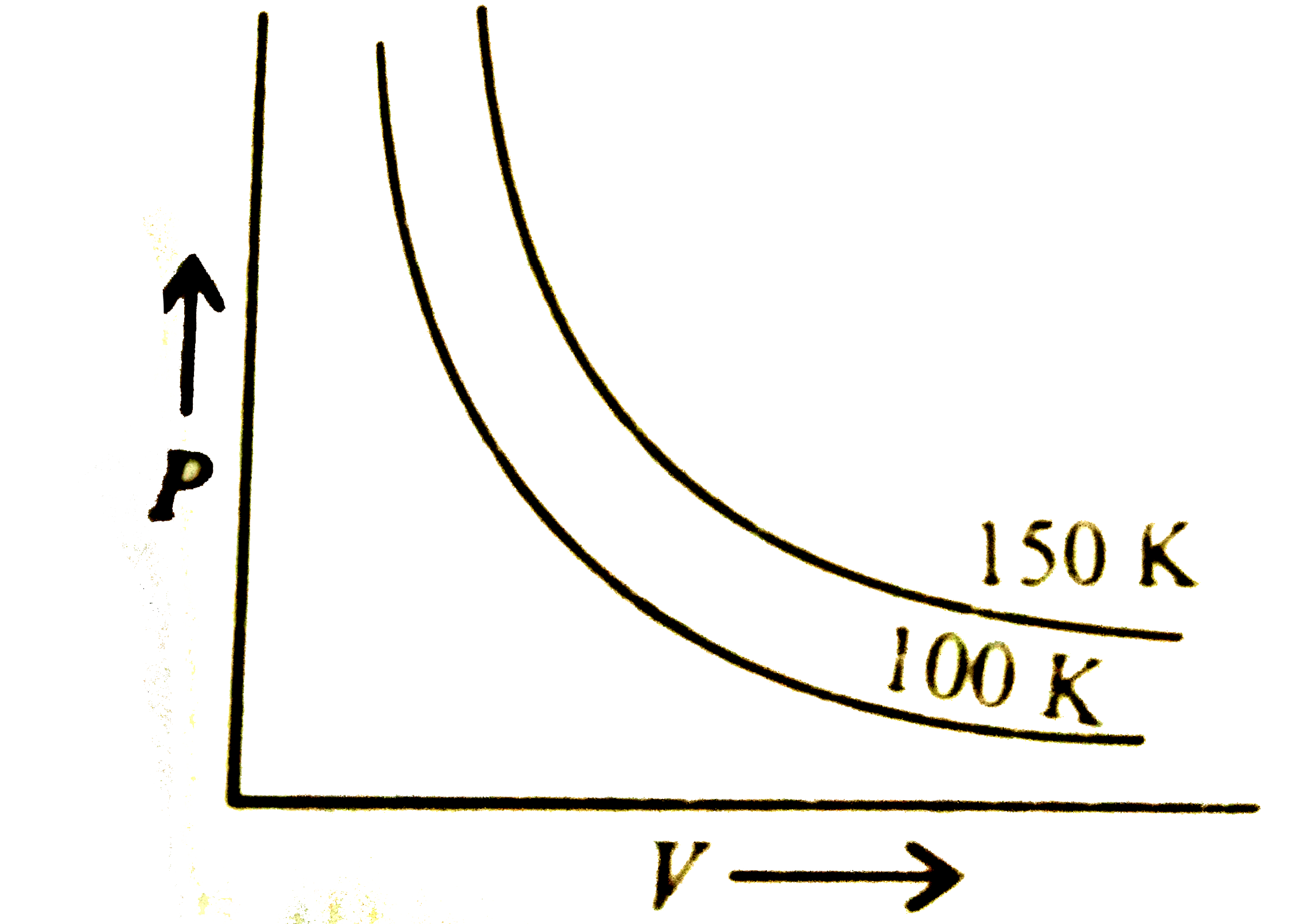
View SolutionA graph is plotted between pressure and volume at different temperatures . On the basis of the graph what changes will you observe in the volume if
(i) the pressure is increased at constant temperature .
(ii) the temperature is decreased at constant pressure .

View Solution
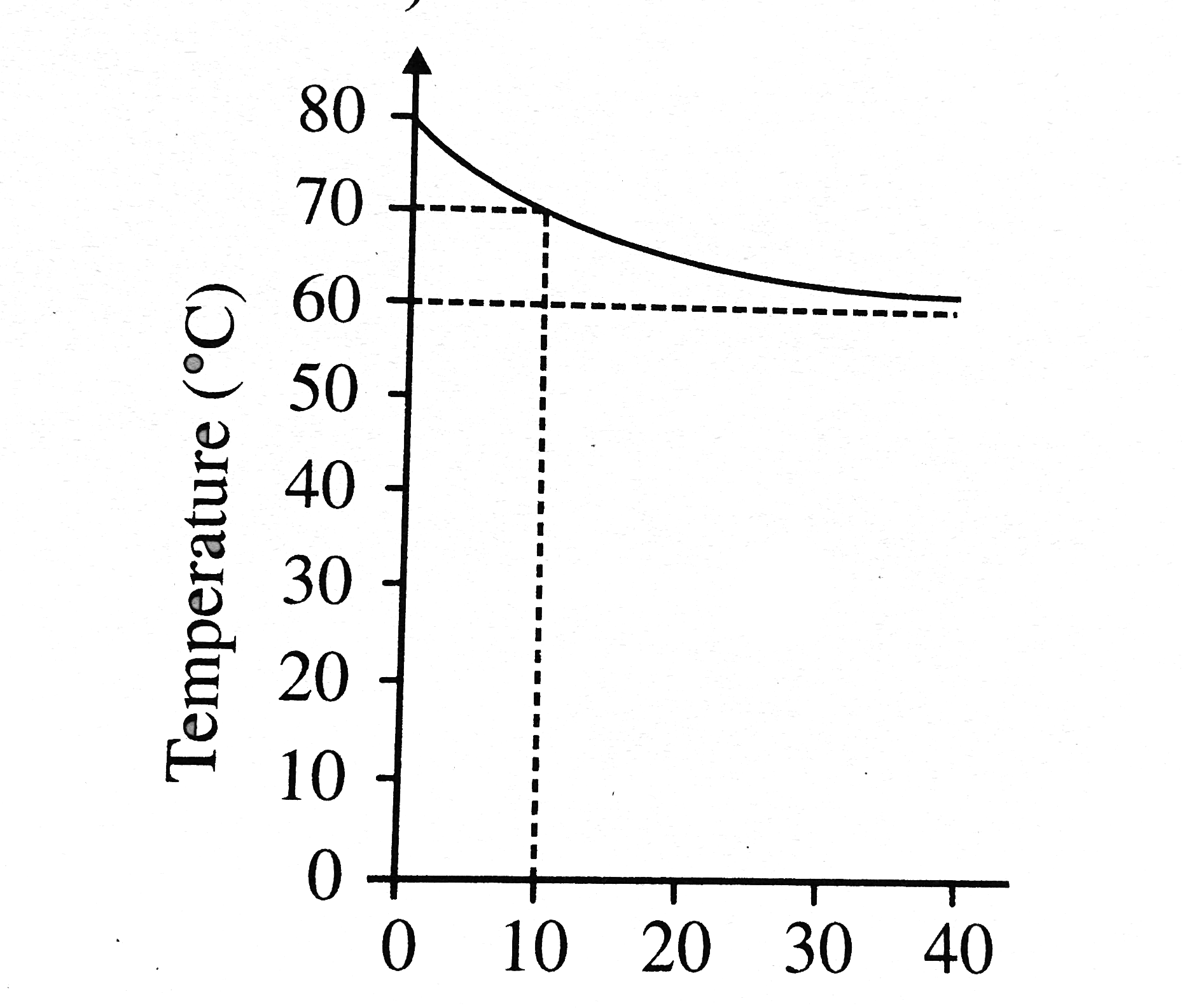
A vessel contains M grams of water at a certain temperature and water at certain other temperature is passed into it at a constant rate of mg/s. The variation of temeprature of the mixture with time is shown in Fig. The values of M and m are, respectively (the heat exhanged after a long time is 800 cal)
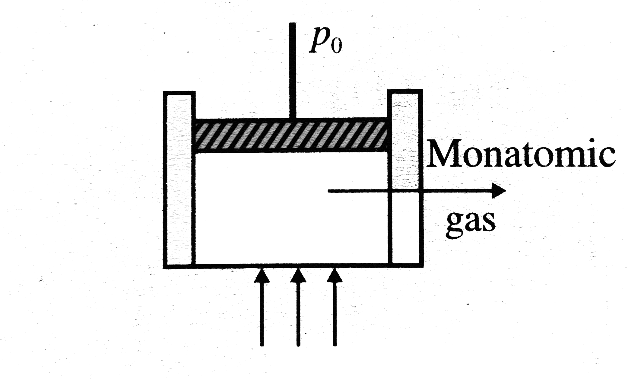
View SolutionIf 50cal of heat is supplied to the system containing 2mol of an ideal monatomic gas, the rise in temperature is (R=2cal/mol−K)

View SolutionWhen a certain amount of heat is supplied to a diatomic gas at constant volume, rise in temperature is T0. When same heat is supplied to the gas at constant pressure, find the rise in temperature
View Solution
