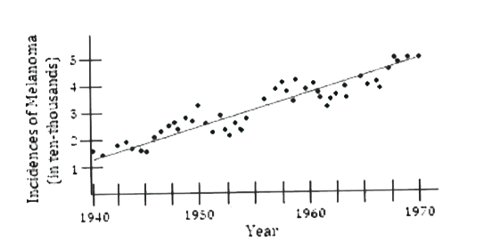
The scatterplot above shows the number of people diagnosed with melanoma, in ten-thousands, from 1940 to 1970. Based on the line of best fit to the data, as shown in the figure, which of the following values is closest to the average yearly increase in the number of incidences of melanoma?
1300
330
0.33
0.13
The correct Answer is:A
Similar Questions
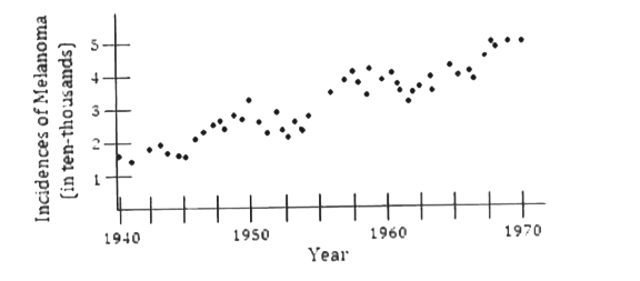
The scatterplot above shows the numbers of people diagnosed with melanoma, in ten - thousands, from 1940 to 1970. Based on the data shown in the figure, which of the following values is closest to the range of the number of incidences of melanoma between 1945 and 1950?View Solution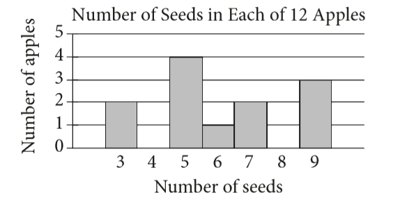
Based on the histogram above, of the following, which is closest to the average (arithmetic mean) number of seeds per apple?View Solution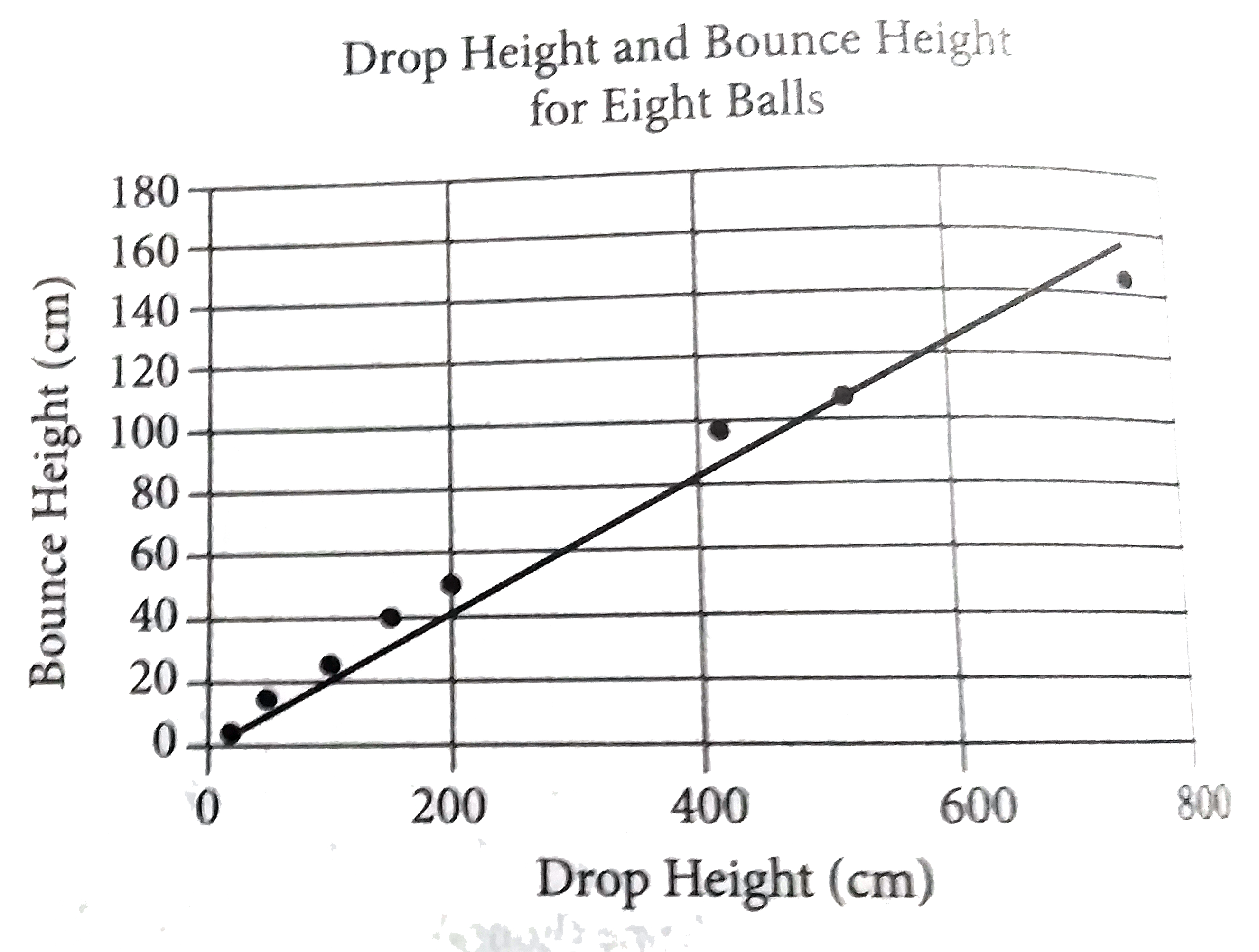
The scatterplot above shows the height in centimeters for both the drop and bounce of eight different balls of the same type. The line of best fit for the data is also shown. According to the lines of best fit, which of the following is closest to the predicted increase in bounce height, in centimeters, for every increase of 100 centimeters in drop height?View Solution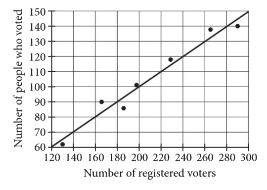
The scatterplot above shows the number of registered voters, x, and the number of people who voted in the last election, y, for seven districts in a town. A line of best fit for the data is also shown. Which of the following could be the equation of the line of best fit?View Solution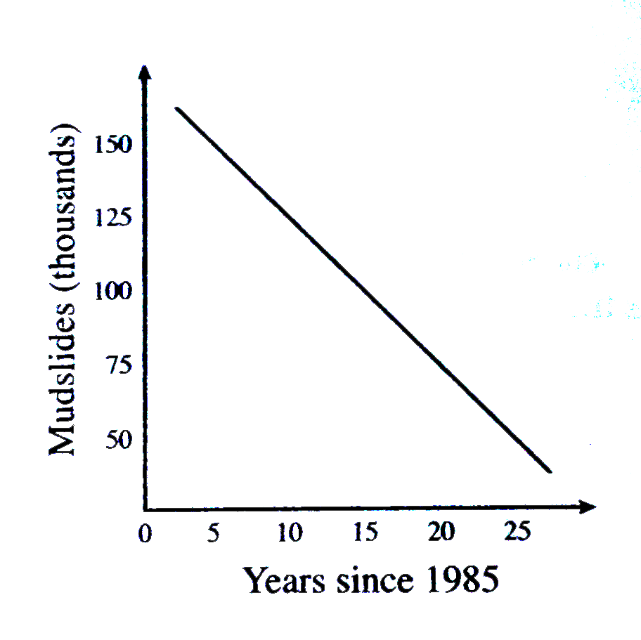
The number of mudslides in a certain country for the past 25 years is approximated by the graph shown above . The graph displays the number of mudslides (in thousands) from 1985 to 2010. Based on the graph , which of the following is closest to the average yearly decrease in the number of mudslides ?View Solution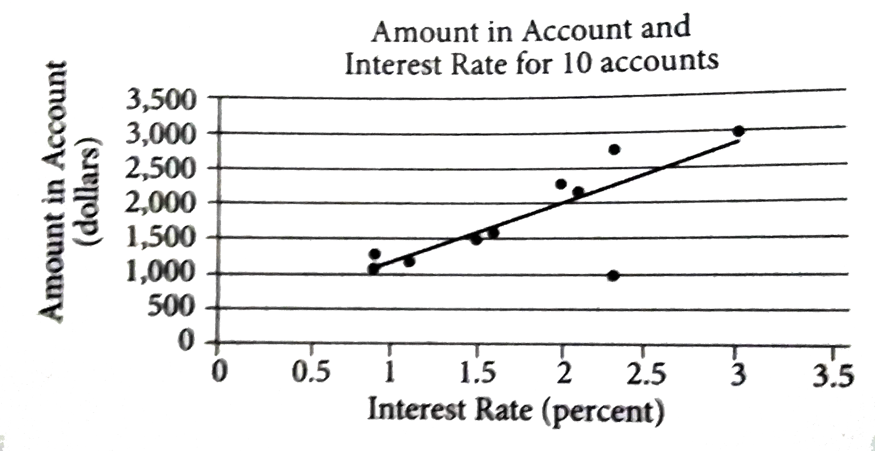
The scatterplot above shows data for ten accounts opened by a company , along with the line of best fit. For the account that contains the least amount of money, which of the following is closest to the difference of the actual amount and the amount predicted by the line of best fit?View SolutionA new fitness class was started at a chain of fitness clubs owned by the same company. The scatter plot above shows the total number of people attending the class during the first 5 months in which the class was offered. The line of best fit is drawn. If n is the number of the month, which of the following functions could represent the equation of the graph's line of best fit?
View Solution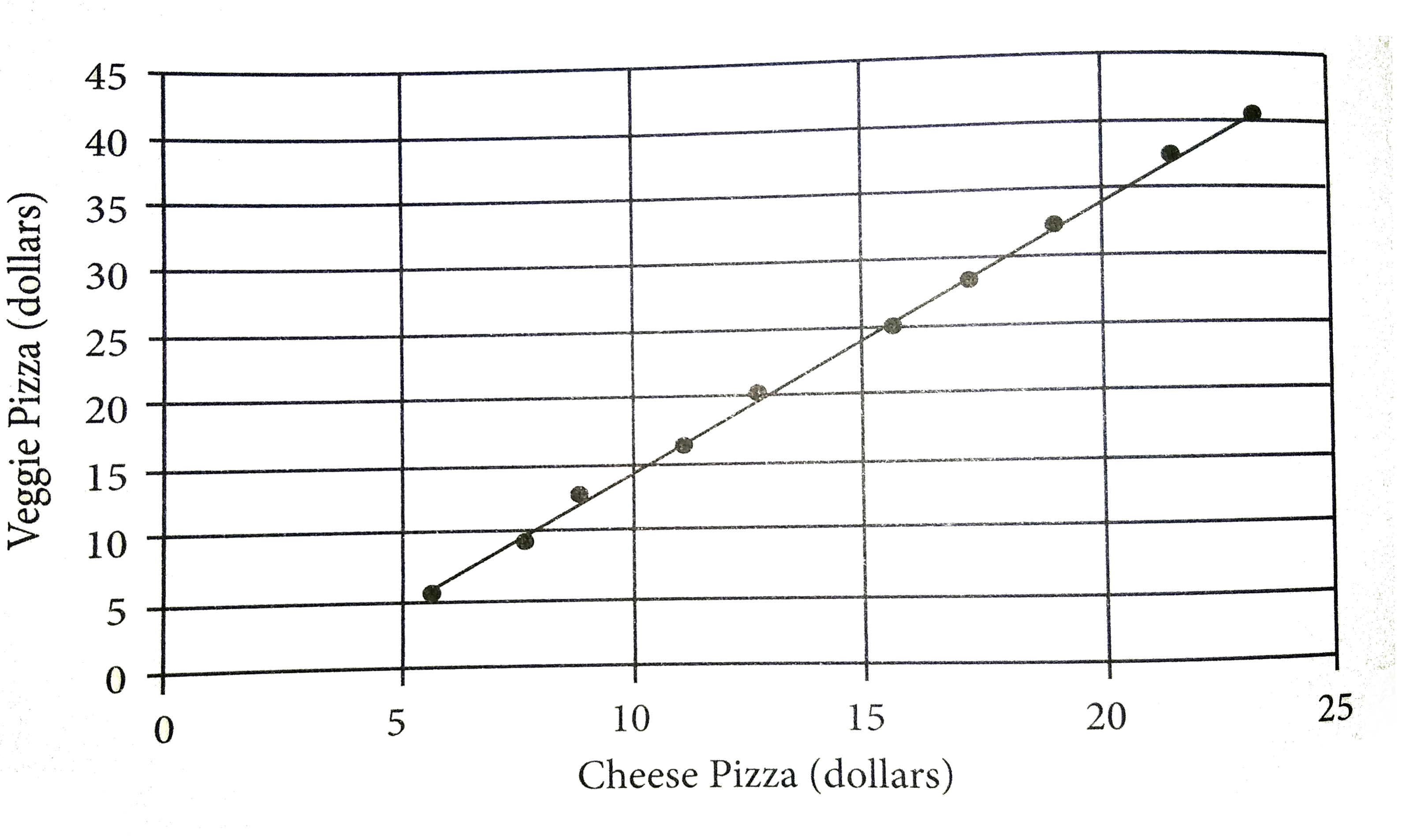
The scatterplot above shows the price, in dollars, for both cheese pizza and a veggie pizza for ten different pizzerias. The line of best fit is also shown. According to the line of best fit, which of the following is closer to the predicted increase in the price of a veggie pizza, in dollars, for every 1 dollar increase in the price of a cheese pizza?View Solution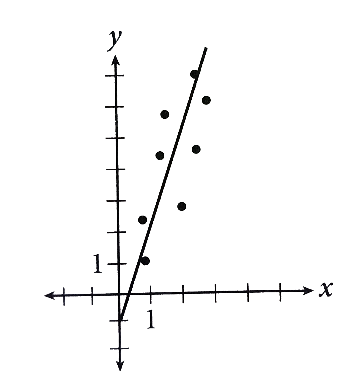
Which of the following equation corresponds to the line of best fit for the data set shown above ?View Solution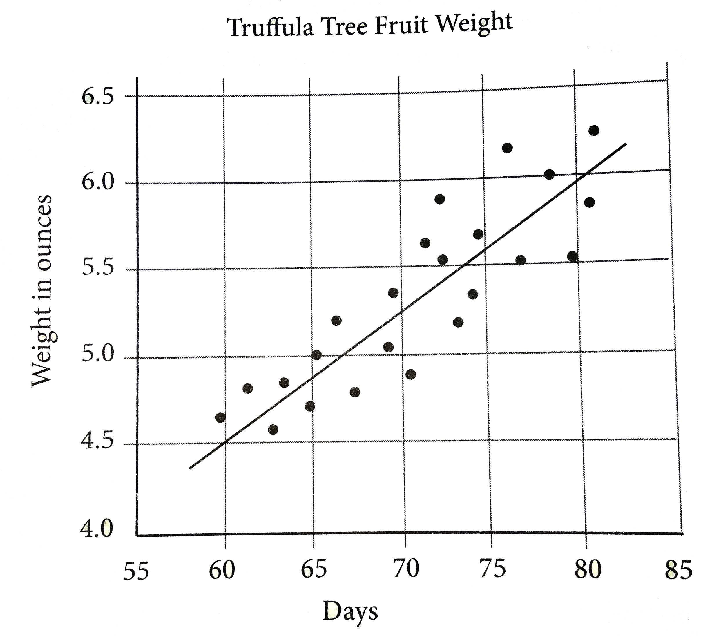
The scatterplot above shows the weight, in ounces,of the fruits on a certain truffula tree from days 55 to 85 after flowering. According to the line of best fit in the scatterplot above, which of the following is the closest approximation of the number of days after flowering of a truffula fruit that weighs 5.75 ounces?View Solution

