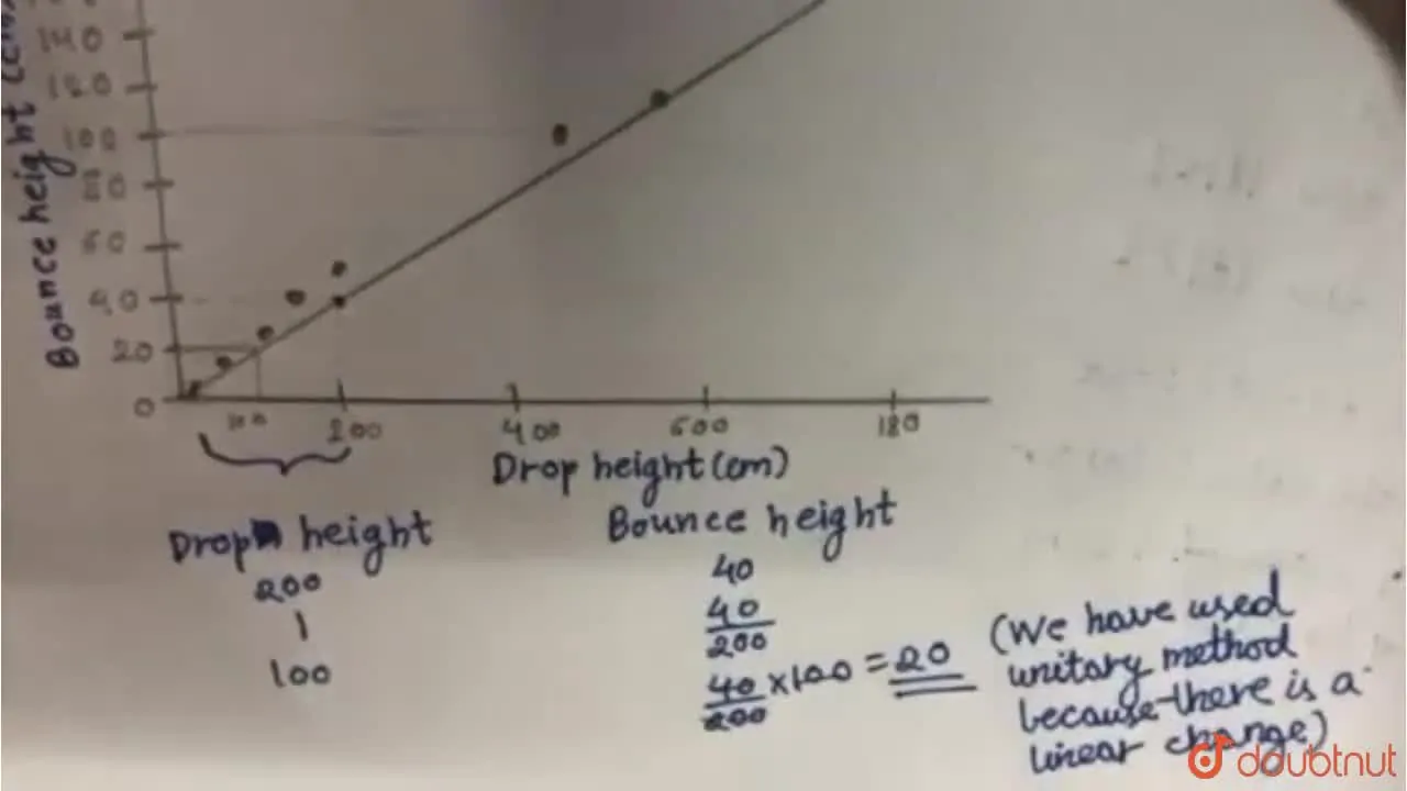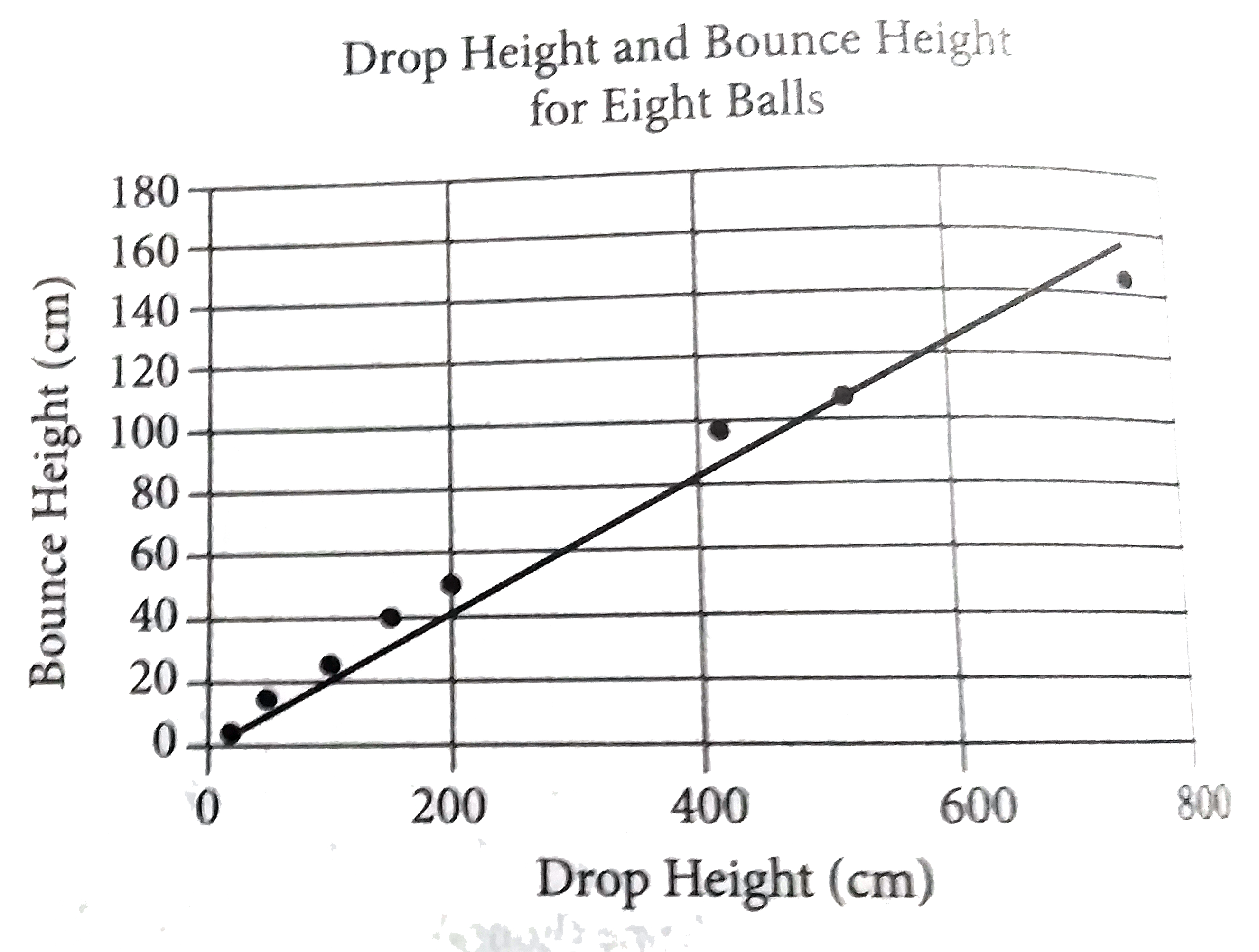
The scatterplot above shows the height in centimeters for both the drop and bounce of eight different balls of the same type. The line of best fit for the data is also shown. According to the lines of best fit, which of the following is closest to the predicted increase in bounce height, in centimeters, for every increase of 100 centimeters in drop height?
25
20
15
10
The correct Answer is:B
Step by step video, text & image solution for The scatterplot above shows the height in centimeters for both the drop and bounce of eight different balls of the same type. The line of best fit for the data is also shown. According to the lines of best fit, which of the following is closest to the predicted increase in bounce height, in centimeters, for every increase of 100 centimeters in drop height? by Maths experts to help you in doubts & scoring excellent marks in Class 12 exams.
Related Playlists
Similar Questions
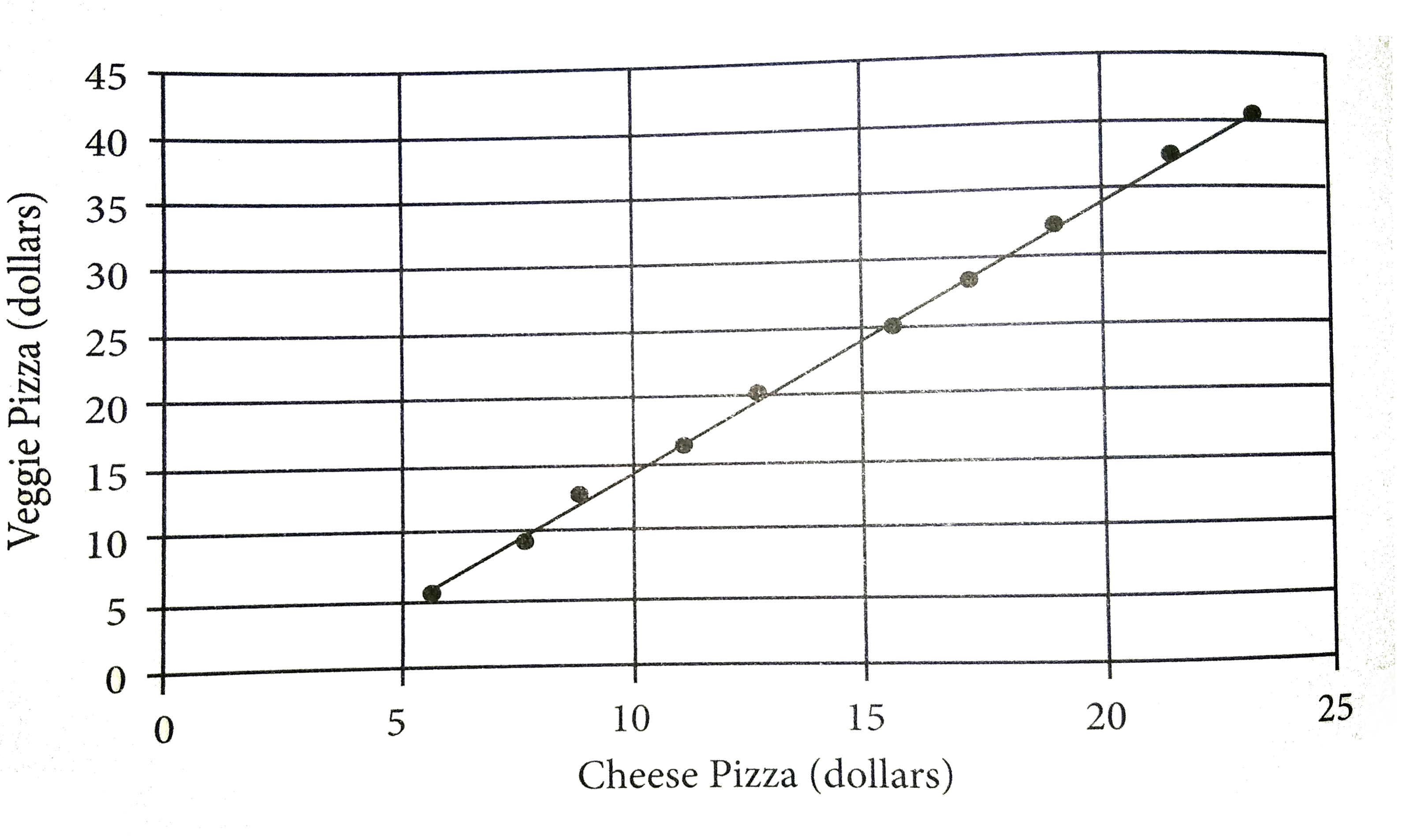
The scatterplot above shows the price, in dollars, for both cheese pizza and a veggie pizza for ten different pizzerias. The line of best fit is also shown. According to the line of best fit, which of the following is closer to the predicted increase in the price of a veggie pizza, in dollars, for every 1 dollar increase in the price of a cheese pizza?View Solution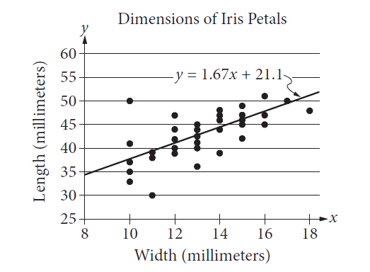
The scatterplot above shows data collected on the lengths and widths of Iris setosa petals. A line of best fit for the data is also shown. Based on the line of best fit, if the width of an Iris setosa petal is 19 millimeters, what is the predicted length, in millimeters, of the petal?View Solution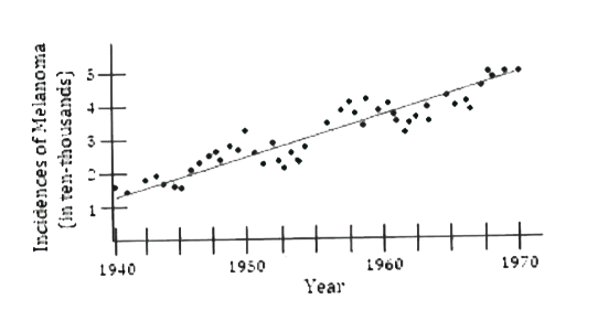
The scatterplot above shows the number of people diagnosed with melanoma, in ten-thousands, from 1940 to 1970. Based on the line of best fit to the data, as shown in the figure, which of the following values is closest to the average yearly increase in the number of incidences of melanoma?View Solution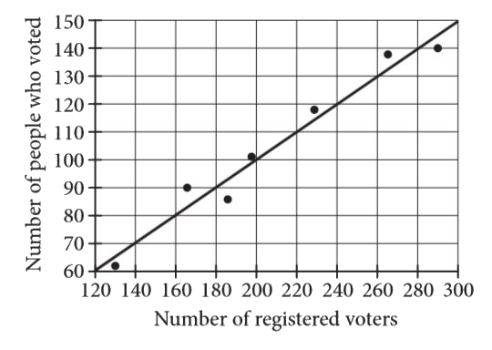
The scatterplot above shows the number of registered voters, x, and the number of people who voted in the last election, y, for seven districts in a town. A line of best fit for the data is also shown. Which of the following could be the equation of the line of best fit?View Solution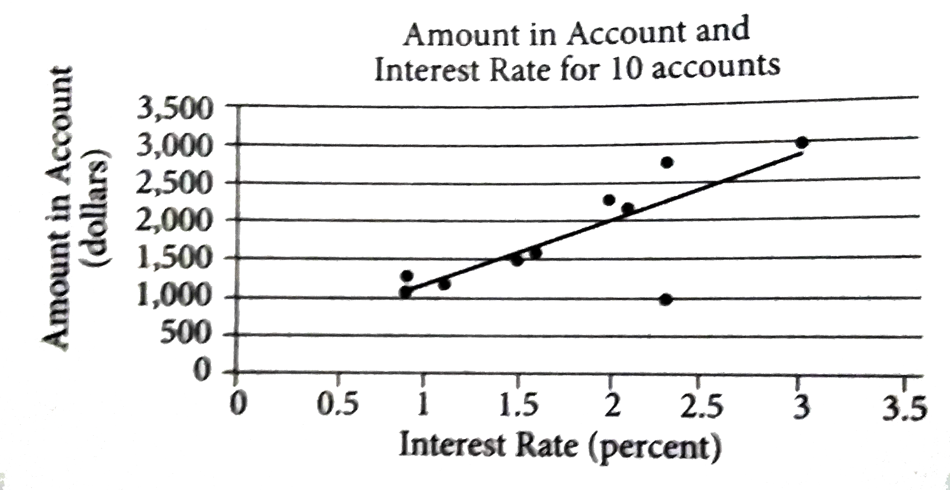
The scatterplot above shows data for ten accounts opened by a company , along with the line of best fit. For the account that contains the least amount of money, which of the following is closest to the difference of the actual amount and the amount predicted by the line of best fit?View Solution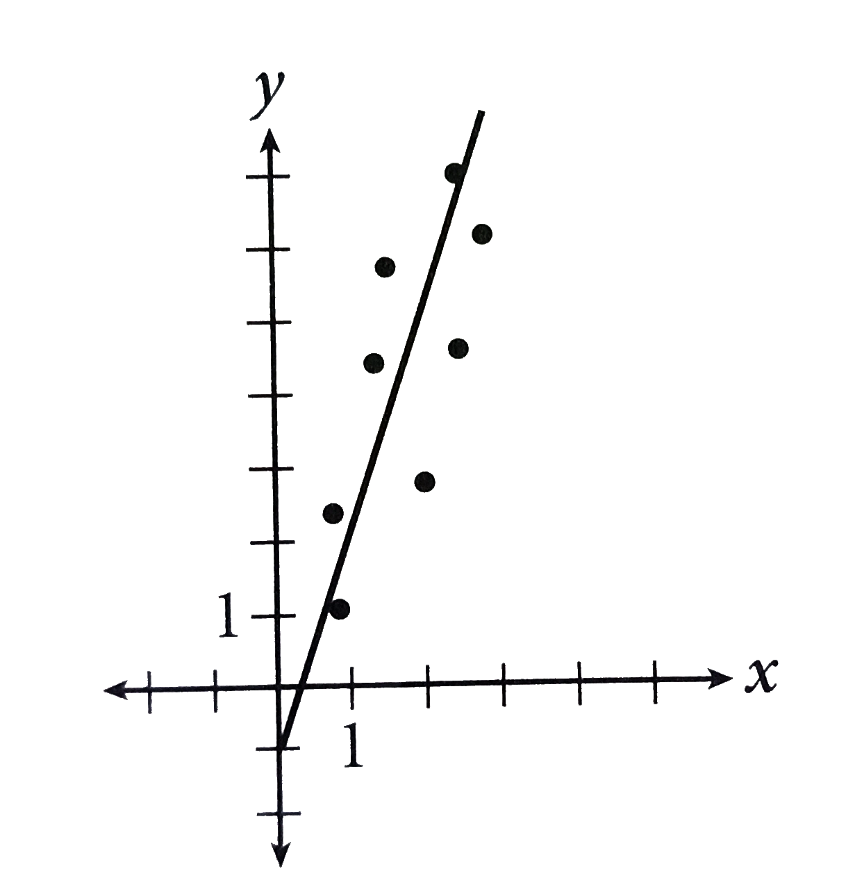
Which of the following equation corresponds to the line of best fit for the data set shown above ?View Solution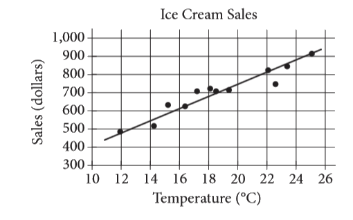
The scatterplot above shows a company’s ice cream sales d, in dollars, and the high temperature t, in degrees Celsius (.∘C), on 12 different days. A line of best fit for the data is also shown. Which of the following could be an equation of the line of best fit?View Solution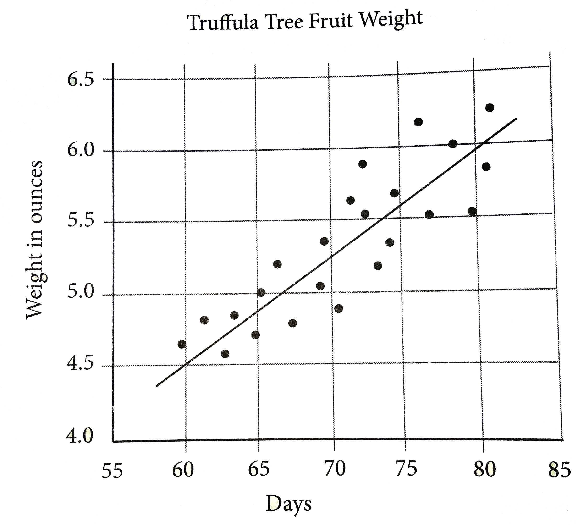
The scatterplot above shows the weight, in ounces,of the fruits on a certain truffula tree from days 55 to 85 after flowering. According to the line of best fit in the scatterplot above, which of the following is the closest approximation of the number of days after flowering of a truffula fruit that weighs 5.75 ounces?View Solution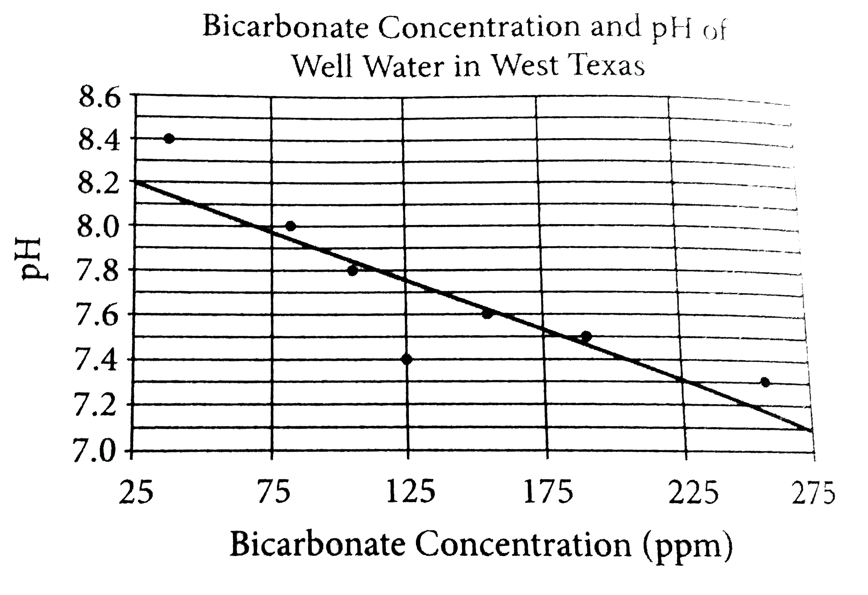
The scatterplot above shows the pH of seven well water samples in West Texas with respect to the bicarbonate concentration in ppm(parts per million). The line of best fit is also shown.
According to the scatterplot, which of the following statements about the relationship between a well's pH and its bicarbonate concentration is true?View Solution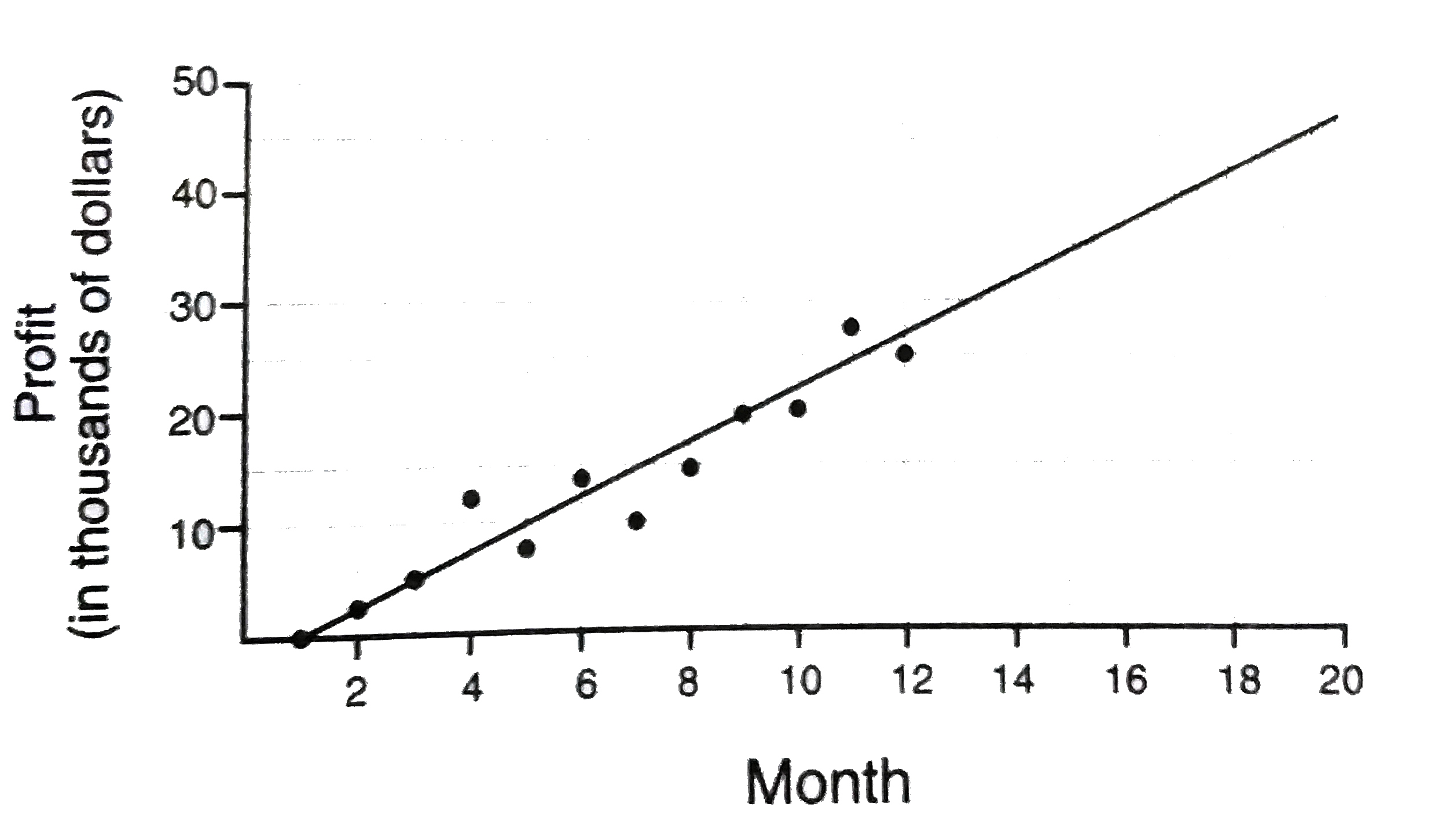
The scatterplot above shows the profit, by month, for a new company for the first year of operation. A line of best fit is also shown. Using this line, by what dollar amount did the profit in the 8th month exceed the profit in the 13th month?View Solution

