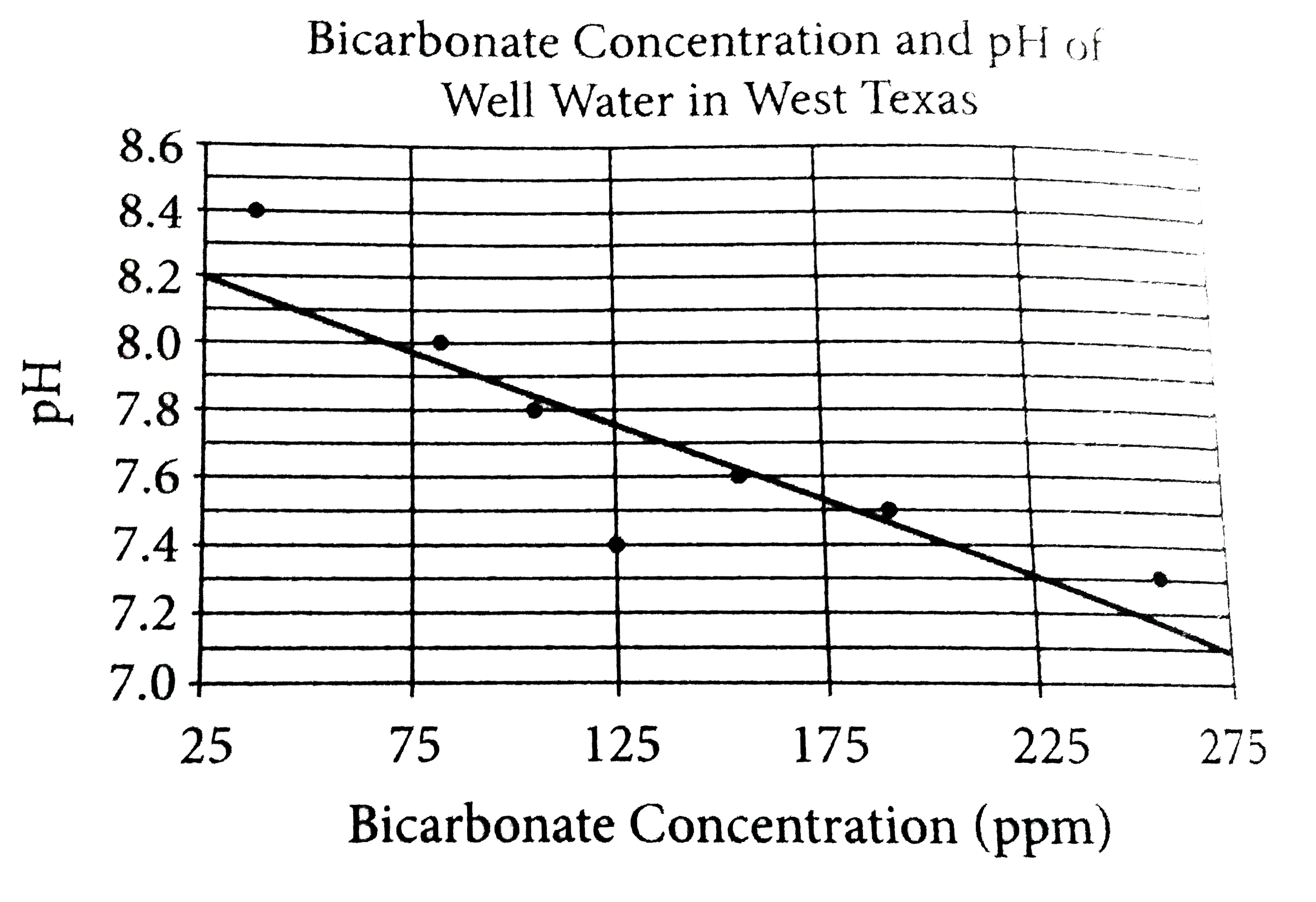
The scatterplot above shows the pH of seven well water samples in West Texas with respect to the bicarbonate concentration in ppm(parts per million). The line of best fit is also shown.
According to the scatterplot, which of the following statements about the relationship between a well's pH and its bicarbonate concentration is true?
A well with half as much bicarbonate as another well will have a pH twice that of the other well
Wells that have more bicarbonate tend to have higher pH
Wells that have more bicarbonate tend to have lower pH
The bicarbonate concentration of the well water is unrelated to its pH.
The correct Answer is:C
Step by step video, text & image solution for The scatterplot above shows the pH of seven well water samples in West Texas with respect to the bicarbonate concentration in ppm(parts per million). The line of best fit is also shown. According to the scatterplot, which of the following statements about the relationship between a well's pH and its bicarbonate concentration is true? by Maths experts to help you in doubts & scoring excellent marks in Class 12 exams.
Updated on:21/07/2023Topper's Solved these Questions
Similar Questions
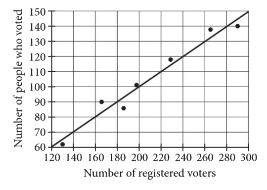
The scatterplot above shows the number of registered voters, x, and the number of people who voted in the last election, y, for seven districts in a town. A line of best fit for the data is also shown. Which of the following could be the equation of the line of best fit?
View Solution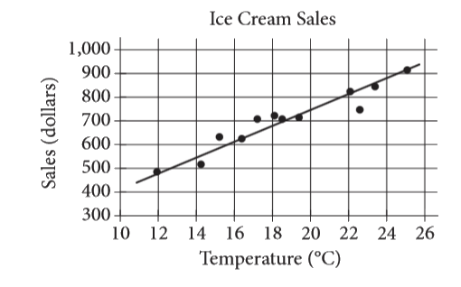
The scatterplot above shows a company’s ice cream sales d, in dollars, and the high temperature t, in degrees Celsius (.∘C), on 12 different days. A line of best fit for the data is also shown. Which of the following could be an equation of the line of best fit?
View Solution
Knowledge Check
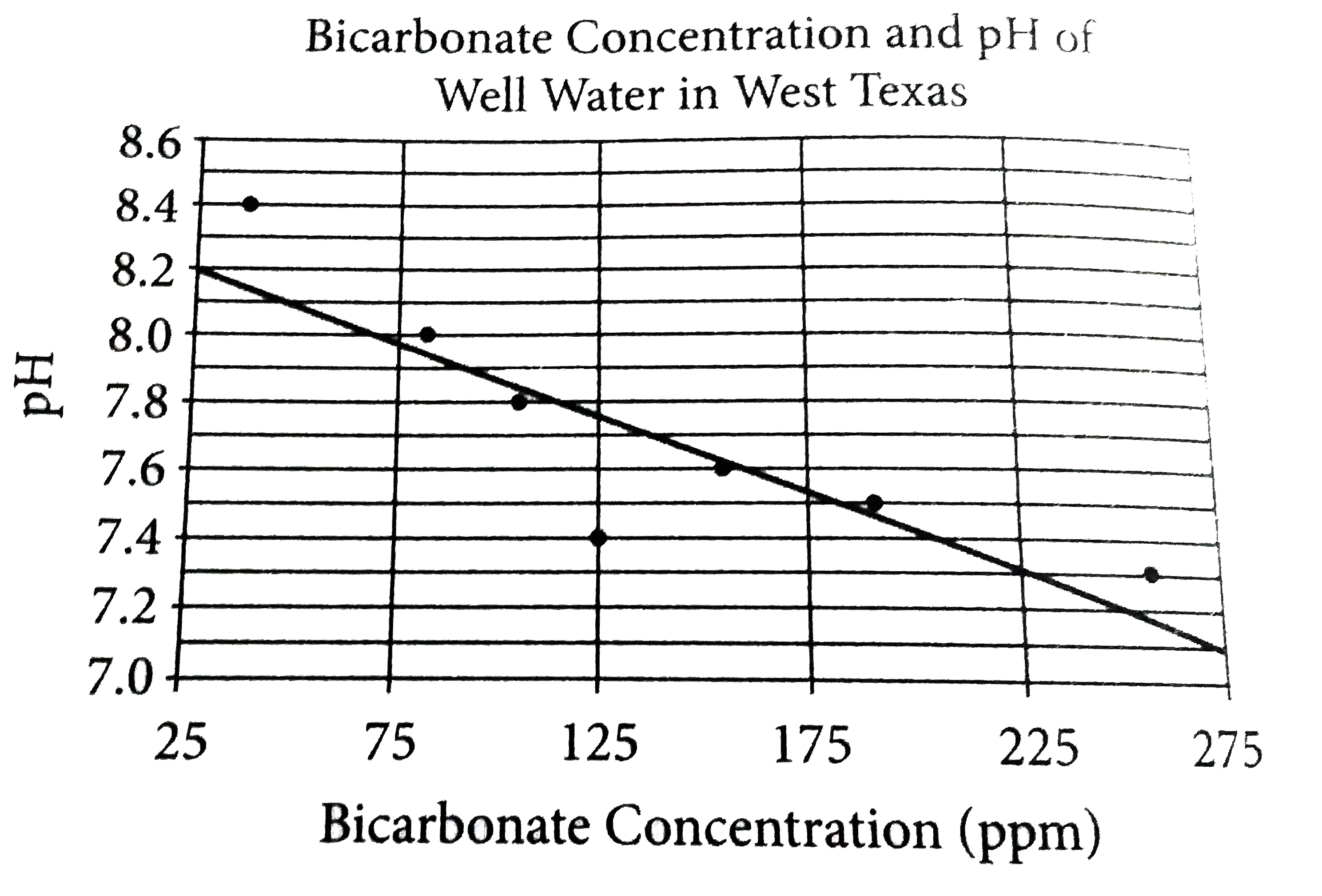
The scatterplot above shows the pH of seven well water samples in West Texas with respect to the bicarbonate concentration in ppm(parts per million). The line of best fit is also shown.
A new well is discovered in West Texas with a bicarbonate concentration of 225 ppm. According to the line of best fit, which of the following best approximates the pH of the well water?A7.1B7.3C7.4D8.4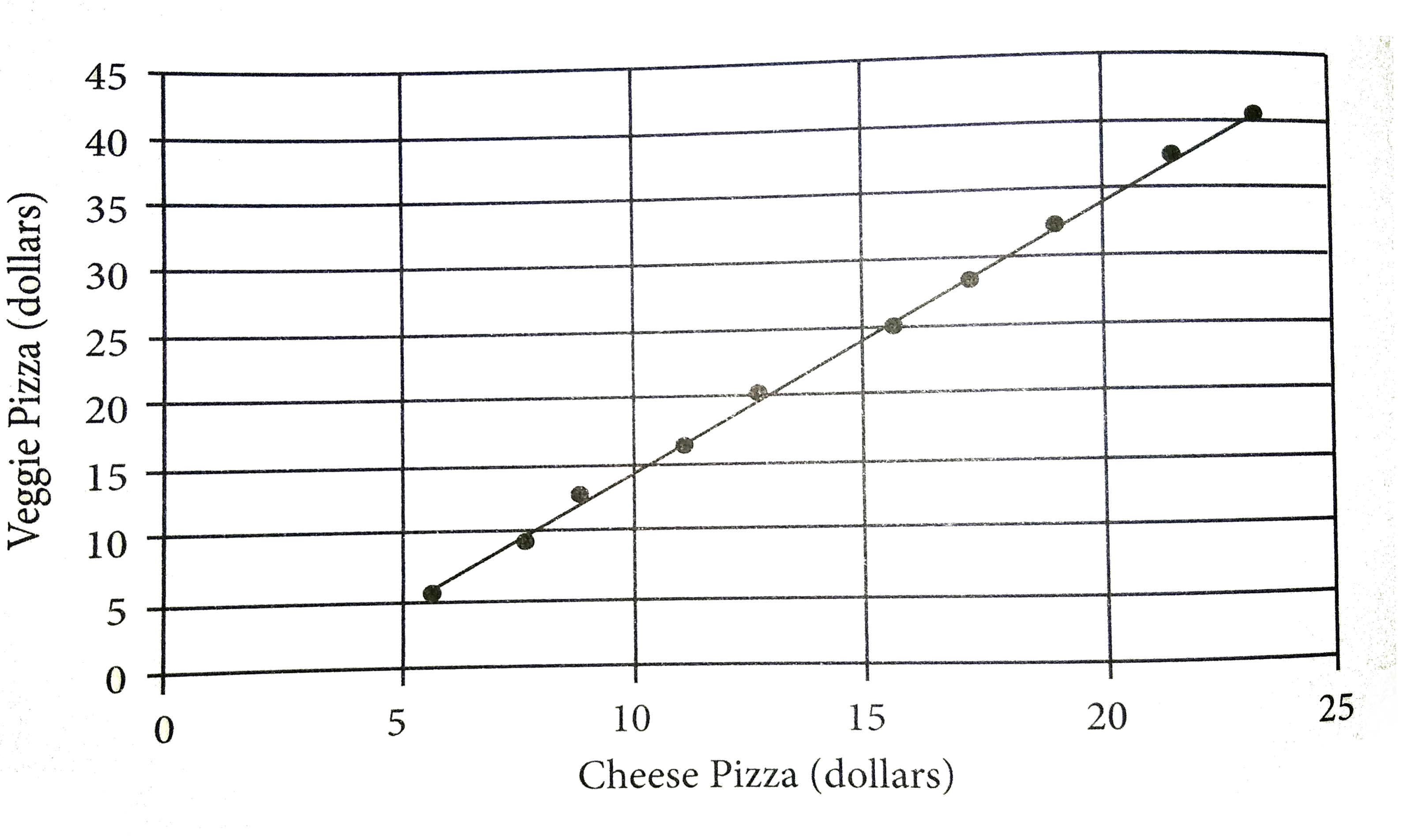
The scatterplot above shows the price, in dollars, for both cheese pizza and a veggie pizza for ten different pizzerias. The line of best fit is also shown. According to the line of best fit, which of the following is closer to the predicted increase in the price of a veggie pizza, in dollars, for every 1 dollar increase in the price of a cheese pizza?A1.5B2.0C2.5D3.0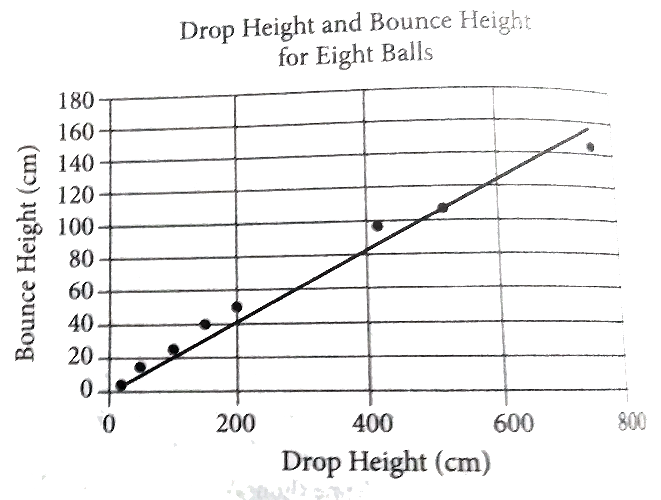
The scatterplot above shows the height in centimeters for both the drop and bounce of eight different balls of the same type. The line of best fit for the data is also shown. According to the lines of best fit, which of the following is closest to the predicted increase in bounce height, in centimeters, for every increase of 100 centimeters in drop height?A25B20C15D10
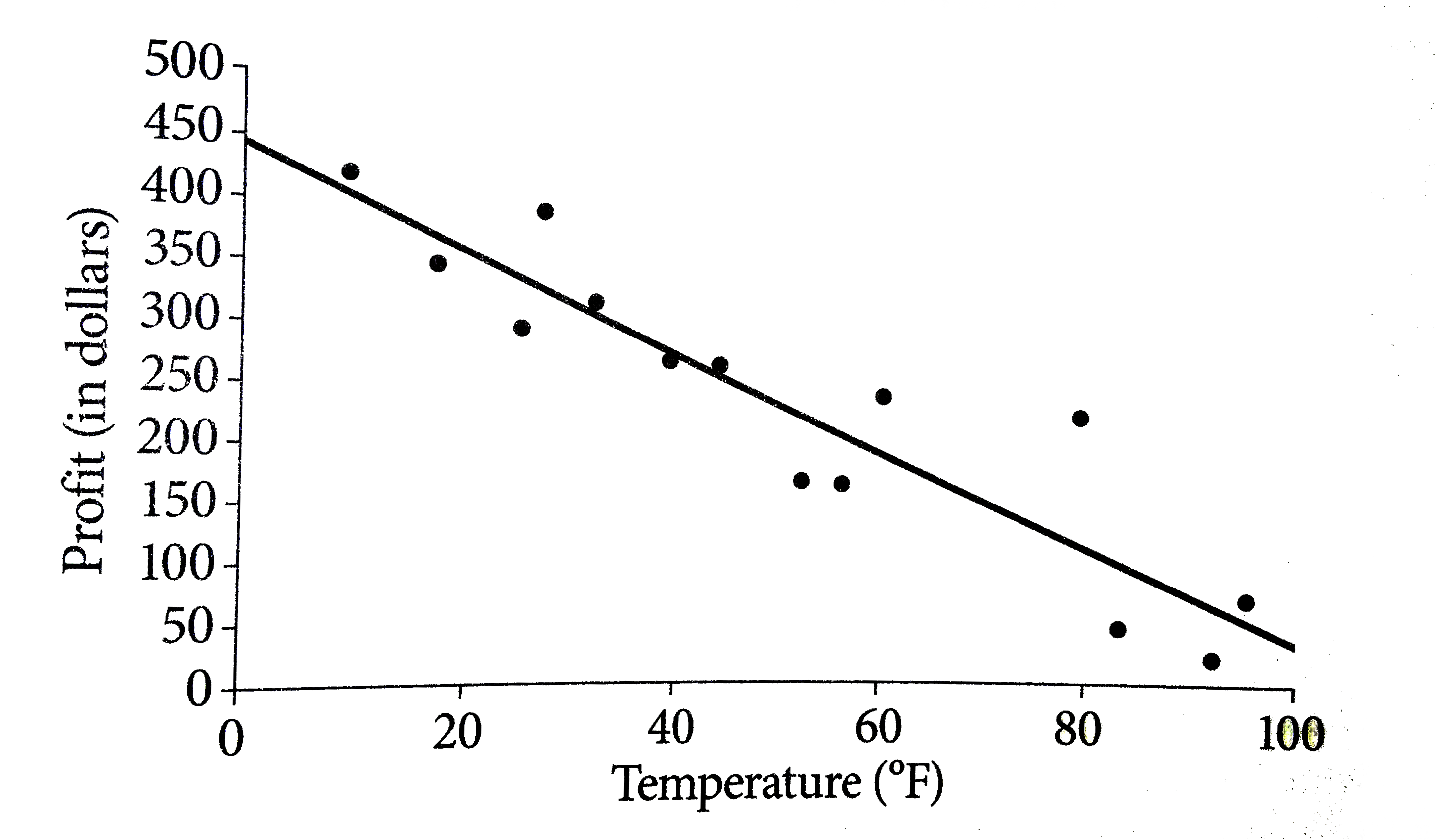
The scatterplot above shows the daily profit made by a school store from selling sweatshirts and the average daily temperature for several days in the year 2004. The line of best fit is also shown and has equation y=-4.1x+446. Which of the following best explains hoow the number −4.1 in the equation relates to the scatterplot?
View Solution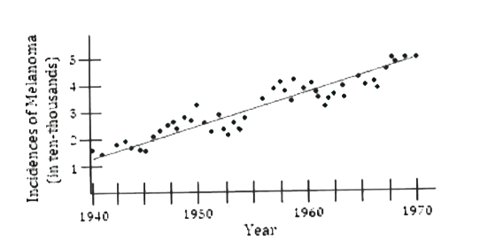
The scatterplot above shows the number of people diagnosed with melanoma, in ten-thousands, from 1940 to 1970. Based on the line of best fit to the data, as shown in the figure, which of the following values is closest to the average yearly increase in the number of incidences of melanoma?
View Solution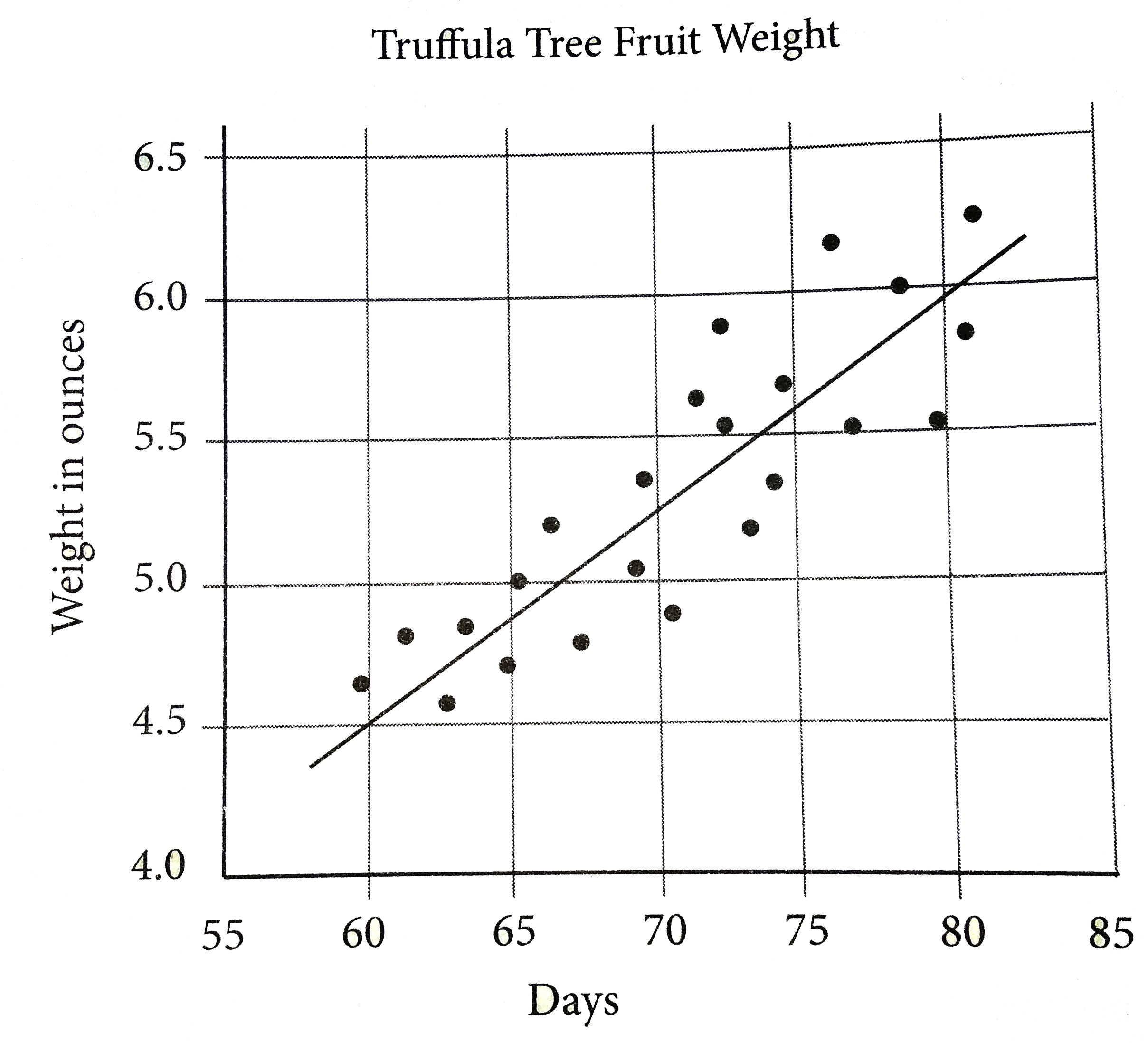
The scatterplot above shows the weight, in ounces,of the fruits on a certain truffula tree from days 55 to 85 after flowering. According to the line of best fit in the scatterplot above, which of the following is the closest approximation of the number of days after flowering of a truffula fruit that weighs 5.75 ounces?
View SolutionThe relative housing cost for a US city is defined to be the ratio average housing cost for the citynational average housing cost expressed as a percent.
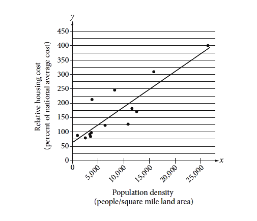
The scatterplot above shows the relative housing cost and the population density for several large US cities in the year 2005. The line of best fit is also shown and has equation y = 0.0125x + 61. Which of the following best explains how the number 61 in the equation relates to the scatterplot?
View Solution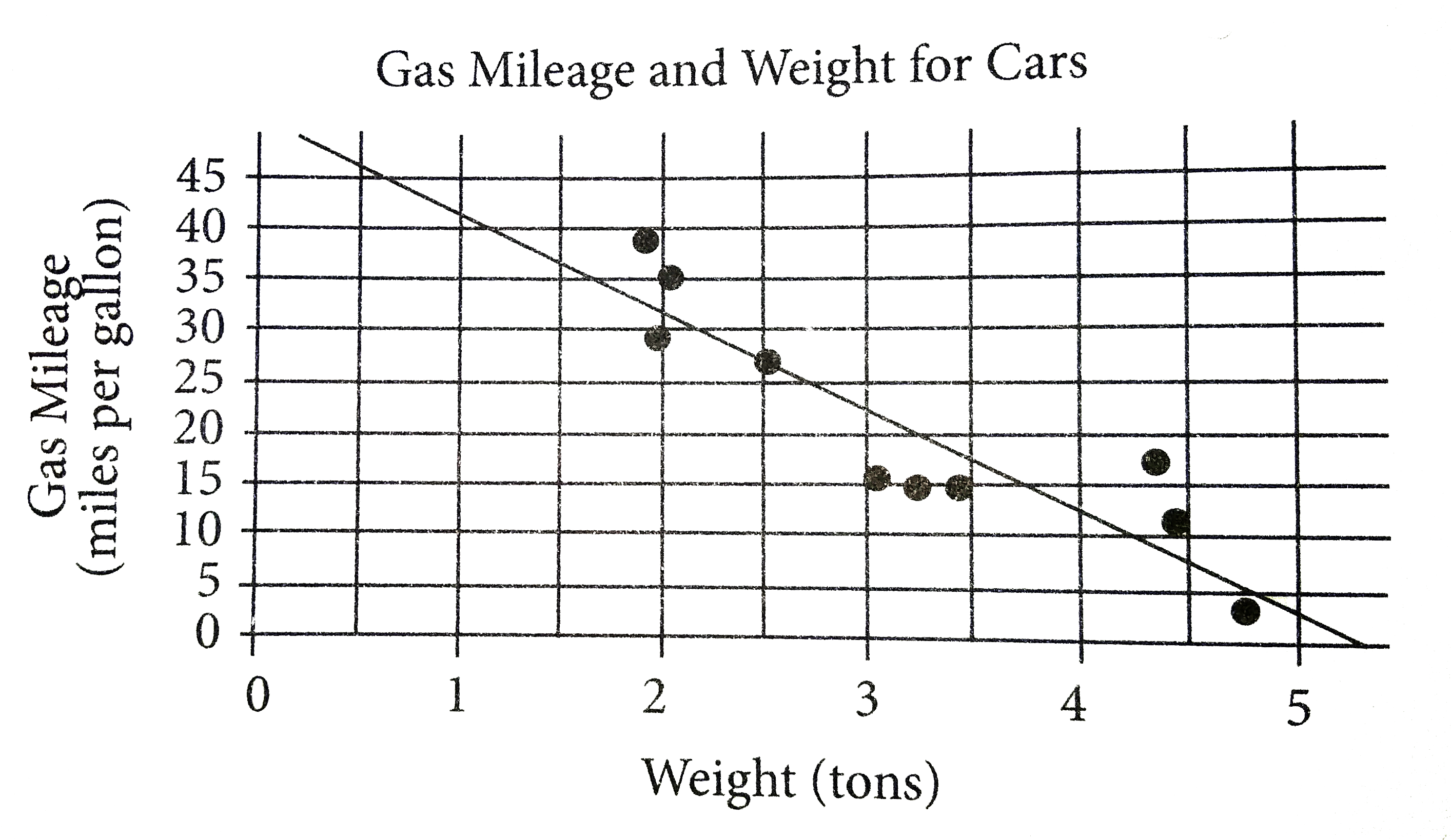
The scatterplot above shows the relationship between gas mileage, in miles per gallon, and weight , in tons, for 10 cars selected at random. The line of best fit models the gas mileage based on the weight of the car. What is the weight, in tons, of the car for which the actual gas mileage was closest to the predicted value?
View Solution
