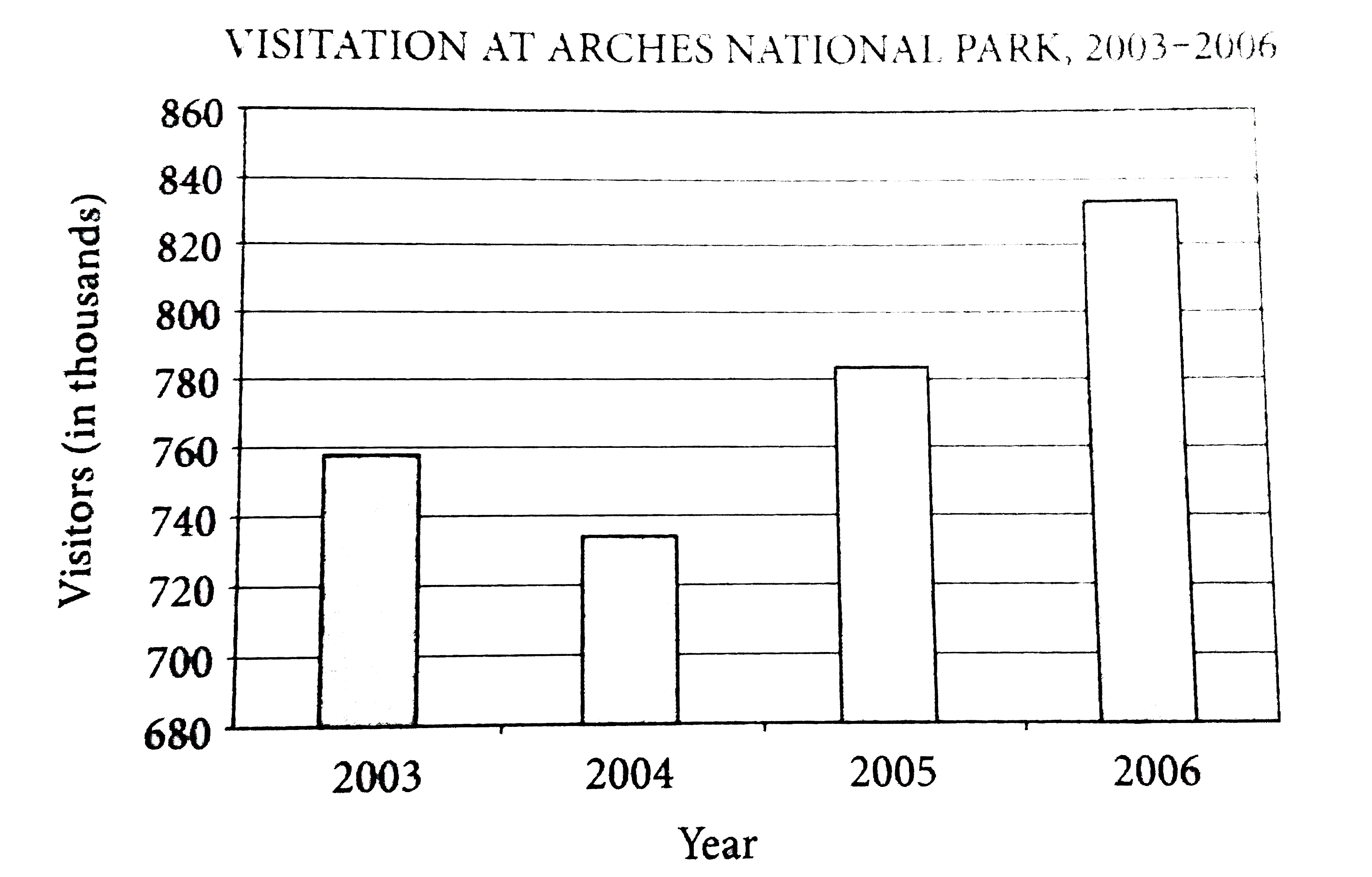
The chart above shows the number of visits, in thousands, at Arches National park for the years 2003 to 2006. Which of the following is the closest approximation of the percent increase in the number of visits from 2004 to 2006?
0.05
0.15
0.2
1.15
The correct Answer is:B
Step by step video, text & image solution for The chart above shows the number of visits, in thousands, at Arches National park for the years 2003 to 2006. Which of the following is the closest approximation of the percent increase in the number of visits from 2004 to 2006? by Maths experts to help you in doubts & scoring excellent marks in Class 12 exams.
Updated on:21/07/2023Topper's Solved these Questions
- ADVANCED ARITHMETICBOOK - PRINCETONCHAPTER - ADVANCED ARITHMETICEXERCISE - Advanced Arithmetic Drill: Calculator-Permitted Section
16 Videos
- ADDITIONAL TOPICSBOOK - PRINCETONCHAPTER - ADDITIONAL TOPICSEXERCISE - QUICK QUIZ #9
3 Videos
- ALEGBRABOOK - PRINCETONCHAPTER - ALEGBRAEXERCISE - QUICK QUIZ #6
3 Videos
Similar Questions
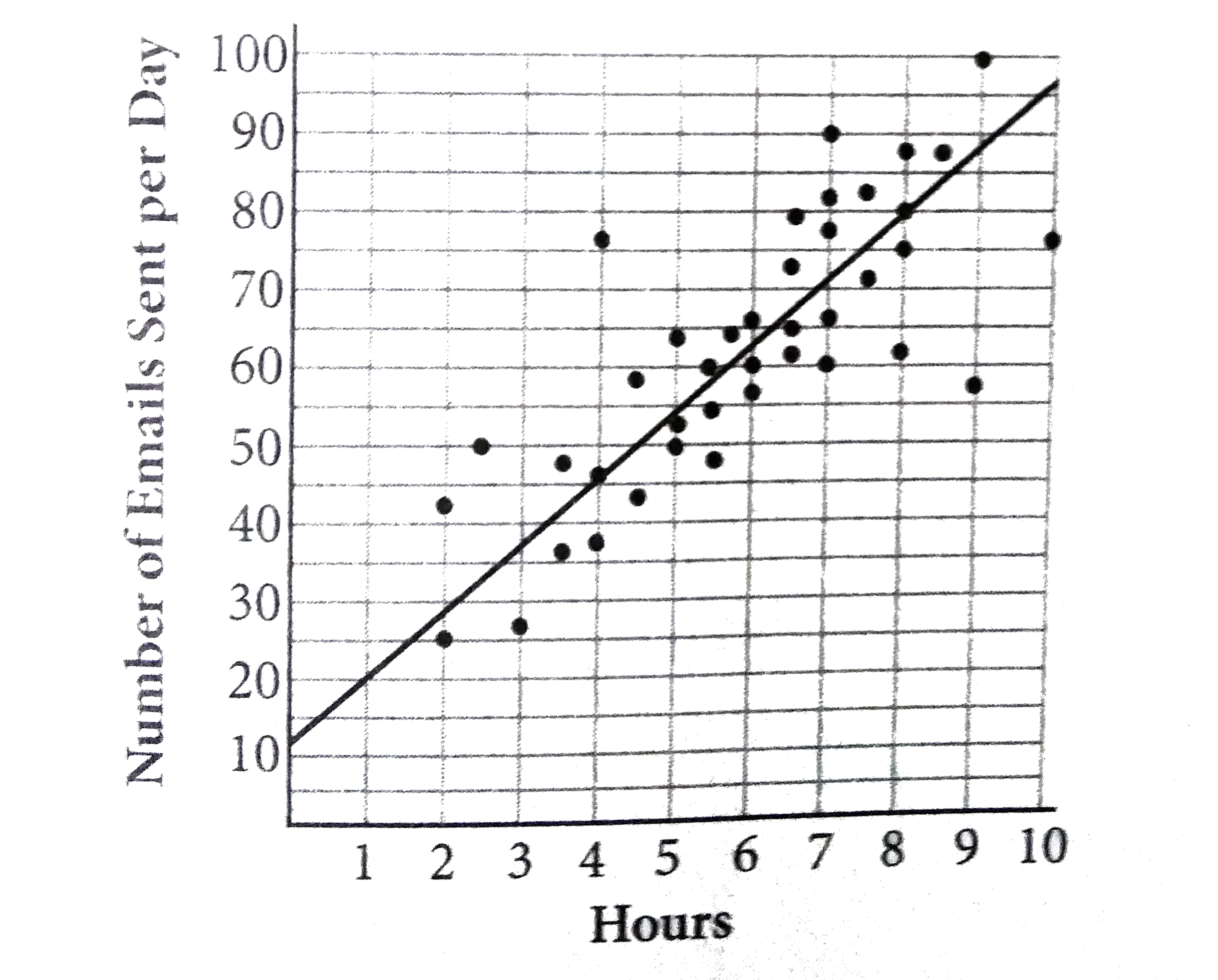
The figure above shows the number of emails sent per day plotted against the number of hours an adult works on a computer per day. Which of the following best estimates the average rate of change in the number of emails sent compared to the number of hours working on a computer?
View SolutionWhich of the following shows nitrogen with its increasing order of oxidation number.
View Solution
Knowledge Check
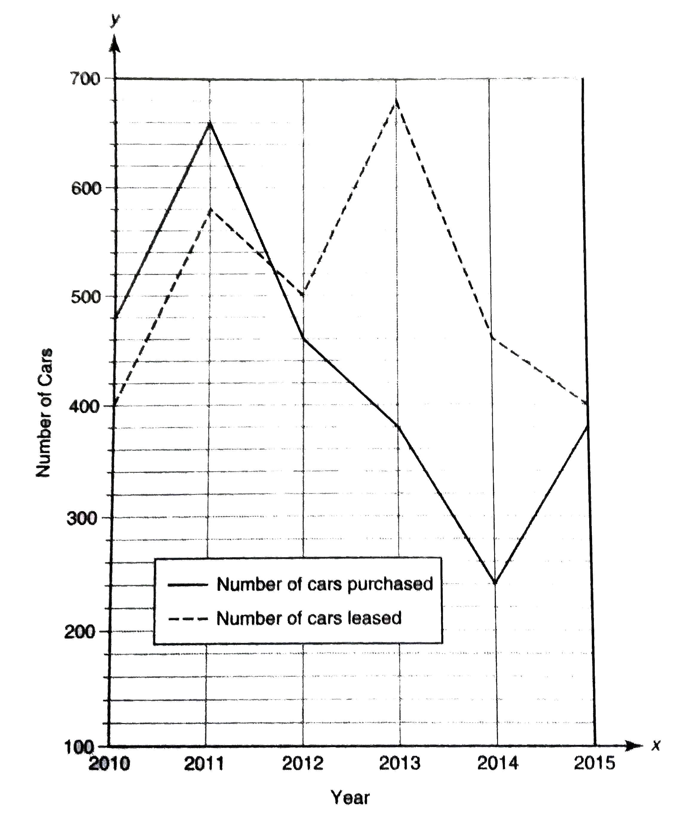
Question 11 and 12 refer to the gaph above.
Q. Which of the following is the best approximation for the decrease in the number of cars purchased per year between 2011 and 2014?A105B140C300D420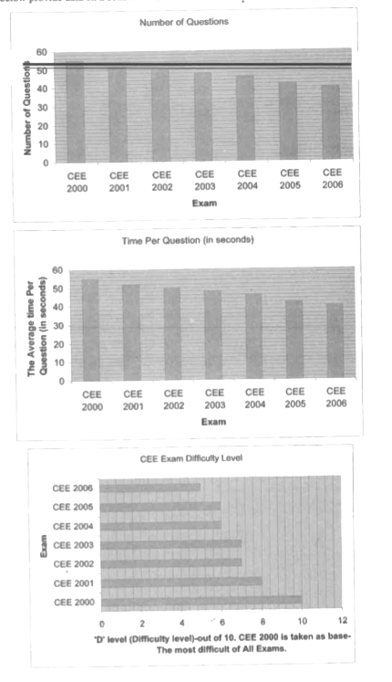
By approximately what percent did the number of questions decrease from CEE 2000 to CEE 2006?A11B22C27D33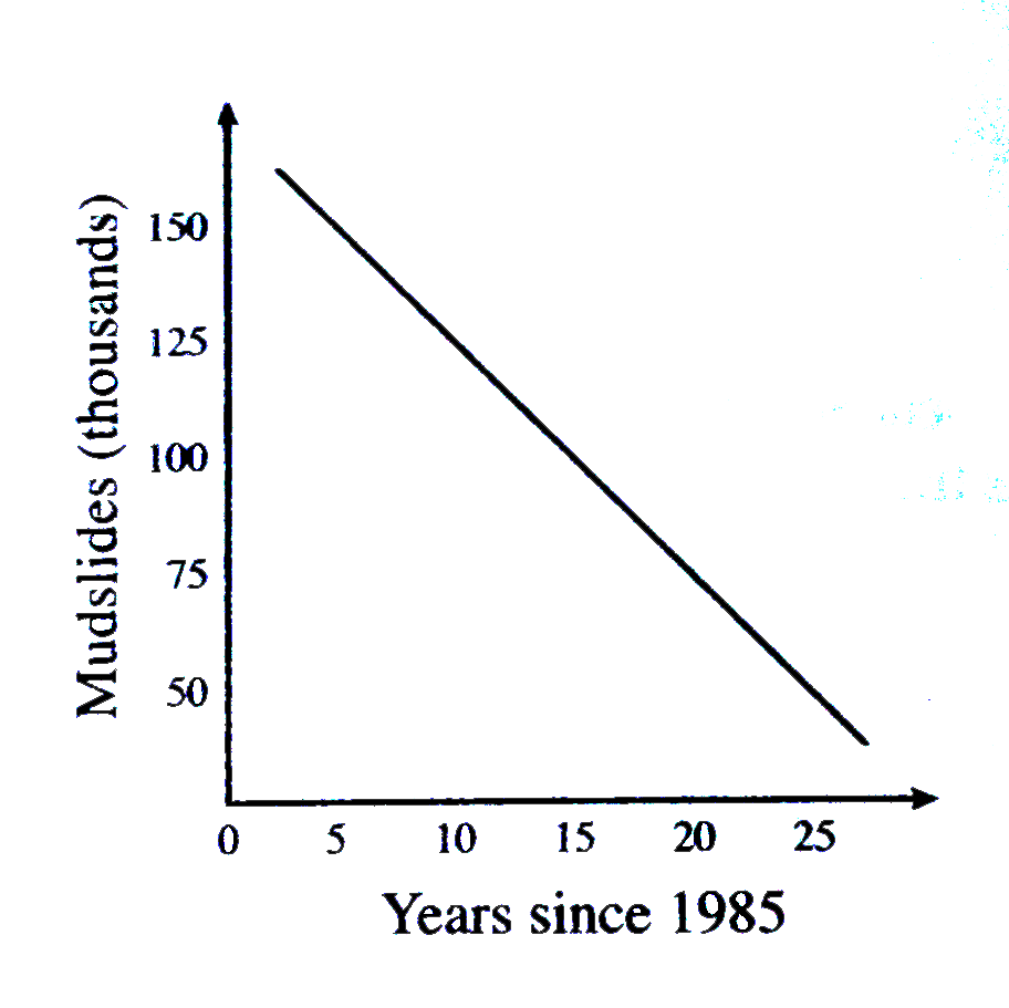
The number of mudslides in a certain country for the past 25 years is approximated by the graph shown above . The graph displays the number of mudslides (in thousands) from 1985 to 2010. Based on the graph , which of the following is closest to the average yearly decrease in the number of mudslides ?A1B5C10D25
Annual Budgets for Different Programs in Kansas, 2007 to 2010
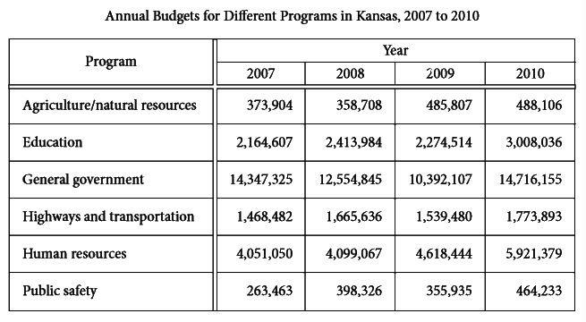
The table above lists the annual budget, in thousands of dollars, for each of six different state programs in Kansas from 2007 to 2010.
Which of the following best approximates the average rate of change in the annual budget for agriculture/natural resources in Kansas from 2008 to 2010 ?
View Solution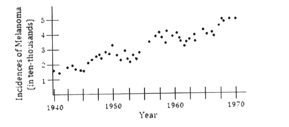
The scatterplot above shows the numbers of people diagnosed with melanoma, in ten - thousands, from 1940 to 1970. Based on the data shown in the figure, which of the following values is closest to the range of the number of incidences of melanoma between 1945 and 1950?
View Solution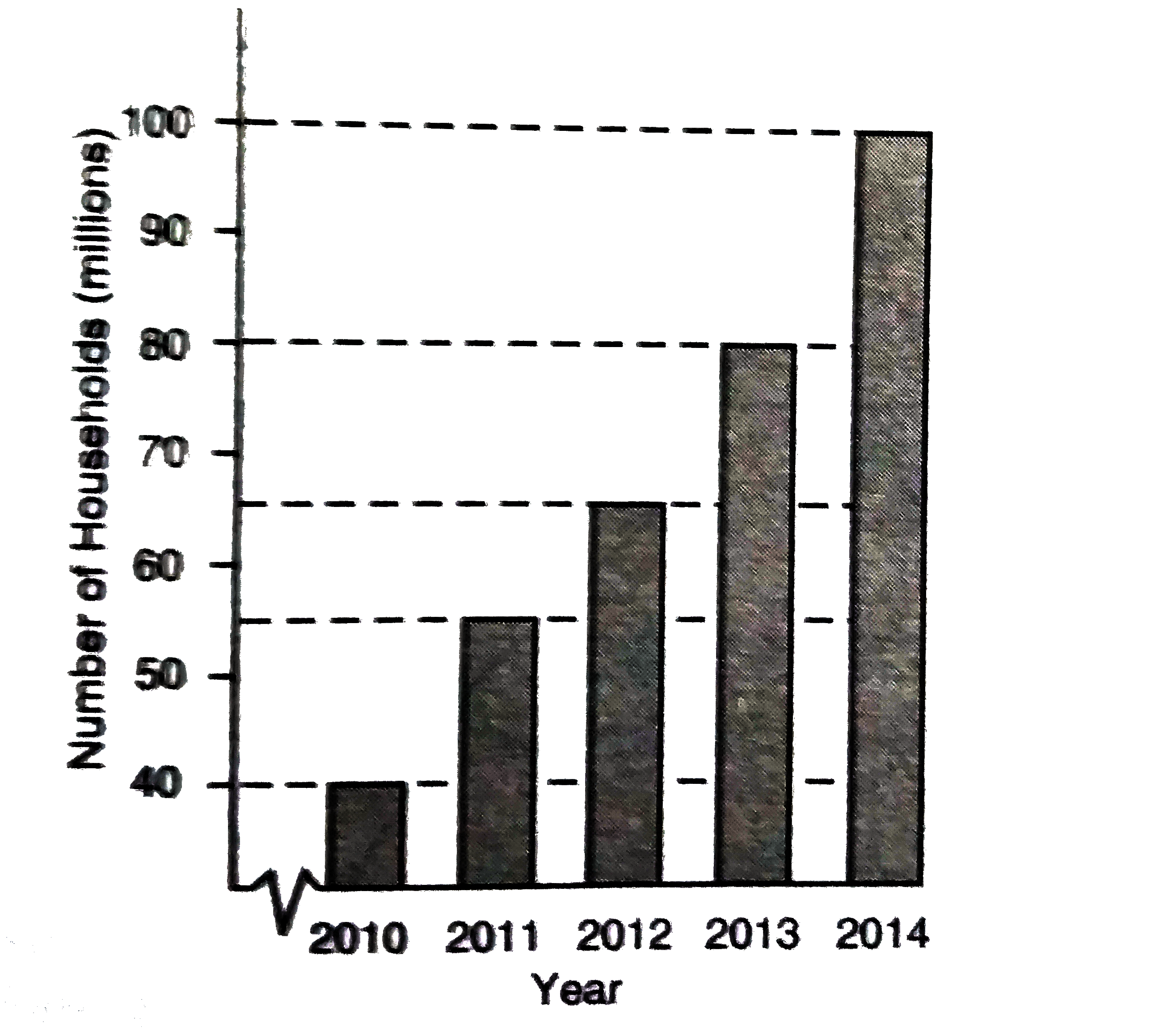
The graph above shows the number of U.S. households with laptop computers for the years 2010 to 2014.
Q. What was the percent of increase in the number of households with laptops from 2010 to 2014?
View SolutionThe following table gives the number of households in USA during 2000-2014.
The following charts give the distribution of households based on the numbers of children for the years 2000 and 2014.

The following charts give the distribution based on the number of childre for the year 2000 and 2014.
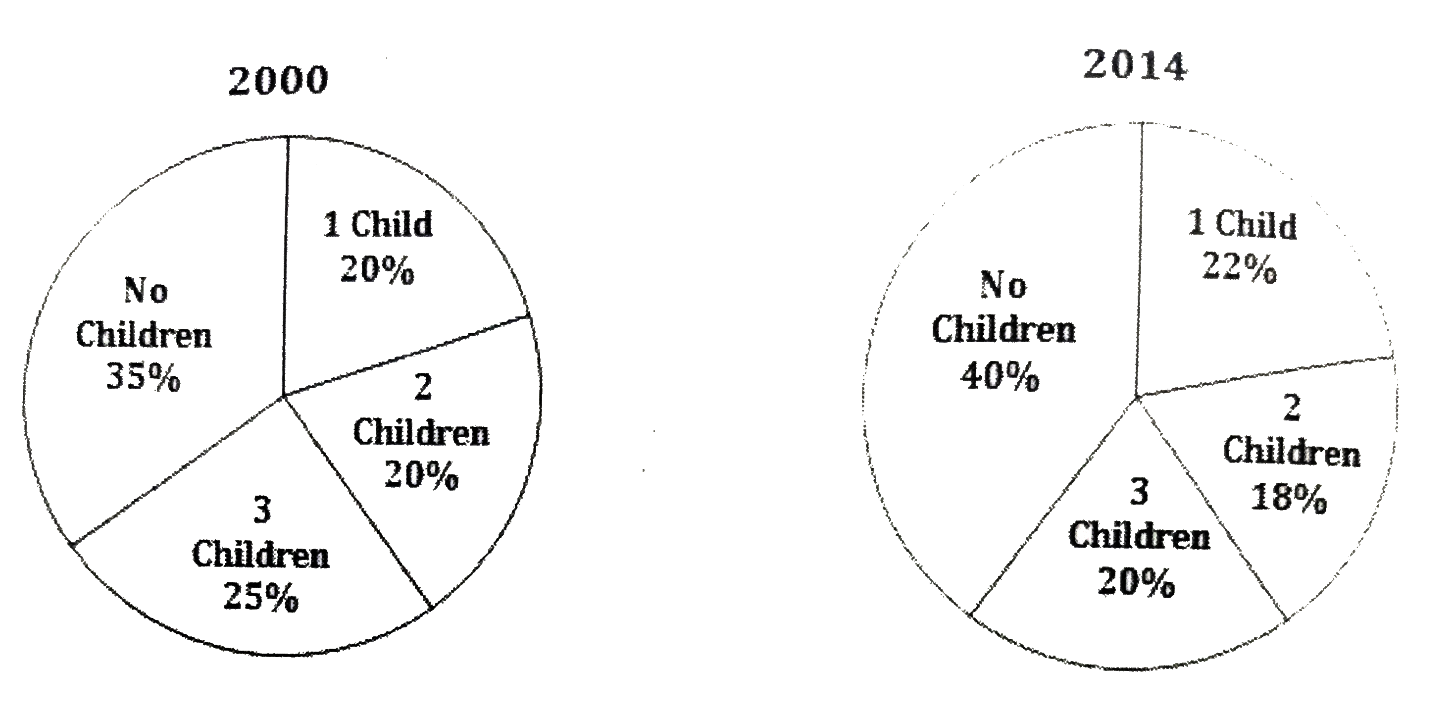
What was the approximate average annual percent increase in the number of households form 2000 to 2014 ?
View Solution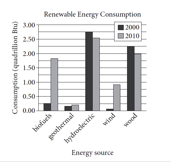
The bar graph above shows renewable energy consumption in quadrillions of British thermal units (Btu) in the United States, by energy source, for several energy sources in the years 2000 and 2010.
Of the following, which best approximates the percent decrease in consumption of wood power in the United States from 2000 to 2010 ?
View Solution
