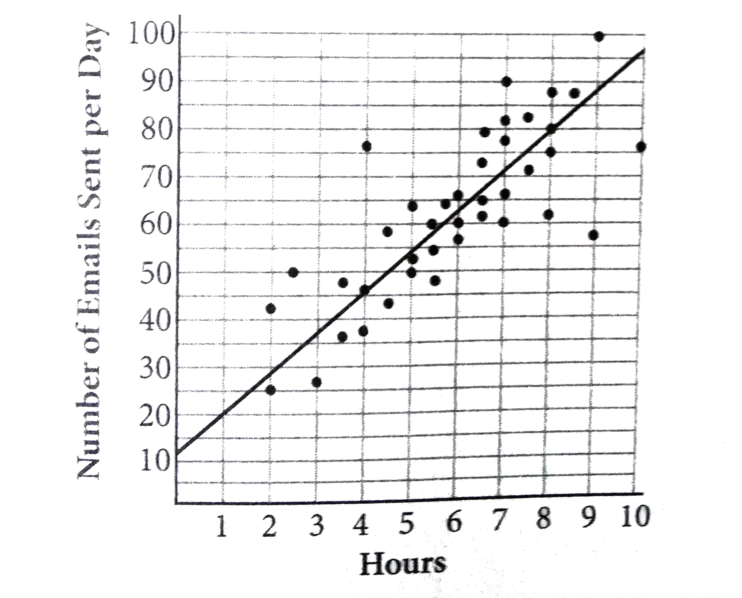
The figure above shows the number of emails sent per day plotted against the number of hours an adult works on a computer per day. Which of the following best estimates the average rate of change in the number of emails sent compared to the number of hours working on a computer?
0.12
1.5
8.5
12
The correct Answer is:C
Difficult: Medium
Category: Problem Solving and Data Analysis/ Scatterplots
Strategic Advice: When real-world data is presented in a scatterplot, the average rate of change is the same as the slope of the best-fit line.
Getting to the Answer: Find the slope of the best-fit line using the slope formula, m=y2−y1x2−x2 and any two points that lie on (or very close to ) the line. Using the two points (4, 46) and (8, 80), the average rate of change is about 80−468−4=344=8.5, which is (C). Note that the answer choices are spread out enough that any two points along the line, even points for which you estimate the coordinates, will yield a slope that is close enough to one of the answer choices.
Topper's Solved these Questions
Similar Questions
An atchitect is working on a design for a solar power plant. While double-checking the blueprint, he realizes that he has made an error: The solar panels will not fit on the roof unless the dimensions of the roof are increased by 0.5%. Which of the following expresses this change in the dimensions of the roof as a fraction of the original dimensions?
View Solution
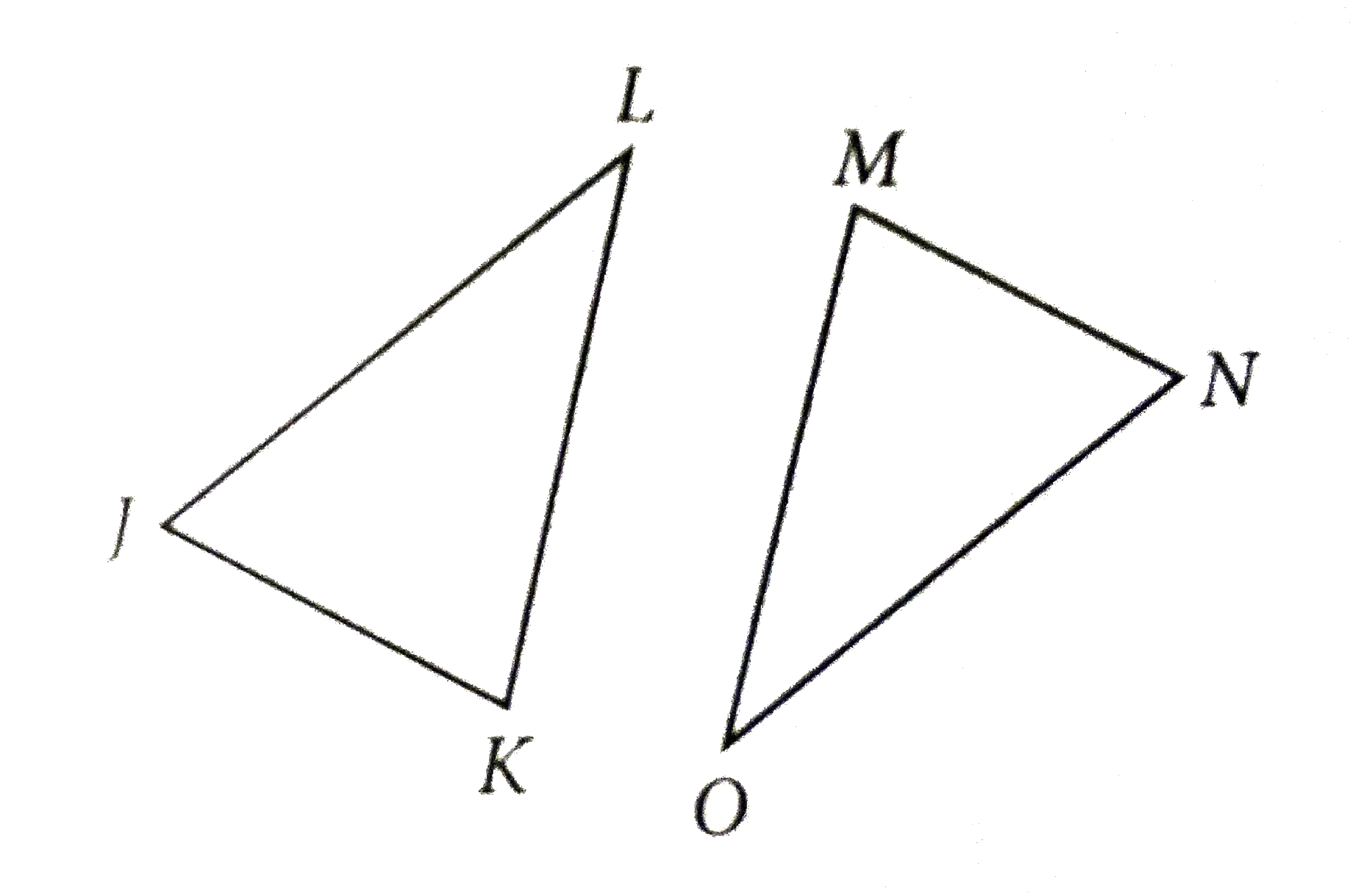
In the diagram above, ¯¯¯¯¯JL=¯¯¯¯¯¯ONand¯¯¯¯¯¯KL=¯¯¯¯¯¯¯OM. Confirmation of which of the following facts would be sufficient to prove that the two triangles are congruent?
View SolutionHow many lines of symmetry does the above figure have ?
View SolutionWhich of the following are correct chain isomers of butane ? (i)
View SolutionDetermine the point of symmetry of a regular hexagon.
View SolutionDtermine the images of the following figure about the given line :
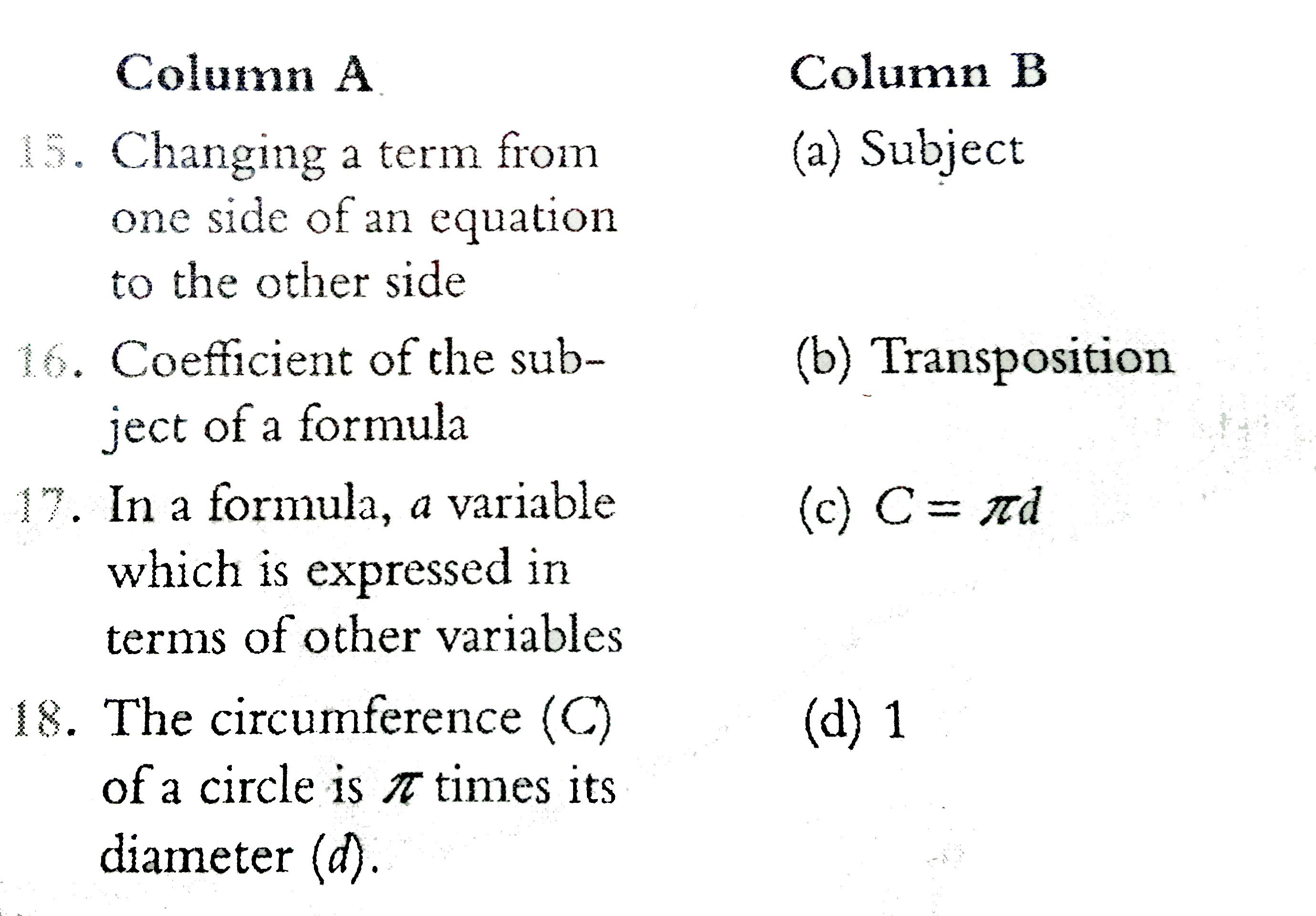
View SolutionMatch the following Column A to Column B

View SolutionMatch the following Column A to Column B

View SolutionMatch the following Column A to Column B

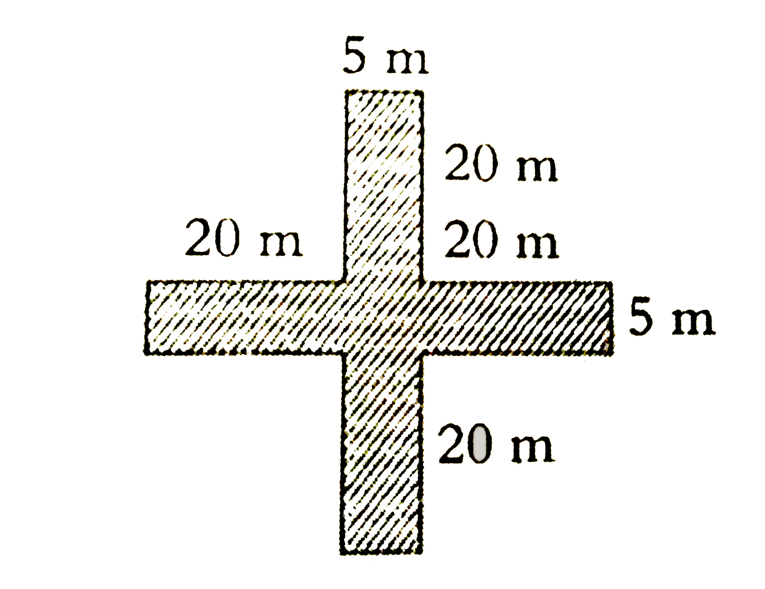
View SolutionFind the area of the figure given below.

View SolutionThe area of the shaded part in the figure given below is ______.

View SolutionThe inequation represented by the graph given below is :
View SolutionThe inequation that best describes the graph given below is _________
View SolutionThe inequation that best describes the following graph is _________
View SolutionWhich inequations represent the shaded region in the given figure
View Solution