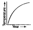
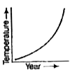
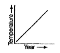
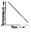
The temperature of a particular place is continuously decreasing. Which of the following graphs shows the condition?
The correct Answer is:D
To determine which graph represents a continuously decreasing temperature, we need to analyze the given options step by step.
1. Understanding the Graphs: We have four options, each showing a different graph. We need to identify which graph depicts a continuous decrease in temperature over time.
2. Analyzing Option 1:
- Look at the graph. If the line is sloping upwards from left to right, it indicates an increase in temperature.
- Conclusion: This graph shows increasing temperature.
3. Analyzing Option 2:
- Check the slope of the line. If it is also sloping upwards from left to right, it indicates an increase in temperature.
- Conclusion: This graph also shows increasing temperature.
4. Analyzing Option 3:
- Observe the graph. If the line is again sloping upwards from left to right, it indicates an increase in temperature.
- Conclusion: This graph shows increasing temperature as well.
5. Analyzing Option 4:
- Examine the graph closely. If the line is sloping downwards from left to right, it indicates a continuous decrease in temperature.
- Conclusion: This graph shows decreasing temperature.
6. Final Conclusion: Based on the analysis, the correct option that represents a continuously decreasing temperature is Option 4.
- Look at the graph. If the line is sloping upwards from left to right, it indicates an increase in temperature.
- Conclusion: This graph shows increasing temperature.
- Check the slope of the line. If it is also sloping upwards from left to right, it indicates an increase in temperature.
- Conclusion: This graph also shows increasing temperature.
- Observe the graph. If the line is again sloping upwards from left to right, it indicates an increase in temperature.
- Conclusion: This graph shows increasing temperature as well.
- Examine the graph closely. If the line is sloping downwards from left to right, it indicates a continuous decrease in temperature.
- Conclusion: This graph shows decreasing temperature.
Topper's Solved these Questions
- DATA HANDLINGBook:BHARDWAJ ACADEMYChapter:DATA HANDLINGExercise:CHAPTER EXERCISE (PREVIOUS YEARS QUESTIONS)
Explore 10 Videos
- DATA HANDLINGBook:BHARDWAJ ACADEMYChapter:DATA HANDLINGExercise:CHAPTER EXERCISE (PREVIOUS YEARS QUESTIONS)
Explore 10 Videos
- ALGEBRABook:BHARDWAJ ACADEMYChapter:ALGEBRAExercise:CHAPTER EXERCISE (Previous Years. Questions)
Explore 24 Videos
- ERROR ANALYSISBook:BHARDWAJ ACADEMYChapter:ERROR ANALYSISExercise:CHAPTER EXERCISE (Previous Year Questions)
Explore 19 Videos
Similar Questions
Knowledge Check
The following graph shows the
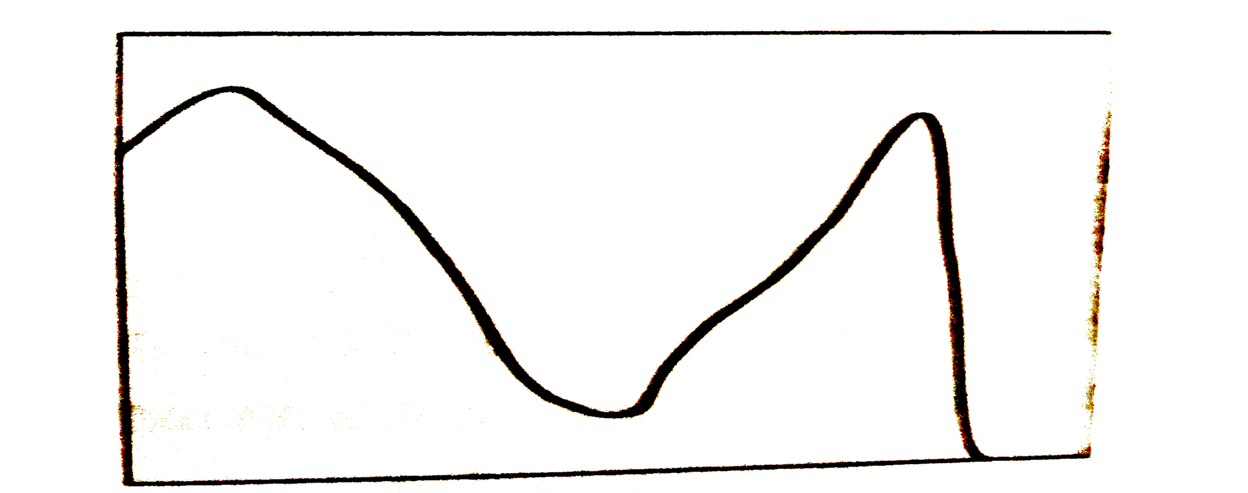 AAbsorption spectrum of chlorophyll aBAbsorption spectrum of chlorophyll bCAction spectrum of photosynthesisDBoth A and B
These days, prices are falling. Which of the following graphs shows this conditions?
A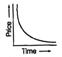 B
B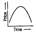 C
C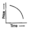 D
D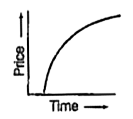
The following graph show that the reaction is:
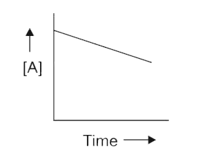 Azero orderBfirst orderCsecond orderDfractional order
Which of the following set of organisms shows dioecious conditions ?
View SolutionWhich of the following conditions shows the polluted enviorment ?
View SolutionThe following graph shows the speed ofabody which is :
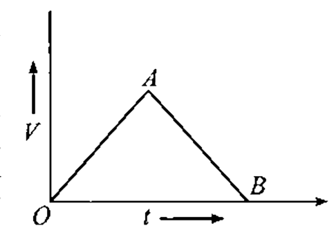
View SolutionWhich of the following graphs has a positive , decreasing slope ?
View SolutionWhich of the following condition show polluted environment ?
View Solution