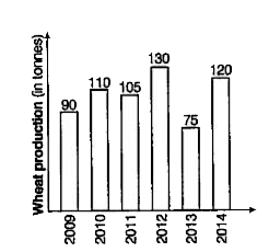
In the given bar graph, the wheat production of a farm (in tonne) from year 2009-2014 is shown. Sum of production during 'odd' years is how many times that of the 'even' years ?
23
0.75
1.33
None of these
The correct Answer is:B
Step by step video, text & image solution for In the given bar graph, the wheat production of a farm (in tonne) from year 2009-2014 is shown. Sum of production during 'odd' years is how many times that of the 'even' years ? by Maths experts to help you in doubts & scoring excellent marks in Class 14 exams.
Topper's Solved these Questions
- BOOK - ARIHANT PUBLICATION PUNJABCHAPTER - DATA HANDLING AND PATTERNSEXERCISE - Chapter Exercise50videos
DATA HANDLING AND PATTERNS
- BOOK - ARIHANT PUBLICATION PUNJABCHAPTER - DATA HANDLING EXERCISE - CHAPTER EXERCISE50videos
DATA HANDLING
- BOOK - ARIHANT PUBLICATION PUNJABCHAPTER - ERROR ANALYSISEXERCISE - CHAPTER EXERCISE25videos
ERROR ANALYSIS
Similar Questions
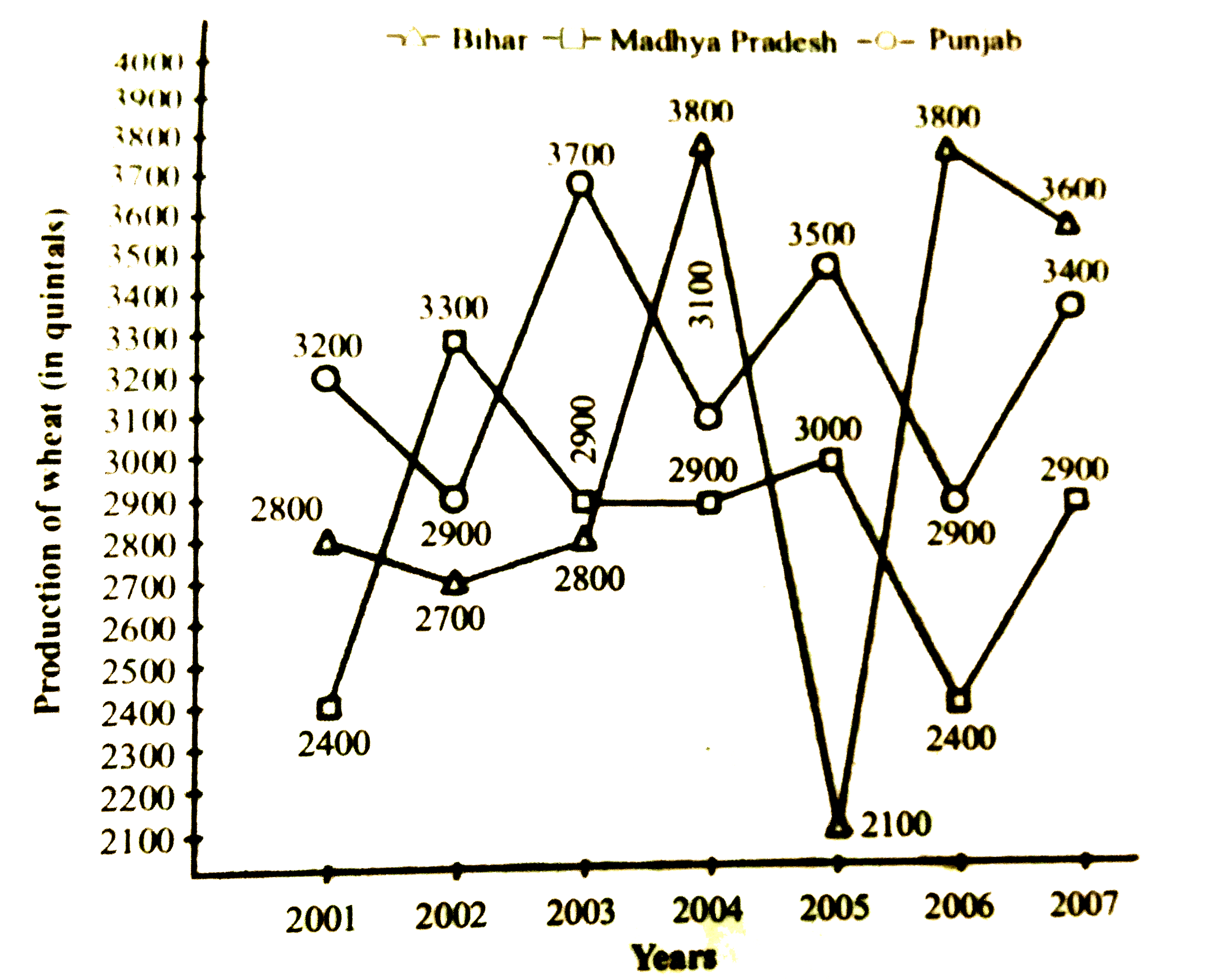
In the given years, what is the average production of wheat in Bihar? (in quintals)View SolutionThe following bar graph shows the data of the production of an item (in thousand tonnes) from four different companies A, B, C and D during the years mentioned.
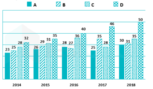
In the five years given, the average production is highest in company _____ and lower in company _______ respectively.View Solution
Knowledge Check
- Question 1 - Select One
In the given figure bar diagram, the wheat production of a farm from year 2009 to 2014 is shown. Sum of production during odd years is how many times that of the even years.
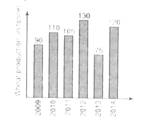 A23B0.75C1.33Dnone of the above
 - Question 2 - Select One
Study the graph carefully and answer the questions.
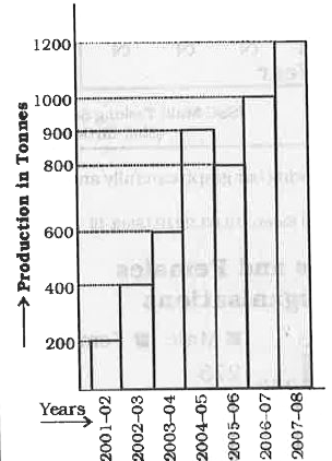
The graph shows production of an item (in tonnes) during certain years
The year in which productions increased the lowest as compared to the previous year isA2007 - 08B2003 - 04C2004 - 05D2006 - 07 - Question 3 - Select One
The Bar graph given below presents the production of wheat (in tonnes) by a big farm during the years 2011-2018. In how many of the given years was the production of wheat greater than the average production of the period?
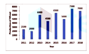 A4B3C2D5
The bar graph given below shows the wheat production (in tonnes) of a large farm during the year 2011-2018. In how many years was wheat production higher than the average production of the period?
नीचे दिए गए दंड आरेख में वर्ष 2011-2018 के दौरान किसी बड़े फार्म के गेहूं उत्पादन (टन में) को दर्शाया गया है | अवधि के औसत उत्पादन की तुलना में दिए गए कितने वर्षो में गेहूं उत्पादन अधिक था ?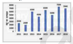 View Solution
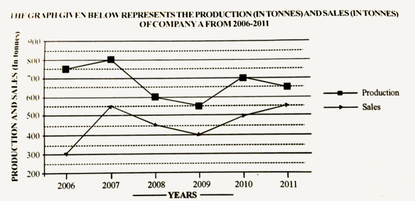
The table given below represents the respective ratio of the production (in tonners) of Company A to the production (in tonnes) of Company B, and the respective ratio of the sales (in tonnes )of Company A to the sales (in tonnes) of Company. B.
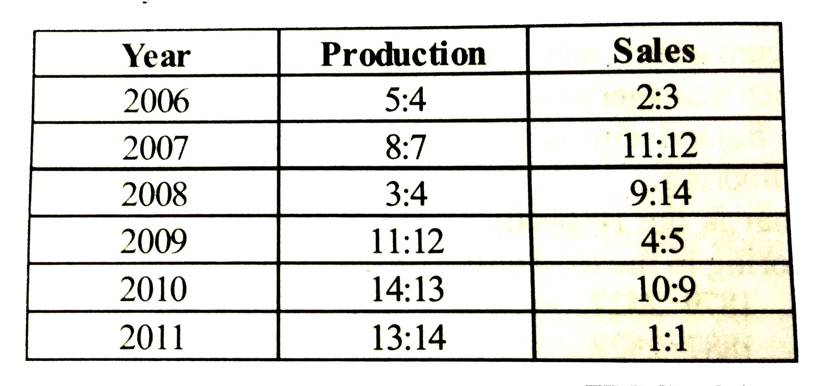
What is teh approximate perentage increases in the production of Company A(in tonnes) from the year 2009 to the production of Company A(in tonnes) in the year 2010?View SolutionThe bar graph given below shows the production (in000 tonnes) of rice of a country for the year 2007 to 2011 .
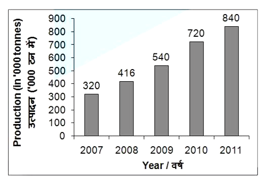
The production of rice in year 2010 is how much percent more that the production of rice in the year 2009 ?View SolutionStudy the chart carefully and answer the questions
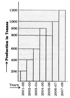
The chart shows production of an item (in tonnes) during certain years .
The year in which production increased the lowest as compared to the previous year isView SolutionThe bar chart given below shows the annual production (in 1000 tonnes) of coffee of a country for years 2009 to 2013.
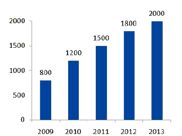
The production for the year 2011 is what percent of the production for the year 2009?View Solution
