Following table shows a frequency distribution for the speeds of cars passing througha particular spot on a highway:

Draw a histogram and frequency polygon representing the above data.
Adding two more class intervals, namely 20−30 and 100−110, each with frequency 0, we have the frequency distribution table as under:
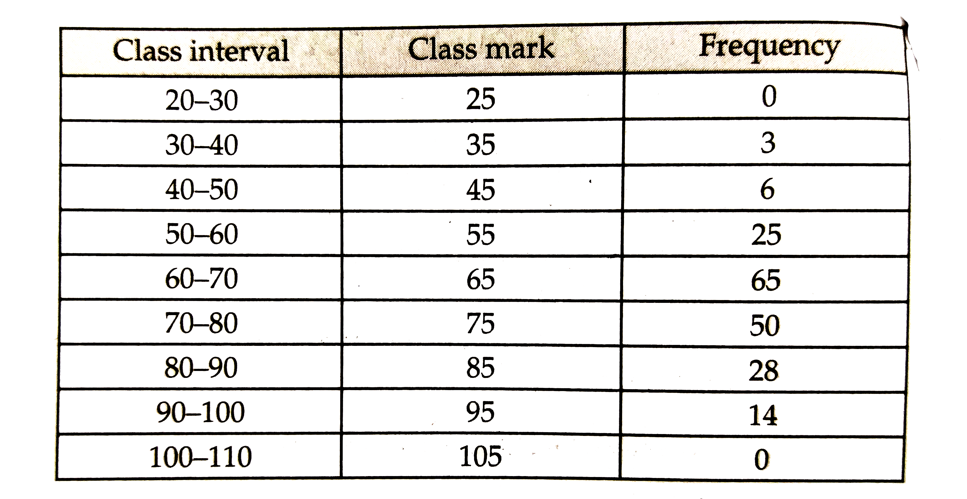
We represent the class intervals along the x-axis on a suitable scale and the corresponding frequencies along the y-axis on another suitable scale. We construct rectangles with class intervals as the bases and the respective frequencies as the heights.
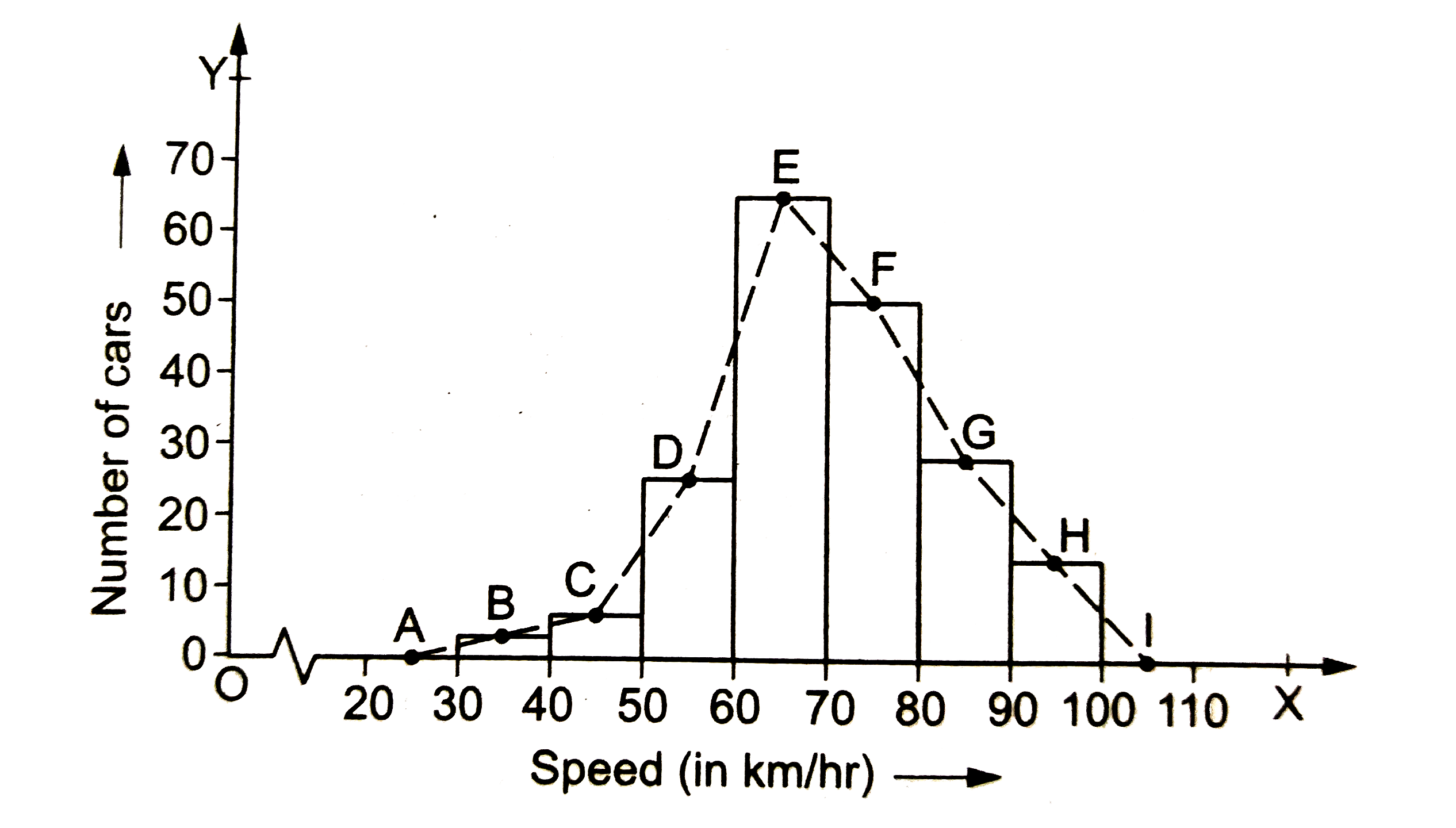
Thus, we obtain the histogram, shown below. We take the imagined classes 20−30 and 100110, each with frequency 0.
Now, we plot the points A(25,0),B(35,3),C(45,6),D(55,25),E(65,65),F(75,50),G(85,28),H(95,14) and I(105,0). Joining these points in pairs successively, we obtain the required frequency polygon ABCDEFGHI, as shown below.
Topper's Solved these Questions
- BAR GRAPH, HISTOGRAM AND FREQUENCY POLYGONBOOK - RS AGGARWALCHAPTER - BAR GRAPH, HISTOGRAM AND FREQUENCY POLYGONEXERCISE - EXERCISE 17A
12 Videos
- BAR GRAPH, HISTOGRAM AND FREQUENCY POLYGONBOOK - RS AGGARWALCHAPTER - BAR GRAPH, HISTOGRAM AND FREQUENCY POLYGONEXERCISE - EXERCISE 17B
16 Videos
- BAR GRAPH, HISTOGRAM AND FREQUENCY POLYGONBOOK - RS AGGARWALCHAPTER - BAR GRAPH, HISTOGRAM AND FREQUENCY POLYGONEXERCISE - EXERCISE 17B
16 Videos
- AREAS OF TRIANGLES AND QUADRILATERALSBOOK - RS AGGARWALCHAPTER - AREAS OF TRIANGLES AND QUADRILATERALSEXERCISE - Multiple Choice Questions (Mcq)
16 Videos
- CIRCLES BOOK - RS AGGARWALCHAPTER - CIRCLES EXERCISE - MULTIPLE CHOICE QUESTION(MCQ)
37 Videos
Similar Questions
Knowledge Check
The given histogram shows the frequency distribution of the speed of cars passing through a particular spot on a highway. Read the graph and answer the following question.
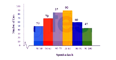
What percentage of cars were running with the speed of 90 km/h and above?A10%B21.25%C11.25%D15.75%The given histogram shows the frequency distribution of the speed of cars passing through a particular spot on a highway. Read the graph and answer the following question.
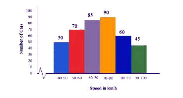
What is the ratio of the number of cars with speed less than 60 km h to the number of cars with speed more than 70 km/h?A13:8B8:5C8:13D5:8The given histogram shows the frequency distribution of the speed of cars passing through a particular spot on a lighway. Read the graph and answer the following question.
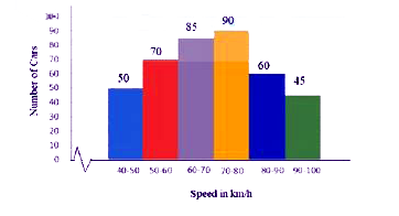
The number of cars with speed (km/h) in the interval (60 - 70) km/h is what percentage less than the number of cars with speed (km/h) in the interval (70-80) km/h? (correct to one decimal place)A5.6%B8.6%C7.5%D5.9%
For the following data, draw a histogram and a frequency polygon
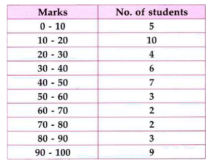
View SolutionDraw the frequency polygon to represent the following data.

View SolutionPrepare histogram and frequency polygon from the following data :

View SolutionThe given histogram shows the frequency distribution of the speed of cars passing though at a particular spot on a highway. Study the graph and answer the question that follows.
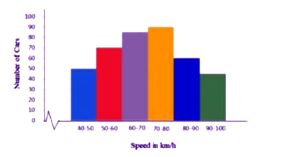
What percentage of cars were running with speed less than 70 km/h?
View SolutionThe given histogram shows the frequency distribution of the speed of cars passing though at a particular spot on a highway. Study the graph and answer the question that follows.
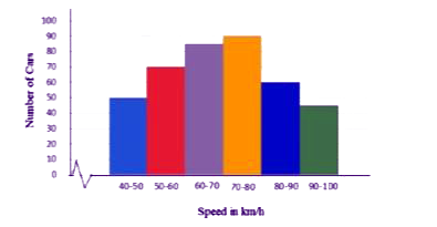
What is the ratio of the number of cars with speed less than 60 km/h to the number of cars with speed more than 80 km/h?
View Solution


