The
following data gives the production of foodgrains
(in thousand tonnes) for some years:

Represent
the above data with the help of a bar graph.
Topper's Solved these Questions
Similar Questions
The following data gives the production of food grains (in thousand tonnes) for some years: Year 1995 1996 1997 1998 1999 2000 Production (in thousand tonnes) 120 150 140 180 170 190 Represent the above data with the help of a bar graph.
View SolutionThe following data gives the amount of manure (in thousand tonnes) manufactured by a company during some years: Year, 1992, 1993, 1994, 1995, 1996, 1997 Manure (In thousand tonnes), 15, 35, 45, 30, 40, 20 Represent the above data with the help of a bar graph. Indicate with the help of the bar graph the year in which the amount of manure manufactured by the company was maximum. Choose the correct alternative: The consecutive years during which there was maximum decrease in manure production are: 1994 to 1995 (b) 1992 and 1993 1996-1997 (d) 1995 and 1996
View Solution
Knowledge Check
The following graph gives the amount of manure (in thousand tonnes) manufactured by a company during some years.
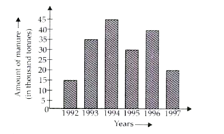
The consecutive years during which there was maximum decrease in manure production are:A1994 and 1995B1992 and 1993C1996 and 1997D1995 and 1996The following graph gives the amount of manure (in thousand tonnes) manufactured by a company during some years.
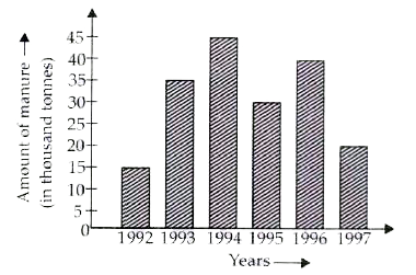
In which year the amount of manure manufactured by the company was maximum?A1993B1994C1996D1997The following graph gives the amount of manure (in thousand tonnes) manufactured by a company during some years.
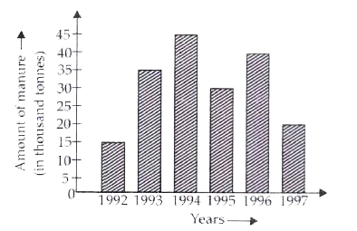
In which year the amonnt of manure manufactured by the company was minimum?A1992B1993C1995D1997
The following bar graph shows the data of the production of an item (in thousand tonnes) from four different companies A, B, C and D during the years mentioned.
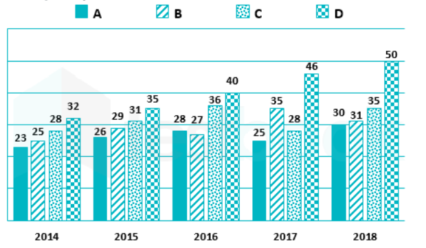
In the five years given, the average production is highest in company _____ and lower in company _______ respectively.
View SolutionGiven below is the data of school going students (boys and girls):

Draw the bar graph to represent the above data.
View SolutionThe following table gives the data of number of schools (stage-wise) of a country in the year 2002.
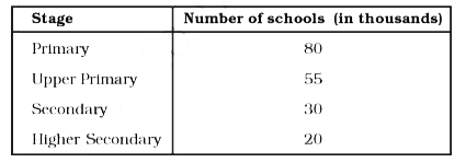
Draw a bar graph to represent the above data:
View SolutionThe following table gives the route length (in thousand kilometres) of the Indian Railways in some of the years: Year, 1960-61, 1970-71, 1980-81, 1990-91, 2000-2001 Route length (in thousand kilometres), 56, 60, 61, 74, 98 Represent the above data with the help of a bar graph.
View SolutionThe following table shows the production of foodgrains in million tonnes in a state for the period from 1988-89 to 1992-93 -----
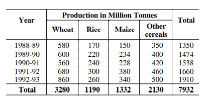
Read the above table and mark a tick against the correct answer in each of the following question -----
During the year 1992-93 the percentage increase in production of wheat over the previous year was ----
View Solution
