Read the below mentioned pie chart carefully to answer the following questions.
Pie chart shows the percentage distribution of people who watches different web series. Consider that people watch no other web series apart from those which are mentioned in the pie chart.
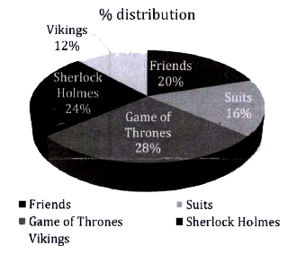
Average of people watching Friends, Suits and Sherlock Holmes is 20000. Ratio of male to female watching Game of Thrones and Vikings is 13:7 and 5: 7 respectively. Find the difference between number of males watching Vikings and number of females watching Game of thrones.
4800
9800
5000
11200
The correct Answer is:A
Step by step video, text & image solution for Read the below mentioned pie chart carefully to answer the following questions. Pie chart shows the percentage distribution of people who watches different web series. Consider that people watch no other web series apart from those which are mentioned in the pie chart. Average of people watching Friends, Suits and Sherlock Holmes is 20000. Ratio of male to female watching Game of Thrones and Vikings is 13:7 and 5: 7 respectively. Find the difference between number of males watching Vikings and number of females watching Game of thrones. by Maths experts to help you in doubts & scoring excellent marks in Class 14 exams.
Topper's Solved these Questions
- BOOK - ADDA247CHAPTER - DATA INTERPRETATIONEXERCISE - Mains Questions33videos
DATA INTERPRETATION
- BOOK - ADDA247CHAPTER - DATA INTERPRETATIONEXERCISE - Previous Year Questions56videos
DATA INTERPRETATION
- BOOK - ADDA247CHAPTER - DATA INTERPRETATIONEXERCISE - Prelims Questions (Level-1)54videos
DATA INTERPRETATION
- BOOK - ADDA247CHAPTER - BOAT AND STREAM EXERCISE - Previous Year Question22videos
BOAT AND STREAM
- BOOK - ADDA247CHAPTER - DATA SUFFICIENCY EXERCISE - PREVIOUS YEAR QUESTIONS25videos
DATA SUFFICIENCY
Similar Questions
Knowledge Check
- Question 1 - Select One
Study the following pie chart carefully and answer the questions. The pie chart represents the percentage of people involved in various occupations.
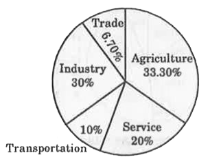
The ratio of the people involved in service to that in industry isA1:2B2:3C3:4D3:2 - Question 2 - Select One
Study the following pie chart carefully and answer the questions. The pie chart represents the percentage of people involved in various occupations.(total number of people-20000).
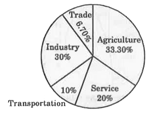
How many more people are involved in service than in trade?A3360B2660C1660D660 - Question 3 - Select One
Study the following pie chart carefully and answer the questions. The pie chart represents the percentage of people involved in various occupations.
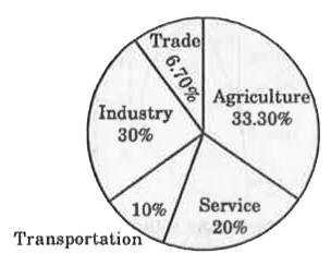
The angle made by the people involved in service in the given pie-chart isA36∘B90∘C72∘D108∘
Directions: Read the following Pie chart carefully and answer the following questions:- The pie chart shows the percentage of candidates in 6 different shifts of an examination. Total number of candidates = 5500

Number of candidates in shift 6 is what percentage more/less than number of candidate in shift 4?View SolutionDirections: Read the following Pie chart carefully and answer the following questions:- The pie chart shows the percentage of candidates in 6 different shifts of an examination. Total number of candidates = 5500

Find the average number of candidates in shift 2, shift 3 and shift 4 together in the examination.View SolutionDirections: Read the following Pie chart carefully and answer the following questions:- The pie chart shows the percentage of candidates in 6 different shifts of an examination. Total number of candidates = 5500
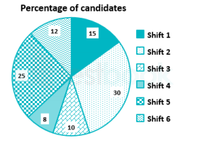
If 215 candidates in shift 2 were absent, then find the number of candidates present in the same shift.View SolutionStudy the following Pie-Chart carefully to answer the questions given below.
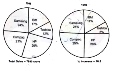
The percentage increase/decrease in the sales of Toshiba in 1999 is approximately-View SolutionStudy the Pie chart carefully and answer the questions.
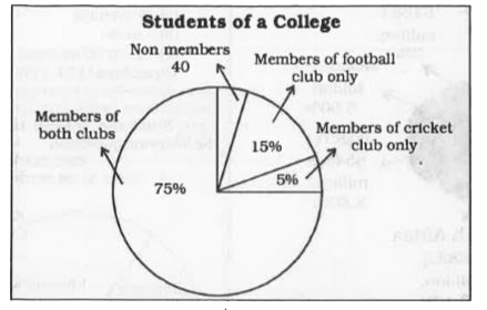
Percentage of students who are not members of any club is :View Solution
