The following graph shows the profit ( in crore ₹) earned by a company in the years from 2012 to 2019.
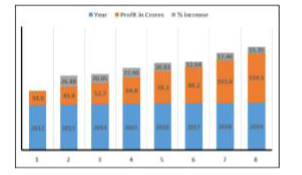
The percentage increased in the profit from the previous year , is greatest in the year :
2013
2017
2015
2018
The correct Answer is:C
Step by step video, text & image solution for The following graph shows the profit ( in crore ₹) earned by a company in the years from 2012 to 2019. The percentage increased in the profit from the previous year , is greatest in the year : by Maths experts to help you in doubts & scoring excellent marks in Class 14 exams.
Updated on:21/07/2023Similar Questions
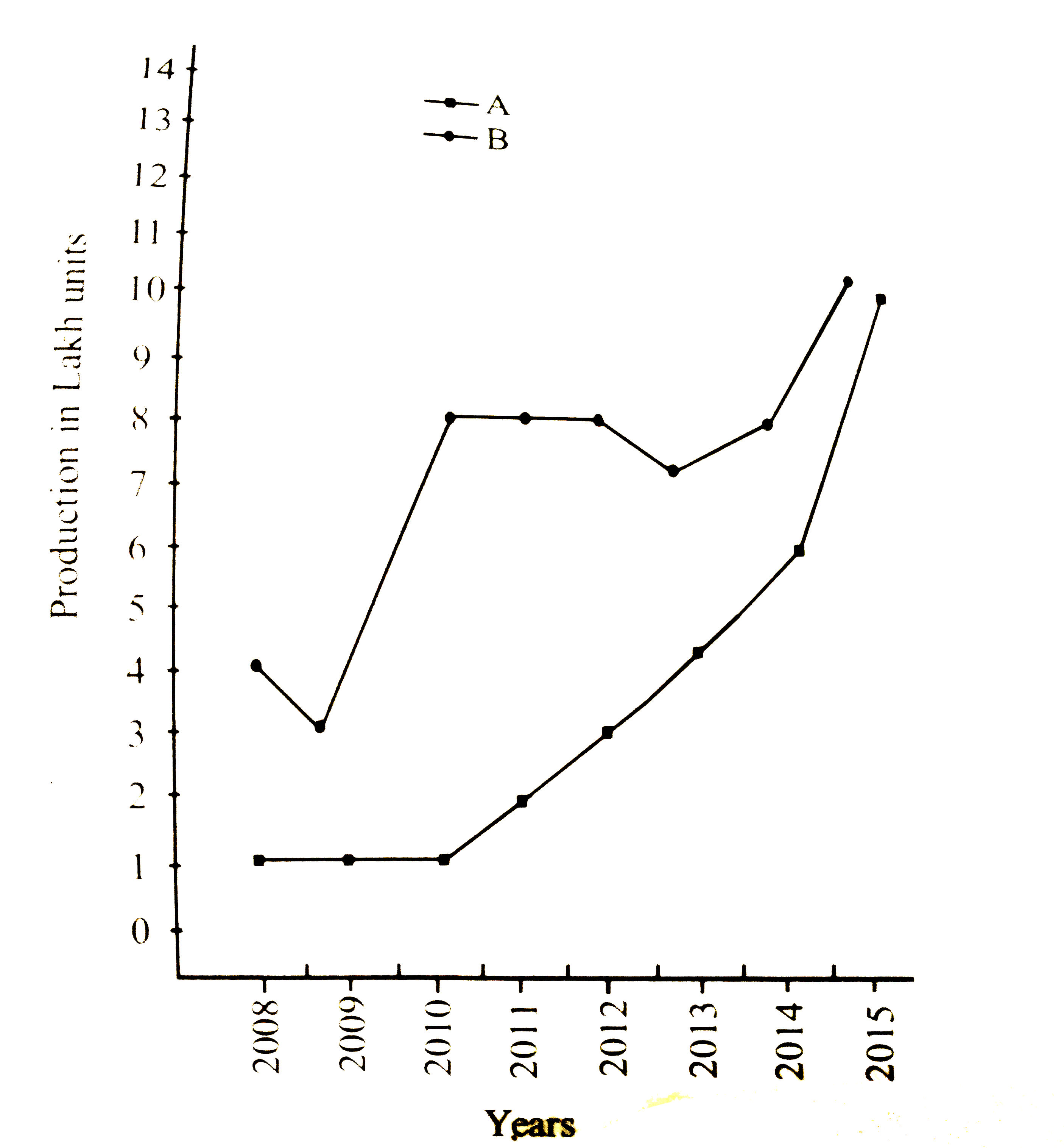
For Company A, in which year is the percentage increases/decrease in the production from the previous year the highest ?
View SolutionThe line chart given below shows the profit (in crores) of a company for the years 2008 to 2015.
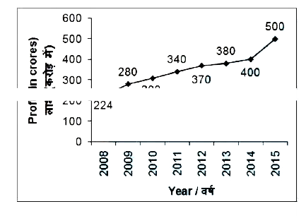
The profit in 2015 is what percetn of the profit in 2014 ?
View Solution
Knowledge Check
The line chart given below shows the profit (in crores) of a company for the years 2008 to 2015.
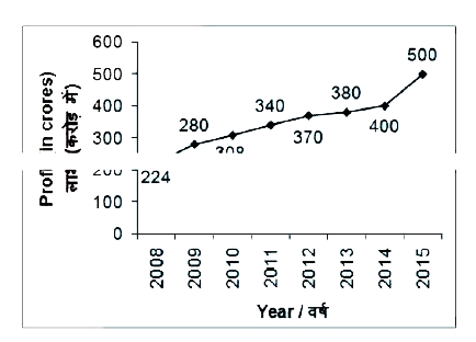
What is the percentage increase in profit in the year 2010 in comparison to the previous year ?Aa)20Bb)12Cc)10Dd)25The line chart given below shows the profit (in crores) of a company for the years 2008 to 2015.
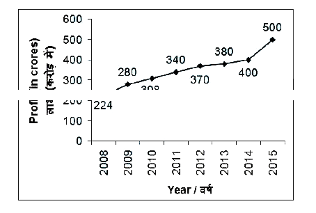
In how many years from 2009 to 2015 the increase in profit with respect to previous years is more than 30 crores?Aa)3Bb)2Cc)5Dd)1Two successive discounts of 20% and 25% are given by Mahesh on a table. If the marked price of the table is Rs 1000, then what is the value (in Rs) of discount?
A440B400C300D380
The following table shows the annual profit of a company (in Rs. lakh).

The period which has the maximum percentage increase in profit over the previous year is:
View SolutionThe line chart given below shows the profit (in crores) of a company for the years 2008 to 2015.
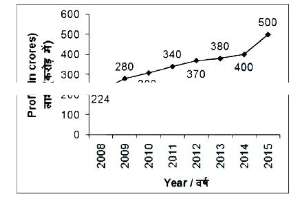
What is the average profit per year from 2011 to 2015 ?
View SolutionThe bar chart given below shows the revenue (in crores) of company A for the years 2008 to 2015.
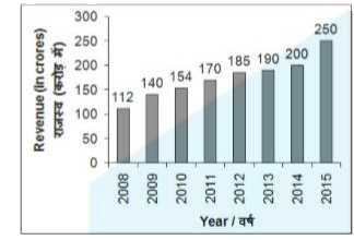
What is the percentage increase in revenue in the year 2010 in comparison to the previous year?
View SolutionThe table given below shows the revenue (in crores) of a company from years 2010 to 2016)
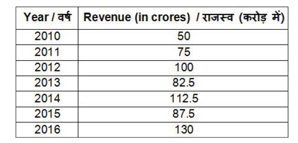
What is the percentage change in the revenue from year 2010 to 2014?
View SolutionThe line chart given below shows the sales (in crores) of a company for the years 2009 to 2016
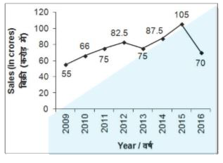
What is the percentage change in the company sales from year 2014 to year 2016?
View Solution
