The following graph gives the amount of manure (in thousand tonnes) manufactured by a company during some years.
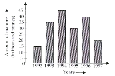
In which year the amount of manure manufactured by the company was maximum?
1993
1994
1996
1997
The correct Answer is:B
Step by step video, text & image solution for The following graph gives the amount of manure (in thousand tonnes) manufactured by a company during some years. In which year the amount of manure manufactured by the company was maximum? by Maths experts to help you in doubts & scoring excellent marks in Class 9 exams.
Updated on:21/07/2023Topper's Solved these Questions
- STATISTICSBOOK - MTG IIT JEE FOUNDATIONCHAPTER - STATISTICSEXERCISE - Exercise ( Subjective Problems ) (Very Short Answer Type )
10 Videos
- STATISTICSBOOK - MTG IIT JEE FOUNDATIONCHAPTER - STATISTICSEXERCISE - Exercise ( Subjective Problems ) ( Short Answer Type )
10 Videos
- STATISTICSBOOK - MTG IIT JEE FOUNDATIONCHAPTER - STATISTICSEXERCISE - Exercise (Assertion and Reason Type)
5 Videos
- QUADRILATERALS BOOK - MTG IIT JEE FOUNDATIONCHAPTER - QUADRILATERALS EXERCISE - Olympiad/HOTS CORNER
15 Videos
- TRIANGLESBOOK - MTG IIT JEE FOUNDATIONCHAPTER - TRIANGLESEXERCISE - OLYMPAID/ HOTS CORNER
10 Videos
Similar Questions
The following data gives the amount of manure (in thousand tonnes) manufactured by a company during some years: Year, 1992, 1993, 1994, 1995, 1996, 1997 Manure (In thousand tonnes), 15, 35, 45, 30, 40, 20 Represent the above data with the help of a bar graph. Indicate with the help of the bar graph the year in which the amount of manure manufactured by the company was maximum. Choose the correct alternative: The consecutive years during which there was maximum decrease in manure production are: 1994 to 1995 (b) 1992 and 1993 1996-1997 (d) 1995 and 1996
View SolutionStudy the following graph carefully and answer the question given below.
The graph gives the three types of mobile phones manufactured by a company over the years.
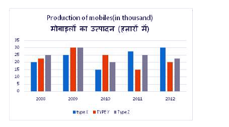
The total number of all the three types of mobiles manufactured was least in which of the following years ?
View Solution
Knowledge Check
The following graph gives the amount of manure (in thousand tonnes) manufactured by a company during some years.
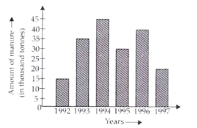
In which year the amonnt of manure manufactured by the company was minimum?A1992B1993C1995D1997The following graph gives the amount of manure (in thousand tonnes) manufactured by a company during some years.
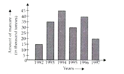
The consecutive years during which there was maximum decrease in manure production are:A1994 and 1995B1992 and 1993C1996 and 1997D1995 and 1996Study the following table carefully to answer the questions that follows.
Number of Articles (in thousands) Manufactured (M) and Defective (D) company over the years-
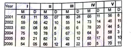
During which year was the percentage increase/decrease in manufacture from the previous year the highest for unit II ?A2001B2002C2003D2004
Study the following graph carefully and answer the question given below.
The graph gives the three types of mobile phones manufactured by a company over the years.
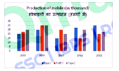
In which of the following years, the percentage production of type Y to Z type mobile phones is the maximum ?
View SolutionStudy the following table, which shows the number of units of a product manufactured and sold by a company in five years, and answer questions.
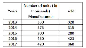
In which year the number of units of the product sold is 19000 more than the average number of units manufactured per year?
View Solution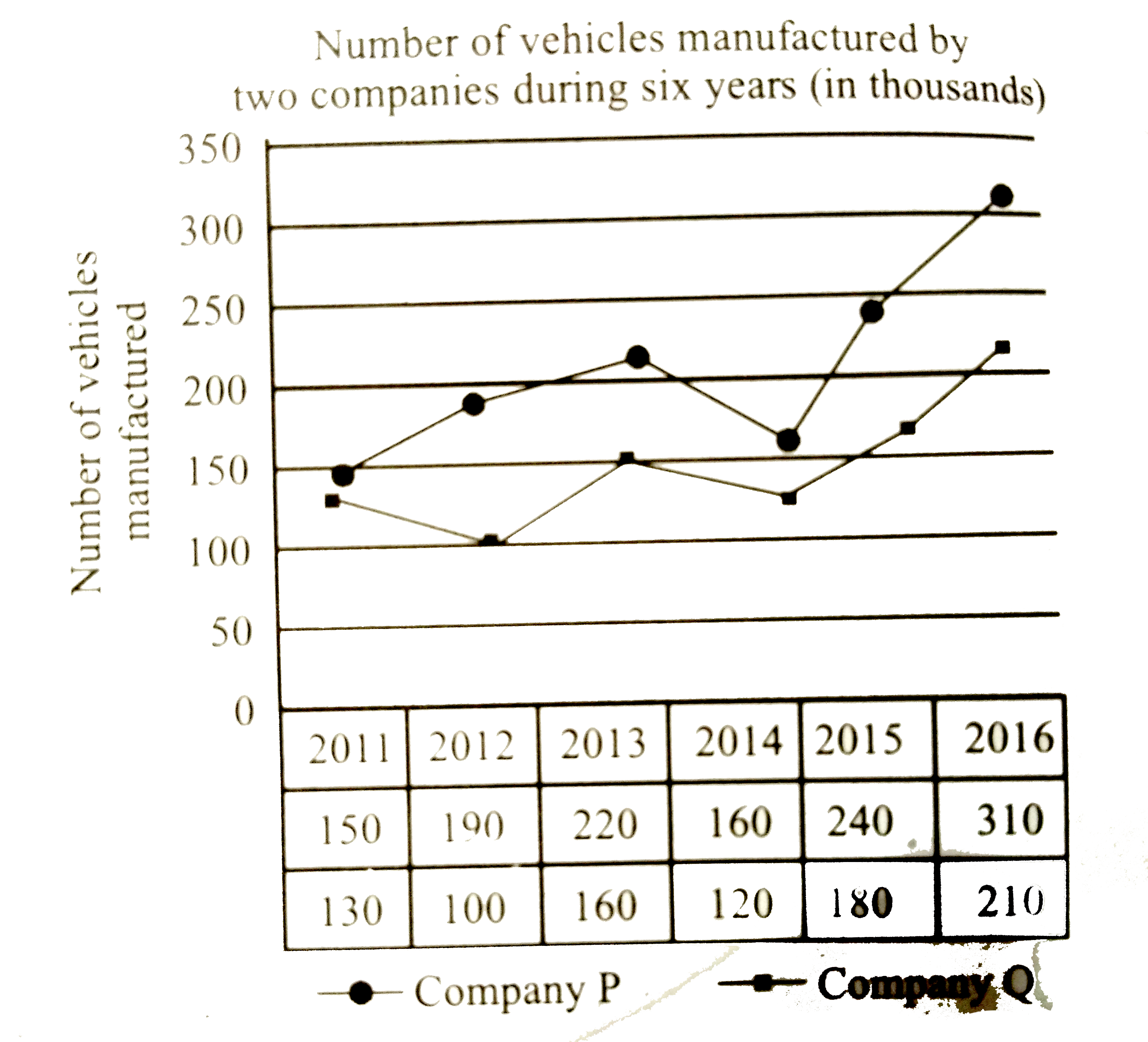
In year 2017, there was in increases of 30% in number of vehicles manufactured by company P as compared to vehicles manufactured by same company in the year 2012. What is the total number of vehicles manufactured by the same company in the year 2017 ?
View SolutionStudy the following graph carefully and answer the question given below.
The graph gives the three types of mobile phones manufactured by a company over the years.
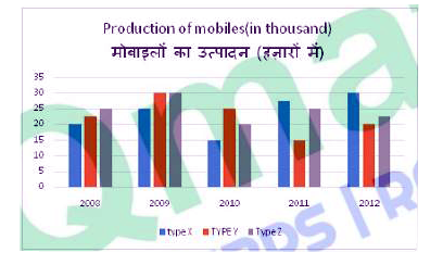
What is the percentage drop in the number of Z type mobiles manufactured from 2009 to 2010 ?
View SolutionThe given Bar Graph presents the Imports and Exports of an item (in tonnes) manufactured by a company for the five financial years, 2013-2014 to 2017- 2018
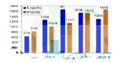
In which financial year, the absolute difference of the Exports to those of Imports is the lowest?
View Solution
