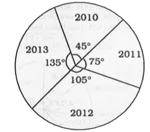
Given here is a pie chart showing the cost of gold in 2010, 2011, 2012 and 2013. Study the chart and answer the following questions.
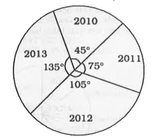
The ratio of the price of gold in the two years 2010 and 2013 is
1:2
1:3
1:4
1:5
The correct Answer is:B
Step by step video, text & image solution for Given here is a pie chart showing the cost of gold in 2010, 2011, 2012 and 2013. Study the chart and answer the following questions. The ratio of the price of gold in the two years 2010 and 2013 is by Maths experts to help you in doubts & scoring excellent marks in Class 14 exams.
Updated on:21/07/2023Topper's Solved these Questions
- STATISTICS AND DATA INTERPRETATIONBOOK - KIRAN PUBLICATIONCHAPTER - STATISTICS AND DATA INTERPRETATIONEXERCISE - TYPE-VIII
8 Videos
- STATISTICS AND DATA INTERPRETATIONBOOK - KIRAN PUBLICATIONCHAPTER - STATISTICS AND DATA INTERPRETATIONEXERCISE - TYPE-VI
86 Videos
- SIMPLIFICATIONBOOK - KIRAN PUBLICATIONCHAPTER - SIMPLIFICATIONEXERCISE - TEST YOURSELF
25 Videos
- TIME AND DISTANCEBOOK - KIRAN PUBLICATIONCHAPTER - TIME AND DISTANCEEXERCISE - Type -XI
74 Videos
Similar Questions
Knowledge Check
Given here is a pie chart showing the cost of gold in 2010, 2011, 2012 and 2013. Study the chart and answer the following questions.
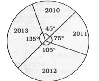
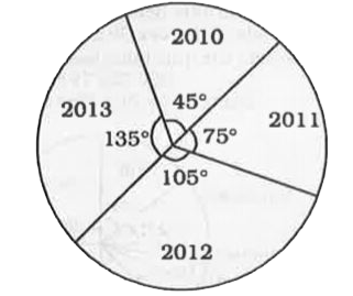
The percentage increase in the price of gold from the year 2011 to 2013 isA50%B60%C70%D80%Given here is a pie chart showing the cost of gold in 2010, 2011, 2012 and 2013. Study the chart and answer the following questions.
The rato of percentage increase in the price of gold from 2011 to 2012 and 2012 to 2013 isA6:5B7:5C8:5D9:5Given here is a pie chart showing the cost of gold in 2010, 2011, 2012 and 2013. Study the chart and answer the following questions.
If the price of gold in 2013 is Rs. 31,500 per 10 gram, then the price of gold in 2011 per 10 gram isARs. 17000BRs. 17500CRs. 18000DRs. 18500
The line graph shows the number of students of a certain university who failed in the given year in their final exams. Study the diagram and answer the following questions
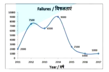
What was the difference in failures between the years 2011 and 2013?
View SolutionThe following Pie Chart shows the export of different foodgrains from India in 2010. Study the chart and answer the questions :
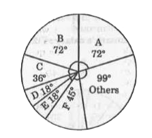
Of the total export of foodgrains, the percentage of crop B exported is
View SolutionFollowing is the pie-chart showing the spendings of a family on various items in a particular year
Study the pie chart and answer questions.
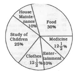
The ratio of the total amount spent for food and medicine is
View SolutionIn the given pie-chart, the comaprative study of the production or Rice, Wheat, Sugar and Tea of a country is given. Study the pie-chart and answer the following questions.
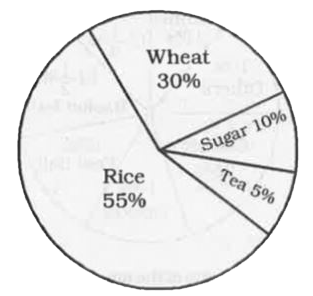
The production of rice and tea is more / greater than production of wheat by
View SolutionDirections : The pie-chart given below shows expenditure incurred by a family on various items and their savings. Study the chart and answer the questions based on the pie-chart
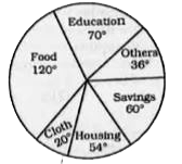
The ratio of expenditure on food to saving is :
View Solution

