Out of a line graph, a pie chart and a bar graph which one is the most suitable to show :
runs scored in various overs of a cricket match ?
The correct Answer is:Bar graph
To determine the most suitable type of graph to show the runs scored in various overs of a cricket match, we can analyze the characteristics of each type of graph:
Step 1: Understand the Data
- We need to represent the runs scored in different overs of a cricket match. This means we have a set of data points (runs scored) that correspond to specific intervals (overs).
Step 2: Analyze the Graph Types
1. Line Graph:
- A line graph is useful for showing trends over time. It connects data points with lines, which can effectively illustrate how runs scored change from one over to the next.
- This would allow viewers to see patterns, such as scoring spikes or declines over the course of the match.
2. Pie Chart:
- A pie chart is used to show proportions of a whole. It is not suitable for showing changes over time or comparing different categories that are not parts of a whole.
- Since we are looking at runs scored over time (in different overs), a pie chart would not effectively convey this information.
3. Bar Graph:
- A bar graph can also be used to compare quantities across different categories. In this case, each bar could represent the runs scored in each over.
- While it can show the runs scored in each over, it does not effectively show the trend over time as a line graph does.
Step 3: Conclusion
- After analyzing the characteristics of each graph type, the line graph is the most suitable choice for showing runs scored in various overs of a cricket match. It effectively illustrates the trend and changes in runs scored over the course of the match.
Final Answer
The most suitable graph to show runs scored in various overs of a cricket match is a line graph.
---
- We need to represent the runs scored in different overs of a cricket match. This means we have a set of data points (runs scored) that correspond to specific intervals (overs).
1. Line Graph:
- A line graph is useful for showing trends over time. It connects data points with lines, which can effectively illustrate how runs scored change from one over to the next.
- This would allow viewers to see patterns, such as scoring spikes or declines over the course of the match.
- A pie chart is used to show proportions of a whole. It is not suitable for showing changes over time or comparing different categories that are not parts of a whole.
- Since we are looking at runs scored over time (in different overs), a pie chart would not effectively convey this information.
- A bar graph can also be used to compare quantities across different categories. In this case, each bar could represent the runs scored in each over.
- While it can show the runs scored in each over, it does not effectively show the trend over time as a line graph does.
- After analyzing the characteristics of each graph type, the line graph is the most suitable choice for showing runs scored in various overs of a cricket match. It effectively illustrates the trend and changes in runs scored over the course of the match.
The most suitable graph to show runs scored in various overs of a cricket match is a line graph.
Topper's Solved these Questions
- BOOK - LAKHMIR SINGH & MANJIT KAURCHAPTER - MOTION AND TIMEEXERCISE - EXERCISE108videos
MOTION AND TIME
- BOOK - LAKHMIR SINGH & MANJIT KAURCHAPTER - LIGHTEXERCISE - EXERCISEE130videos
LIGHT
- BOOK - LAKHMIR SINGH & MANJIT KAURCHAPTER - WINDS, STORMS AND CYCLONESEXERCISE - EXERCISE92videos
WINDS, STORMS AND CYCLONES
Similar Questions
Knowledge Check
- Question 1 - Select One
Which of the following is the most appropriate to demonstrate the runs scored in the various ovens of a cricket match ?
Atime graphBbar graphCpie chartDline graph - Question 2 - Select One
Which Indian cricketer has scored the most number of runs in a single World Cup?
AKapil DevBRohit SharmaCRahul DravidDSachin Tendulkar - Question 3 - Select One
Study the following graph carefully and answer the questions that follow
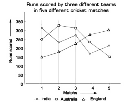
What are the average runs scored by all the three teams in Match 3 together ?Aa) 280Bb) 270Cc) 275Dd) 285
The line graph shows the scores of a batsman in 6 consecutive matches. What is the range of his scores?
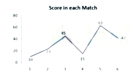 View Solution
The given bar graph shows the number of students of two schools over a period of six years.
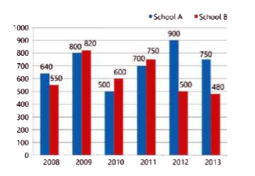
In the bar graph, in which year is the absolme difference of the students from schools A to B taken together, the maximum?View SolutionThe given pie chart shows runs scored by A in 6 matches
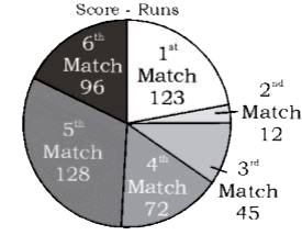
In the given pie chart what is the average runs scored in all matchesView SolutionThe given pie-chart shows runs scored by A in 6 matches.
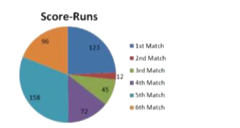
In the given pie-chart, what is the increase or decrease in score in match 4 as compared to match 2?View SolutionWhich of the following cricket players has surpassed Don Bradman as the record for the most runs scored as a captain in international cricket by more than 150 runs?
View Solution

