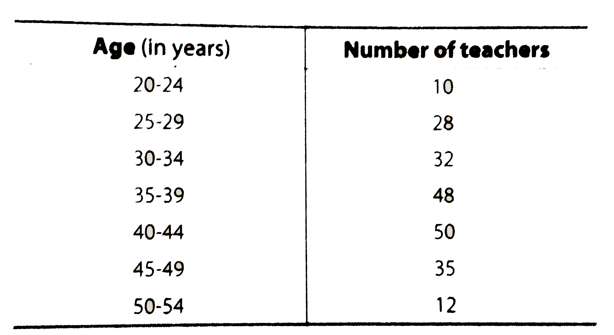
Draw a histogram to represent the following grouped frequency distribution.

Video Solution
Text Solution
The given frequency distribution is in inclusive form. So, first we convert it into exclusive form.
Now, consider the class 20-24, 25-29.
lower limit of 25-29 is 25.
Upper limit of 20-24 is 23.
Thus, the half of the difference is 25−242=12=0.5
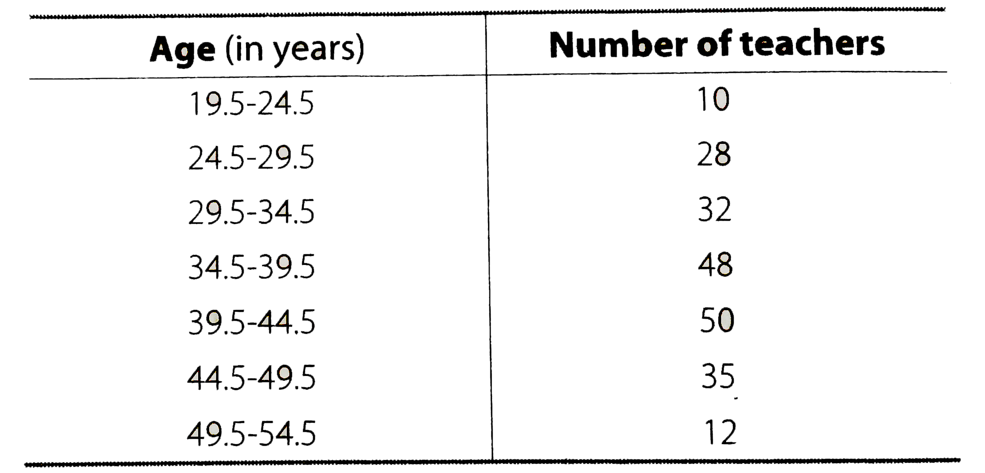
So, we subtract 0.5 from each lower limit and add 0.5 to each upper limit. The table for continuous grouped frequency distribution is given below.

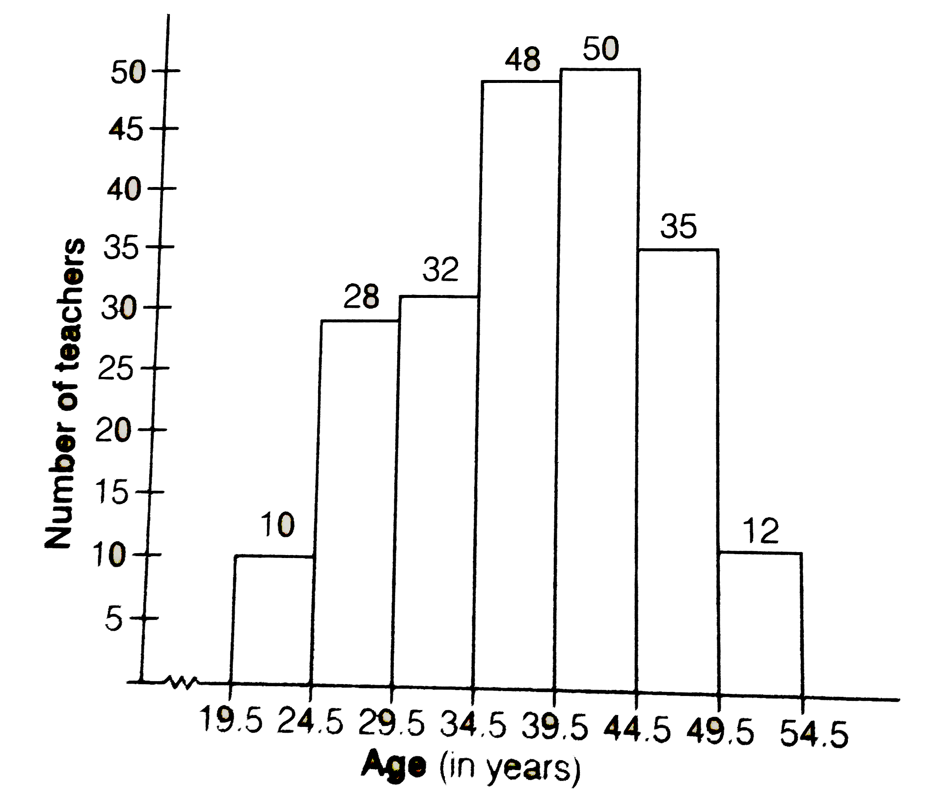
Thus, the given data becomes in exclusive form. Along the horizontal axis, we represent the class interval of ages on some suitable scale. The corresponding frequencies of number of teachers are represented along the vertical axis on a suitable scale.
Since, the given intervals start with 19.5-24.5. It means that, there is some break indicated near the origin to signify the graph is drawn with a scale beginning at 19.5.

|
Topper's Solved these Questions
- STATISTICS AND PROBABILITYBOOK - NCERT EXEMPLARCHAPTER - STATISTICS AND PROBABILITYEXERCISE - LONG ANSWER TYPE QUESTIONS
5 Videos
- QUADRILATERALS BOOK - NCERT EXEMPLARCHAPTER - QUADRILATERALS EXERCISE - Quadrilaterals
56 Videos
- TRIANGLESBOOK - NCERT EXEMPLARCHAPTER - TRIANGLESEXERCISE - Triangles
55 Videos
Similar Questions
Knowledge Check
To draw a histogram to represent the following frequency distribution.
Class Interval 5−1010−1515−2525−4545−75
Frequency 6 12 10 8 15
The adjusted frequency for the class 25−45 isA6B5C3D2
Draw the histogram to represent the following data.

View SolutionRepresent the following frequency distribution as a bar graph:

View SolutionRepresent the following frequency distribution by a bar graph :

View SolutionContinuous or grouped frequency distribution.
View SolutionDraw a histogram representing the following distribution.

View SolutionDraw a histogram representing the following distribution.

View SolutionDraw a histogram and frequency polygen to represent the following frequency distribution :
View Solution

