The graph below shows historical exchange rates between the Indian Rupee ( INR) and the US Dollar ( USD) between January 9 and February 8 of a parrticular year .
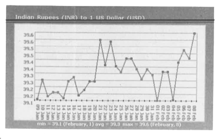
On which day shown on the graph did the value of the US dollar increase against the Rupee by the greatest amount?
Jan. 10
Jan. 14
Jan . 21
43853
The correct Answer is:C
Step by step video, text & image solution for The graph below shows historical exchange rates between the Indian Rupee ( INR) and the US Dollar ( USD) between January 9 and February 8 of a parrticular year . On which day shown on the graph did the value of the US dollar increase against the Rupee by the greatest amount? by Maths experts to help you in doubts & scoring excellent marks in Class 12 exams.
Updated on:21/07/2023Similar Questions
Sea ice extent is a measurement of the area of ocean with at least 15% sea ice. The graph below shows data for the extent of Artic sea ice between 2000 and 2012 as reported by the National Snow and Ice Data Center. The line of best fit is also shown. The equations of the line is A(t)=−0.187t+380.5, where A(t) represents the area of measurement sea ice in the Artic Ocean in the year t.
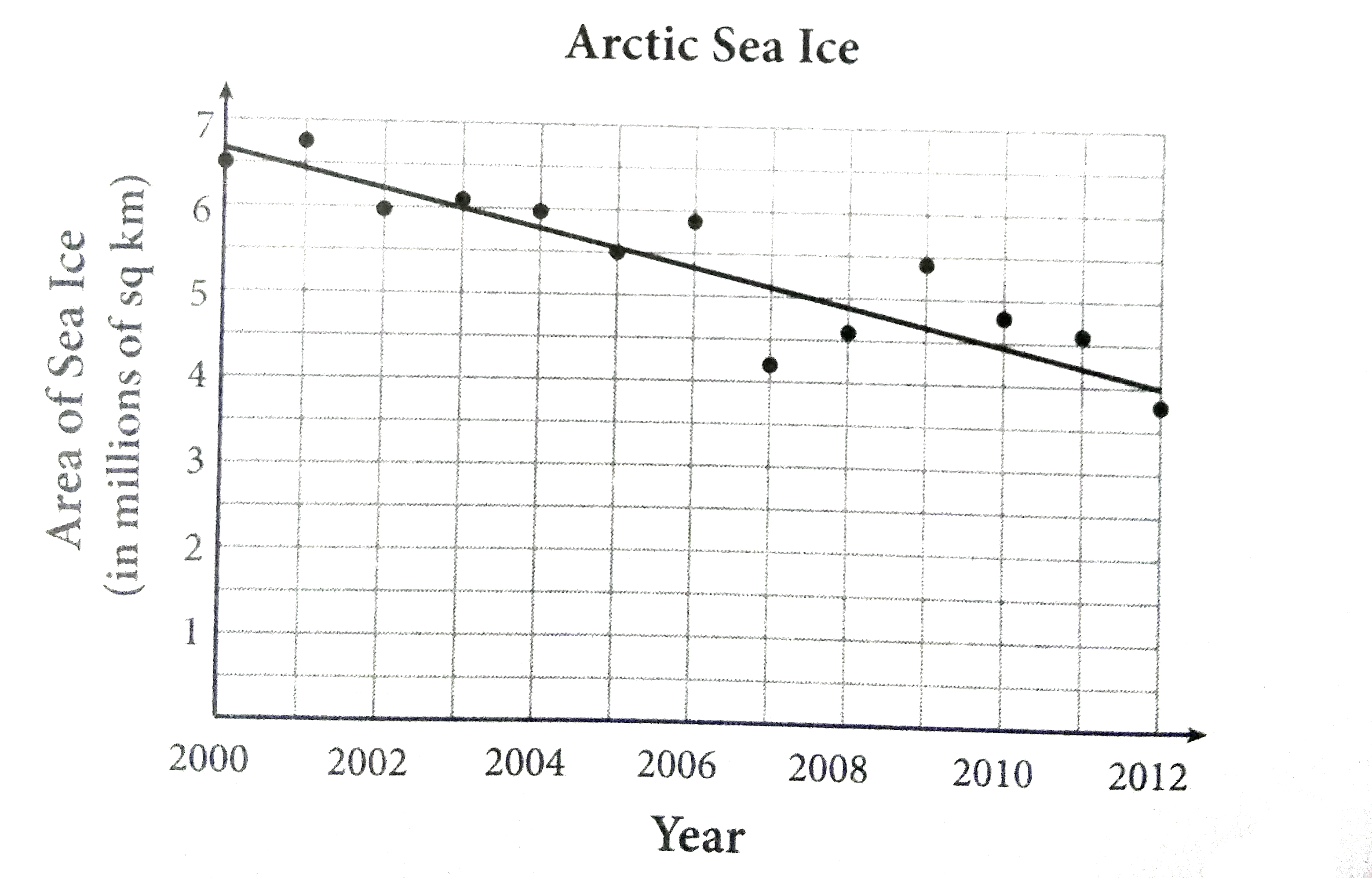
Q. Based on the equation of the line of best fit, which of the following statements accurately of measurable Arctic sea ice during the given times period?
View SolutionA single conservative force F(x) acts on a on a (1.0kg ) particle that moves along the x-axis. The potential energy U(x) is given by:
U(x)=20+(x−2)2
where, x is meters. At x=5.0m the particle has a kinetic energy of 20J
(a) What is the mechanical energy of the system?
(b) Make a plot of U(x) as a function of x for −10m≤x≤10m, and on the same graph draw the line that represents the mechanical energy of the system. Use part (b) to determine.
(c) The least value of x and
(d) the greatest value of x between which the particle can move.
(e) The maximum kinetic energy of the particle and
(f) the value of x at which it occurs.
(g) Datermine the equation for F(x) as a function of x.
(h) For what (finite ) value of x does F(x)=0?.
View Solution
Knowledge Check
The graph below shows historical exchange rates between the Indian Rupee ( INR) and the US Dollar ( USD) between January 9 and February 8 of a parrticular year .

John had 100 dollars. The exchange rate converts the amount in US dollars to a number in Indian Rupees by directly multiplying by the value of the exchange rate. By what amount did John's $100 increase in terms of Indian Rupees from Jan.9 to Fed. 8?A5B10C15D50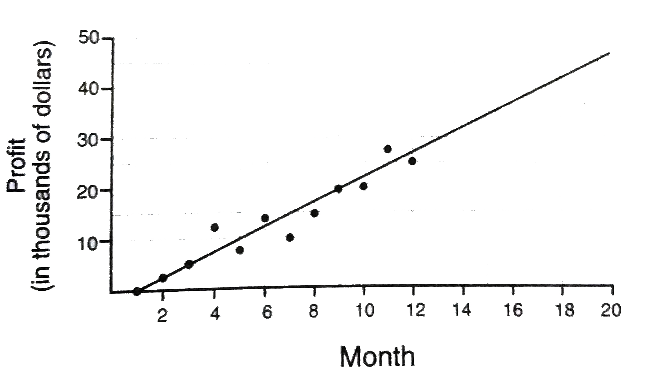
The scatterplot above shows the profit, by month, for a new company for the first year of operation. A line of best fit is also shown. Using this line, by what dollar amount did the profit in the 8th month exceed the profit in the 13th month?A$5,000B$7,750C$12,500D$15,000The toe shoes of professional ballerinas often wear out in less than a year . At a ballet school there are 20 students , all of whom bought new toe shoes of different brands and at varying prices. They kept track of how long their shoes lasted. Each point on the graph below shows the duration of a ballet student's toe shoes plotted against their price . Of the five labeled points , which one corresponds to the toe shoes that cost the greatest amount per month of use ?
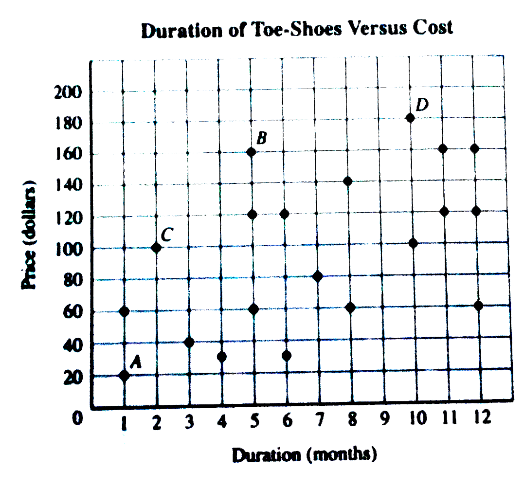 AABBCCDD
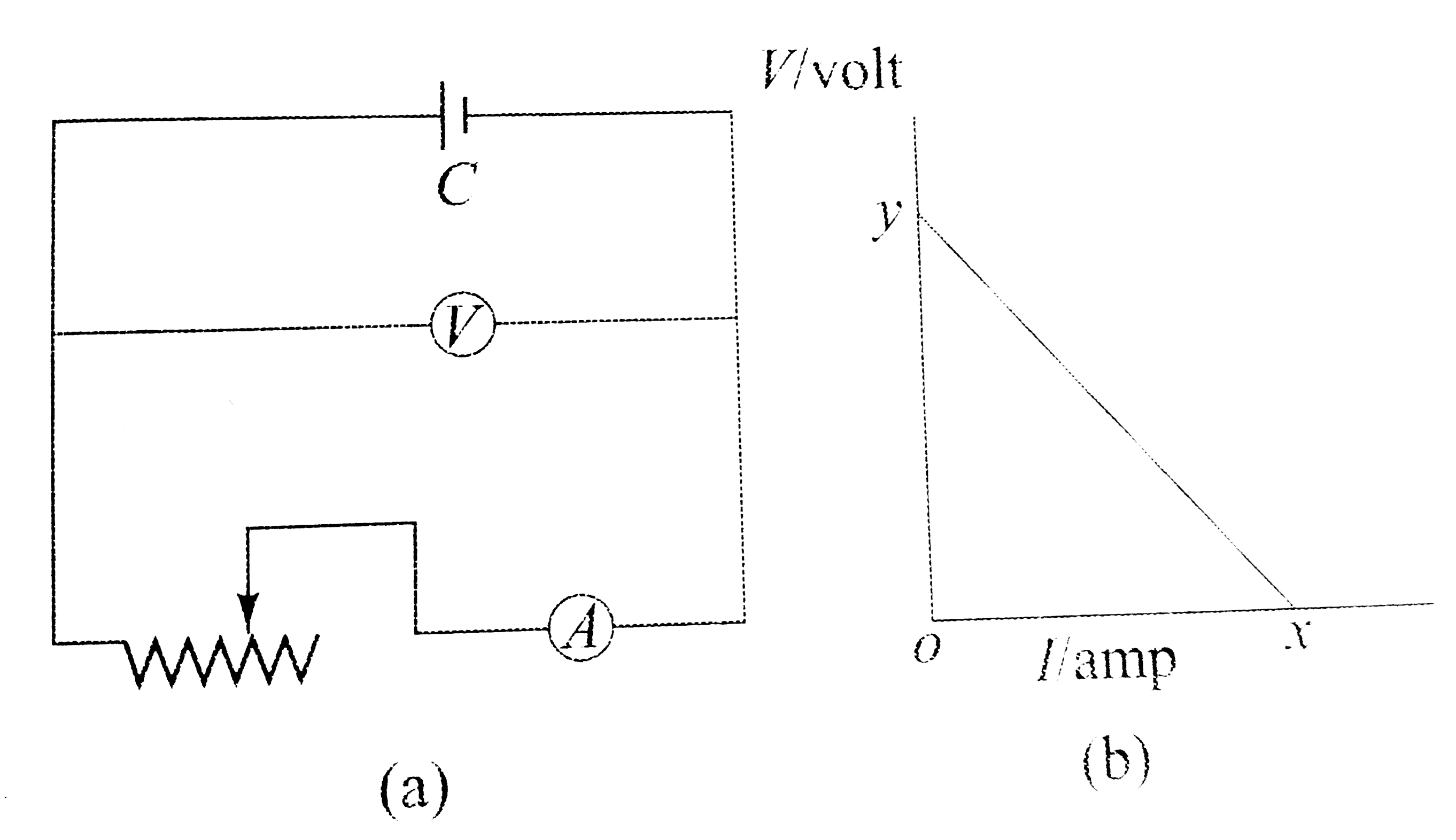
shows a circuit used in an experiment to detrmine the emf and interanl resistance of the battery C. A graph was plotted of the potential difference V between the terminals of the battery against the current I, which was varied by adjusting the rheostat. The graph is shown in x and y are the intercepts of the graph with the axes as shown. What is the internal resistance of the battery?
View SolutionBetween 1985 and 2003, data were collected every three years on the amount of plastic produced annually in the United States, in billions of pounds. The graph below shows the data and a line of best fit. The equation of the line of best fit is y = 3.39x + 46.89, where x is the number of years since 1985 and y is the amount of plastic produced annually, in billions of pounds.
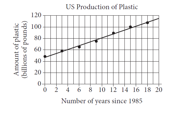
Which of the following is closest to the percent increase in the billions of pounds of plastic produced in the United States from 2000 to 2003?
View SolutionAdapted from a 1981 speech to congress, Ronald Reagan states his reasons for a new program for economic recovery. Mr.Speaker , Mr. President, distinguished Members of Congress, honored guests and fellow citizens: Only a month ago I was your guest in this historic building, and i pledged to you my cooperation in doing what is right for tis Nation that we all love so much. I'm here tonight to reaffirm that pledge and to ask that we share in restoring the promise that is offered to every citizen by this, the last, best hope of man on earth. All of us are aware of the punishing inflation which has for the first time in 60 years held to double-digit figures for 2 years in a row. Interest rates have reached absurb levels of more than 20 percent and over 15 percent for those who would borriw to buy a home.All across this land one can see newly built homes standing vacant, unsold because of mortagage interest rates. Almost 8 million Americans are out of work. These are people who want to be productie. But as the months go by, despair dominates their lives. The threat oh layoff lions, and all who work are frustrated by their inability to keep up with inflaction. One worker in a Midwest city put it to me this way: HE said,"I am bringing home more dollars than i ever nelieved i could possibly earn, but i seem to be getting worse off." and he is. Not only have hourly earnings of the American worker, after adjusting for inflation, declined 5 percent over the past 5 years, but in these 5 years, federal personal taxes for the average family have increased 67 percent. We can no longer procrastinate and hope that things will get better. They will not. Unless we act forcefully-and now-the economy will get worse. Can we, who man ship of states, deny it is somewhat out of control? Our national debt is approaching $1 trillion. A few weeks ago i called such a figure, a trillion dollors, incomprehensible and I've been trying ever since to think of a way to illustate how big a trillion really is. And the best I could come up with is that if you had a stack of thousands dollrs bills in your hand only 4 inches high, you'd be a millionare. A trillion dollars would be a stack of thousand-dollar-bills 67 miles high. The intrest on the public debt this year we know we will be over $90 billion and unless we change the proposed spending for the fiscal year beginning October 1st, we'll add another almost %80 billion to the debt. Adding to our troubles is a mass of regulations imposed on the shopkeeper, the farmer, the craftman, professionals and major industry that is estimated to add $100 billion to the price of the things we buy and it reduces our ability to produce. The rate of increase in American productivity, once one of the highest in the world, is among the lowest of all major industrial nations. Indeed, it has actually declined in the last 3 years. Now, I've painted a preety grim picture, but I think I've painted it accuurately. It is within our power to change this picture, and we can act with hope. There's nothing wrong with our internal strengths. There has been no breakdown of the human, technology and natural resources upon which the economy is built. This, then, is our proposal-american's new beginning: a program for economic recovery. I don't want it to be simply the plan of my administration. I'm here tonight t ask you to join me in making it our plan. together we can embark on this road.
Q. The overall point of this passage is to
View SolutionAdapted from a 1981 speech to congress, Ronald Reagan states his reasons for a new program for economic recovery. Mr.Speaker , Mr. President, distinguished Members of Congress, honored guests and fellow citizens: Only a month ago I was your guest in this historic building, and i pledged to you my cooperation in doing what is right for tis Nation that we all love so much. I'm here tonight to reaffirm that pledge and to ask that we share in restoring the promise that is offered to every citizen by this, the last, best hope of man on earth. All of us are aware of the punishing inflation which has for the first time in 60 years held to double-digit figures for 2 years in a row. Interest rates have reached absurb levels of more than 20 percent and over 15 percent for those who would borriw to buy a home.All across this land one can see newly built homes standing vacant, unsold because of mortagage interest rates. Almost 8 million Americans are out of work. These are people who want to be productie. But as the months go by, despair dominates their lives. The threat oh layoff lions, and all who work are frustrated by their inability to keep up with inflaction. One worker in a Midwest city put it to me this way: HE said,"I am bringing home more dollars than i ever nelieved i could possibly earn, but i seem to be getting worse off." and he is. Not only have hourly earnings of the American worker, after adjusting for inflation, declined 5 percent over the past 5 years, but in these 5 years, federal personal taxes for the average family have increased 67 percent. We can no longer procrastinate and hope that things will get better. They will not. Unless we act forcefully-and now-the economy will get worse. Can we, who man ship of states, deny it is somewhat out of control? Our national debt is approaching $1 trillion. A few weeks ago i called such a figure, a trillion dollors, incomprehensible and I've been trying ever since to think of a way to illustate how big a trillion really is. And the best I could come up with is that if you had a stack of thousands dollrs bills in your hand only 4 inches high, you'd be a millionare. A trillion dollars would be a stack of thousand-dollar-bills 67 miles high. The intrest on the public debt this year we know we will be over $90 billion and unless we change the proposed spending for the fiscal year beginning October 1st, we'll add another almost %80 billion to the debt. Adding to our troubles is a mass of regulations imposed on the shopkeeper, the farmer, the craftman, professionals and major industry that is estimated to add $100 billion to the price of the things we buy and it reduces our ability to produce. The rate of increase in American productivity, once one of the highest in the world, is among the lowest of all major industrial nations. Indeed, it has actually declined in the last 3 years. Now, I've painted a preety grim picture, but I think I've painted it accuurately. It is within our power to change this picture, and we can act with hope. There's nothing wrong with our internal strengths. There has been no breakdown of the human, technology and natural resources upon which the economy is built. This, then, is our proposal-american's new beginning: a program for economic recovery. I don't want it to be simply the plan of my administration. I'm here tonight t ask you to join me in making it our plan. together we can embark on this road.
Q. Lines 58-60 ("shopkeeper...industry") are intended to illustrate the
View SolutionAdapted from a 1981 speech to congress, Ronald Reagan states his reasons for a new program for economic recovery. Mr.Speaker , Mr. President, distinguished Members of Congress, honored guests and fellow citizens: Only a month ago I was your guest in this historic building, and i pledged to you my cooperation in doing what is right for tis Nation that we all love so much. I'm here tonight to reaffirm that pledge and to ask that we share in restoring the promise that is offered to every citizen by this, the last, best hope of man on earth. All of us are aware of the punishing inflation which has for the first time in 60 years held to double-digit figures for 2 years in a row. Interest rates have reached absurb levels of more than 20 percent and over 15 percent for those who would borriw to buy a home.All across this land one can see newly built homes standing vacant, unsold because of mortagage interest rates. Almost 8 million Americans are out of work. These are people who want to be productie. But as the months go by, despair dominates their lives. The threat oh layoff lions, and all who work are frustrated by their inability to keep up with inflaction. One worker in a Midwest city put it to me this way: HE said,"I am bringing home more dollars than i ever nelieved i could possibly earn, but i seem to be getting worse off." and he is. Not only have hourly earnings of the American worker, after adjusting for inflation, declined 5 percent over the past 5 years, but in these 5 years, federal personal taxes for the average family have increased 67 percent. We can no longer procrastinate and hope that things will get better. They will not. Unless we act forcefully-and now-the economy will get worse. Can we, who man ship of states, deny it is somewhat out of control? Our national debt is approaching $1 trillion. A few weeks ago i called such a figure, a trillion dollors, incomprehensible and I've been trying ever since to think of a way to illustate how big a trillion really is. And the best I could come up with is that if you had a stack of thousands dollrs bills in your hand only 4 inches high, you'd be a millionare. A trillion dollars would be a stack of thousand-dollar-bills 67 miles high. The intrest on the public debt this year we know we will be over $90 billion and unless we change the proposed spending for the fiscal year beginning October 1st, we'll add another almost %80 billion to the debt. Adding to our troubles is a mass of regulations imposed on the shopkeeper, the farmer, the craftman, professionals and major industry that is estimated to add $100 billion to the price of the things we buy and it reduces our ability to produce. The rate of increase in American productivity, once one of the highest in the world, is among the lowest of all major industrial nations. Indeed, it has actually declined in the last 3 years. Now, I've painted a preety grim picture, but I think I've painted it accuurately. It is within our power to change this picture, and we can act with hope. There's nothing wrong with our internal strengths. There has been no breakdown of the human, technology and natural resources upon which the economy is built. This, then, is our proposal-american's new beginning: a program for economic recovery. I don't want it to be simply the plan of my administration. I'm here tonight t ask you to join me in making it our plan. together we can embark on this road.
Q. This speaker most directly suggests that unempployed Americans
View Solution
