(##KPL_SAT_PRD_PLS_C09_E01_001_Q01.png" width="80%">
The scatterplot shows the prevalence of obesity plotted against the prevalence of diabetes in various ares of the United States. Which of the following best estimates the average rate of change in the prevalence of diabetes as comared to the prevalence of obesity ?
3
The correct Answer is:A
To solve the problem of estimating the average rate of change in the prevalence of diabetes compared to the prevalence of obesity using the scatterplot, we can follow these steps:
1. Identify the Variables:
- The x-axis represents the prevalence of obesity.
- The y-axis represents the prevalence of diabetes.
2. Select Points on the Scatterplot:
- Choose two points on the line of best fit from the scatterplot. For this example, let's select:
- Point A: (20, 9)
- Point B: (30, 11)
3. Write Down the Coordinates:
- The coordinates of the two points are:
- Point A: (20, 9)
- Point B: (30, 11)
4. Calculate the Change in y (Δy):
- Δy = y2 - y1 = 11 - 9 = 2
5. Calculate the Change in x (Δx):
- Δx = x2 - x1 = 30 - 20 = 10
6. Calculate the Slope (Average Rate of Change):
- The slope (m) is given by the formula:
m=ΔyΔx=210=0.2
7. Estimate the Average Rate of Change:
- The average rate of change in the prevalence of diabetes compared to the prevalence of obesity is approximately 0.2.
8. Select the Nearest Answer:
- According to the options provided in the question, the nearest answer to 0.2 is 0.3.
Final Answer:
The best estimate for the average rate of change in the prevalence of diabetes compared to the prevalence of obesity is 0.3.
---
- The x-axis represents the prevalence of obesity.
- The y-axis represents the prevalence of diabetes.
- Choose two points on the line of best fit from the scatterplot. For this example, let's select:
- Point A: (20, 9)
- Point B: (30, 11)
- The coordinates of the two points are:
- Point A: (20, 9)
- Point B: (30, 11)
- Δy = y2 - y1 = 11 - 9 = 2
- Δx = x2 - x1 = 30 - 20 = 10
- The slope (m) is given by the formula:
m=ΔyΔx=210=0.2
- The average rate of change in the prevalence of diabetes compared to the prevalence of obesity is approximately 0.2.
- According to the options provided in the question, the nearest answer to 0.2 is 0.3.
The best estimate for the average rate of change in the prevalence of diabetes compared to the prevalence of obesity is 0.3.
Topper's Solved these Questions
- SCATTERPLOTSBook:KAPLANChapter:SCATTERPLOTSExercise:TRY ON YOUR OWN
Explore 20 Videos
- SCATTERPLOTSBook:KAPLANChapter:SCATTERPLOTSExercise:LINE OF BEST FIT
Explore 1 Video
- SAT MATH: TIMING ANS SECTION MANAGEMENT STRATEGIESBook:KAPLANChapter:SAT MATH: TIMING ANS SECTION MANAGEMENT STRATEGIESExercise:TRY ON YOU OWN
Explore 5 Videos
- SYSTEMS OF LINEAR EQUATIONSBook:KAPLANChapter:SYSTEMS OF LINEAR EQUATIONSExercise:NUMBER OF POSSIBLE SOLUTIONS
Explore 1 Video
Similar Questions
The following is the illustration of the sequence of ovarian events (a - i) in human female.

(i) Identify the figure that illustrates ovulation and mention the stage of oogenesis it represents.
(ii) Name the ovarian hormone and the pituitary hormone that have caused the above mentioned event.
(iii) Explain the changes that occur in the uterus simultaneously in anticipation.
(iv) Write the difference between 'c' and 'h'
(v) Draw a labelled sketch of the structure of a human ovum prior to fertilization.
View SolutionIn the following figure .
(i) if ∠BAD=96∘, find ∠BCDand∠BFE.
(ii) Prove that AD is parallel to PE.
(##SEL_RKB_ICSE_MAT_X_C17_E02_019_Q01.png" width="80%">
(b) ABCD is a parallelogram. A circle through vertices A and B meets side BC at point P and side AD at point Q . Show that quadrilateral PCDQ is cyclic.
View Solution
Knowledge Check
(##KPL_SAT_PRD_PLS_C09_E01_004_Q01.png" width="80%">
The scaterplot abouve shows data collected each year after the British Parlimament enacted a mandatory seat belt law and line of beast fit to the data. Which of the following equations best represents the trend of the data shown in the figure ?Ay=0.4x+25By=1.8x+15Cy=2.1x+35Dy=2.6x+25(##KPL_SAT_PRD_PLS_C09_E01_006_Q01.png" width="80%">
Scientists measured the concentration of an exprerimental medication in blood samples over time. If a quadratic function is used to model the data, which of following best explains th meaning of the vertex ?AThe average maximum medicine concentration in the blood sample is 7.5 units.BThe average maximum medicine concentration is more than 20 units.CThe average maximum medicine concentration in the blood samples occurs around 2.5 minutes.DThe average maximum medicine concentration in the blood sample occurs bgetween 5 and 10 minutes.
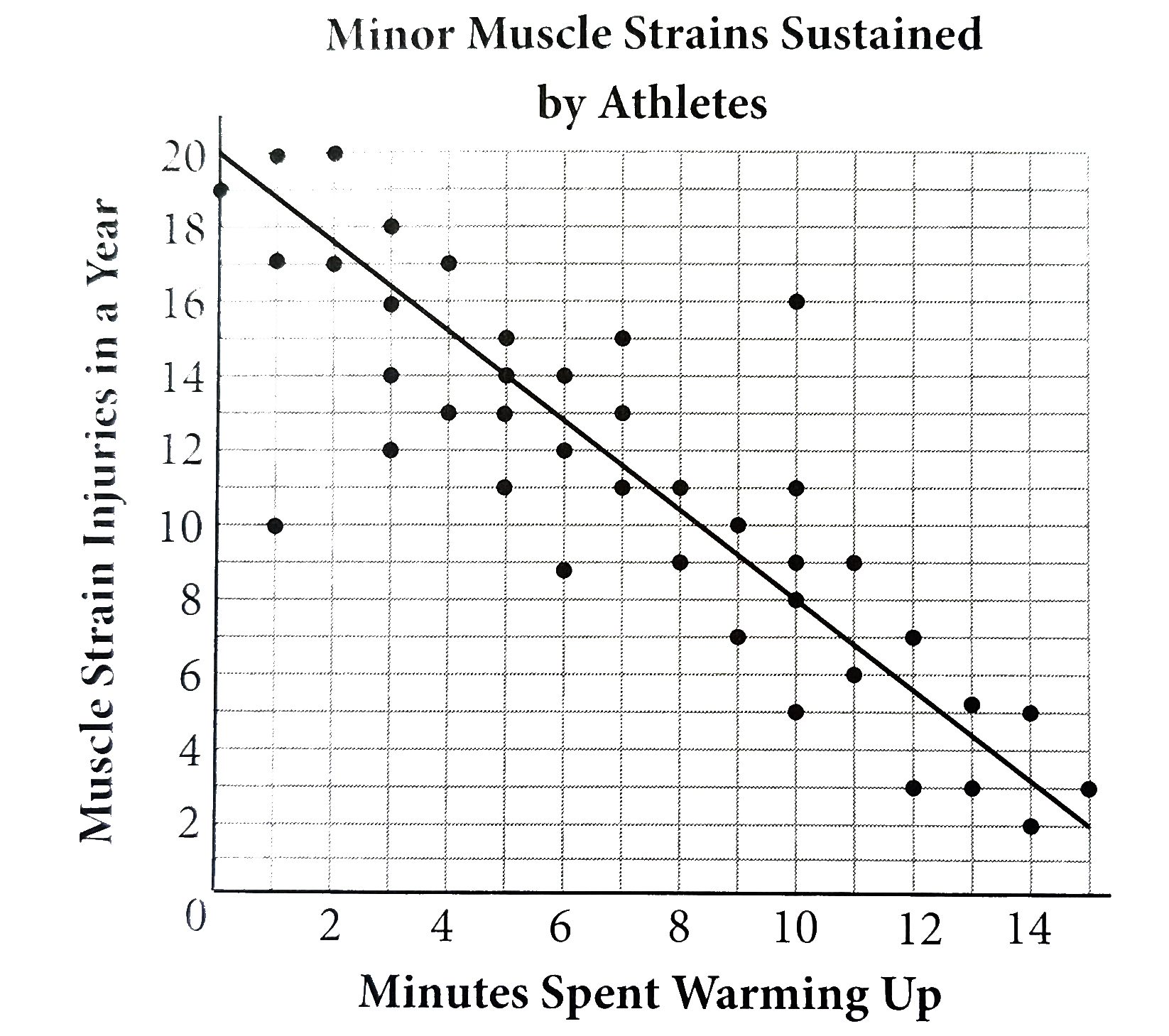
The scatterplot above shows the number of minor muscle strain injuries sutained in a year by athletes, plotted against their self-reported amount of time spent stretching and doing other "warm up" activities before energing in rigorous physical activity. Which of the following best estimates the average rate of change in the number of injuries compared with the number of minutes spent warmig up ?A−1.2B−0.8C2D20
Which one of the following compounds will undergo hydrolysis at a faster rate by SN1 mechanism? Justify.

or CH3CH2CH2Cl
View Solution(##KPLSATPRDPLSC09E01002_Q01.png width=80%><br>W∈dχll,ameasurementtˆreflactsthetemperaturetˆo≠feelswhenoutsbasedontheactualtemperatureandthew∈dspeed,wasfirst∫roduced∈1939,andtheforμlawasrevised∈2001.Iftheoutstemperatureis0^(@)F, what is the approximate wind chill at 40 miles per hour based on the 2001 formula ?
View Solution
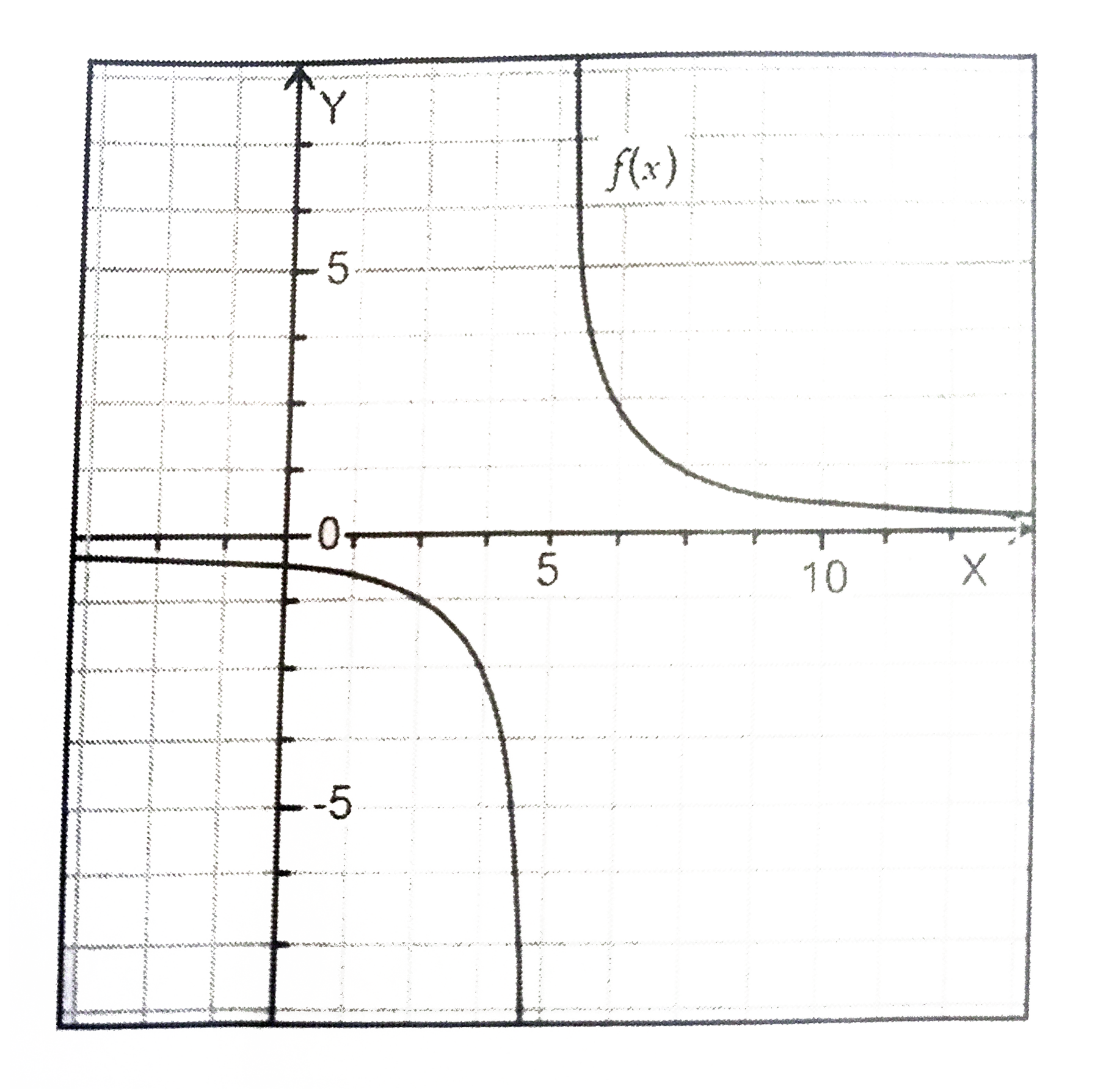
The graph of f(x)=3x−5 is shown above:
(##VIB_343_SAT_MAT_C04_E01_003_Q02.png" width="80%">
Which option gives the correct expression for g(x) as shown below?
View Solution

