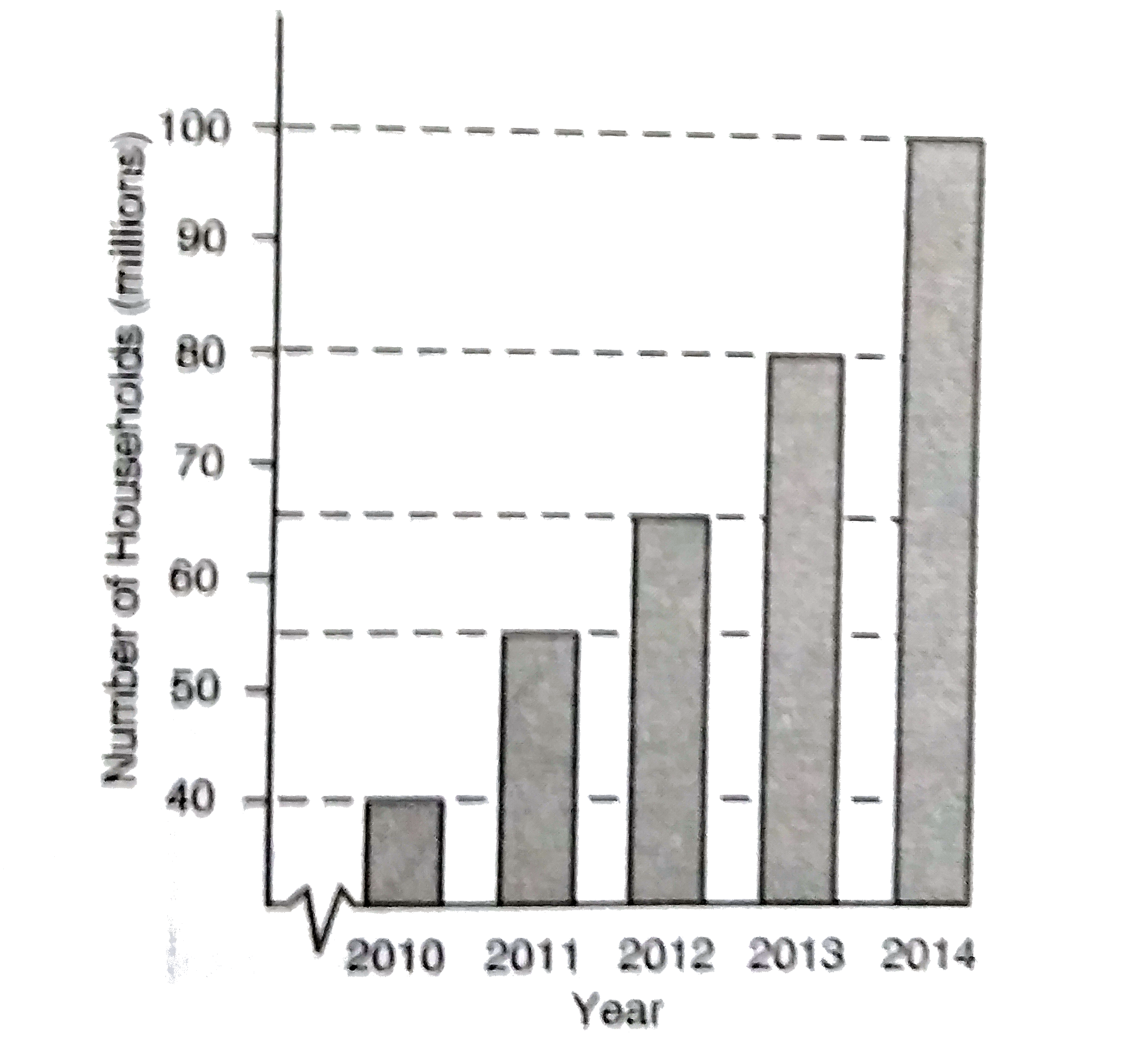
The graph above shows the number of U.S. households with laptop computers for the years 2010 to 2014.
Q. The greatest percent of increase in the number of households with laptops occurred in which two consecutive years?
2010 to 2011
2011 to 2012
2012 to 2013
2013 to 2014
The correct Answer is:A
Step by step video, text & image solution for The graph above shows the number of U.S. households with laptop computers for the years 2010 to 2014. Q. The greatest percent of increase in the number of households with laptops occurred in which two consecutive years? by Maths experts to help you in doubts & scoring excellent marks in Class 12 exams.
Updated on:21/07/2023Topper's Solved these Questions
- PROBLEM SOLVING AND DATA ANALYSISBook:ENGLISH SATChapter:PROBLEM SOLVING AND DATA ANALYSISExercise:Grib-In
Explore 40 Videos
- PROBLEM SOLVING AND DATA ANALYSISBook:ENGLISH SATChapter:PROBLEM SOLVING AND DATA ANALYSISExercise:Grib-In
Explore 40 Videos
- PROBLEM SOLVING AND DATA ANALYSISBook:ENGLISH SATChapter:PROBLEM SOLVING AND DATA ANALYSISExercise:EXERICSE
Explore 80 Videos
- PROBLEMS IN CONTEXT Book:ENGLISH SATChapter:PROBLEMS IN CONTEXT Exercise:PRACTICE TEST
Explore 10 Videos
Similar Questions
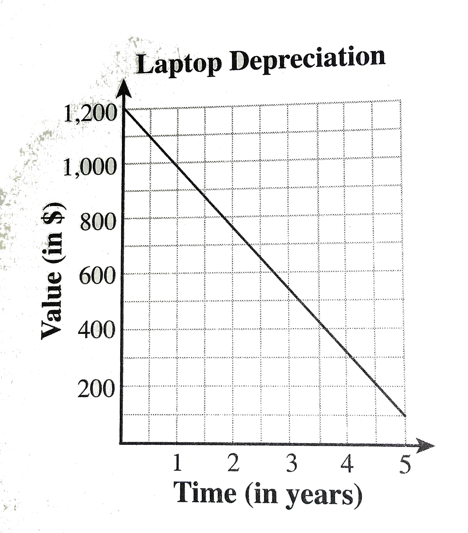
The figure above shows the straight-line depreciation of a laptop computer over the first five years of its use. According to the figure, what is the average rate of change in dollars per year of the value of the computer over the five-year period?
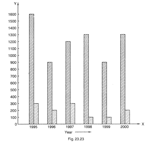
View SolutionThe following bar graph shows the number of persons killed in industrial accidents in a country for some years (Figure) Read the bar graph and choose the correct alternative in each of the following: The year which shows the maximum percentage increase in the number of persons killed in coal mines over the preceding year is:
View Solution
Knowledge Check
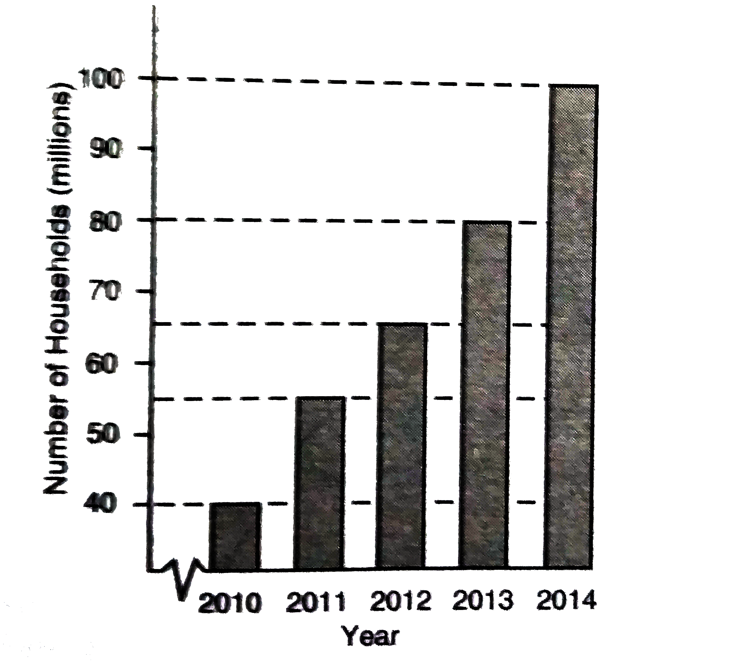
The graph above shows the number of U.S. households with laptop computers for the years 2010 to 2014.
Q. What was the percent of increase in the number of households with laptops from 2010 to 2014?A40%B60%C120%D150%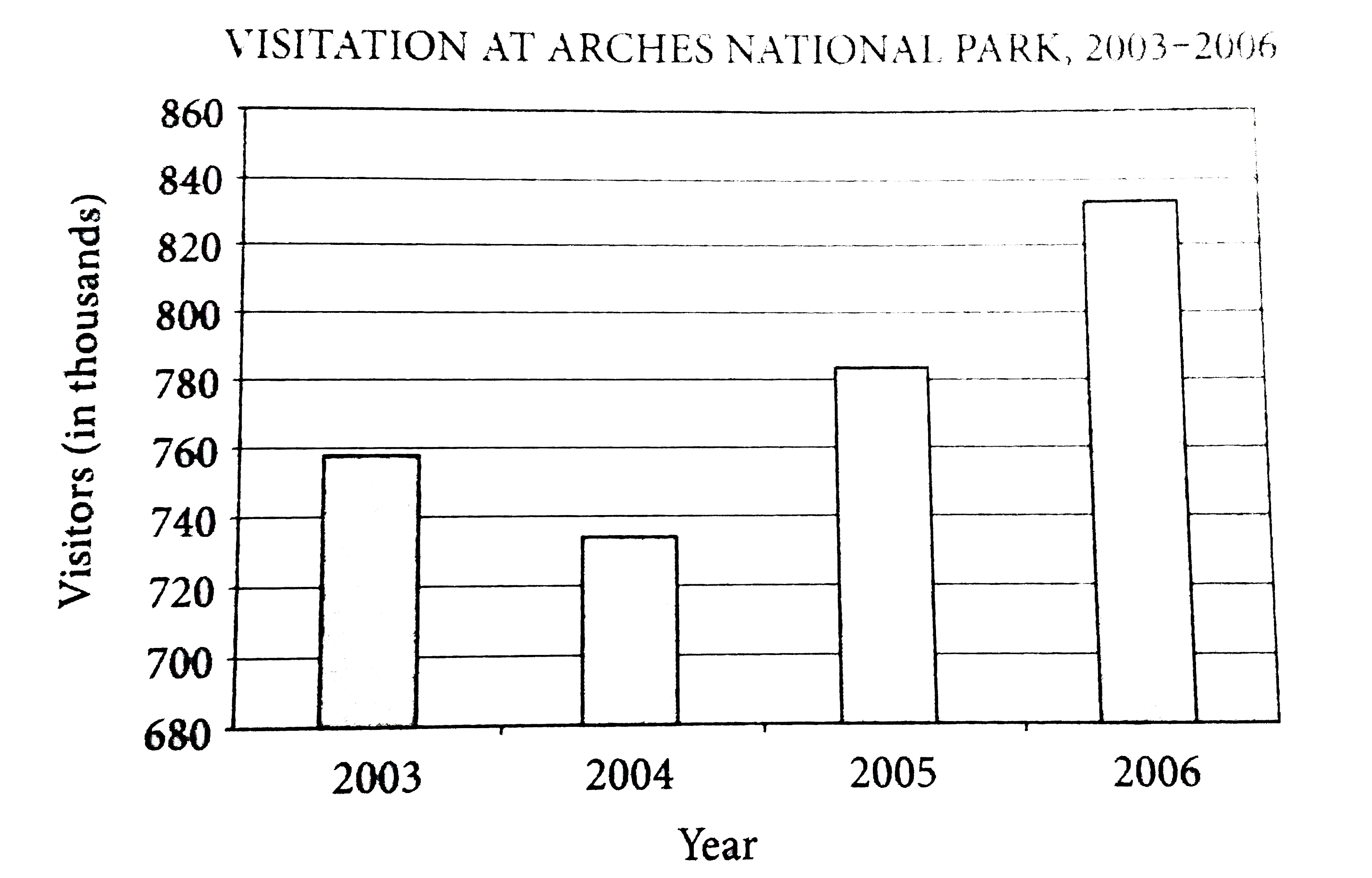
The chart above shows the number of visits, in thousands, at Arches National park for the years 2003 to 2006. Which of the following is the closest approximation of the percent increase in the number of visits from 2004 to 2006?A0.05B0.15C0.2D1.15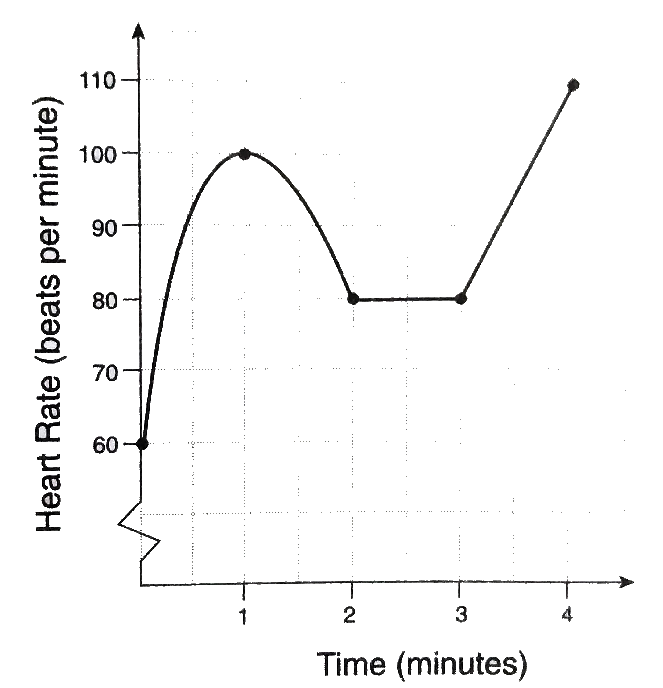
Question 13 and 14 refer to the gaph above which shows the heart rate, in veats per minutes, of a jogger during a 4-minutes interval.
Q. The greatest percent of increase in the jogger's heart rate occured over what interval of time, in minutes?A0 to 1B1 to 2C2 to 3D3 to 4
The following table gives the number of households in USA during 2000-2014.
The following charts give the distribution of households based on the numbers of children for the years 2000 and 2014.

The following charts give the distribution based on the number of childre for the year 2000 and 2014.
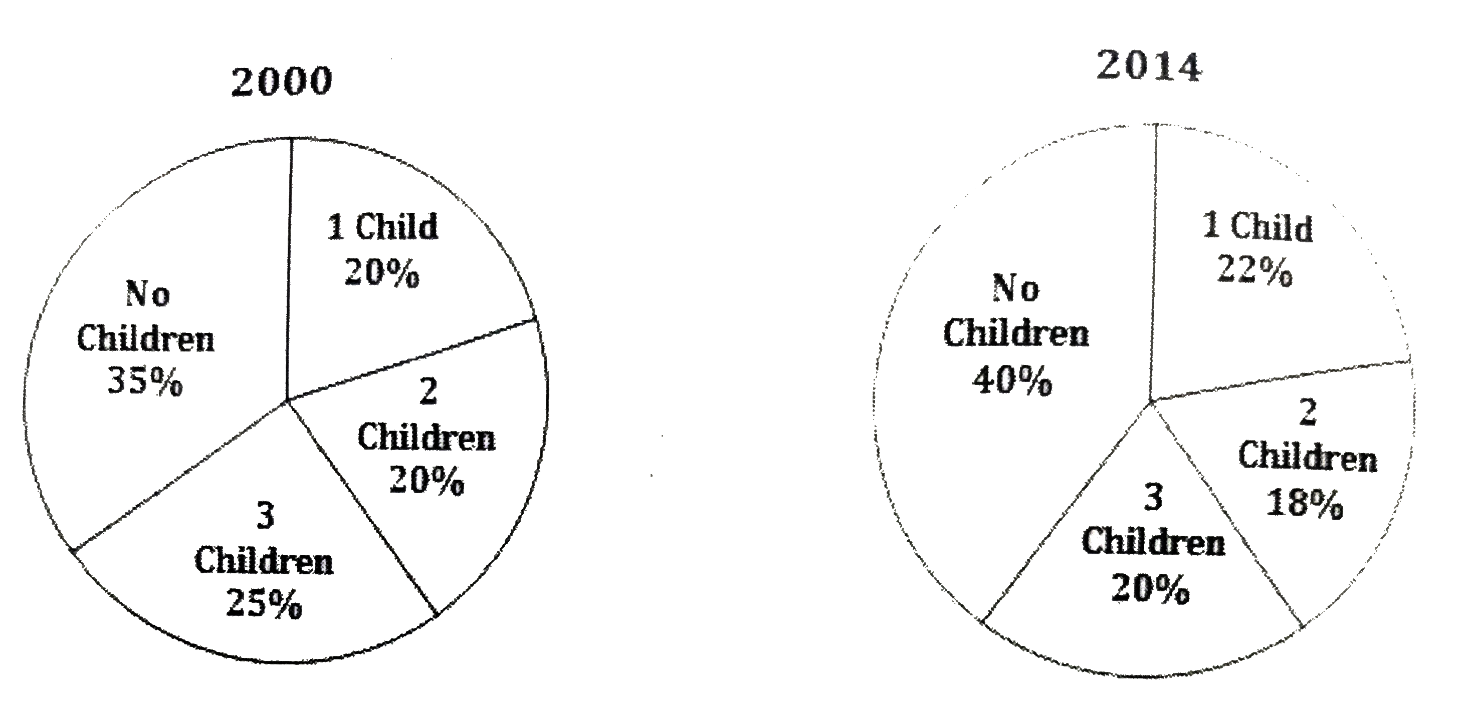
What was the approximate average annual percent increase in the number of households form 2000 to 2014 ?
View SolutionThe following table gives the number of households in USA during 2000-2014.
The following charts give the distribution of households based on the numbers of children for the years 2000 and 2014.

The following charts give the distribution based on the number of childre for the year 2000 and 2014.
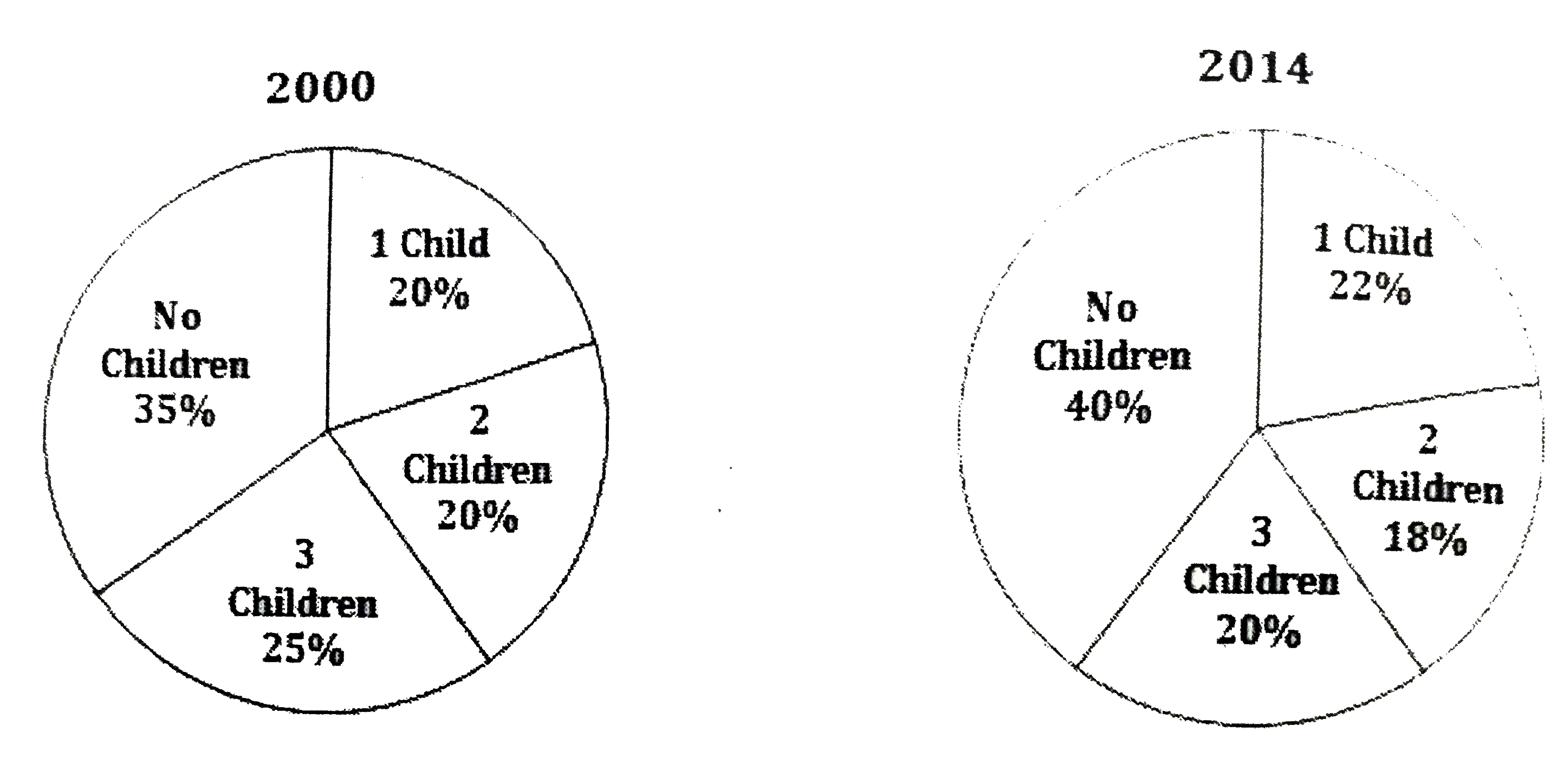
In the above problem, how many additional children were born in that year ?
View SolutionThe following table gives the number of households in USA during 2000-2014.
The following charts give the distribution of households based on the numbers of children for the years 2000 and 2014.

The following charts give the distribution based on the number of childre for the year 2000 and 2014.
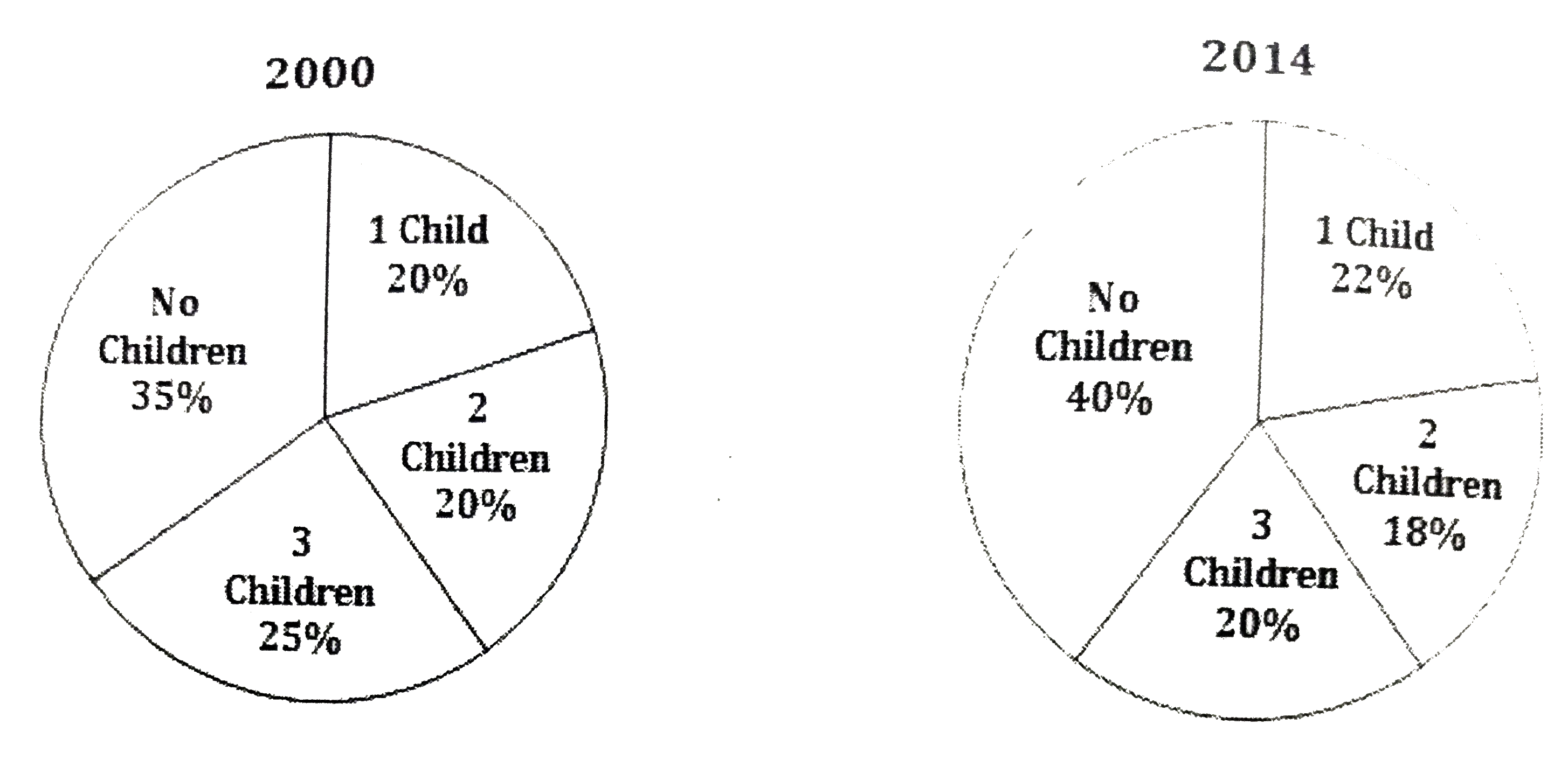
What is the total number of children in 2014?
View SolutionThe following table gives the number of households in USA during 2000-2014.
The following charts give the distribution of households based on the numbers of children for the years 2000 and 2014.

The following charts give the distribution based on the number of childre for the year 2000 and 2014.
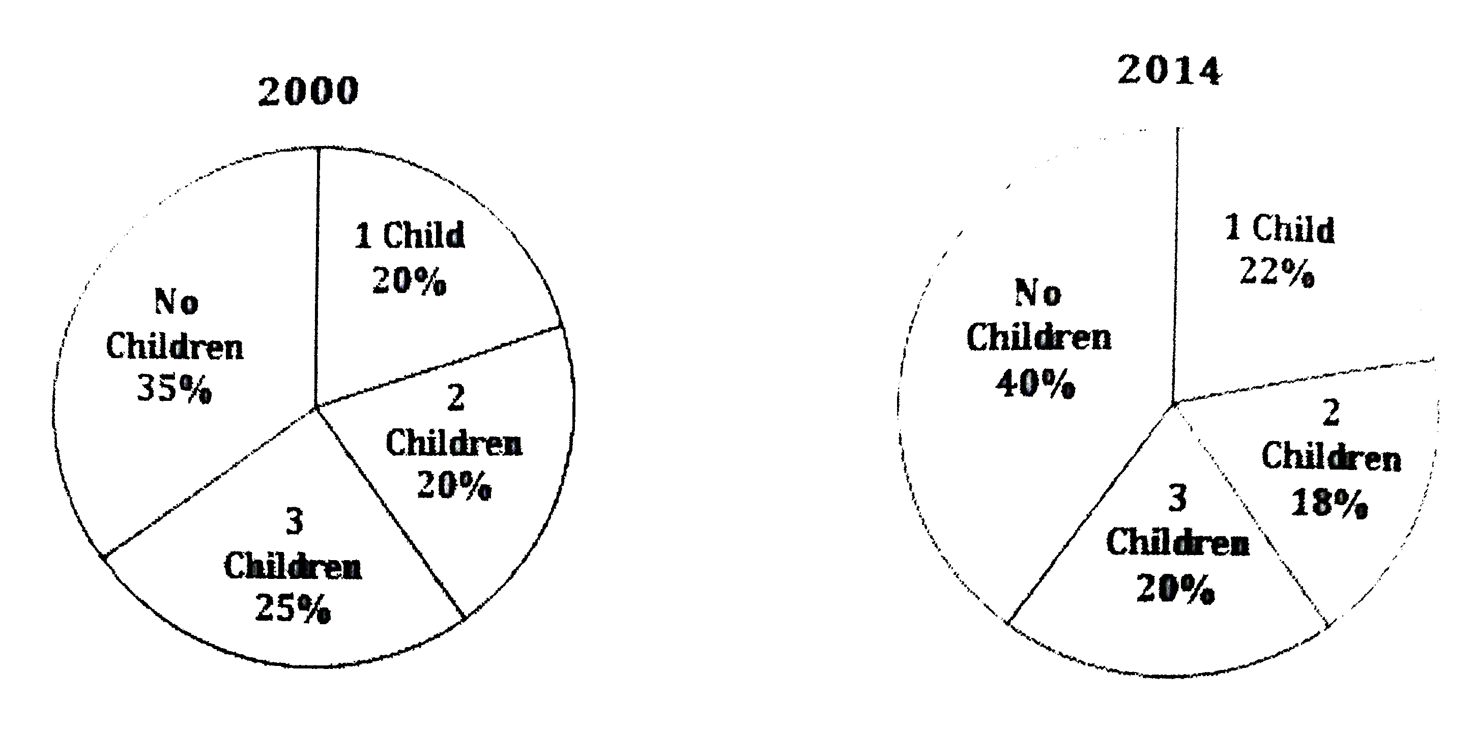
In 2000, 20 % of the household beloing to the category " no children " decided to have children . If those households had 1,2 and 3 children in the ratio of 4:2:1, respectively , what would be the share of households having 2 children ?
View Solution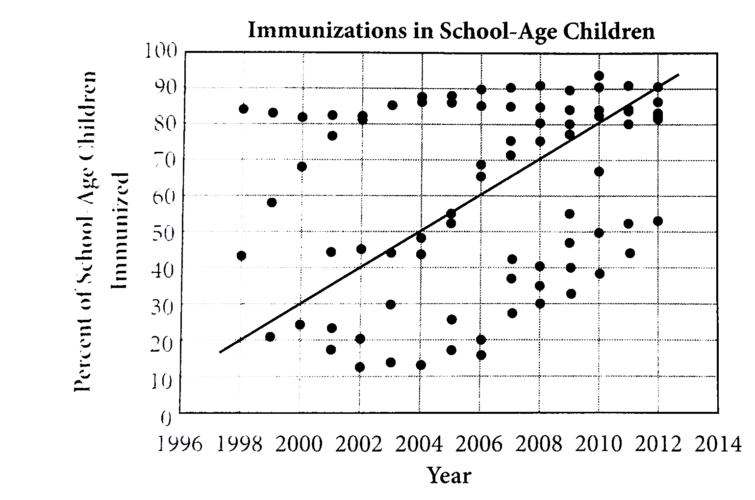
The graph above shows the percent of school-age children in the United States who received immunization for various illnesses beetween 1996 and 2012. What was the average rate of increase in the percent of children immunized per year over the given time period ?
View Solution

