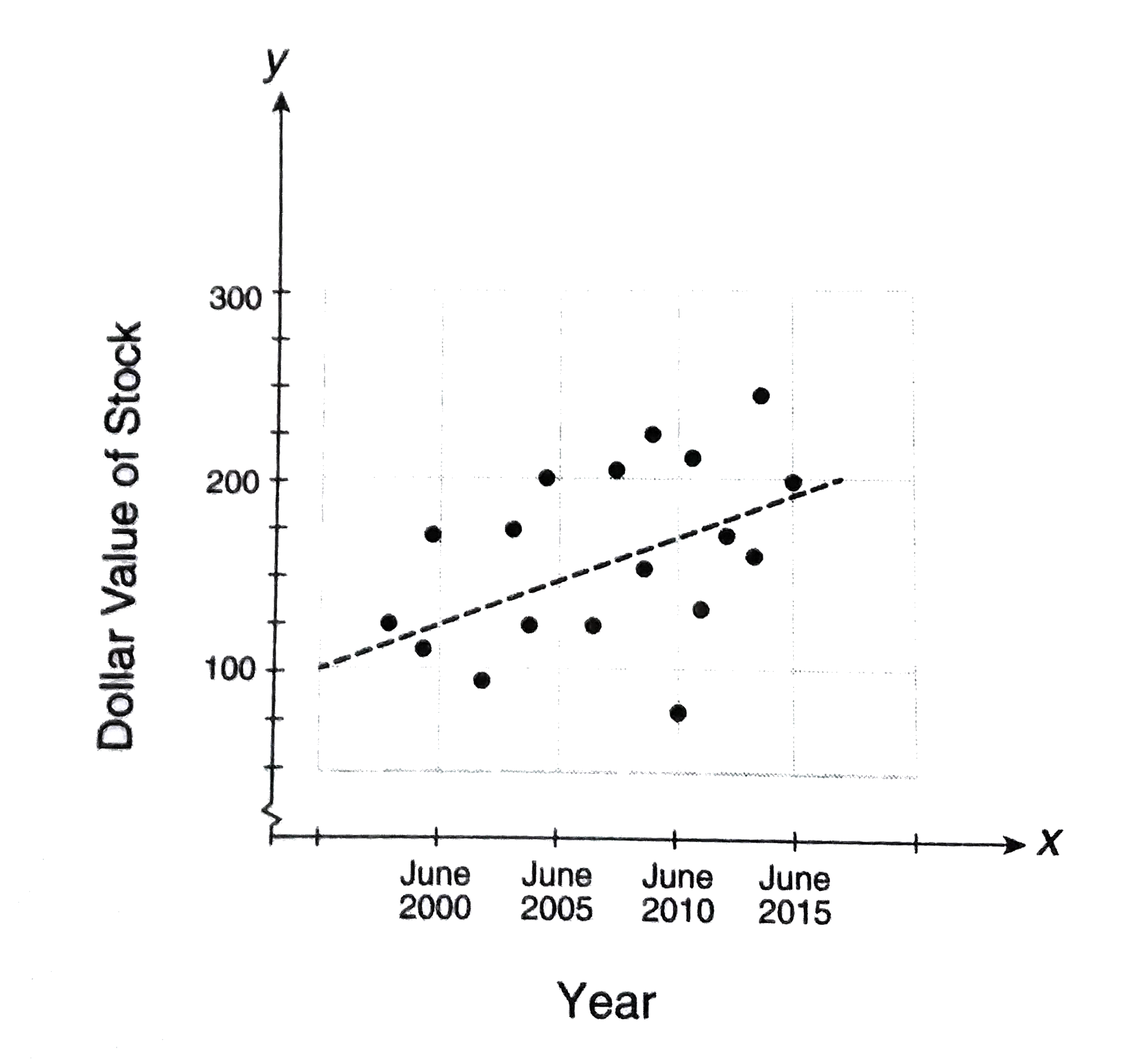
The graph above shows how the value of a stock has increased over time. The line of best fit is shown.
a. The value of the stock increased from June 2000 to Jone 2005 by approcimately what percent?
0.16
0.2
0.25
0.28
The correct Answer is:B
Step by step video, text & image solution for The graph above shows how the value of a stock has increased over time. The line of best fit is shown. a. The value of the stock increased from June 2000 to Jone 2005 by approcimately what percent? by Maths experts to help you in doubts & scoring excellent marks in Class 12 exams.
Updated on:21/07/2023Topper's Solved these Questions
- PROBLEM SOLVING AND DATA ANALYSISBook:ENGLISH SATChapter:PROBLEM SOLVING AND DATA ANALYSISExercise:Multiple Choice
Explore 128 Videos
- PROBLEM SOLVING AND DATA ANALYSISBook:ENGLISH SATChapter:PROBLEM SOLVING AND DATA ANALYSISExercise:Grib-In
Explore 40 Videos
- PROBLEM SOLVING AND DATA ANALYSISBook:ENGLISH SATChapter:PROBLEM SOLVING AND DATA ANALYSISExercise:EXERICSE
Explore 80 Videos
- PROBLEMS IN CONTEXT Book:ENGLISH SATChapter:PROBLEMS IN CONTEXT Exercise:PRACTICE TEST
Explore 10 Videos
Similar Questions
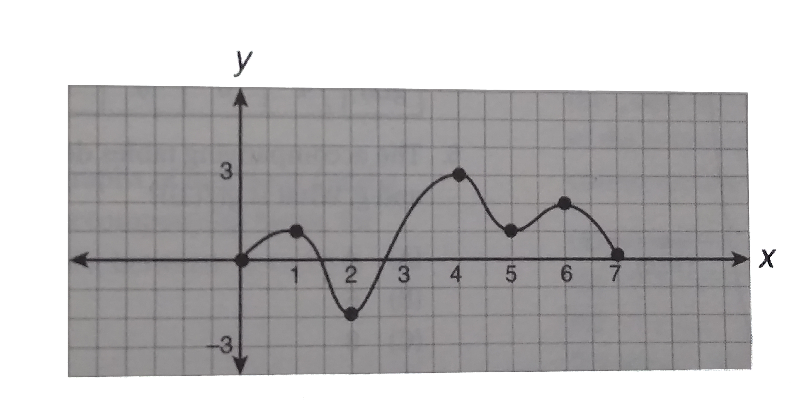
The graph above shows the function y=f(x) over the interval 0≤x≤7. What is the value of f(f(6))?
View SolutionThe use of calculator is not permited.
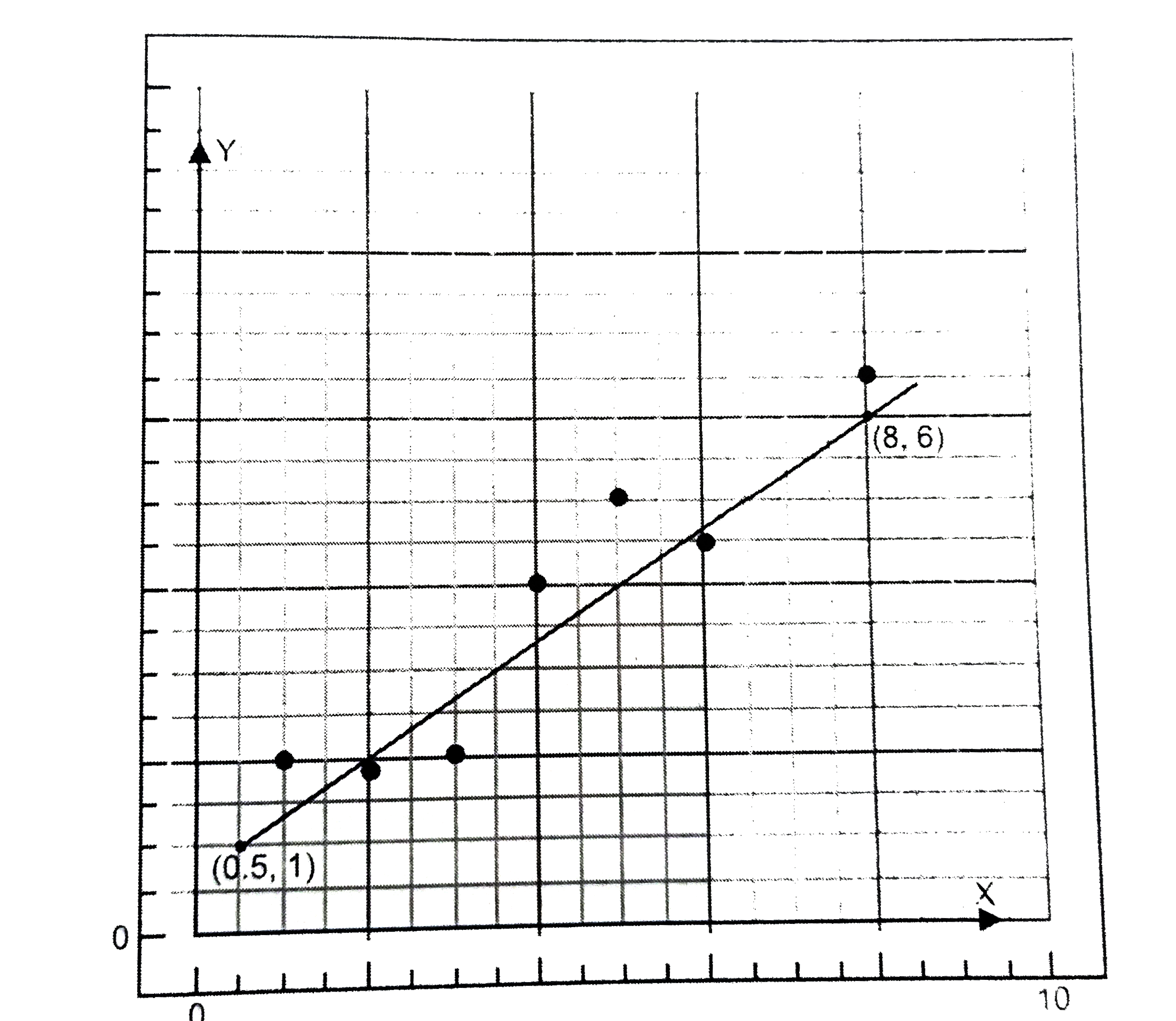
In the graph above ,a number of points are shown, and the line of best fit is also shown. What is the sum of the expected values of the Y coordinates of the points having X values 7 and 9?
View Solution
Knowledge Check
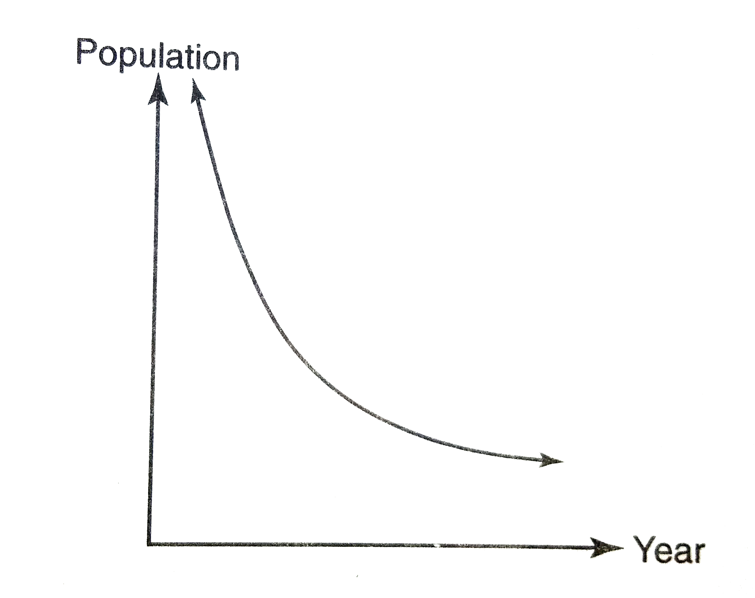
The graph above shows how the size of a country's population has changed over time. Which of the following are the most likely underlying reasons for the type of graph shown?AA moderate increase in annual birthrates and a liberal immigration policy.BA large increase in annual birhtrates and increased life expectancy rates.CA liberal immigration policy and a opportunities.DThe spread of a highly contagius fatal disease and a history of political strife and unrest.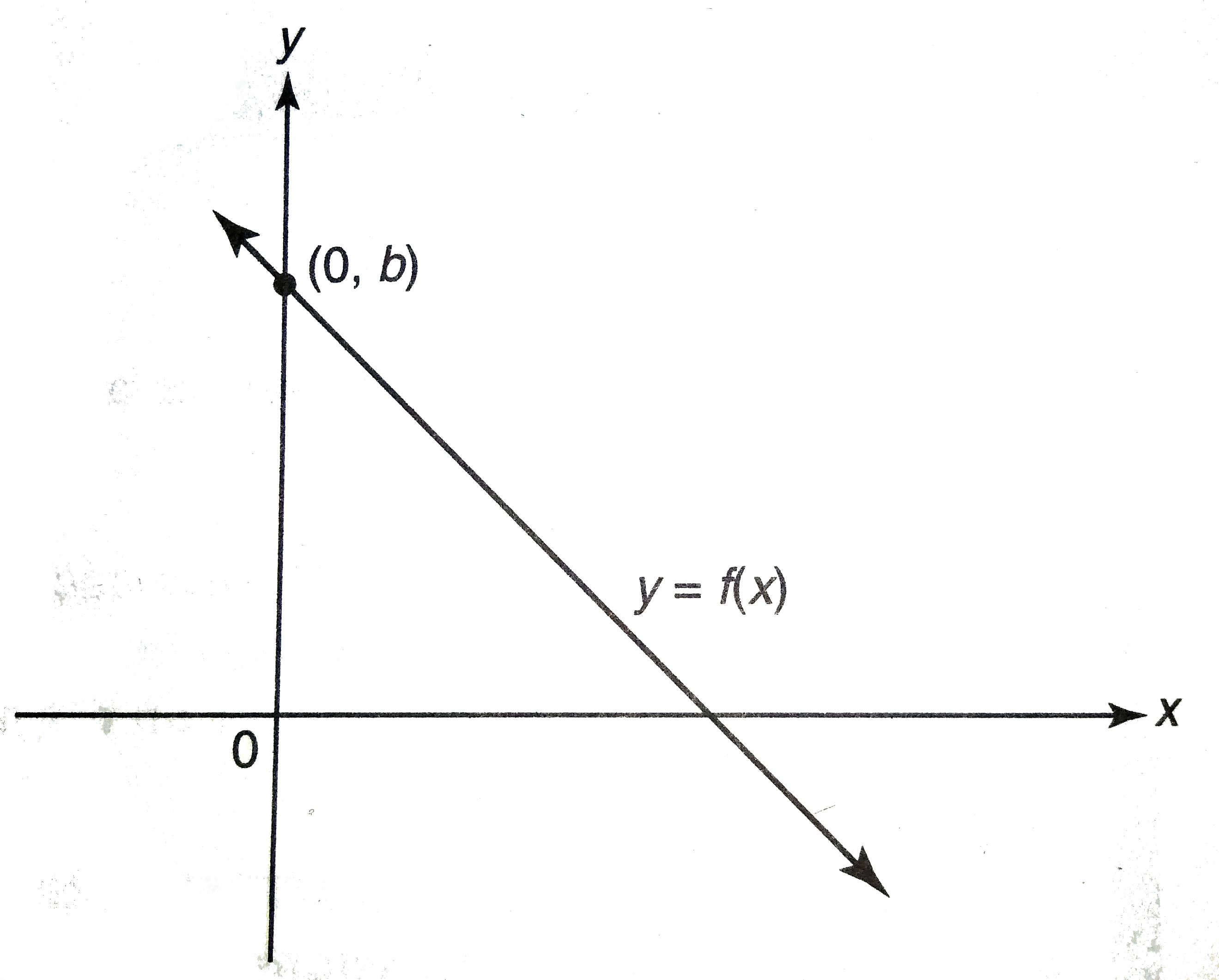
The figure above shows the graph of the linear function, y=f(x). If slope of the line is -2 and f(3)=4, what is the value of b?A8B9C10D11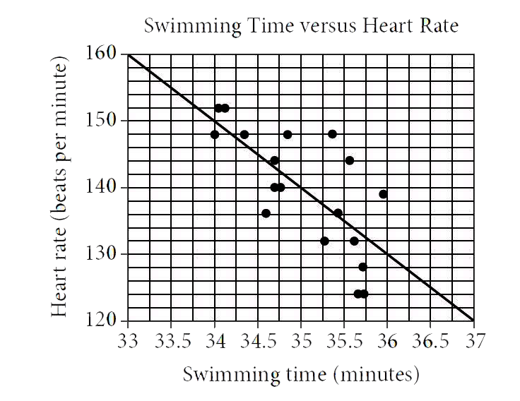
Michael swam 2,000 yards on each of eighteen days. The scatterplot above shows his swim time for and corresponding heart rate after each swim. The line of best fit for the data is also shown. For the swim that took 34 minutes, Michael’s actual heart rate was about how many beats per minute less than the rate predicted by the line of best fit?A1B2C3D4
Between 1985 and 2003, data were collected every three years on the amount of plastic produced annually in the United States, in billions of pounds. The graph below shows the data and a line of best fit. The equation of the line of best fit is y = 3.39x + 46.89, where x is the number of years since 1985 and y is the amount of plastic produced annually, in billions of pounds.
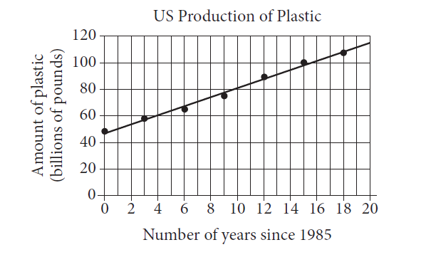
Which of the following is closest to the percent increase in the billions of pounds of plastic produced in the United States from 2000 to 2003?
View Solution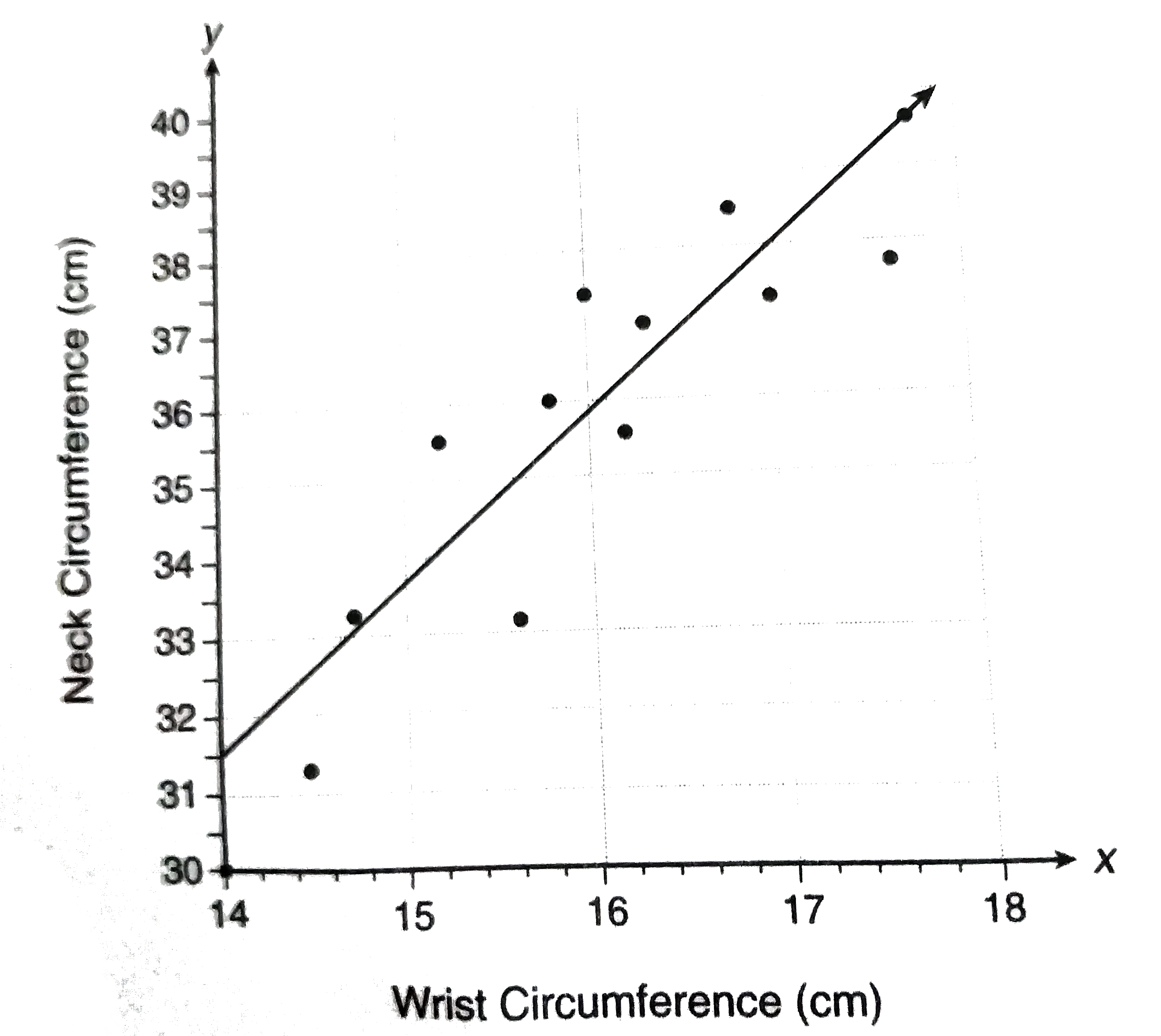
Question 1-3 refer to the above scatterplot, which shows wrist and neck cicumference measurements, in centimeters, for 12 people. The line of beat fit is drawn.
Q. What is the average increase in neck circumference per centimeter increase in wrist circumference, correct to the nearest tenth?
View SolutionWhat is the average yearly increase in value of the stock?
View Solutionwhat is the greatest difference between the actual value of the stock and the value of the stock predicted by the line of best fit?
View Solution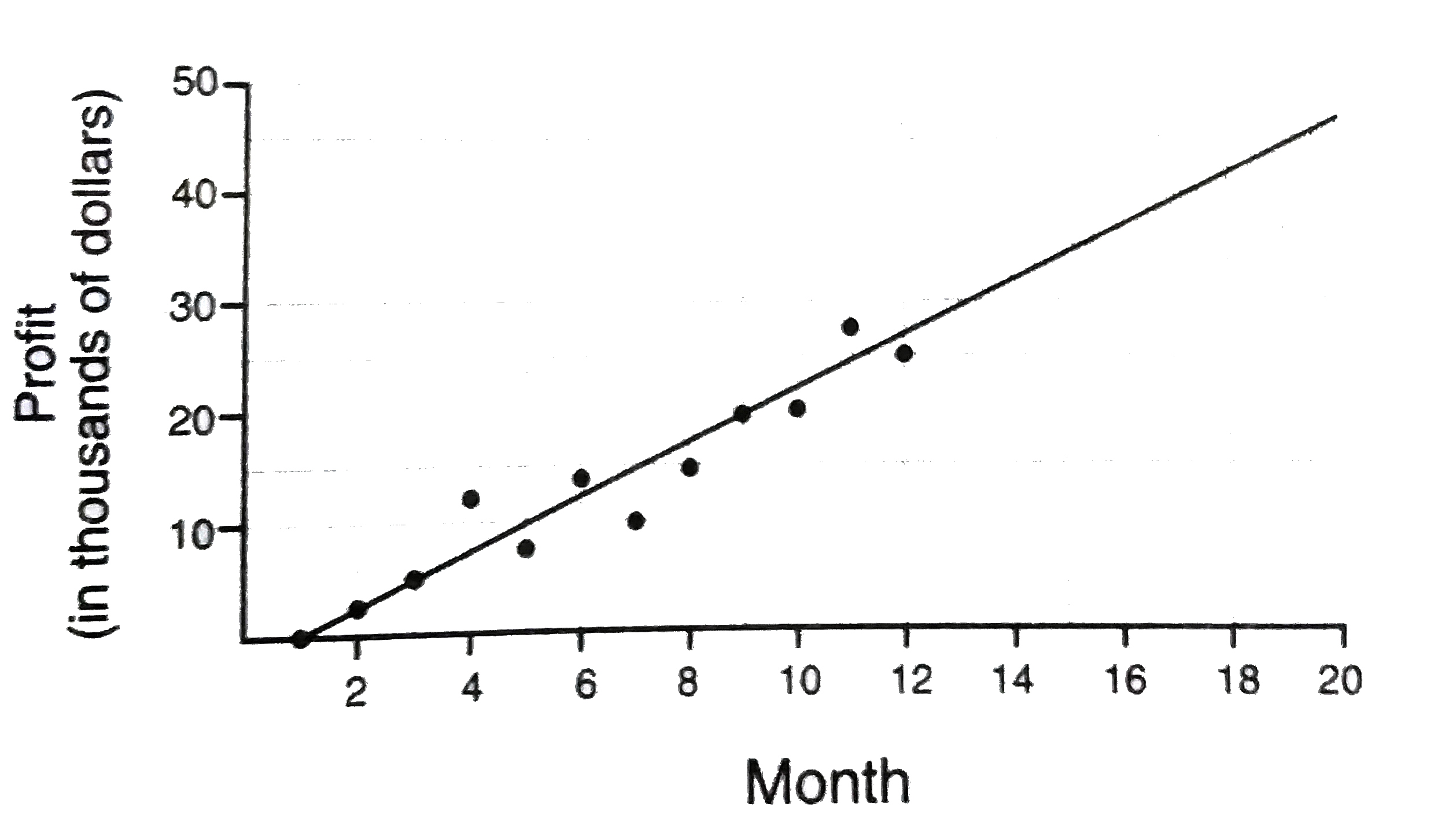
The scatterplot above shows the profit, by month, for a new company for the first year of operation. A line of best fit is also shown. Using this line, by what dollar amount did the profit in the 8th month exceed the profit in the 13th month?
View Solution
