'These days prices have started rising.'' Which amongst the following graphs represents this situation?
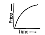
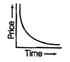

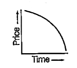
The correct Answer is:A
To determine which graph represents the situation where prices have started rising, we will analyze each option step-by-step.
Step 1: Understand the Statement
The statement indicates that prices are currently rising. This means that as time progresses, the prices should show an upward trend.
Hint: Look for a graph where the price increases as time goes on.
Step 2: Analyze Option 1
In Option 1, the x-axis represents time, and the y-axis represents price. As time increases, the price starts low and gradually increases. This aligns with the statement that prices are rising.
Hint: Check if the graph shows a consistent upward movement as time progresses.
Step 3: Analyze Option 2
In Option 2, the graph shows that the price is initially increasing but then time is decreasing. This does not align with the statement since it suggests that prices are rising while time is going backward, which is not logical.
Hint: Ensure that time is moving forward in the graph for it to represent a realistic scenario.
Step 4: Analyze Option 3
In Option 3, the graph shows that prices increase initially but then start to decrease as time progresses. This contradicts the statement that prices are rising, as it suggests that prices eventually fall.
Hint: Look for a graph that does not show any decline in prices over time.
Step 5: Analyze Option 4
In Option 4, the graph indicates that as time increases, the price is actually decreasing after an initial increase. This also contradicts the statement that prices are rising.
Hint: A graph that shows a downward trend over time cannot represent rising prices.
Conclusion
After analyzing all options, we find that Option 1 is the only graph that accurately represents the situation where prices have started rising.
Final Answer: The correct graph representing the situation where prices have started rising is Option 1.
The statement indicates that prices are currently rising. This means that as time progresses, the prices should show an upward trend.
In Option 1, the x-axis represents time, and the y-axis represents price. As time increases, the price starts low and gradually increases. This aligns with the statement that prices are rising.
In Option 2, the graph shows that the price is initially increasing but then time is decreasing. This does not align with the statement since it suggests that prices are rising while time is going backward, which is not logical.
In Option 3, the graph shows that prices increase initially but then start to decrease as time progresses. This contradicts the statement that prices are rising, as it suggests that prices eventually fall.
In Option 4, the graph indicates that as time increases, the price is actually decreasing after an initial increase. This also contradicts the statement that prices are rising.
After analyzing all options, we find that Option 1 is the only graph that accurately represents the situation where prices have started rising.
Topper's Solved these Questions
- DATA HANDLING AND PATTERNSBOOK - ARIHANT PUBLICATION PUNJABCHAPTER - DATA HANDLING AND PATTERNSEXERCISE - Chapter Exercise
50 Videos
- DATA HANDLING BOOK - ARIHANT PUBLICATION PUNJABCHAPTER - DATA HANDLING EXERCISE - CHAPTER EXERCISE
50 Videos
- ERROR ANALYSISBOOK - ARIHANT PUBLICATION PUNJABCHAPTER - ERROR ANALYSISEXERCISE - CHAPTER EXERCISE
25 Videos
Similar Questions
Knowledge Check
Which of the following graph represents e−x?
A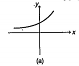 B
B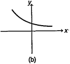 C
C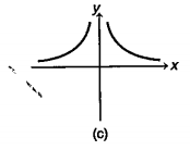 D
D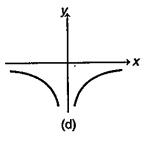
Which one of the following graphs represents motion?
A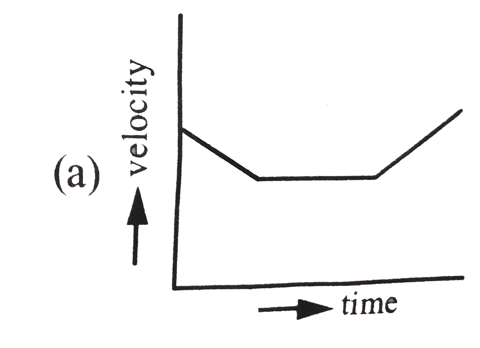 B
B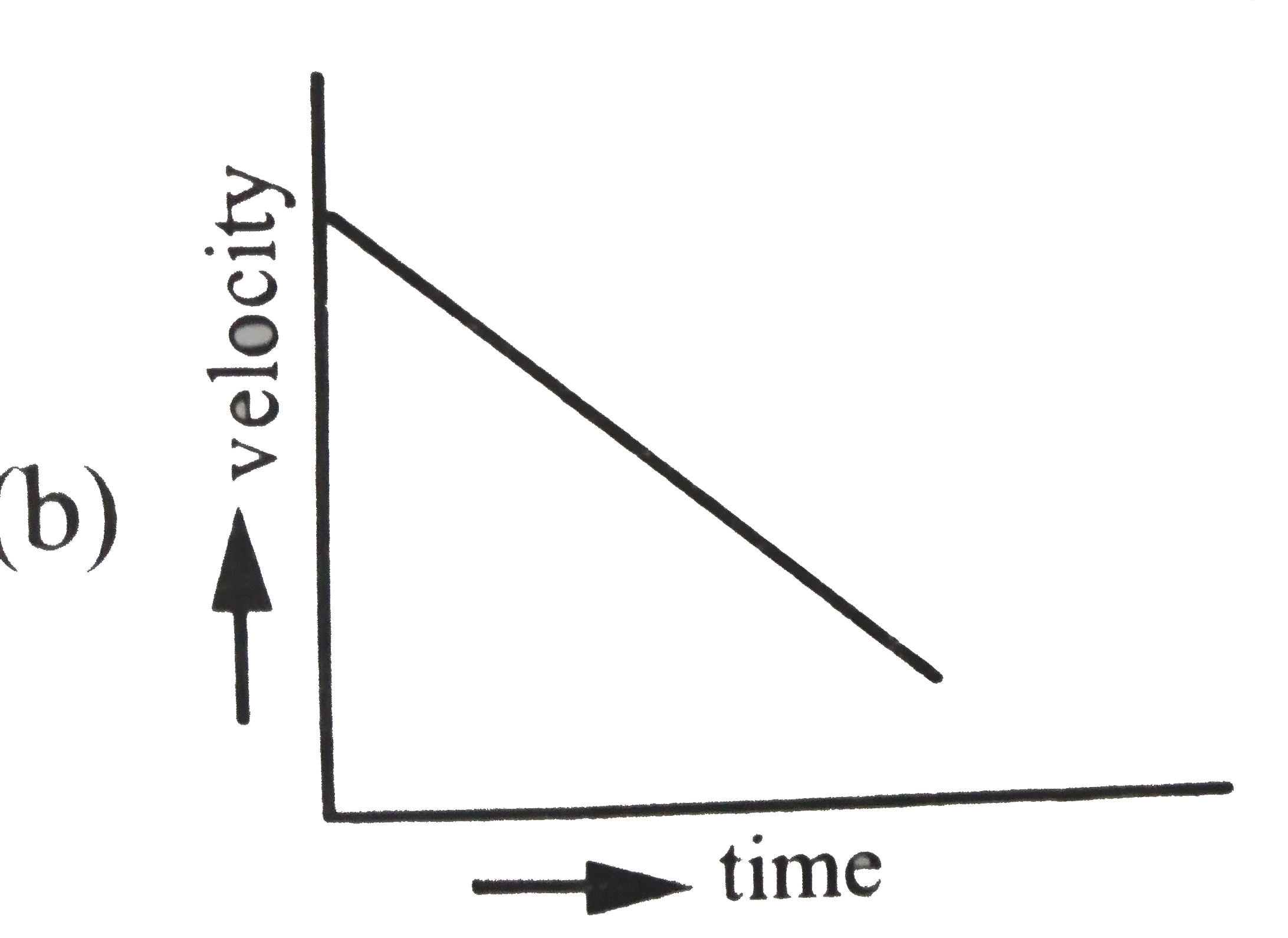 C
C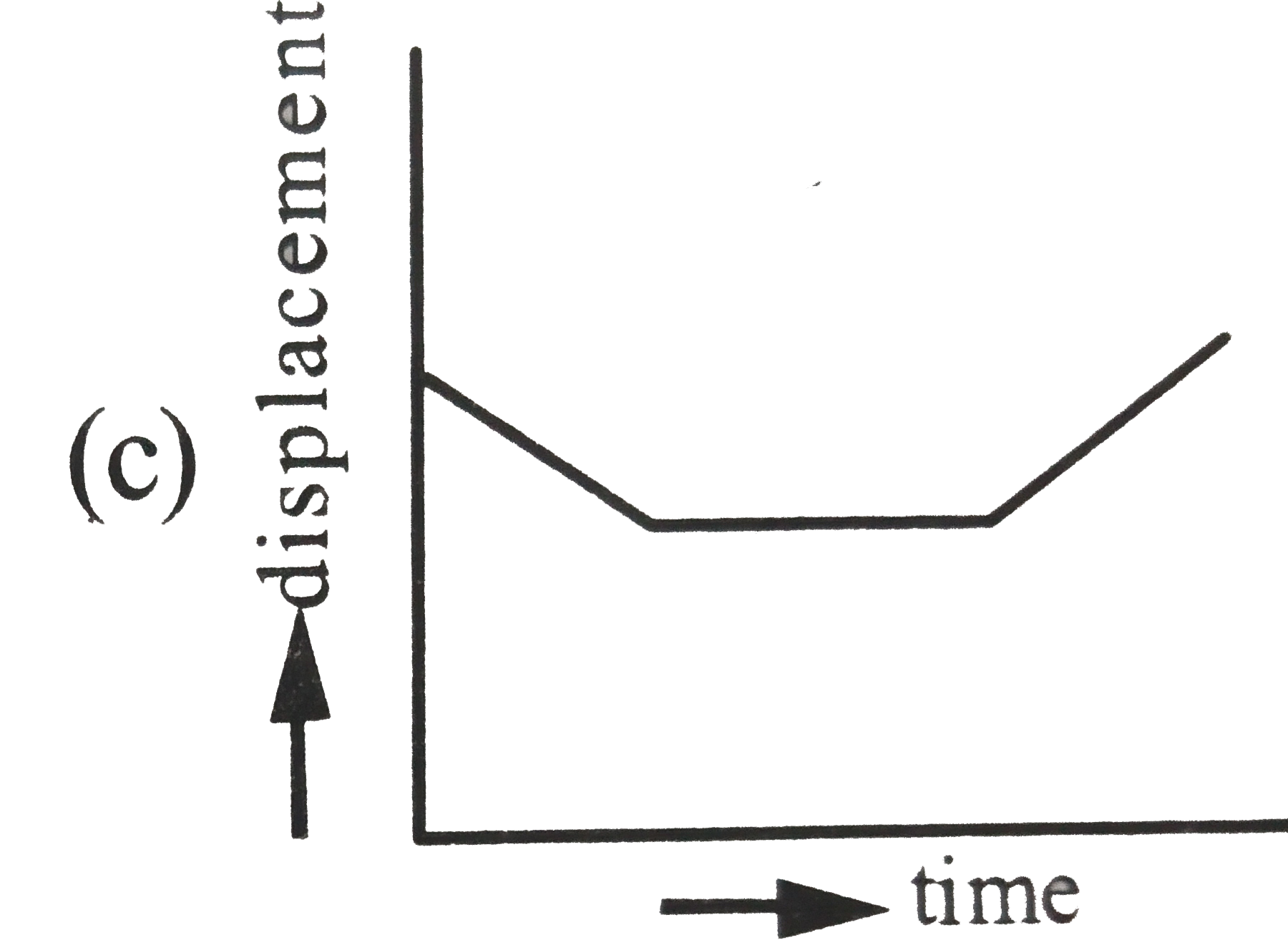 D
D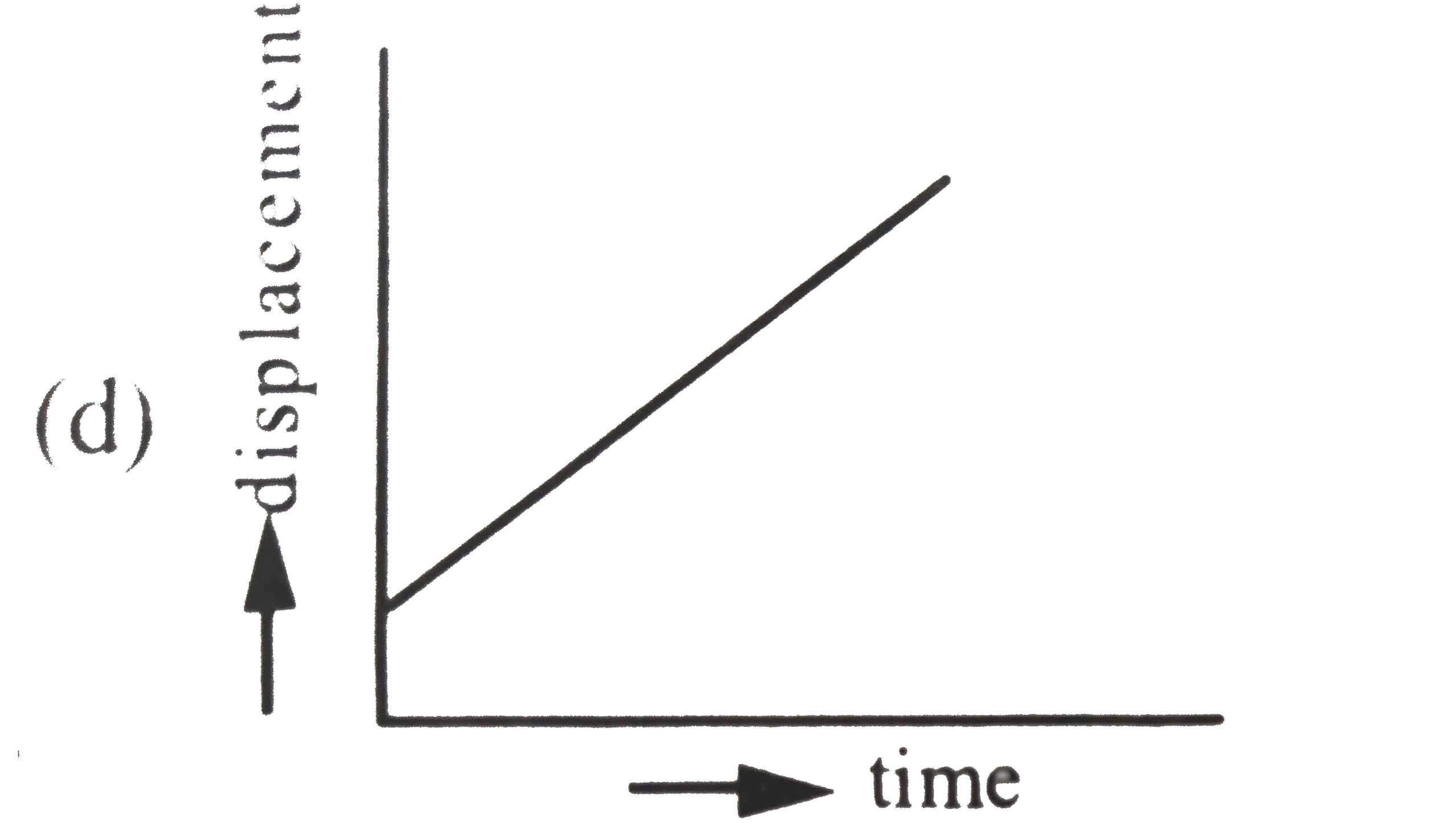
The following diagram represents the situation of:
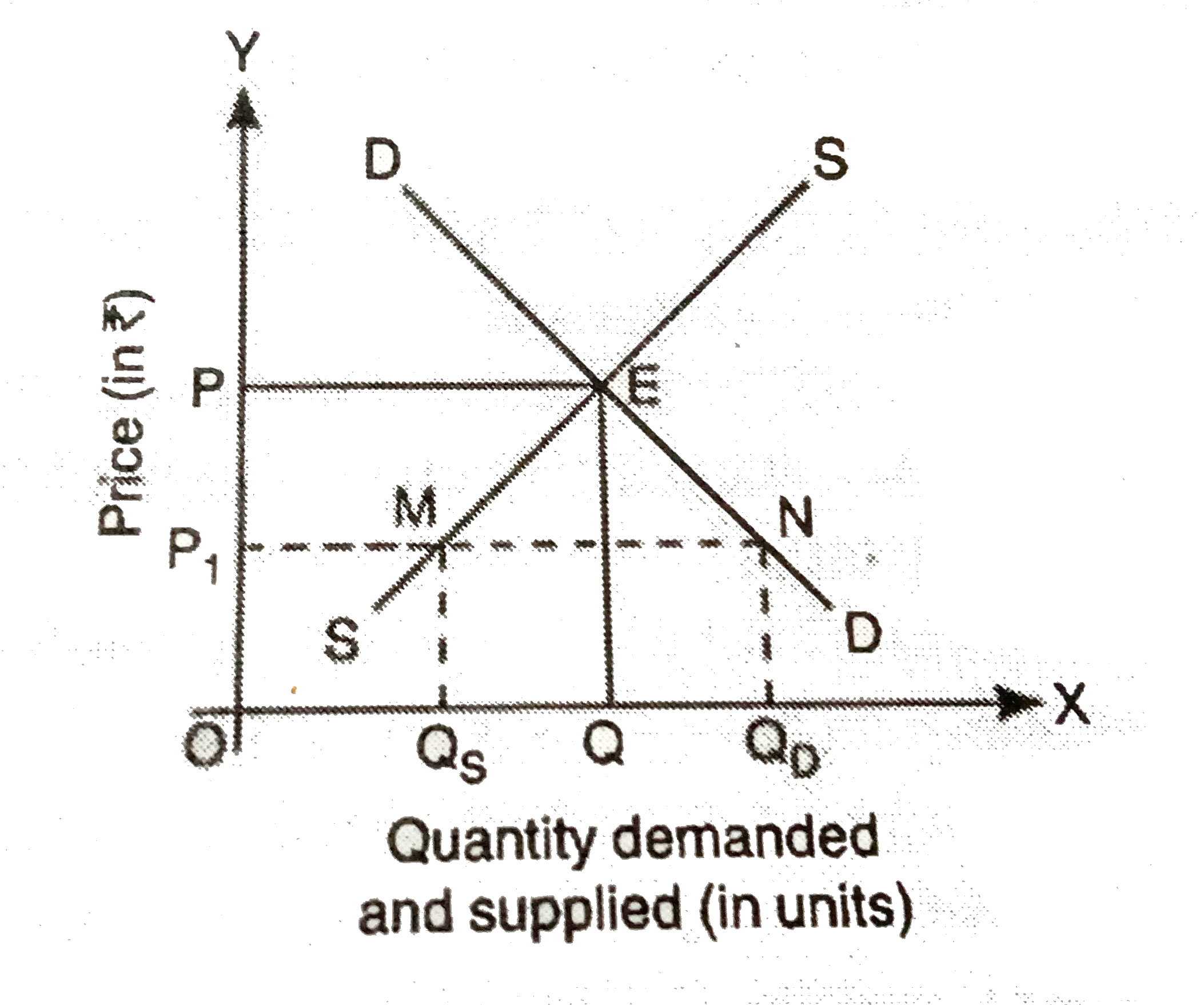 APrice FloorBPrice CeilingCEither (a) or (b)DNeither (a) nor (b)
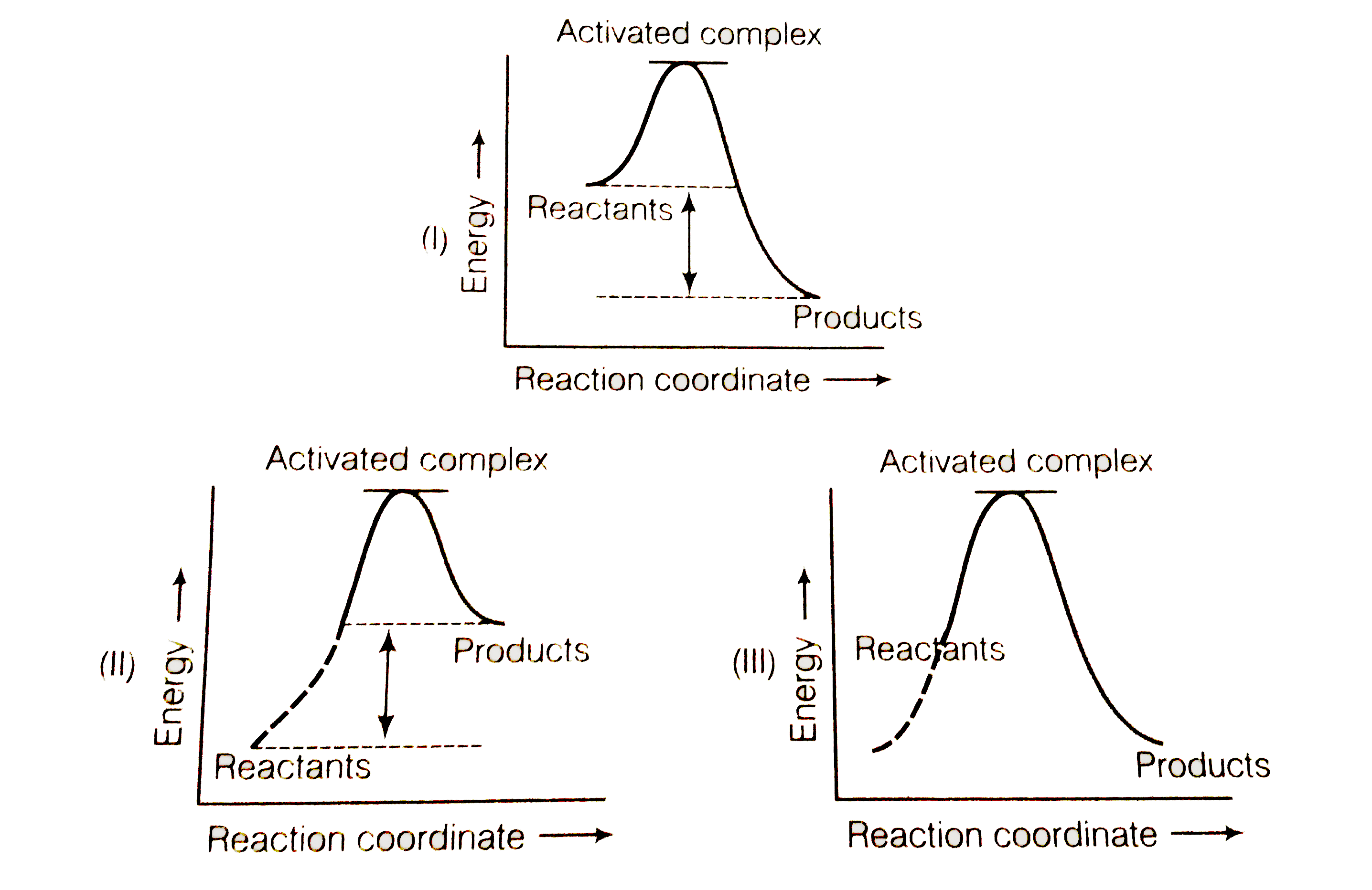
Which of the following graphs represents exothermic reaction?

View SolutionWhich of the following graph represents e−x?
View SolutionWhich of the following graphs represents ohmic resistance?
View SolutionWhich of the following graph represents exothermic reaction ?
View SolutionWhich of the following graph represents 3s orbital
View Solution

