Frequency polygon can be drawn after drawing
ogive
bar chart
histogram
None of these
The correct Answer is:C
To determine whether a frequency polygon can be drawn after drawing a histogram, we will go through the necessary steps to understand the relationship between these two graphical representations of data.
1. Understand the Definitions:
- A frequency polygon is a graphical representation of the distribution of a dataset, created by connecting the midpoints of the top of the bars of a histogram with straight lines.
- A histogram is a bar graph that represents the frequency distribution of numerical data. The bars touch each other, indicating that the data is continuous.
2. Draw the Histogram:
- To create a histogram, we need to plot the frequency of data points in intervals (bins). For example, if we have marks of students, we can create bins for ranges of marks (0-10, 10-20, etc.) and count how many students fall into each bin.
- On the x-axis, we will place the intervals (bins) and on the y-axis, we will place the frequency (number of students).
3. Plot the Frequencies:
- For each interval, draw a bar that corresponds to the frequency of that interval. Ensure that the bars are adjacent to each other without any gaps.
4. Identify Midpoints:
- Once the histogram is drawn, identify the midpoints of each bar. The midpoint of a bin can be calculated by taking the average of the lower and upper limits of the bin.
5. Draw the Frequency Polygon:
- To create the frequency polygon, plot the midpoints on the x-axis against their corresponding frequencies on the y-axis.
- Connect these points with straight lines to form the frequency polygon.
6. Conclusion:
- Therefore, a frequency polygon can indeed be drawn after creating a histogram, as the histogram provides the necessary data (frequencies) and midpoints to construct the frequency polygon.
Final Answer:
A frequency polygon can be drawn after drawing a histogram.
- A frequency polygon is a graphical representation of the distribution of a dataset, created by connecting the midpoints of the top of the bars of a histogram with straight lines.
- A histogram is a bar graph that represents the frequency distribution of numerical data. The bars touch each other, indicating that the data is continuous.
- To create a histogram, we need to plot the frequency of data points in intervals (bins). For example, if we have marks of students, we can create bins for ranges of marks (0-10, 10-20, etc.) and count how many students fall into each bin.
- On the x-axis, we will place the intervals (bins) and on the y-axis, we will place the frequency (number of students).
- For each interval, draw a bar that corresponds to the frequency of that interval. Ensure that the bars are adjacent to each other without any gaps.
- Once the histogram is drawn, identify the midpoints of each bar. The midpoint of a bin can be calculated by taking the average of the lower and upper limits of the bin.
- To create the frequency polygon, plot the midpoints on the x-axis against their corresponding frequencies on the y-axis.
- Connect these points with straight lines to form the frequency polygon.
- Therefore, a frequency polygon can indeed be drawn after creating a histogram, as the histogram provides the necessary data (frequencies) and midpoints to construct the frequency polygon.
A frequency polygon can be drawn after drawing a histogram.
Topper's Solved these Questions
- STATISTICS Book:ARIHANT PUBLICATION JHARKHANDChapter:STATISTICS Exercise:Exam Booster for Cracking Exam
Explore 25 Videos
- SOLVED PAPER 2019Book:ARIHANT PUBLICATION JHARKHANDChapter:SOLVED PAPER 2019Exercise:SECTION I: MATHEMATICS
Explore 48 Videos
- TAXATION Book:ARIHANT PUBLICATION JHARKHANDChapter:TAXATION Exercise:EXAM BOOSTER
Explore 14 Videos
Similar Questions
Knowledge Check
The marks obtained by 273 examinees are shown by the frequency polygon. Given that mean marks is 59.5. Study the frequency polygon and answer the given questions.
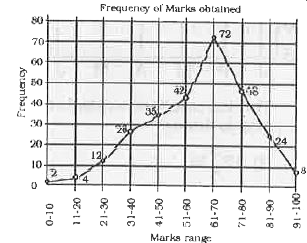
Percentage of the students who get above 80% marks isA9.81B10.53C11.28D11.72The marks obtained by 273 examinees are shown by the frequency polygon Given that mean marks is 59.5 Study the frequency polygon and answer the given question

यदि उत्तीर्ण अंक 40 हो तो बताये कितने % छात्र फैल हुए ।A72B105C152D164
The following pairs relate to frequency distribution of a discrete variable and its frequency polygon. Which one of the following pairs is not correctly matched ?
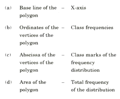
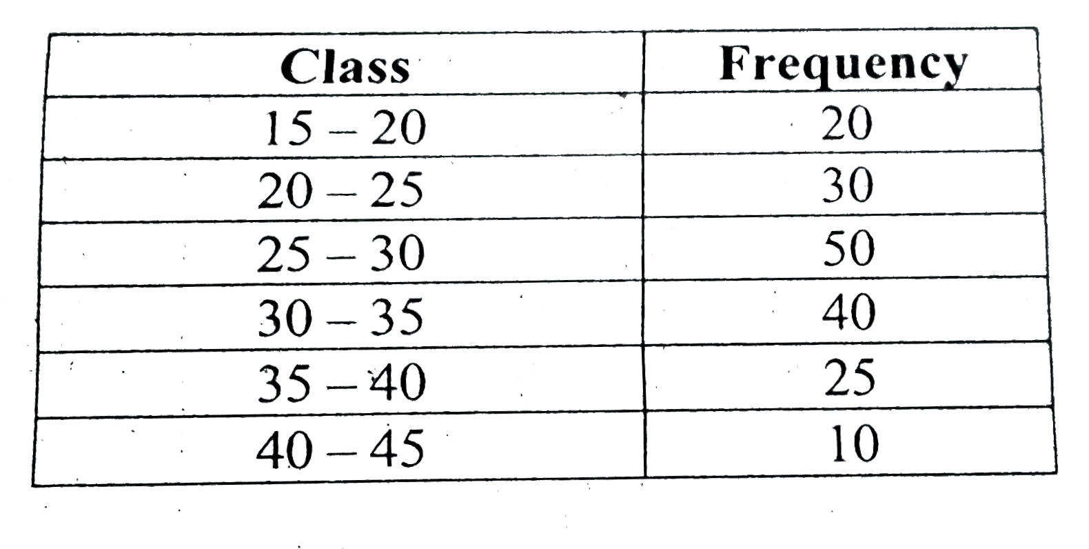
View SolutionDraw the frequency polygon representing the following frequency distribution

View SolutionDraw histrogram and frequency polygon on the same graph paper for the following frequency distribution:
View SolutionDefine frequency polygon.
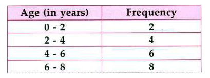
View SolutionConstruct the frequency polygon for the following data:

View SolutionConstruct a frequency polygon for the following data.
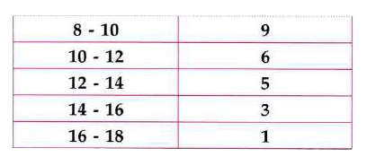
View Solution


