The line graph shows the Sales per employee of a certain company. Study the diagram and answer the following questions.
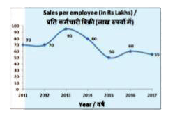
What was the difference in the Sales per employee (in Rs lakhs) between the years 2011 and 2015?
A
15
B
10
C
20
D
5
Video Solution
Text Solution
The correct Answer is:C
20
|
Updated on:21/07/2023
Similar Practice Problems
- Question 1 - Select One
The line graph shows the number of vacancies for executives in a certain company. Study the diagram and answer the following questions.
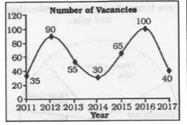
What was the difference in the number of vacancies between the years 2016 and 2014?A60B50C70D40 - Question 1 - Select One
The line graph shows the number of vacancies for sales officers in a certain company. Study the diagram and answer the following questions.
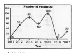
What was the difference in the number of vacancies between the years 2015 and 2012?A55B40C50D45 - Question 1 - Select One
The line graph shows the number of vacancies for sales officers in a certain company. Study the diagram and answer the following questions.

What was the difference in the number of vacancies between the years 2015 and 2012?A55B40C50D45 - Question 1 - Select One
The line graph shows the production of steel of a certain country. Study the diagram and answer the following questions.
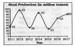
What was the difference (in million tonnes) in the steel production between the years 2011 and 2015?A10B5C15D20 - Question 1 - Select One
The line graph shows the number of deaths due to road accidents in a certain state. Study the diagram and answer the following questions.
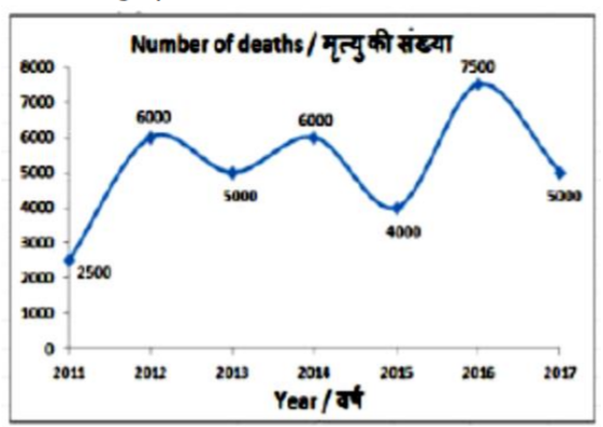
What was the difference in the number of deaths between the years 2011 and 2013?A3500B2000C2500D3000 - Question 1 - Select One
The line graph shows the number of vacancies for management trinees in a certain company. Study the diagram and the answer the following questions.
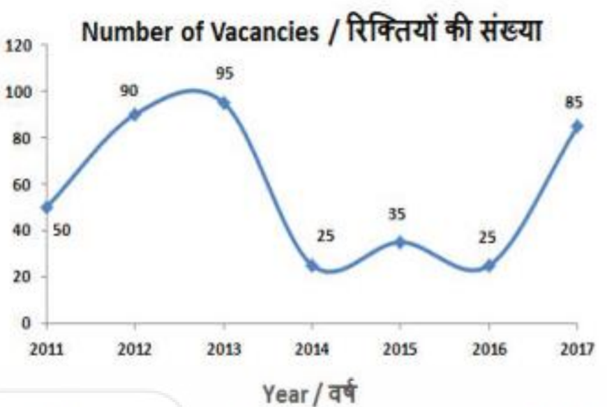
What was the difference in the number of vacancies between the years 2011 and 2014?A25B20C15D30 - Question 1 - Select One
The line graph shows the number of deaths due to rail accidents in a certain state. Study the diagram and answer the following questions.
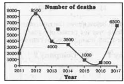
What was the difference between the number of deaths between the years 2012 and 2015?A6500B8500C7500D5500
Similar Questions
The line graph shows the exprots by a certain company. Study the diagram and answer the following questions.
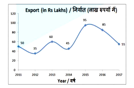
What was the difference in the exports (in Rs lakhs) between the years 2012 and 2014?View SolutionThe line graph shows the Sales per employee of a certain company. Study the diagram and answer the following questions.
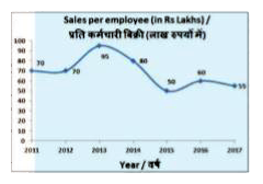
In which year were the Sales per employee greater than that of the previous year?View SolutionThe line graph shows the Sales per employee of a certain company. Study the diagram and answer the following questions.
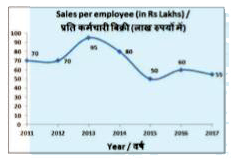
The Sales per employee in 2012 were greater than that in 2015 by _______.View Solution

