What is the name given to the graph that shows all the combinations of two commodities that a consumer can afford at given market prices and within the particular income level in economic terms?
Demand Curve
Isocost Line
Supply Curve
Budget Line
The correct Answer is:D
The Budget Line, also called as Budget Constraint shows all the combinations of two commodities that a consumer can afford at given market prices and within the particular income level.
Topper's Solved these Questions
- ECONOMICSBook:PINNACLEChapter:ECONOMICSExercise:MCQ (NATIONAL INCOME, IFLATION, BUDGET, TAXATION AND GDP)
Explore 115 Videos
- ECONOMICSBook:PINNACLEChapter:ECONOMICSExercise:MCQ (INTERNATIONAL ORGANISATIONS)
Explore 5 Videos
- ECONOMICSBook:PINNACLEChapter:ECONOMICSExercise:MCQ (CONCEPTS OF DEMAND AND SUPPLY)
Explore 9 Videos
- CURRENT AFFAIRSBook:PINNACLEChapter:CURRENT AFFAIRSExercise:SCHEMES & PROJECTS
Explore 40 Videos
- GEOGRAPHYBook:PINNACLEChapter:GEOGRAPHYExercise:WORLD GEOGRAPHY AND MAP
Explore 3 Videos
Similar Questions
If at a given price of the commodity there is excess demand, how will the equilibrium price be reached4? Explain with the help of a diagram.
OR
If equilibrium price of a good is grcater than its market price, explain all the changes that will take place in the market. Use diagram.
OR
Explain the changes that will take place in the market for a commodity if the prevailing market price is less than the equilibrium price.
View SolutionAnswer the following by filling in the blanks :
(i) The sum total of both the substitution and the income effect is called the ______
(ii) If a fall in the price of one good raises the demand for another good, the two goods are called ______
(iii) If demand for a commodity rises even without any change in its price, then it is known as ______
(iv) In case of ______ goofd, demand rises with increase in income
(v) ______shows the tabular presentation of various quantities of a commodity a consumer is willing the buy at different prices, during a given period of time.
View Solution
Knowledge Check
The ______ shows all the combinations of two commodities that a consumer can afford at given market prices and within the particular income level.
A1. Utility lineB2. Supply lineC3. Demand lineD4. Budget lineThe _______ shows all the combinations of two commodities that a consumer can afford at given market prices and within the particular income level.
ASupply lineBBudget lineCUtility lineDDemand lineWhat is the name given to the online payment services that all internet banking customers can use?
AE payBE-commerceCECSDAll of these
What is the name given to the online payment services that all internet banking customers can use?
View SolutionWhat special name can be given to a quadrilateral whose all angles are equal?
View SolutionThe bundles that the consumer can purchase by spending his entire money income at given prices is represented by
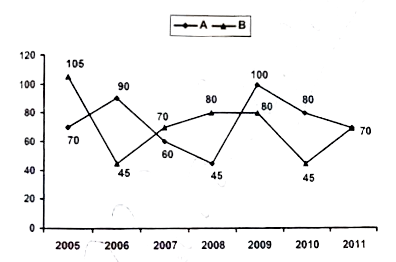
View SolutionStudy the following graph carefully and answer the given questions :-
The following graph shows the % profit of two companies over the years :-

In which of the following years was the total income more than double the total expenditure in that year for company A ?
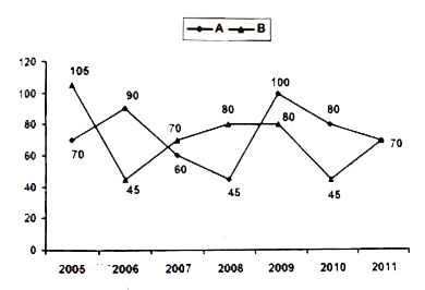
View SolutionStudy the following graph carefully and answer the given questions :-
The following graph shows the % profit of two companies over the years :-

In which of the following years the ratio of expenditure to income was the least for company B?
View Solution
