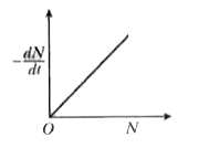
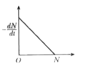
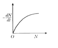
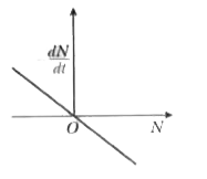
Which of the graphs shown in the figure below best represents the relationship between the radioactive decay rare and population N?
The correct Answer is:A
To solve the question regarding the relationship between the radioactive decay rate −dNdt and the population N, we can follow these steps:
1. Understanding Radioactive Decay:
The radioactive decay law states that the rate of decay of a radioactive substance is proportional to the number of undecayed nuclei present at any time. This can be mathematically expressed as:
−dNdt=λN
where N is the number of undecayed nuclei, and λ is the decay constant.
2. Identifying the Relationship:
From the equation −dNdt=λN, we can see that the decay rate −dNdt is directly proportional to the population N. This indicates a linear relationship between the two variables.
3. Graphical Representation:
In a graph where the x-axis represents the population N and the y-axis represents the decay rate −dNdt, the relationship can be represented as a straight line passing through the origin (0,0). This is because when N=0, −dNdt should also be 0.
4. Analyzing the Options:
- Option A: A straight line passing through the origin, indicating a direct proportionality.
- Option B: A decreasing curve, which does not represent a linear relationship.
- Option C: A quadratic relationship, which is not applicable here.
- Option D: Another non-linear relationship.
5. Conclusion:
The graph that best represents the relationship between the radioactive decay rate −dNdt and the population N is Option A, as it shows a linear relationship with no intercept.
Final Answer:
Option A is the best representation of the relationship between the radioactive decay rate −dNdt and the population N.
---
The radioactive decay law states that the rate of decay of a radioactive substance is proportional to the number of undecayed nuclei present at any time. This can be mathematically expressed as:
−dNdt=λN
where N is the number of undecayed nuclei, and λ is the decay constant.
From the equation −dNdt=λN, we can see that the decay rate −dNdt is directly proportional to the population N. This indicates a linear relationship between the two variables.
In a graph where the x-axis represents the population N and the y-axis represents the decay rate −dNdt, the relationship can be represented as a straight line passing through the origin (0,0). This is because when N=0, −dNdt should also be 0.
- Option A: A straight line passing through the origin, indicating a direct proportionality.
- Option B: A decreasing curve, which does not represent a linear relationship.
- Option C: A quadratic relationship, which is not applicable here.
- Option D: Another non-linear relationship.
The graph that best represents the relationship between the radioactive decay rate −dNdt and the population N is Option A, as it shows a linear relationship with no intercept.
Option A is the best representation of the relationship between the radioactive decay rate −dNdt and the population N.
Topper's Solved these Questions
- THE NUCLEUSBOOK - RESNICK AND HALLIDAYCHAPTER - THE NUCLEUSEXERCISE - PRACTICE QUESTIONS (More than One Correct Choice Type)
22 Videos
- THE NUCLEUSBOOK - RESNICK AND HALLIDAYCHAPTER - THE NUCLEUSEXERCISE - PRACTICE QUESTIONS (Linked Comprehension)
12 Videos
- THE NUCLEUSBOOK - RESNICK AND HALLIDAYCHAPTER - THE NUCLEUSEXERCISE - PROBLEMS
66 Videos
- THE KINETIC THEORY OF GASESBOOK - RESNICK AND HALLIDAYCHAPTER - THE KINETIC THEORY OF GASESEXERCISE - PRACTICE QUESTIONS
72 Videos
- UNITS AND MEASUREMENT BOOK - RESNICK AND HALLIDAYCHAPTER - UNITS AND MEASUREMENT EXERCISE - PRACTICE QUESTIONS (MATRIX-MATCH)
11 Videos
Similar Questions
Which of the following venn diagrams best represents the relationship between women, mother and doctor?
View SolutionWhich figure best represents the relationship between Religon,Mosque, Temple?

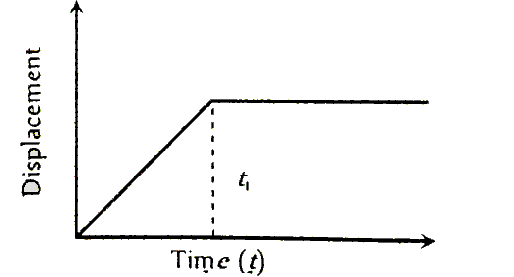
View SolutionThe x -t graph shown in figure represents
View SolutionWhich of the answer figures best represents the relation between shirt , Garments , clothes.

View SolutionWhich figure best represents the relationship between Religion Mosque , Temple ?

View SolutionWhich of the following Venn diagrams best represents the relationship between tables, chairs and lamps?
View SolutionWhich figure best represents the relationship between Editor, Newspaper and Journalist?
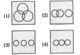
View SolutionWhich of the following venn diagrams best represents the relationship between
Apples, Fruits and eatables?
View SolutionWhich of the following venn diagrams best represents the relationship between carnivores, lions and tigers ?
View SolutionWhich combination figure best represents the relationship between mosquitoes, ants and insects?
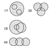
View Solution
