The graph showing the variation of decay rate with number of nuclei is:
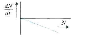
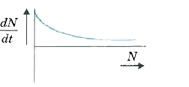
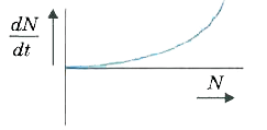
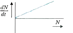
The correct Answer is:A
To solve the question regarding the graph that shows the variation of decay rate with the number of nuclei, we can follow these steps:
Step 1: Understand the Decay Law
The decay of radioactive nuclei is described by the equation:
n(t)=n0e−λt
where:
- n(t) is the number of undecayed nuclei at time t,
- n0 is the initial number of nuclei,
- λ is the decay constant.
Step 2: Determine the Decay Rate
The decay rate (or activity) A is given by the derivative of the number of nuclei with respect to time:
A=−dndt=λn(t)
Substituting the expression for n(t):
A=λn0e−λt
Step 3: Analyze the Relationship
From the equation A=λn(t), we see that the decay rate A is directly proportional to the number of undecayed nuclei n(t). This means that as the number of nuclei decreases over time, the decay rate also decreases.
Step 4: Graphical Representation
1. The graph of decay rate A versus the number of nuclei n will show a linear relationship since A is proportional to n.
2. As n decreases, A will also decrease, indicating a negative slope.
Step 5: Identify the Correct Graph
Among the options provided, we need to identify the graph that shows:
- A downward slope (negative slope) as the number of nuclei decreases.
- The graph should start from a positive value when n is at its maximum (initial number of nuclei).
Conclusion
The correct graph that represents the decay rate as a function of the number of nuclei will be the one that shows a negative slope, indicating that as the number of nuclei decreases, the decay rate also decreases.
Final Answer
The correct option is Option A.
---
The decay of radioactive nuclei is described by the equation:
n(t)=n0e−λt
where:
- n(t) is the number of undecayed nuclei at time t,
- n0 is the initial number of nuclei,
- λ is the decay constant.
The decay rate (or activity) A is given by the derivative of the number of nuclei with respect to time:
A=−dndt=λn(t)
Substituting the expression for n(t):
A=λn0e−λt
From the equation A=λn(t), we see that the decay rate A is directly proportional to the number of undecayed nuclei n(t). This means that as the number of nuclei decreases over time, the decay rate also decreases.
1. The graph of decay rate A versus the number of nuclei n will show a linear relationship since A is proportional to n.
2. As n decreases, A will also decrease, indicating a negative slope.
Among the options provided, we need to identify the graph that shows:
- A downward slope (negative slope) as the number of nuclei decreases.
- The graph should start from a positive value when n is at its maximum (initial number of nuclei).
The correct graph that represents the decay rate as a function of the number of nuclei will be the one that shows a negative slope, indicating that as the number of nuclei decreases, the decay rate also decreases.
The correct option is Option A.
Topper's Solved these Questions
- NUCLEIBook:MODERN PUBLICATIONChapter:NUCLEIExercise:COMPETITION FILE (AIPMT/NEET & OTHER STATE BOARDS FOR MEDICAL ENTRANCES )
Explore 31 Videos
- NUCLEIBook:MODERN PUBLICATIONChapter:NUCLEIExercise:COMPETITION FILE (JEE MAIN & OTHER STATE BOARDS FOR ENGINEERING ENTRANCES)
Explore 19 Videos
- NUCLEIBook:MODERN PUBLICATIONChapter:NUCLEIExercise:REVISION EXERCISES (NUMERICAL PROBLEMS)
Explore 18 Videos
- MOVING CHARGES AND MAGNETISMBook:MODERN PUBLICATIONChapter:MOVING CHARGES AND MAGNETISMExercise:CHAPTER PRACTICE TEST
Explore 13 Videos
- RAY OPTICS AND OPTICAL INSTRUMENTSBook:MODERN PUBLICATIONChapter:RAY OPTICS AND OPTICAL INSTRUMENTSExercise:CHAPTER PRACTICE TEST
Explore 14 Videos
Similar Questions
Draw a graph showing the variation of decay rate with number of active nuclei.
View SolutionDraw a graph showing the variation of decay rate with number of active nuclei.
View SolutionDraw a graph showing the variation of decay rate (−dNdt) with number (N) of radioactive nuclei.
View SolutionDraw the graph showing the variation of binding energy per nucleon with mass number. Give the reason for the decrease of binding energy per nucleon for nuclei with high mass numbers.
View SolutionDraw the graph showing thervariation of binding energy per nucleon with mass number. Give therason for the decrease of binding energy per nucleon for nuclei with high mass numbers.
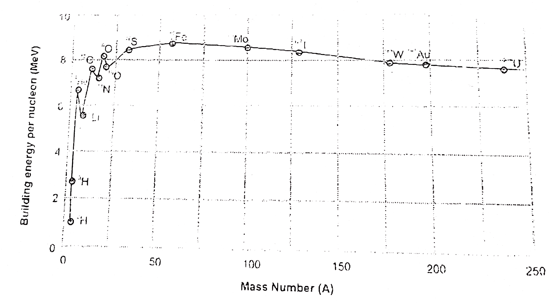
The binding energy per nucleon for nuclei with high mass number is low due to the large coulomb repulsion between the protons inside these nuclei.
View SolutionDraw a graph showing the variation of binding energy per nucleon with mass number of different nuclei. State two inferences from this graph.
View SolutionSketch a graph showing the variation of reactance of an inductor with frequency of the applied voltage
View SolutionPlot a graph showing the variation of undecayed nuclei N versus time t. From the graph, find out how one can determine the half-life and average life of the radioactive nuclei.
View SolutionDraw the graph showing variation of the value of the induced emf as a function of rate of change of current flowing through an ideal inductor.
View SolutionDraw the graph showing variation of the value of the induced emf as a function of rate of change of current flowing through an ideal inductor.
View Solution

