The temperature-time graph obtained when hot water is allowed to cool resembles the graph given in one of the following figures. The correct figure is:
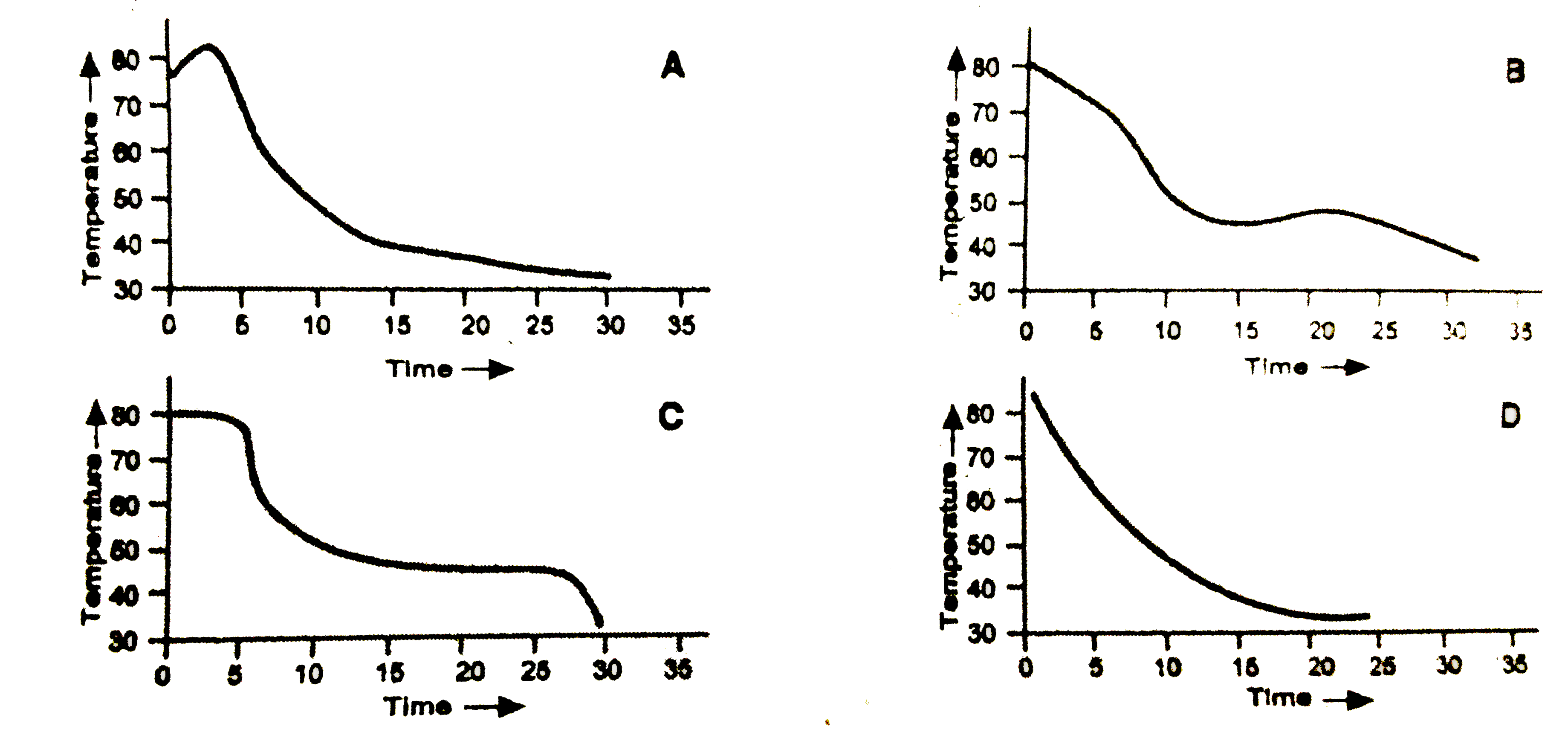
A
B
C
D
The correct Answer is:D
Step by step video, text & image solution for The temperature-time graph obtained when hot water is allowed to cool resembles the graph given in one of the following figures. The correct figure is: by Physics experts to help you in doubts & scoring excellent marks in Class 9 exams.
Updated on:21/07/2023Topper's Solved these Questions
- SOUNDBook:LAKHMIR SINGH & MANJIT KAURChapter:SOUNDExercise:NCERT
Explore 5 Videos
- SOUNDBook:LAKHMIR SINGH & MANJIT KAURChapter:SOUNDExercise:Value Based Questions
Explore 20 Videos
- SOUNDBook:LAKHMIR SINGH & MANJIT KAURChapter:SOUNDExercise:HOTS
Explore 8 Videos
- MOTION Book:LAKHMIR SINGH & MANJIT KAURChapter:MOTION Exercise:NCERT BOOK QUESTIONS AND EXERCISES
Explore 3 Videos
- WORK AND ENERGYBook:LAKHMIR SINGH & MANJIT KAURChapter:WORK AND ENERGYExercise:Multiple Choice Questions
Explore 1 Video
Similar Questions
Knowledge Check
The temperature-time graphs obtained in Newton's cooling experiment is
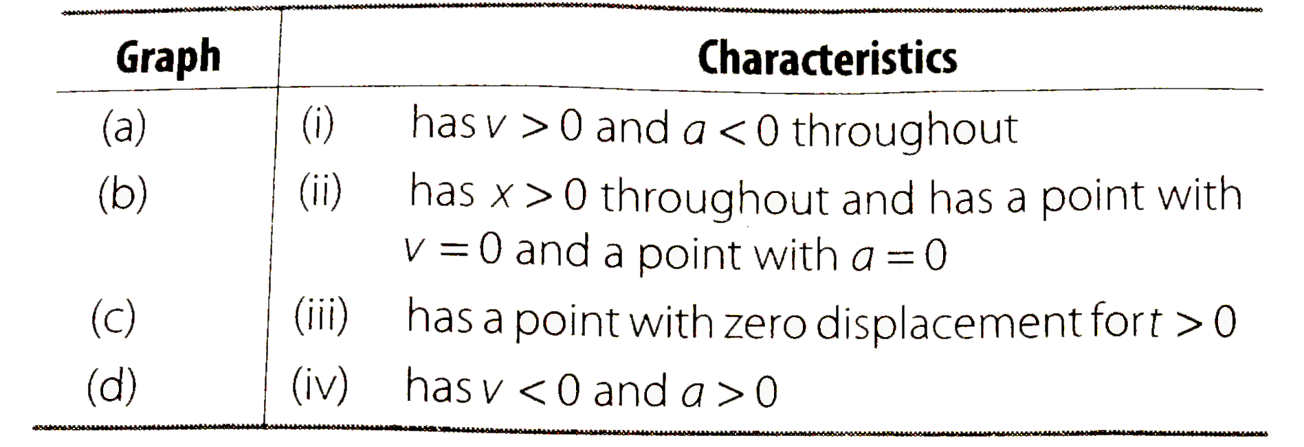
Aa straight line with positive slopeBa straight line with negative slopeCa curve with positive slopeDa curve with negativeRefer to the graph in figure. Match the following
 A
A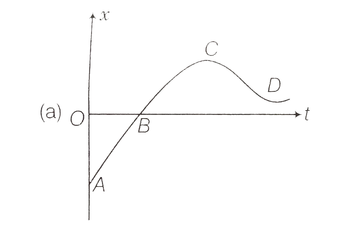 B
B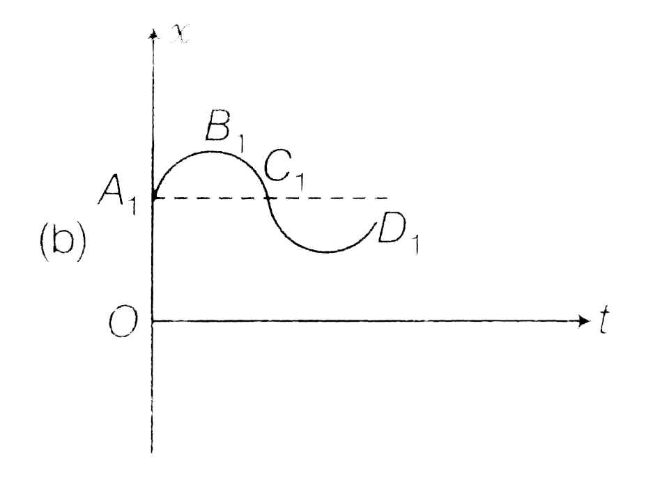 C
C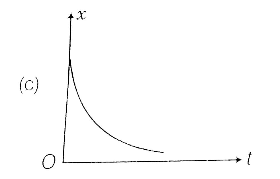 D
D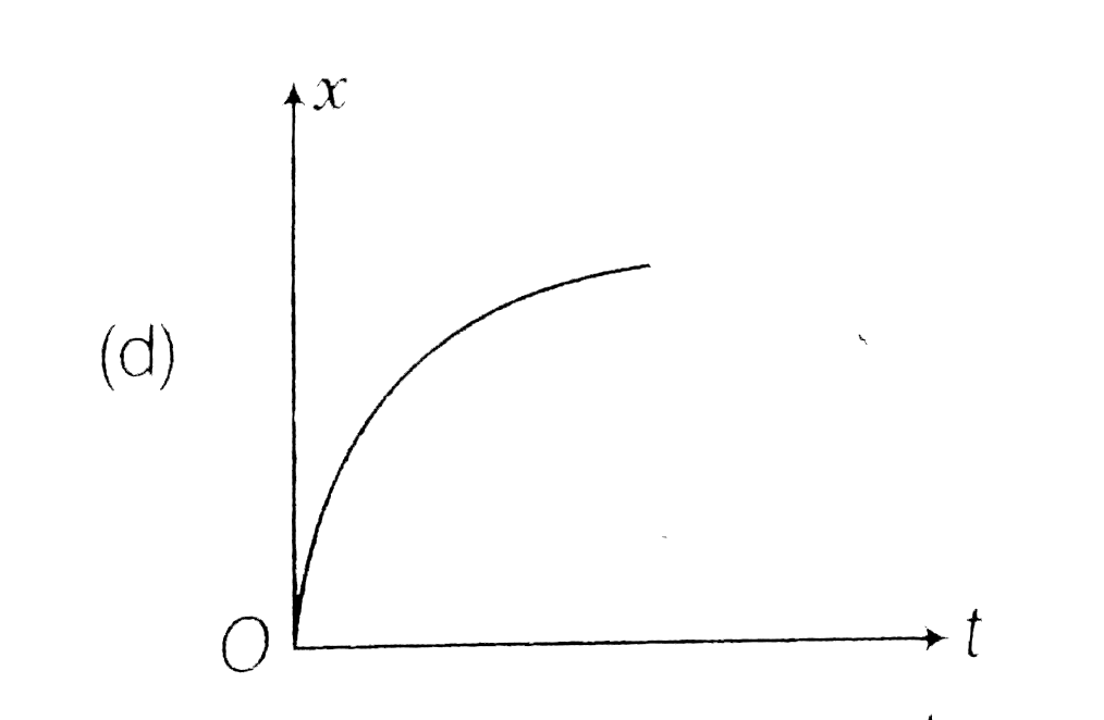
The shaded portion of figure shows the graph of which of the following ?
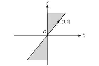 Ax(y−2x)≥0Bx(y−2x)≤0Cx(y+12x)≥0Dx(y−12x)≤0
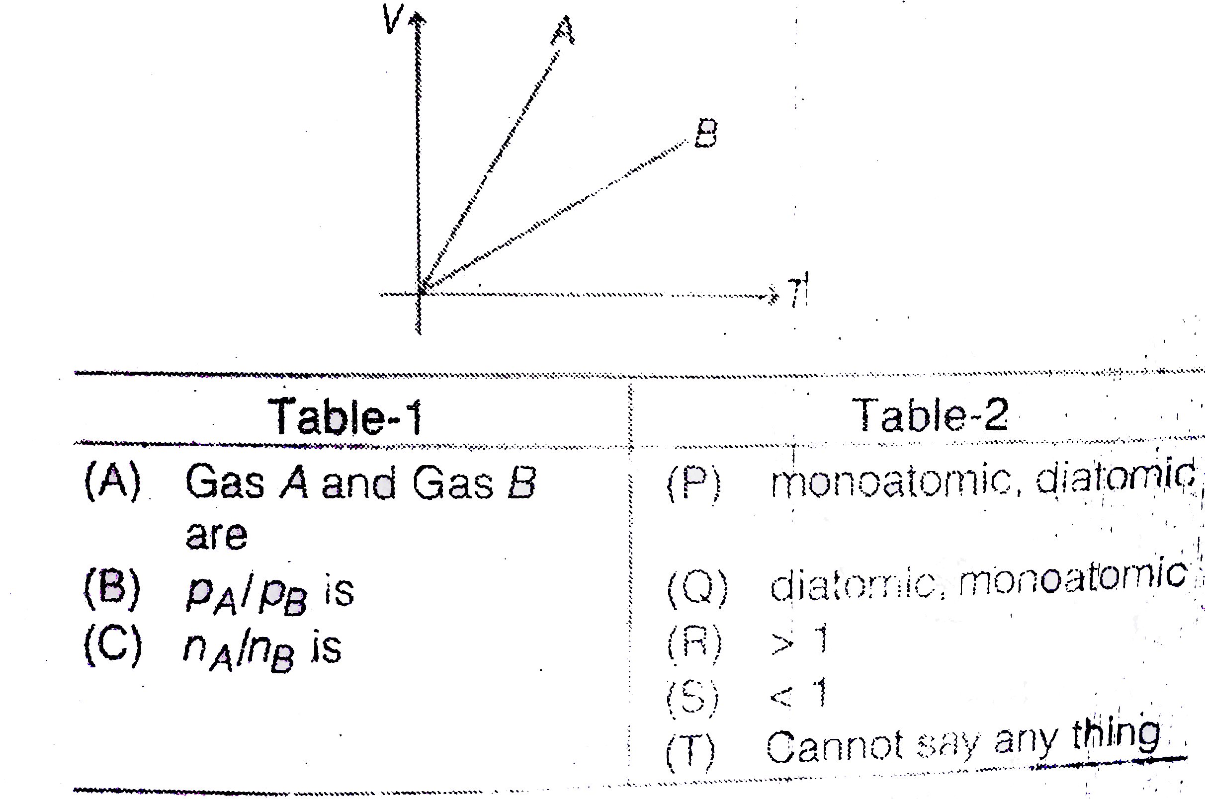
In the ρ-T graph shown in figure, match the following.
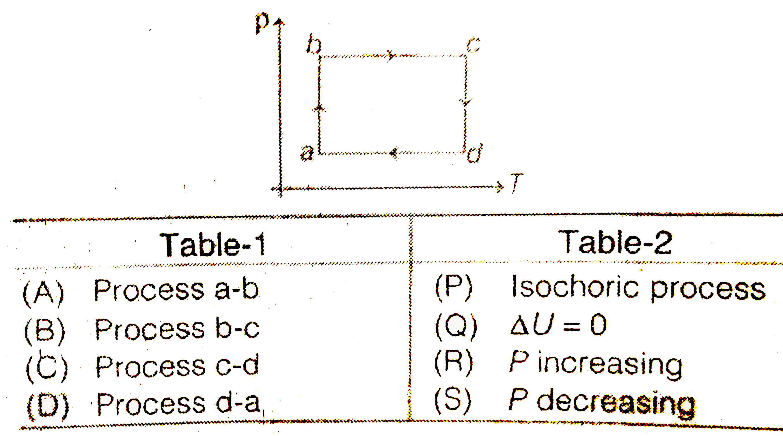
View SolutionThe distance versus time graph of a car is shown in the given figure.
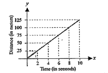
View SolutionDraw the graph showing cooling of hot water with time.
View SolutionThe displacement-time graph of two moving objects A and B are shown in the figure given below. Which of the following is incorrect?
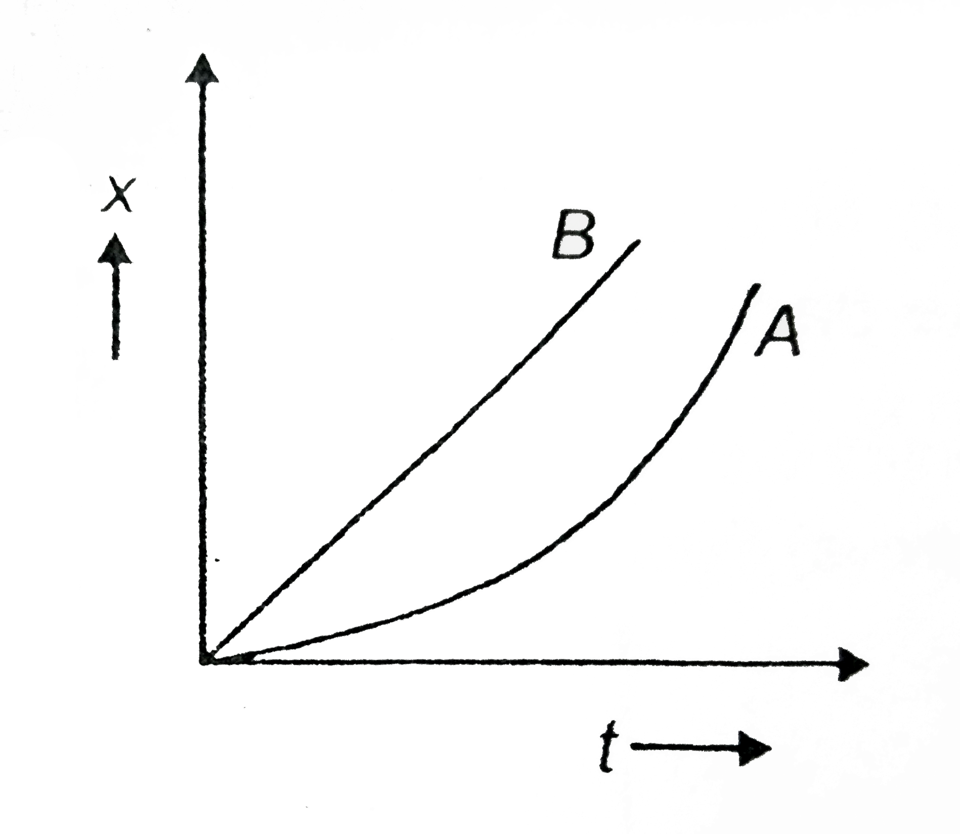
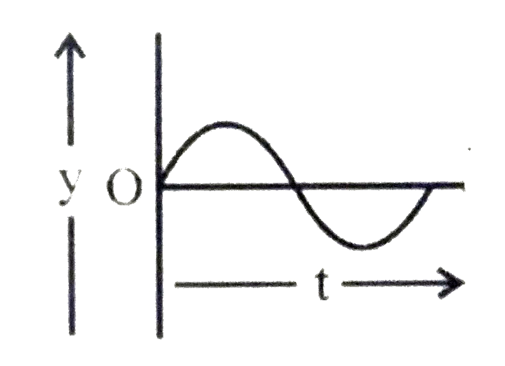
View SolutionThe current I in an inductance coil varies with time according to the graph given in the figure.
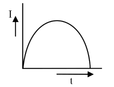
Which one of the following graphs gives the variation of voltage with time across the inductor?
View Solution

