The curve in the following diagram is the most similar to a typical ,
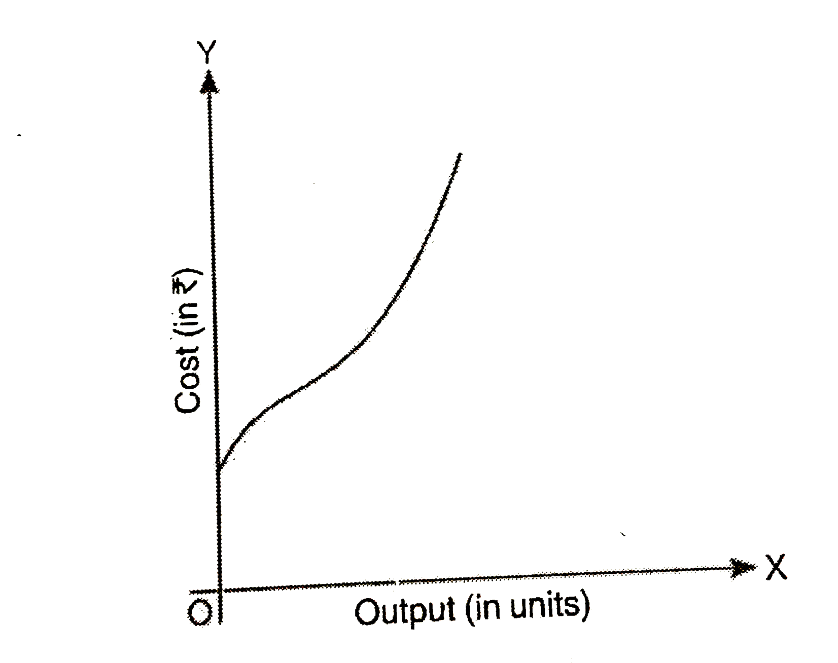
Total Variable Cost Curve
Marginal Cost Curve
Total Cost Curve
Average Variable Cost Curve
The correct Answer is:C
Step by step video, text & image solution for The curve in the following diagram is the most similar to a typical , by Economics experts to help you in doubts & scoring excellent marks in Class 11 exams.
Updated on:21/07/2023Topper's Solved these Questions
- COSTBook:SANDEEP GARGChapter:COSTExercise:Very Short Answer Type
Explore 41 Videos
- COSTBook:SANDEEP GARGChapter:COSTExercise:Short Answer
Explore 23 Videos
- COSTBook:SANDEEP GARGChapter:COSTExercise:Guidelines
Explore 12 Videos
- CONSUMER'S EQUILIBRIUMBook:SANDEEP GARGChapter:CONSUMER'S EQUILIBRIUMExercise:Revision Exercise
Explore 64 Videos
- DEMANDBook:SANDEEP GARGChapter:DEMANDExercise:Unsolved particles
Explore 4 Videos
Similar Questions
Knowledge Check
Which of the following was most similar to modern man ?
AJava manBNeanderthal manCHomo habilisDCro-Magnon ManChoose the most appropriate option.
Which of the following elements is the most chemically similar to Na?AHBMgCCDCsThe following diagram represents the demand curve of:
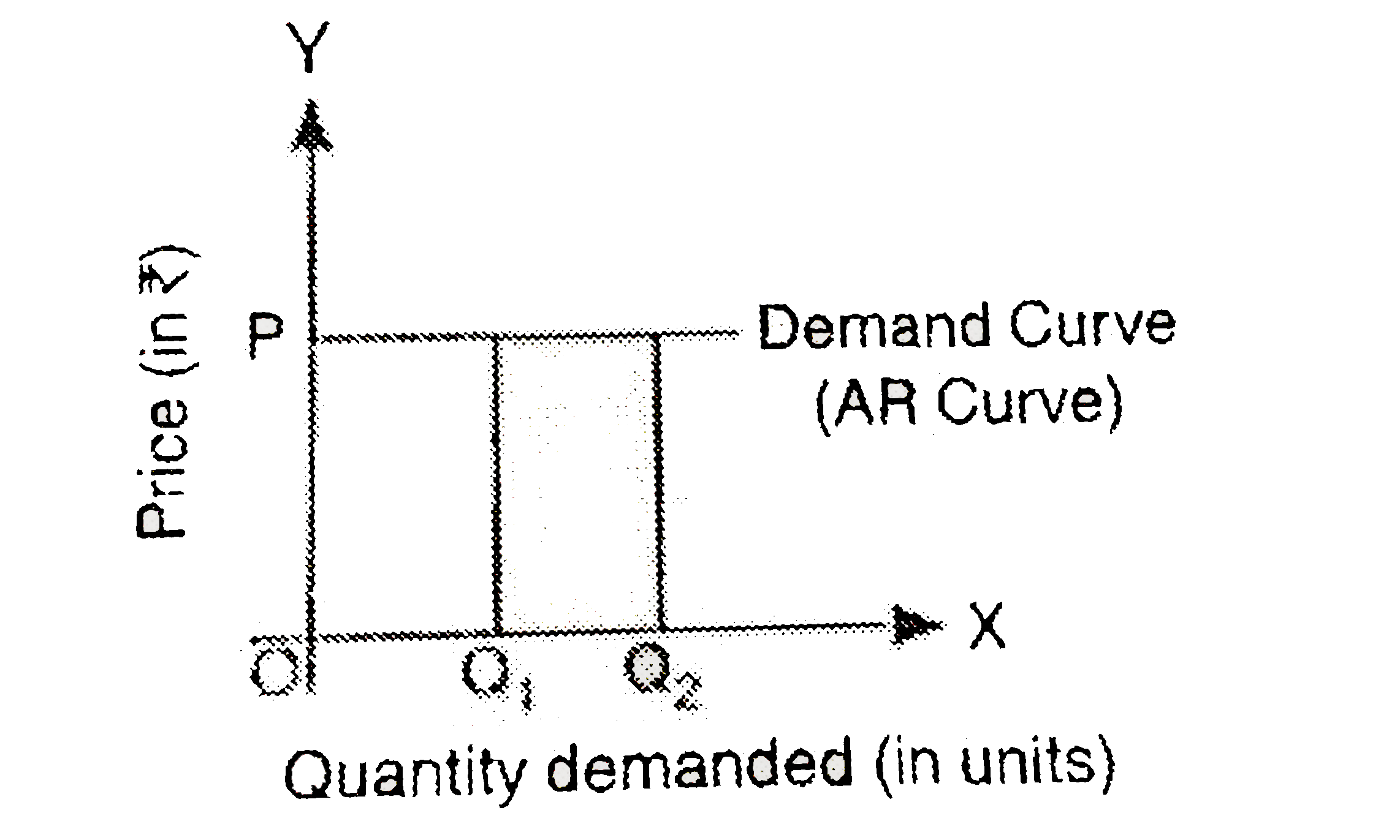 APerfect competitionBMonopolist CompetitionCMonopolyDOligopoly
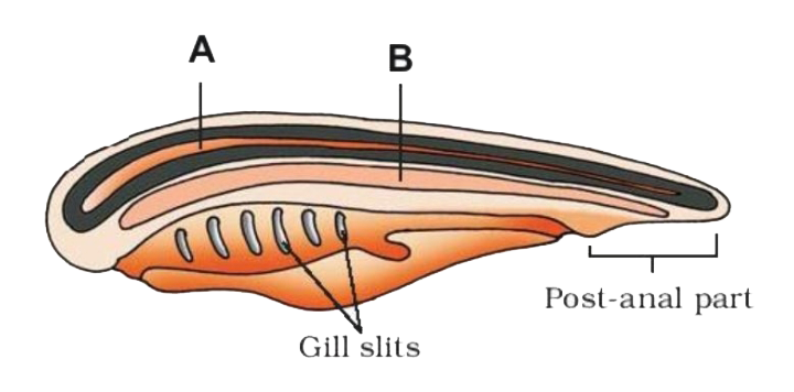
The typical body plan of a chordate is given in the following diagram. Given labellings A and B , respectively, are :
View SolutionWhich of the following is a typical element ?
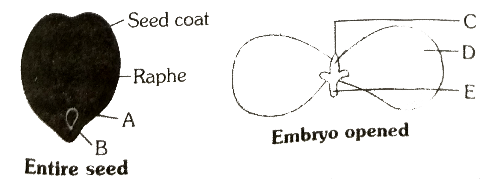
View SolutionThe following diagram is the typical structure of dicotyledonous seeds. In which one of the option all the five parts A to E are correctly identified.
View SolutionWhich of the following taxonomic ranks contain organism most similar to one another?
View SolutionWhich of the following is a typical element?
View Solution

