Arrangement Of Raw Data (i) Alphabetical order (ii) Ascending order (iii) Descending order
Primary and Secondary Data:
The data collected by an investigator herself or himself with a definite objective in her or his mind is called primary data.
When the information gathered from a source that already had the data stored, the retrieved data is called secondary data.
Raw Data
Let's consider the marks obtained in a mathematics test by ten students as given below
65 26 94 75 59 42 25 78 75 62
The data is called raw data in this form.
Range
The Data Range is called the difference between the lowest and highest values.
Range = Highest value – The lowest value
Ungrouped Frequency Distribution Table
Let’s find the marks (out of
100 marks) obtained by 30 class IX students of a school
10 20 36 93 96 40 50 56 60 70
93 89 80 70 72 70 34 40 36 40
93 40 50 50 56 60 70 60 60 89
To make the data more understandable, we write it in the table below
Marks
Number of students
(i.e., the frequency)
10
1
20
1
36
2
40
4
50
3
56
2
60
4
72
1
80
1
89
2
93
3
96
1
Total
25
This table is called a table of ungrouped frequency distribution, or only a table of the distribution of frequencies. When planning specific tables, we can use tally points.
The number of students that got a certain amount of marks is called the frequency of those marks. In the above data, four students received 60 points. So 60 mark frequency is 4.
Grouped Frequency Distribution Table
Let's take the following example of gathering data.
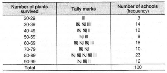
During Van Mahotsava 100 plants were planted each in 100 schools. The number of plants which survived after one month was recorded as
95 66 28 32 65 65 69 34 98 96
76 45 32 38 42 40 40 69 94 92
75 84 76 83 85 62 37 65 63 42
89 65 72 81 49 52 64 76 83 92
93 68 52 79 82 83 59 82 75 82
84 90 44 62 31 36 38 42 39 83
87 56 58 24 35 76 82 85 30 68
69 86 86 43 45 39 83 75 66 82
92 74 89 66 91 27 88 89 90 42
53 69 90 55 65 49 52 83 34 36
The above data may be condensed in a tabular form using tally marks as follows

We condense it into groups, to represent such a large amount of data. These groupings are known as classes 20-29, 30-39.
The lower class limit is considered the least number in a class, and the highest number is regarded as the upper-class limit, as, in 20-29, 20 is lower, and 29 is the upper-class limit.
The class interval is called the difference between the lower and upper-class limits.
The midpoint of a class is known as the class mark. Thus,
Class mark= Upper class limit + Lower class limit / 2
Modified Table
The upper and lower differences Limits of 2 different classes in the frequency distribution graph. Thus, we need to split the intervals such that the upper and lower limits of successive intervals are the same for this we consider the discrepancy between the upper limit of a class and the lower limit of its successor class, Add half of that difference to each of the upper limits and remove from each of the lower limits the same.
e.g., consider two consecutive classes 21-35 and 36-40.
Then, difference = 36 – 35 = 1
Half of the difference = 1 / 2 = 0.5
So, the new class interval formed from 31-35 is 30.5-35.5 and from 36-40 is 35.5-40.5.
Graphical Data Representation
There is another type of data representation, a graphical representation of data. The principal graphic images are as follows
Bar graphs: A bar graph is a pictorial representation of data in which bars of uniform width are usually drawn with the same spacing between them on one axis (say the x-axis), representing the variable. The values of the variable are displayed at the other axis (say the y-axis), and the heights of the bars depend on the variable values.
Histogram: A graphical representation of a histogram is the continuous-class clustered frequency distribution. The building phases are as follows
We represent along the x-axis the class limits and frequencies along the y-axis on a suitable scale.
Now we draw rectangles (or rectangular bars) of width equal to the size of the class and lengths of the corresponding class intervals according to the frequencies.
Since no gaps exist between consecutive rectangles, the resulting graph appears as a solid figure. It is a histogram.
Remark:
If the interval of the first class does not start from zero, then we display it on the graph by labelling a kink or a break on the axis.
The area of the erected rectangles in a histogram is proportional to the respective frequencies.
If the widths of the rectangles differ, we need to make some adjustments in the lengths of the boxes So that the frequencies are again proportional to the areas. The measures to take in this regard are as set out below
Choose an interval with a minimum size of the class.
Then, rectangle lengths are adjusted to the size corresponding to the minimum class. Those lengths are called 'Lengths proportional to the size of the minimum class.'
Note: If both histogram and polygon frequency are drawn, then drawing a histogram first, and then a polygon frequency is advisable.
Related Videos:
- Why statistics?
- Statistics in plural sense
- Presentation Of Data
- Ungrouped Data
- Frequency Distribution
Mean
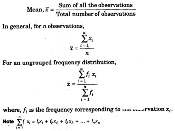
The mean (or average) observations is the sum of the values of all the observations divided by the total number of observations. Thus,

Combined mean
If the mean of n1 observations is X1 and the mean
of n2 observations is X2 then the combined mean of these observations is
x12 = x1n1 + x2n2 / n1n2
Median
The median is the number of observations given, which divides it into exactly two parts. Thus, the median is the middle-most score.
To Find Median: The data arranged in ascending first of all (or descending) order. Then, the median of the ungrouped data calculates as follows
(i) If the number of observations (n) is odd, the mean value of the observation that shall be n+1 / 2
(ii) The mean of n / 2 the observations is the median if the number of observations (n) is even.
Mode
The mode is the observation value, which most frequently occurs, i.e., the model is called an observation with the maximum frequency.
Extreme values affect the mean in the data. The absolute values present in the data don't change the median and mode.
Important Chapters:
Marks
Number of students
(i.e., the frequency)
10
1
20
1
36
2
40
4
50
3
56
2
60
4
72
1
80
1
89
2
93
3
96
1
Total
25


Similar Questions
Knowledge Check
Arrange the following in ascending order
A334>251>717B717>251>334C334>717>251D251>334>717Which of the following is I ascending order ?
A0.65,0.76,0.67,0.86B0.65,086,0.67,0.76C0.65,0.67,0.76,0.86D0.67,0.65,0.76,.0.86The hierachical arrangement of taxonomic
categories in descending order isAkingdom, phylum, class, order, family,
genus, speciesBkingdom, division, phylum, order, family,
genus, speciesCkingdom, class, phylum, order, family,
genusDdivision, kingdom, class, phylum, order,
family, genus, species
Arrange the following word in alphabetical order and find the third word?
View SolutionArrange the following rational numbers in ascending order :
View SolutionArrange the values of the following expressions in descending order
View SolutionWhich arrangement is in correct ascending order?
View SolutionArrange the given words in alphabetical order and tick one that comes first.
View Solution
