DATA HANDLING for Class 8 MATHS
INTRODUCTION
Baccho aapne apni previous classes m data handling se related kuch topics pdhe the. Humne seekha tha ki data handling basically hume tools provide krta hai jinhe use krke hum alag alag information ko efficiently collect krke, arrange krke unhe different purposes k lie use kr skte hai. We learnt how to use frequency distributions tables, pictograms/pictographs, Bar graphs and double bar graphs. We also learnt about the concept of probability and chance. In this chapter we will first revise our old topics and uske baad hum unn topics p build krke naye concepts seekhenge like histogram, pie charts or circle graphs, equally likely outcomes, etc. So let's begin!
Let's recapitulate
Baccho, previous topics ko revise krne k lie hum ek example lenge. Let's observe the following situation.
Data related to the runs scored by a batsman in the last five test matches was collected and it was notes that he scored 80 runs in the first match, 130 runs in the second match, 60 runs in the third match, 90 runs in the fourth match and 100 runs in the fifth match.
Baccho ise kehte hai Data Collection jisme aap ek research conduct krke saari important information ko note down krlete hai. But what next? Let's see how we can represent this information visually.
. Look at the following table
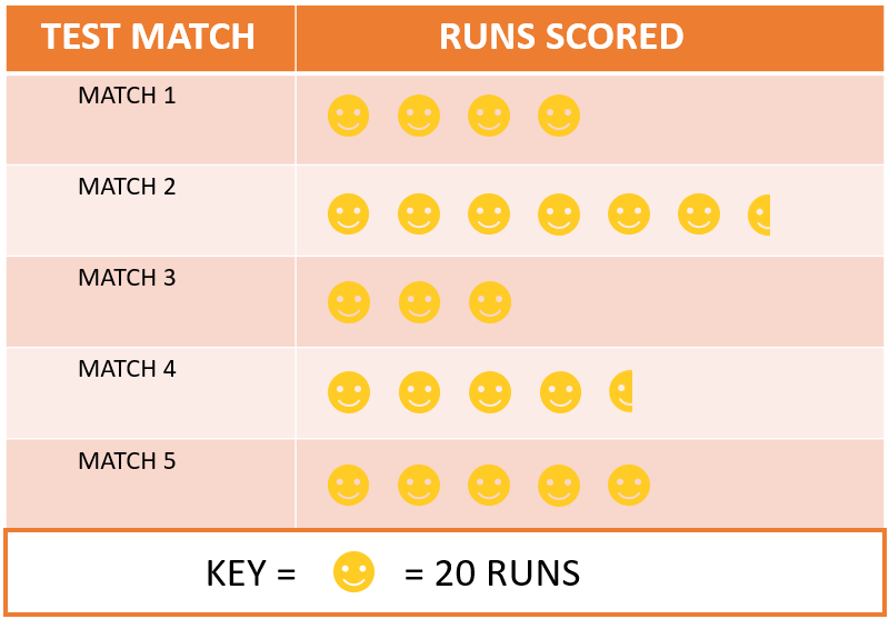
Baccho jaisa ki aap dekh skte hai iss table k through information ko pdhna, smjhna aur compare krna kitna easy hai. This is a pictograph.
Pictograph m ek symbol ek particular value ya quantity ko denote krta hai. It is a form of Data Organization
Now let's represent the above information in some other forms too.
Baccho bar graphs m hum rectangular bars ko use krte hai to denote particular values. The length of each bare denotes the quantity depending upon the scale of the graph. Aapne apni previous classes m pdha hai ki scale kaise choose kiya jaata hai. Scales ko choose krna k lie hum sabse phle apni values ko dekhte hai aur fir ek particular scale decide krte hai apne y−axis k lie.
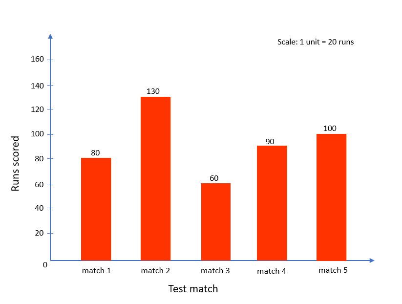
Baccho, in this bar graph we chose the scale as 1 unit=10 runs kyunki humari saari values 10 k multiples m thi islie hum iss information ko easily represent kr skte hai with this scale. x−axis p humne apne 5 test matches ko represent kia fir uske baad humne har test match ko ek rectangular bar se represent kia jiski length batsman k runs ko denote krti hai.
Note: The width of each rectangular bar remains the same.
Baccho, what if hum iss information m ek aur batsman k information add krde aur hume unn dono ki performances ko simultaneously compare krna ho? For such cases we use double bar graphs.
Look at the following information:
A batsman scored the following runs:80 runs in the first match, 130 runs in the second match, 60 runs in the third match, 90 runs in the fourth match and 100 runs in the fifth match.
Another batsman scored 60 runs in the first match, 120 runs in the second match, 90 runs in the third match, 100 runs in the fourth match and 80 runs in the fifth match.
Represent the above information to establish comparison between the two batsmen.
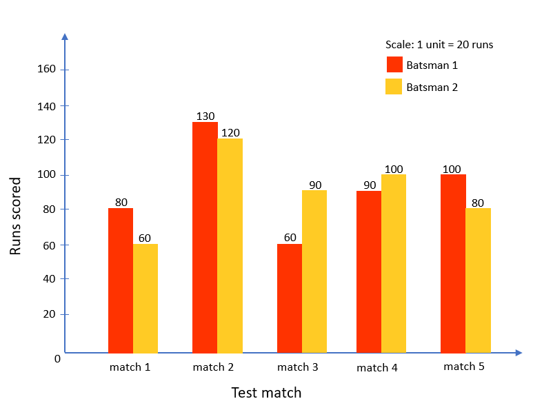
Baccho, jaisa ki aap dekh skte hai double bar graph ka concept ek simple bar graph k uppr hi based hota hai. In a double bar graph we simultaneously represent the two different data using two rectangular bars side by side.
Example 1
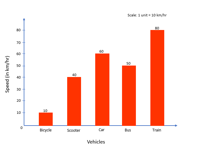
The approximate speeds of some objects are given below. Draw a bar graph to represent them.

Example 2
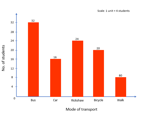
Hundred students from a certain locality use different modes of travelling to school as given below. Draw a bar graph.

Example 3
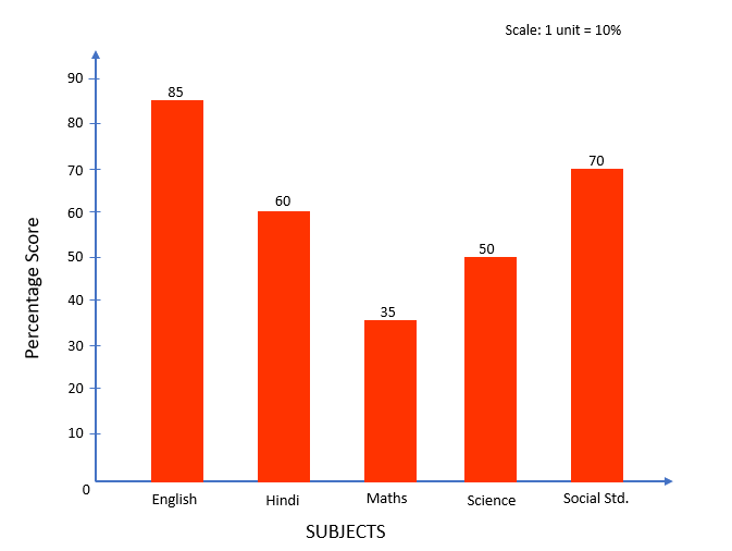
The percentage of marks obtained, in different subjects by Ashok Sharma (in an examination) are given below. Draw a bar graph to represent it.

ORGANISING DATA
When we collect data, it's usually in a very unorganised form, from which not much can be understood. This is called raw data. To draw meaningful
results, we need to organise the data systematically. For example, a group of students
was asked for their favorite subject. The results were as listed below:
Art, Mathematics, Science, English, Mathematics, Art, English, Mathematics, English,
Art, Science, Art, Science, Science, Mathematics, Art, English, Art, Science, Mathematics,
Science, Art.
Which is the most liked subject and the one least liked?
It is not easy to answer the question looking at the choices written in a unorganised form. We
arrange the data in a table using tally marks. This is called a frequency distribution table.

The number of tallies before each subject gives the number of students who like that
particular subject.
This is known as the frequency of that subject.
Frequency gives the number of times that a particular entry occurs.
Baccho, frequency ka basically mtlb hota h ki koi ek cheez kitne baari occur krrhi hai. Iss table k use krke hum apne data ko simplify krlete hai taaki usse better information derive ho ske. Iss pure process ko kehte hai organisation of data and it's the second step after collection of data
GROUPING DATA
Baccho imagine kijiye ki aapko ek frequency distribution table bnani hai for the marks obtained by your 60 classmates in a math test. Itne large data ko organize krne k lie hum apne data ko class intervals m divide krlete hai. Isko kehte hai grouping of data
Consider
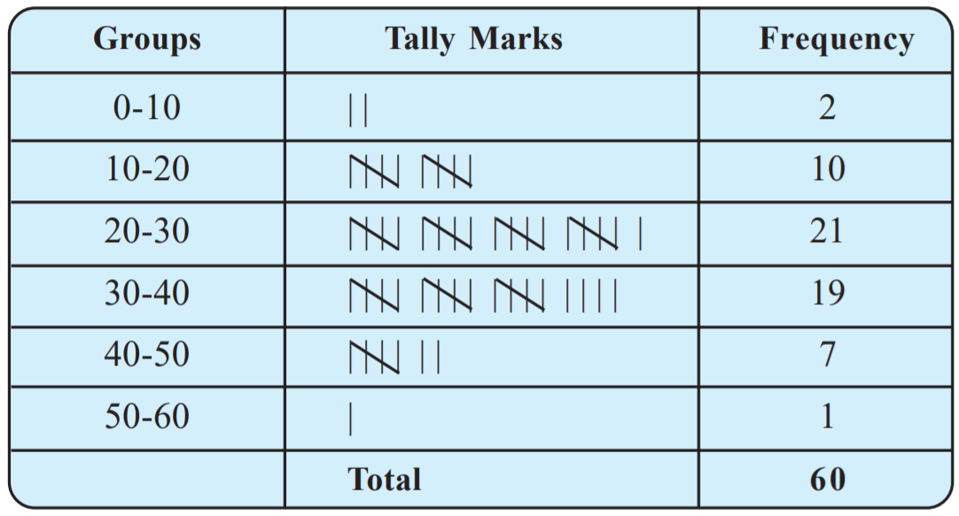
the following marks (out of 50) obtained in mathematics by your 60 classmates :
21,10,30,22,33,5,37,12,25,42,15,39,26,32,18,27,28,19,29,35,31,24,36,18,20,38,22,44,16,24,10,27,39,28,49,29,32,23,31,21,34,22,23,36,24,36,33,47,48,50,39,20,7,16,36,45,47,30,22,17
If we make a frequency distribution table for each observation, then the table would
be too long, so, for convenience, we make groups of observations say, 0−10, 10−20 and
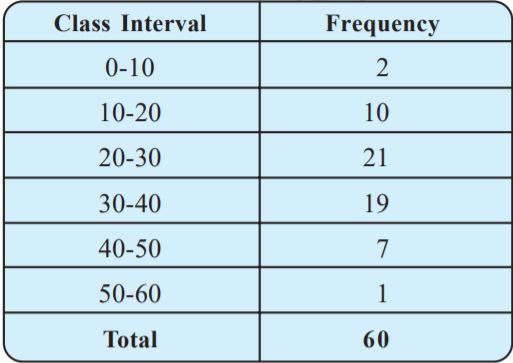
so on, and obtain a frequency distribution of the number of observations falling in each group. Thus, the frequency distribution table for the above data can be:
Data presented in this manner is said to be grouped and the distribution obtained is called
grouped frequency distribution. It helps us to draw meaningful inferences like –
(1) Most of the students have scored between 20 and 40.
(2) Eight students have scored more than 40 marks out of 50 and so on.
Each of the groups 0−10, 10−20, 20−30, etc., is called a Class Interval (or briefly
a class).
Observe that 10 occurs in both the classes, i.e., 0−10 as well as 10−20. Similarly, 20
occurs in classes 10−20 and 20−30. But it is not possible that an observation (say 10 or 20)
can belong simultaneously to two classes. In the class interval 10−20, 10 is the lower limit and 20 is the upper limit.The value equal to the upper limit is NOT included in that class interval. It is included in the next higher class interval. For example, here in the case of 20, it is not included in the class interval 10−20, it is included in the class interval 20−30.
Class width or size = upper limit - lower limit
∴ In this case, class width =20−10=10
Example 4
If the lower and the upper limits of a class interval are 7.5 and 12.5, the class interval is ..............
Class width = Upper limit − lower limit
⇒ 12.5−7.5
⇒5
Example 5
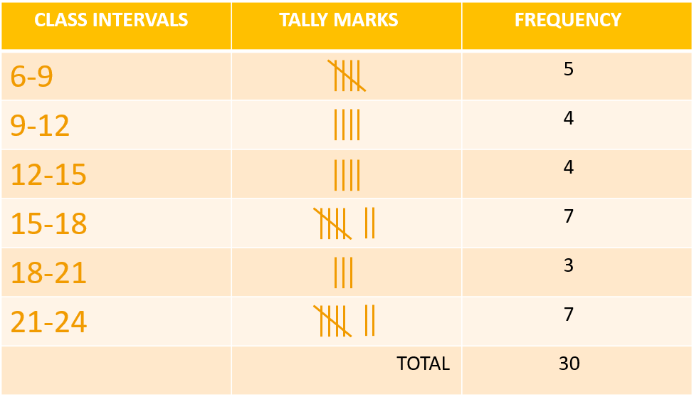
Construct a frequency table for the following ages (in years) of 30 students using equal class intervals, one of them being 9−12, where 12 is not included.
18,12,7,6,11,15,21,9,8,13,15,17,22,19,14,21,23,8,12,17,15,6,18,23,22,16,9,21,11,16.
HISTOGRAM
Baccho humne dekha ki hum simple frequency table ko bar graph k through represent kr skte hai but what if we have to represent a data with class intervals graphically? For this we use histograms.
Histogram ek tarah ka bar diagram hota hai jisme x−axis p class intervals ko represent kia jaata hai and y−axis p unki frequencies ko.
Let's take an example and see how we can make a histogram to represent it:
Histogram:
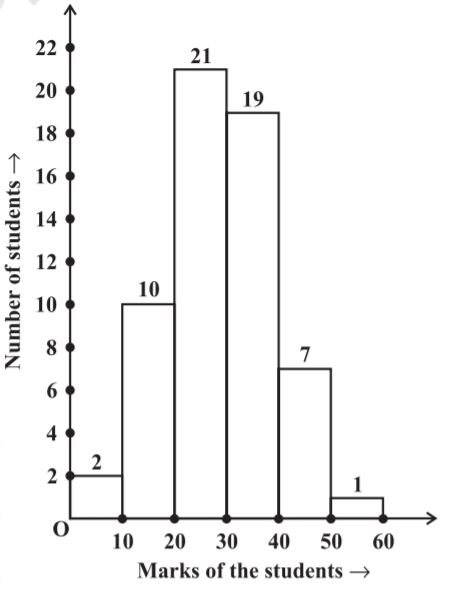
Observations:
Note: Baccho, maanlo ki aapka data 0 se start nahi horha, ki aapke paas 0−10 ya 0−20 jaise intervals ka koi data nahi hai, to aap kaise represent krenge? Iske lie hum kink ka use krte hai. Kink basically ek jagged line hoti hai jo hum x−axis p mark krte hai before our rectangular bars start. Look at the following histogram to understand better.
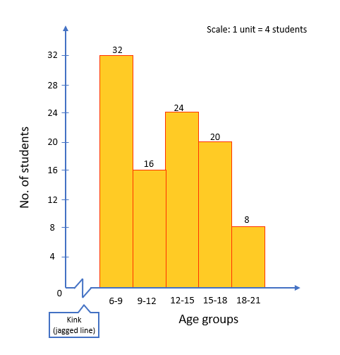
As the class interval does not start from zero, so we will put a jagged line which shows that there is no number between 0–6.
Example 6
The following table gives the marks scored by 100
students in an entrance examination.
Represent this data in the form of a histogram.
| Marks | No. of Students (Frequency) |
|---|---|
| 0−10 | 4 |
| 10−20 | 10 |
| 20−30 | 16 |
| 30−40 | 22 |
| 40−50 | 20 |
| 50−60 | 18 |
| 60−70 | 8 |
| 70−80 | 2 |