DATA HANDLING for Class 6 MATHS
INTRODUCTION
Baccho, aapne apni previous classes m seekha tha ki data ko pictoral form m kaise represent kia jaata hai Hum humari daily life m aisi situations face krte hai where we deal with a lot of information and it gets difficult to understand all that information. For example look at the following examples of data that we deal in our daily life.
SCORES IN A CRICKET MATCH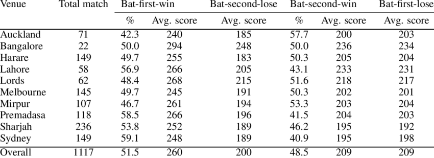
ATTENDENCE REPORT OF A CLASS
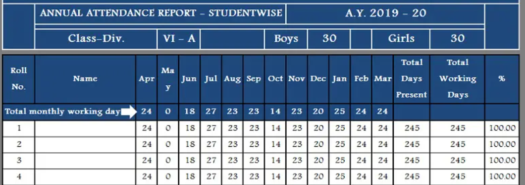
Iss problem se deal krne k lie hum data collect krke use simplified form m represent krte hai taaki hume jo information chahie vo hum quickly and easily smjh ske. Iss chapter m hum data ko efficiently use krna seekhenge. We will cover different topics like recording and organising data, pictographs and their interpretation, bar graphs and their interpretation. So let's begin!
Recording Data
Baccho let's imagine a scenario to understand this topic. Suppose ki aap apni class k saath ek picnic p jaa rhe hai aur aapko sabko choice di gyi hai ki konse fkavour ki ice-cream aap khaana chaahenge waha par. Iss information ko collect krne k lie, teacher n aap sabhi ka naam likh lia aur uske saamne icecream flavours k naam likh liye, like in the table given below:
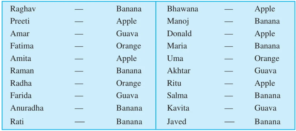
Ab agar m aapse puchu ki ki kitne baccho ko apple flavoured ice-cream chahie, to aapko ek ek karke count krna pdega which is time-consuming. To avoid such waste of time and energy, we record data by using frequencies as a tool. Frequency ka matlab hota hai ki ek cheez kitne number of times appear horhi hai. Let's learn how to organize the collected data in a smart way.
Organisation of Data
Let's see how we can organize the data derived from above situation in a way which makes it easier for us to quickly understand and interpret it. Look at the following table and observe that how instead of writing down the names of all the students, only the flavors of ice-creams have been noted down and for every student there's a tick mark infront of that flavor of icecream.

This method of organizing data helps us to quickly count the number of flavours of ice-creams and the number of students who want these flavours in a respective order.
To organize data in a similar manner, we prepare Frequency distribution tables in which we use tally marks to represent the number of times an observation is appearing in a given data.
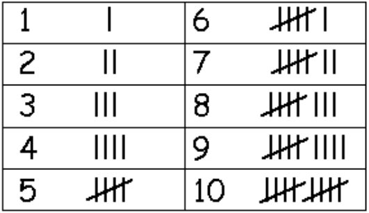
Example:
There are 30 students in a class. They have to choose one sport each for the sports period. 5 took badminton, 10 took cricket, 4 took football, 1 took hockey, 3 took tennis and 7 went for volleyball. Represent this data in the frequency distribution table.
Solution:
To make a frequency distribution table-

Example 1
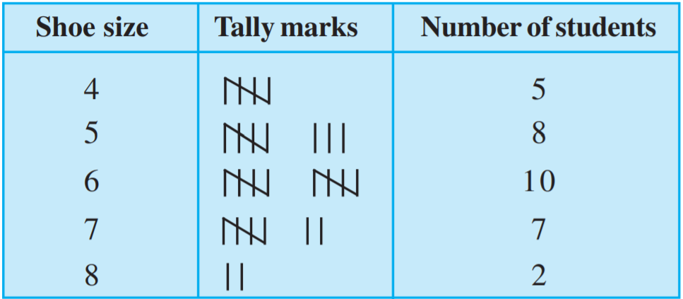
Ekta is asked to collect data for size of shoes of students in her Class VI. Her finding are recorded in the manner shown below

Javed wanted to know
(i) the size of shoes worn by the maximum number of
students.
(ii) the size of shoes worn by the minimum number of students. Can
you find this information?
Pictograph
A pictograph is a representation of data using different images or symbols." Pictographs in maths typically find application in concepts like data handling. They help in laying the foundation for the interpretation of data based on pictorial information.
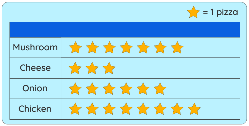
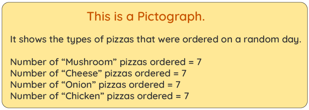
For example, the pictograph given below depicts the data of the different types of pizzas that were ordered on a random day.
Interpretation of a Pictograph
Pictograph is one of the easiest form of data representation to interpret. Let's look at an example and interpret it.
The number of strawberries eaten by various people is shown below.
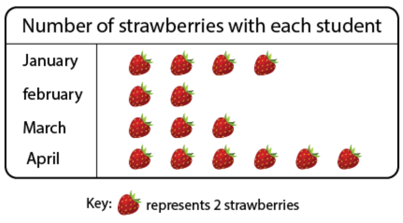
Question. Find the number of apples eaten by Margaret, Susan, Maria and Dorothy.
Solution: Here each symbol of strawberry represents two strawberries.
⇒ Margaret ate 8 strawberries
⇒ Susan ate 4 strawberries
⇒Maria ate 2 strawberries
⇒Dorothy ate 12 strawberries.
So, the total number of strawberries eaten by all the four is 30.
Example 2
A survey was carried out on 30 students of class VI in a school. Data about the different modes of transport used by them to travel to school was displayed as pictograph. What can you conclude from the pictograph?
What can you conclude from the pictograph?
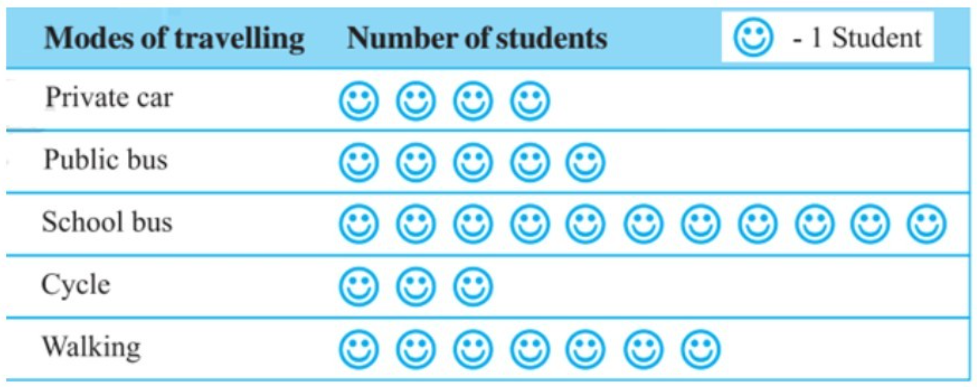
From the pictograph we find that:
(a) The number of students coming by private car is 4.
(b) Maximum number of students use the school bus. This is the most
popular way.
(c) Cycle is used by only three students.
(d) The number of students using the other modes can be similarly found.
Example 3
Following is the pictograph of the number of wrist watches manufactured by a factory in a particular week.
(i) On which day were least number of wrist watches manufactured?
(ii) On which day were maximum number of wrist watches manufactured?
(iii) Find out the appropriate number of wrist watches manufactured in this particular week?
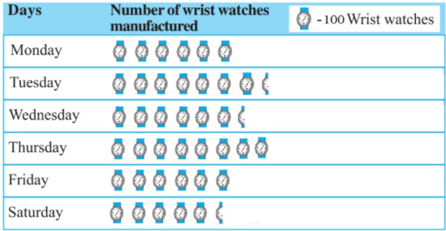
a) saturday
b) thursday
c)3950.
Drawing a Pictograph
In mathematics, a pictograph, also known as a pictogram, is the pictorial representation of data using images, icons, or symbols. We can represent the frequency of data while using symbols or images that are relevant using a pictograph. Pictographs are one of the simplest ways of representing data.
bb"
How to Make a Pictograph"
Let us take an example. We will represent the average hours spent by students on different activities.
The following table gives this data:
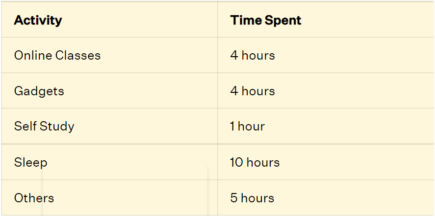
The below-given steps can be followed to represent the data given in the table in the form of a pictograph.

Advantages of Pictograph
Pictographs are widely used in maths. There are several advantages to using pictographs in maths. These are some of the advantages.
1.They can be used primarily for making early learners associate objects with numbers.
2.They help in visually formatting statistics.
3.They make data visually interesting and easy to understand.
4.Representing data pictographic way can be useful for representing a large amount of data
Example 4
The following are the number of electric bulbs purchased for a lodging house during the first four months of a year:
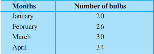
Represent the details by a pictograph.
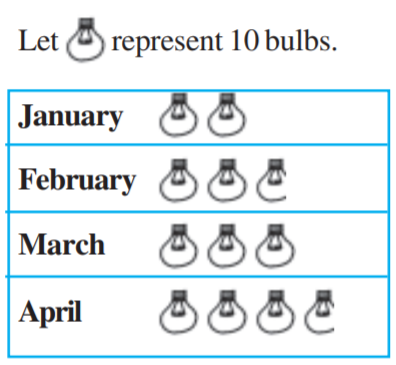
Picturising for January and March is
not difficult. But representing 26 and 34 with the
pictures is not easy.
We may round off 26 to nearest 5 i.e. to 25
and 34 to 35. We then show two and a half bulbs
for February and three and a half for April.
Bar Graph
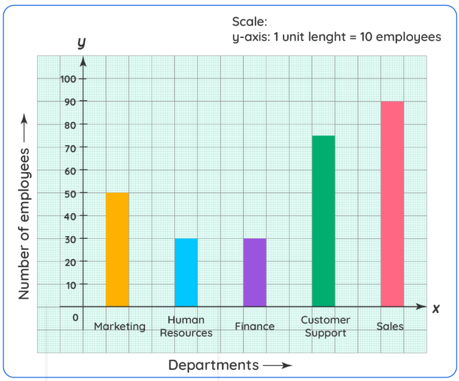
Baccho abhi humne data representation k ek type k baare m pdha i.e pictographs, ab hum ek dusre form of representation k baare m pdhenge jise kehte hai bar graphs.The bar graph is a specific way of data representation using rectangular bars, where the length of each bar is proportional to the value the bar represents. Bar graphs, also referred to as are the pictorial representation of grouped data. Bar graphs are one of the examples of data handling that are an excellent tool when representing data that are independent of one another and don’t need to be in any specific order while being represented.
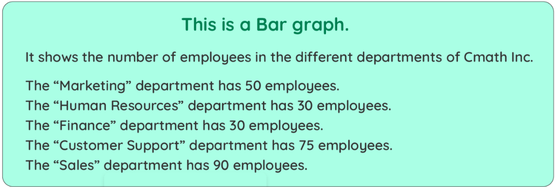
For example, the bar graph given below depicts the data of the number of employees in the different departments of Cmath Inc.
Interpretation of a bar graph
We learn how to interpret pictographs, in a similar way, we also interpret bar graphs. Let's understand this with an example. Given below are the marks scored by students in mathematics.
Calculate the sum of marks scored by A and C.
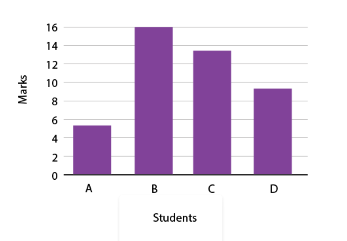

Sum of marks scored by A and C=8+9=17
∴ The required sum is 17.
Collection of numbers gathered together to give some valuable information is called data. Pictograph shows numerical information by making use of icons or picture symbols to represent data sets. Pictograph can also be defined as a visual presentation of data using symbols, pictures, icons, etc.
Uses of Bar Graph
A bar graph is mostly used in mathematics and statistics. Some of the uses of the bar graph are as follows:
1.The comparisons between different variables are easy and convenient.
2.It is the easiest diagram to prepare and does not require too much effort.
It is the most widely used method of data representation. Therefore, it is used by various industries.
3.It is used to compare data sets. Data sets are independent of one another.
4.It helps in studying patterns over long periods of time.
Drawing a bar graph
Baccho, humne abhi uppr do sections m seekha ki bar graphs kya hote hai aur unhe kaise interpret kia jaata hai. Ab hum seekhenge ki inn bar graphs ko kaise bnaya jaata hai.
Let us understand how to draw a bar graph with help of an example. Liza went to the market for buying different types of fruits in different quantities of each−5 apples, 3 mangoes, 2 watermelons, 3 strawberries, 6 oranges.
She wants to display the data by making a bar graph so that she can visually understand which type of fruits she buys the most.
Let us use the following steps to make a bar graph of the most bought fruit.
While drawing a bar graph it is very important to mention four things - labels on axes, title, scale, and name of the axes.
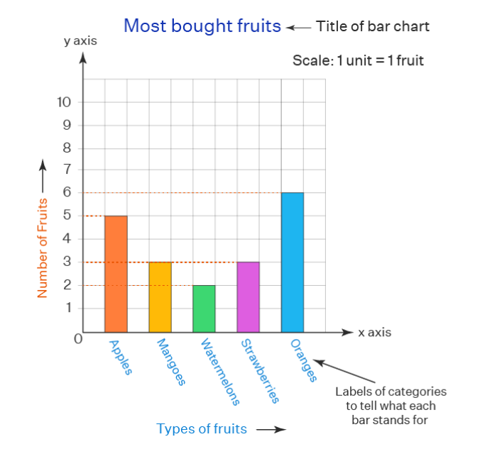
From the above graph, we can easily say that orange is the most bought fruit that Liza buys.
Example 5
Following table shows the monthly expenditure of Imran’s familyon various items.
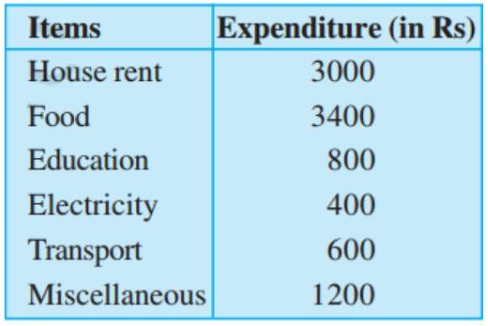
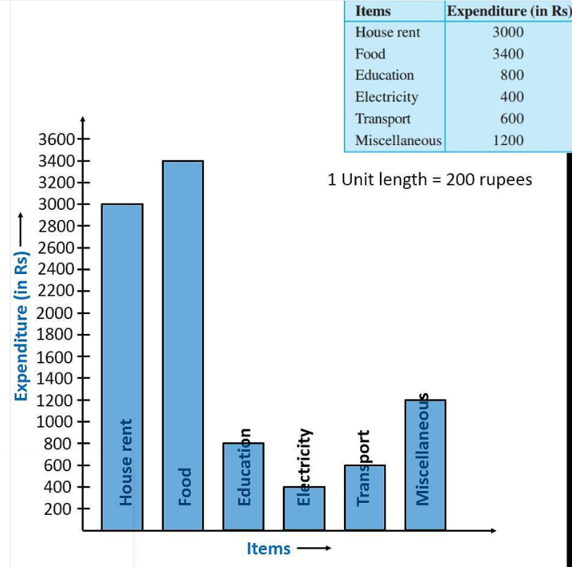
To represent this data in the form of a bar diagram, here are the steps.
(a) Draw two perpendicular lines, one vertical and one horizontal.
(b) Along the horizontal line, mark the ‘items’ and along the vertical line, mark
the corresponding expenditure.
(c) Take bars of same width keeping uniform gap between them.
(d) Choose suitable scale along the vertical line. Let 1 unit length =Rs.200 and
then mark the corresponding values.
Calculate the heights of the bars for various items as shown below.
House rent :3000÷200=15units
Food :3400÷200=17units
Education :800÷200=4units
Electricity :400÷200=2units
Transport :600÷200=3units
Miscellaneous :1200÷200=6units
SUMMARY
1. We have seen that data is a collection of numbers gathered to give some information.
2. To get a particular information from the given data quickly, the data can be arranged
in a tabular form using tally marks.
3. We learnt how a pictograph represents data in the form of pictures, objects or parts
of objects. We have also seen how to interpret a pictograph and answer the related
questions. We have drawn pictographs using symbols to represent a certain number
of items or things.
4. We have discussed how to represent data by using a bar diagram or a bar graph. In
a bar graph, bars of uniform width are drawn horizontally or vertically with equal
spacing between them. The length of each bar gives the required information.
5. To do this we also discussed the process of choosing a scale for the graph.
For example, 1 unit =100 students. We have also practised reading a given bar
graph. We have seen how interpretations from the same can be made.
Let's Revise
1. Baccho iss chapter m humne seekha ki hum kisi given data ko kaise record, organize aur represent kr skte hai taaki hum use quickly interpret kr ske.
2. Data ko efficiently record aur organize krne k lie hum frequency distribution tables ko use krte hai in which we use tally marks to denote the frequncies.
3. Hum frequency distribution table ko use krke pictographs bna skte hai.
4. Pictographs basically ek visual form of data representation hota hai jisme hum icons ya symbols ko use krke data ko represent krte hai.
5. We also learnt how to interpret pictographs in order to find out specific information about the data.
6. Bar graphs are also a great tool of data representation. Bar graphs m hum rectangular bars use krte hai jinme hum given data ko rectangles/bars se represent krte hai of different lengths. The various lengths correspond with the frequencies of the table.
7. baccho, humne fir seekha ki hum b ar graphs ko kaise interpret krte hai aur kaise bnate hai.
8. Hum apni daily life m bohot si heavy information ya data se deal krte hai. To help us in these salutations, we learnt some tools of data representation in this chapter.