Complete Solutions to EXERCISE 15.1 of chapter INTRODUCTION TO GRAPHS of Class 8 book with complete answers and questions
| Class 8 | MATHS |
| Chapter | INTRODUCTION TO GRAPHS |
| NAND LAL PUBLICATION | EXERCISE 15.1 |
| Number Of Questions | 30 |
| Academic Year | 2023-24 |
The following graph shows the tempreature of a patient in a hospital,recorded every hour.
What was the patient's temperature at 1p.m.?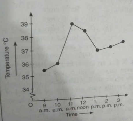 01:28View Solution
When was the patient's temperature `38.5^(@)C` ?
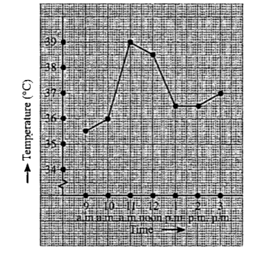 01:14View Solution
The following graph shows the tempreature of a patient in a hospital,recorded every hour.
When was the patient's temperature was the same two times during the period is given.What were these two times? 00:45View Solution
The following graph shows the tempreature of a patient in a hospital,recorded every hour.
What was the temperature at 1.30 pm. ?How did you arrive at your answer ? 04:39View Solution
The following graph shows the temperature of a patient in a hospital,recorded every hour.
During which periods did the patient's temperature showed an upward trend? 01:15View Solution
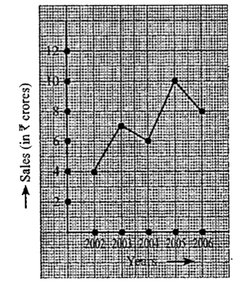
The following line graph shows the yearly sales figures for a manufacturing company: What were the sales in (i) 2002 (ii) 2006?
 01:31View Solution
The following line graph shows the yearly sales figures for a manufacturing company: What were the sales in (i) 2002 (ii) 2006?
 01:31View Solution
Compute the difference between the sales in 2002 and 2006 .
 01:42View Solution
The following line graph shows the yearly sales figures for a manufacturing company: In which year was there the greatest difference between the sales as compared to its previous year?
 02:41View Solution
For an experiment in Botany, two different plants, plant A and plant B were grown under similar laboratory conditions. Their heights were measured at the end of each week for 3 weeks. The results are shown by the following graph.
 How high was Plant A after (i) 2 weeks (ii) 3 weeks?01:54View Solution
For an experiment in Botany, two different plants, plant A and plant B were grown under similar laboratory conditions. Their heights were measured at the end of each week for 3 weeks. The results are shown by the following graph.
 How high was Plant A after (i) 2 weeks (ii) 3 weeks?01:54View Solution
For an experiment in Botany , two different plants , plant A and plant B were grown under similar laboratory conditions . Their heights were measured at the end of each weak for 3 weeks .The results are shown by the following graph :
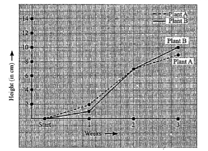
How much did Plant A grow during the 3rd week ?03:10View SolutionFor an experiment in Botany, two different plants, plant A and plant B were grown under similar laboratory conditions. Their heights were measured at the end of each week for 3 weeks. The results are shown by the following graph.
 How high was Plant A after (i) 2 weeks (ii) 3 weeks?01:54View Solution
For an experiment in Botany, two different plants, plant A and plant B were grown under similar laboratory conditions. Their heights were measured at the end of each week for 3 weeks. The results are shown by the following graph.
 How high was Plant A after (i) 2 weeks (ii) 3 weeks?01:54View Solution
For an experiment in Botany, two different plants, plant A and plant B were grown under similar laboratory conditions. Their heights were measured at the end of each week for 3 weeks. The results are shown by the following graph.
 How high was Plant A after (i) 2 weeks (ii) 3 weeks?01:54View Solution
For an experiment in Botany , two different plants , plant A and plant B were grown under similar laboratory conditions . Their heights were measured at the end of each weak for 3 weeks .The results are shown by the following graph :
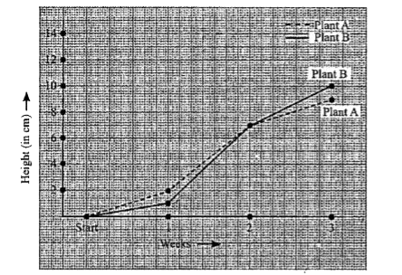
Were the two plants of the same height during any week shown here ? Specify .02:16View SolutionThe following graph whose temperature forecast and the actual temperature for each day of a week.
On which days was the forecast temperature the same as the actual temperature ? 01:03View Solution
The following graph whos the temperature forecast and the actual temperature forecast and the actual temperature for eachday of a week.
What was the maximum forecaast temperature during th week?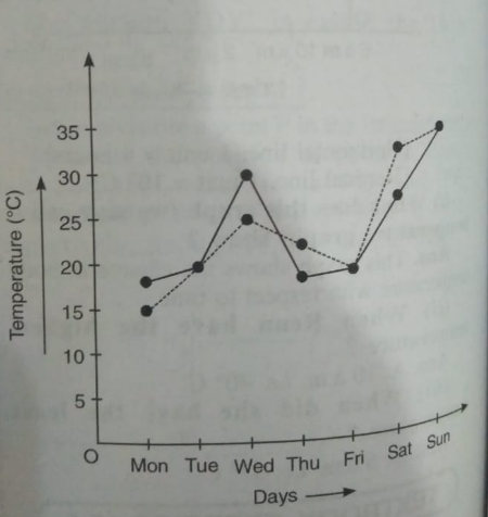 02:37View Solution
The following graph whos the temperature forecast and the actual temperature forecast and the actual temperature for eachday of a week.
What was the minimum actual temperature during the week? 03:11View Solution
On which day did the actual temperature differ the most from the forecast temperature ?
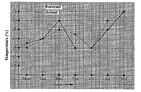 03:50View Solution
Use the tables below to draw linear graphs .
The number of days a hill side city received snow in different years .
 02:28View Solution
Draw the graph of Population (in thousands) of men and women in a village in different years .
 02:59View Solution
A courier -person cycles from a town to a neighbouring subrban area to deliver a parcel to a merchant .His distance from the town at different times is shown by the following graph:
Did the person stop on his way ?Explain.01:26View SolutionA courier -person cycles from a town to a neighbouring suburban area to deliver a parcel to a merchant .His distance from the town at different times is shown by the following graph:
How much time did the person taken for the travel ?00:59View SolutionA courier -person cycles from a town to a neighbouring suburban area to deliver a parcel to a merchant .His distance from the town at different times is shown by the following graph:
How for is the place of the merchant from the town ?00:42View SolutionA courier -person cycles from a town to a neighbouring subrban area to deliver a parcel to a merchant .His distance from the town at different times is shown by the following graph:
Did the person stop on his way ?Explain.01:26View SolutionDuring which period did he ride fastest ?
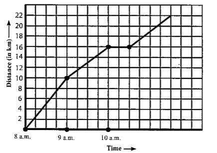 03:27View Solution
Can there be a time temperature graph as fallows ? Justify your answer .
(i)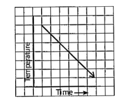 01:27View Solution
Can there be a time temperature graph as fallows ? Justify your answer .
(i)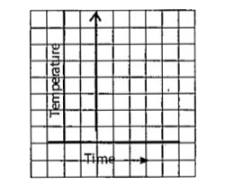 01:56View Solution
Can there be a time temperature graph as fallows ? Justify your answer .
(i)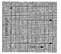 01:59View Solution
EXERCISE 15.1 questions and complete solutions for chapter INTRODUCTION TO GRAPHS of NAND LAL PUBLICATION of Class 8
