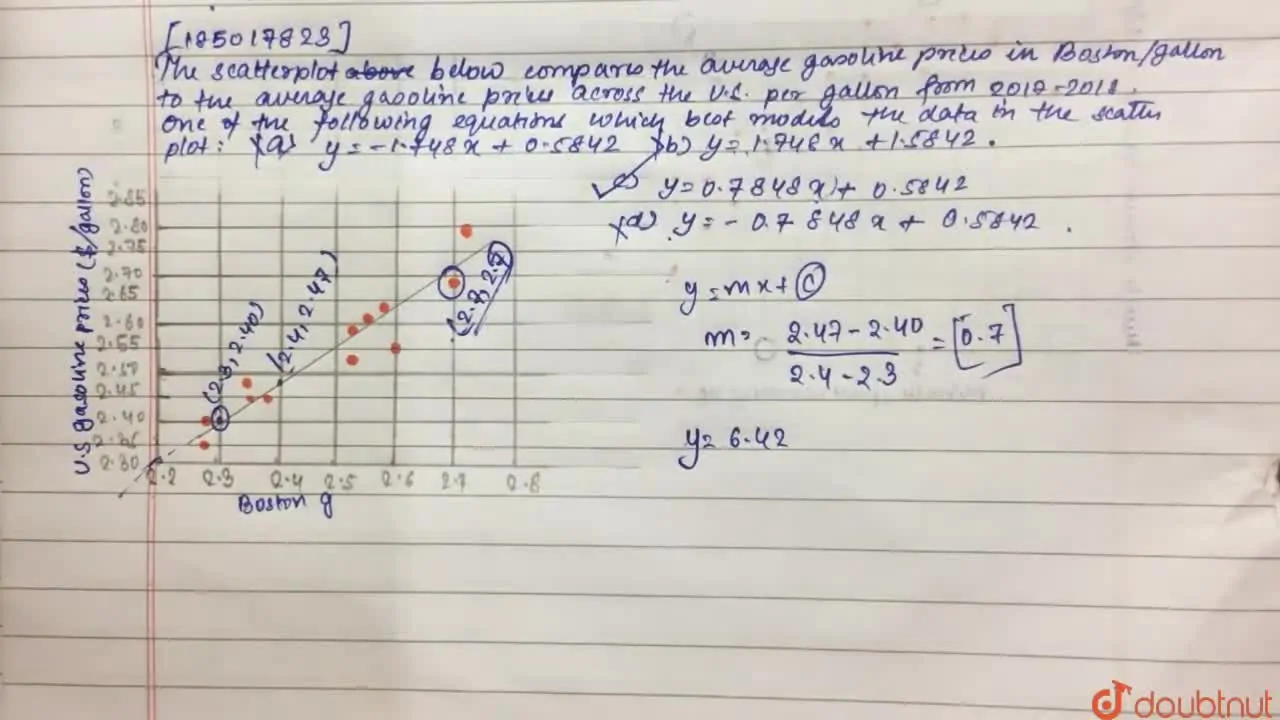
The scatterplot below compares the average gasoline prices I Boston, per gallon, to the average gasoline prices across the United States, per gallon, during a one-year period from 2017 to 2018.
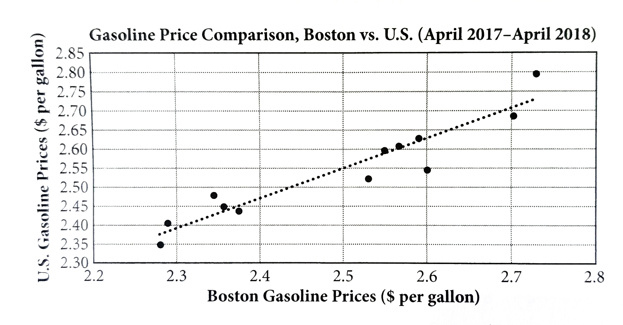
Of the following equations, whihc best modeles the data in the scatterplot ?
y=−1.7848x+0.5842
y=1.7848x+1.5842
y=0.7848x+0.5842
y=−0.7848x+0.5842
The correct Answer is:C
Notice that the answer choices involve very precise coefficients, which is a good indicator that logic is the best way to get to the correct answer. The slope of the line of best fit is positive, so eliminate (A) and (D), which have negatibve slopes. It is also important to note that the lower-left corner of the graph is not the origin, which means that the y-intercept needs to be extrapolated. With only two choices left, you can test only one of them. If the equation you test works, then it is correct. If the equation you test works, then it is correct. If the equation you test works, then it is correct. If the equation you test does not work, the other is correct. To test (B), choose one of the values for the scatterplot that is close to the line of best fit, for example (2.7,2.7). Pugging 2.7 in for x should mean that y=2.7, but with the equation in choice (B) you get:
y=1.7848(2.7)+1.5842
y=4.81896+1.5842
y=6.40316
This does not matcvh the coordinate point so (C) is corect.
Related Playlists
- BOOK - KAPLANCHAPTER - SCATTERPLOTSEXERCISE - LINE OF BEST FIT1videos
SCATTERPLOTS
- BOOK - KAPLANCHAPTER - SCATTERPLOTSEXERCISE - SCATTERPLOT MODELING1videos
SCATTERPLOTS
- BOOK - KAPLANCHAPTER - SCATTERPLOTSEXERCISE - SCATTERPLOT MODELING1videos
SCATTERPLOTS
- BOOK - KAPLANCHAPTER - SAT MATH: TIMING ANS SECTION MANAGEMENT STRATEGIESEXERCISE - TRY ON YOU OWN5videos
SAT MATH: TIMING ANS SECTION MANAGEMENT STRATEGIES
- BOOK - KAPLANCHAPTER - SYSTEMS OF LINEAR EQUATIONSEXERCISE - NUMBER OF POSSIBLE SOLUTIONS1videos
SYSTEMS OF LINEAR EQUATIONS
Similar Questions
The scatterplot below shows the amount of electric energy generated, in millions of megawatt-hours, by nuclear sources over a 10‑year period.
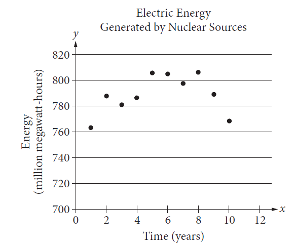
Of the following equations, which best models the data in the scatterplot?View Solution
The scatterplot above shows the daily profit made by a school store from selling sweatshirts and the average daily temperature for several days in the year 2004. The line of best fit is also shown and has equation y=-4.1x+446. Which of the following best explains hoow the number −4.1 in the equation relates to the scatterplot?View SolutionA study of gasoline prices across a particular state showed that the state's mean gas price was $2.87 per gallon, and the median gas price was $3.25 per gallon. Which of the following most likely accounts for the difference between the mean and median gas prices in this state?
View Solution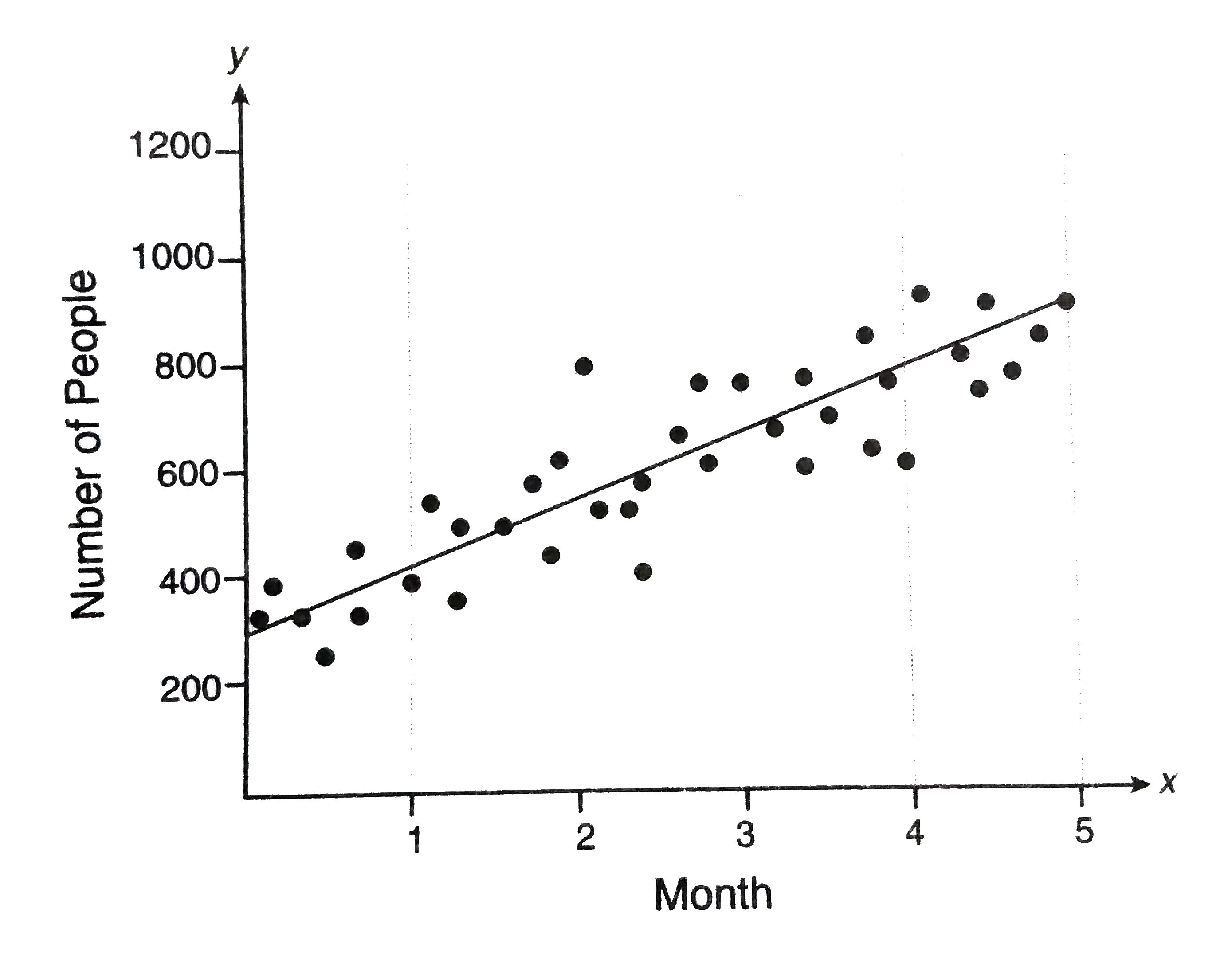
A new fitness class was started at several fitness clubs owned by the same company. The scatterplot shows the total number of people attending the class during the first five months in which the class was offered. The line of best fit is drawn.
Q. During the five-month period, the average increase in the number of people attending the class per month is closest to which of the following?View Solutionr=2.24+0.06t
p=2.89+0.10x
In the equation above, r and p represent the price per gallons, in dollars, of regular and premium grades of gasolin, respectively, x months after January 1 of last year. What was the cost per gallon, in dollars, of premium gasoline for the month in which the per gallons price of premium exceeded the per gallon price of regular by $0.93?View SolutionIn the United States, the maintanance and contruction of airports, transit systems, and major roads are largely funded through a federal excise tax on gasoline. Based on the 2011 statistics given below, how much did the average house hold pay per year in federal gasoline taxes?
* The federal gasoline tax rate was 18.4 cents per gallon.
* The average motor vehicles was driven approximately 11,340 miles per year.
* The national average fuel economy for noncommercial vehicles was 21.4 miles per gallon.
* The average American household owned 1.75 vehicles.View Solution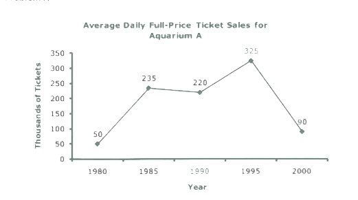
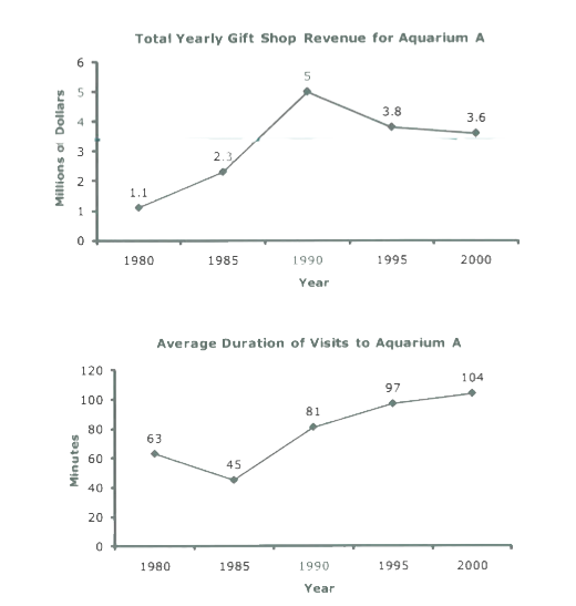
Which of the following statements can be inferred from the data?
In each of the five - year periods shown in which yearly gift shop revenue decreased, average daily full - price ticket sales also decreased.
The greatest increase in total yearly gift shop revenue over any five - year period shown was $2.7 million.
From 1995 to 2000, the average duration of visits to the museum increased by 12 minutes.View SolutionBetween 1985 and 2003, data were collected every three years on the amount of plastic produced annually in the United States, in billions of pounds. The graph below shows the data and a line of best fit. The equation of the line of best fit is y = 3.39x + 46.89, where x is the number of years since 1985 and y is the amount of plastic produced annually, in billions of pounds.
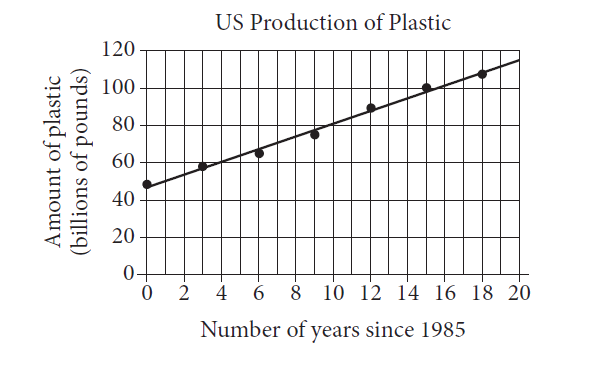
Which of the following is closest to the percent increase in the billions of pounds of plastic produced in the United States from 2000 to 2003?View Solution743 children from the United States, aged 6 through 11, were tested to see if they were overweight . The data are shown in the table below.
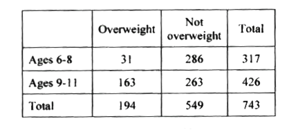
In 2014 the total population of children between 6 and 11 years old, inclusive , in the United States was about 74.3 million. If the test results are used to estimate information about children across the country, which of the following is the best estimate of the total number of children between 9 and 11 years old in the United States who were overweight in 2014 ?View SolutionAlan drives an average of 100 miles each week. His car can travel an average of 25 miles per gallon of gasoline. Alan would like to reduce his weekly expenditure on gasoline by $5. Assuming gasoline costs $4 per gallon, which equation can Alan use to determine how many fewer average miles,m, he should drive each week?
View Solution

