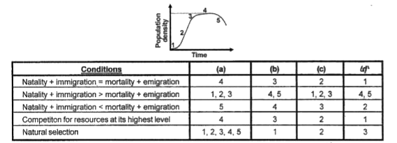
Which of the following graphs shows the likely relationship between the percentage of pollution to the population of people in a particular town?
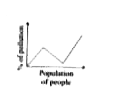


The correct Answer is:C
To determine the likely relationship between the percentage of pollution and the population of people in a particular town, we can follow these steps:
1. Understanding the Relationship:
- We need to analyze how population growth affects pollution levels. Generally, as the population increases, human activities that contribute to pollution also increase.
2. Identifying Types of Pollution:
- Consider different types of pollution: soil pollution (due to waste disposal), water pollution (from sewage and waste), air pollution (from vehicles and industries), and noise pollution (from various sources). All these types tend to increase with a growing population.
3. Analyzing the Graph:
- The graph should depict the relationship where the x-axis represents the population and the y-axis represents the percentage of pollution.
4. Proportional Relationship:
- As the population increases, the pollution levels are likely to increase as well. This indicates a proportional relationship, which means that the graph will show an upward trend.
5. Choosing the Correct Graph:
- Among the options provided, look for a graph that shows an upward curve or line, indicating that as the population increases, the pollution percentage also increases.
6. Final Conclusion:
- Based on the analysis, the correct answer is the graph that shows an exponential increase in pollution as the population grows. This is typically represented by option C.
- We need to analyze how population growth affects pollution levels. Generally, as the population increases, human activities that contribute to pollution also increase.
- Consider different types of pollution: soil pollution (due to waste disposal), water pollution (from sewage and waste), air pollution (from vehicles and industries), and noise pollution (from various sources). All these types tend to increase with a growing population.
- The graph should depict the relationship where the x-axis represents the population and the y-axis represents the percentage of pollution.
- As the population increases, the pollution levels are likely to increase as well. This indicates a proportional relationship, which means that the graph will show an upward trend.
- Among the options provided, look for a graph that shows an upward curve or line, indicating that as the population increases, the pollution percentage also increases.
- Based on the analysis, the correct answer is the graph that shows an exponential increase in pollution as the population grows. This is typically represented by option C.
Topper's Solved these Questions
Similar Questions
Knowledge Check
Which of the following graphs shows the relationship between the rate of an enzymatic activity and substrate concentration (S) ?
A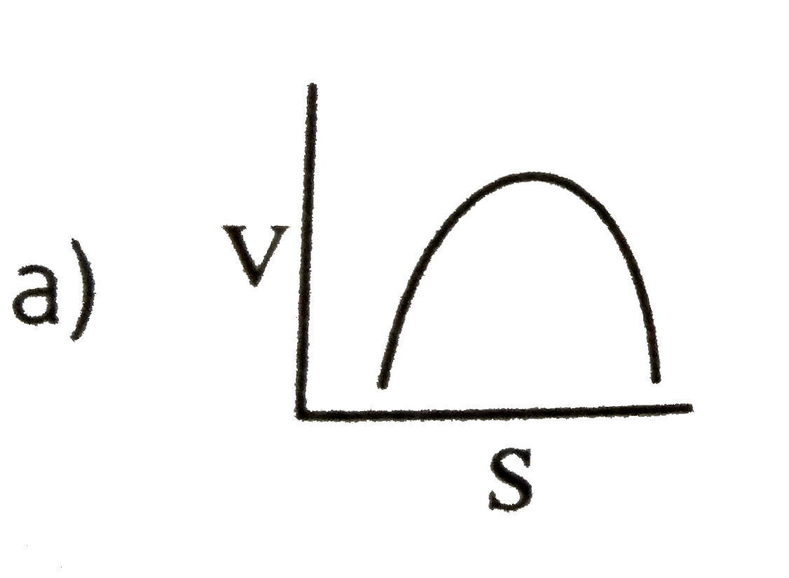 B
B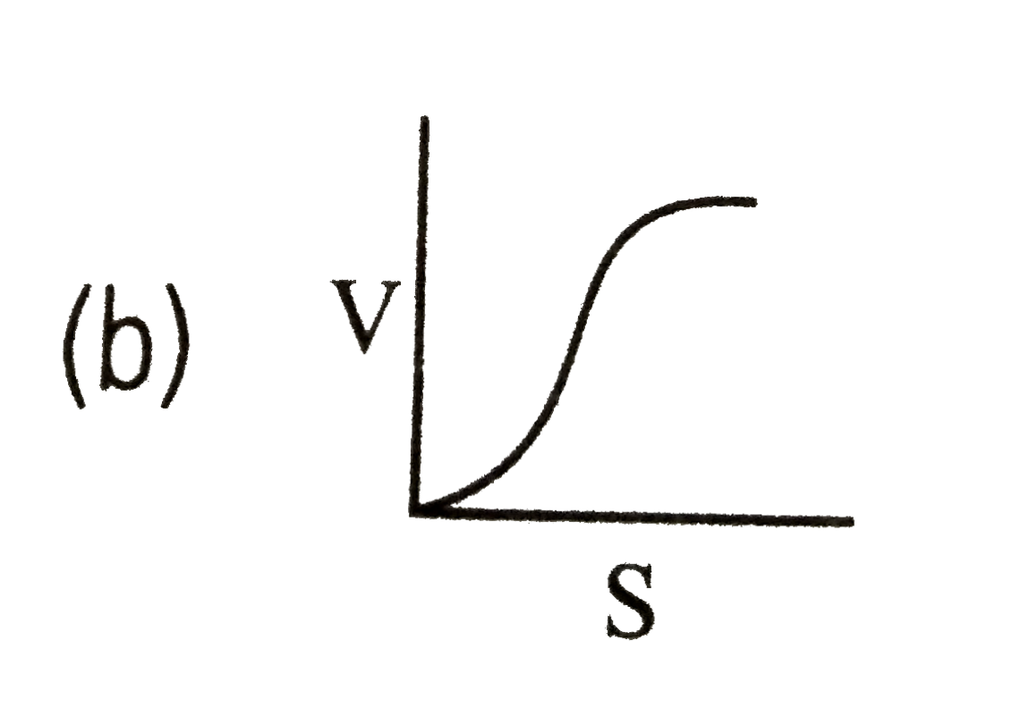 C
C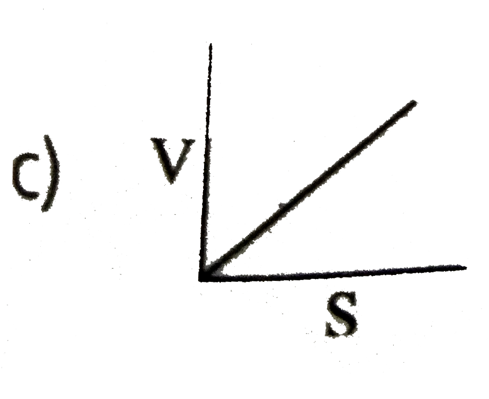 D
D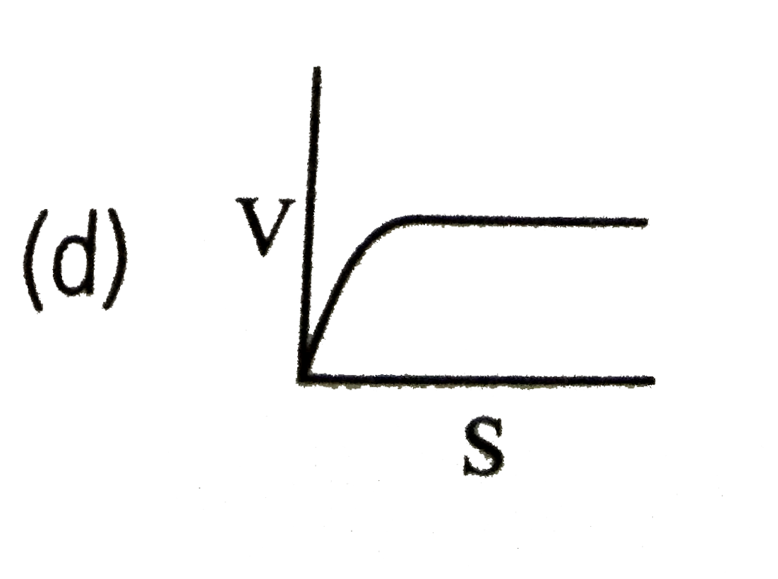
Which one of the following graphs show the relationship between the rate of an enzymatic activity and substrate conc(S) -
A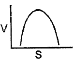 B
B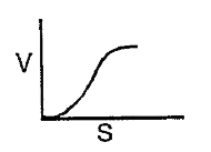 C
C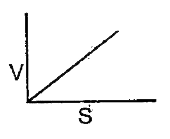 D
D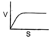
Which of the following graphs shows the relationship between the rate of an enzymatic activity and substrate concentration (S) ?
A B
B C
C D
D
Of the following graphs , the one which shows the relationship between the resistance R of multirange moving coil ammeter and its range I is
View SolutionWhich of the following is correct statement showing showing the relationship between AP and MP ?
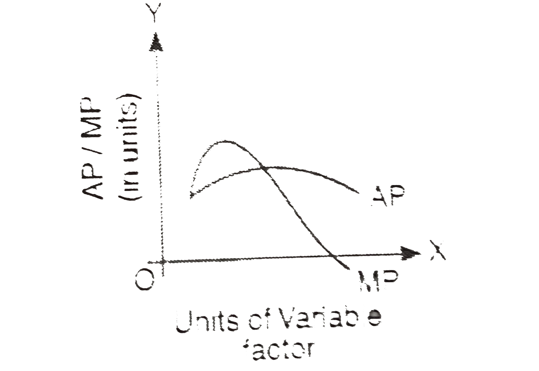
View SolutionWhich of the following will not control particular pollutants
View SolutionWhich of the graphs shown in the figure below best represents the relationship between the radioactive decay rare [−(dN/dt)] and population N?
View SolutionThe bar graph shows the number of males and females (in crores) in india during 1951-1991. Read the graph and answer the following questions
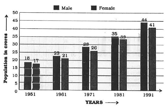
What was the approximate percentage of female population of female population in India during 1991 ?
View Solution

