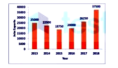
The following bar chart shows the quantity ( in million kg) of grains exported by a country during from 2013-2018. By how much percent is the maximum export greater than the minimum export during the given period?
A)
B)
C)
D)
The correct Answer is:A
Step by step video, text & image solution for The following bar chart shows the quantity ( in million kg) of grains exported by a country during from 2013-2018. By how much percent is the maximum export greater than the minimum export during the given period? by Maths experts to help you in doubts & scoring excellent marks in Class 14 exams.
Updated on:21/07/2023Similar Questions
The following bar graph shows the quantity (in million) of grains exported by a country for a period. The maximum export is what percent more than the minimum export in the given period ?
निम्नलिखित दंड आरेख के दौरान किसी देश द्वारा निर्यात किए गए अनाज की मात्रा (मिलियन में) दर्शाता है | दी गई अवधि में अधिकतम निर्यात न्यूनतम निर्यात से कितना प्रतिशत अधिक है ?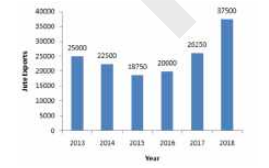
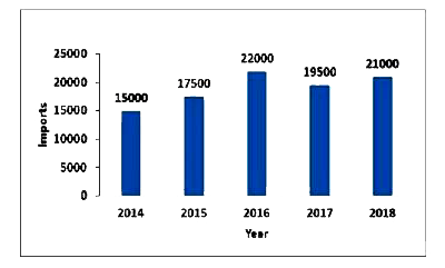
View SolutionThe following Bar chart presents the quantity (in million kg ) of imports of a particular item made by India during 2014-2018. For how many years, is the quantity imported less than the overall average of imports of the said item during the given period ?
View Solution
Knowledge Check
The following line graph shows the ratio of imports and exports of a company during a period of 1995-2001. Study the graph carefully and answer the questions.
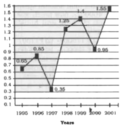
Of the given years. In how many years was the export less than import ?A4B2C1D3In how many years were the imports more than 80% of the average exports of the country during the given 5 years.
A4B2C1D3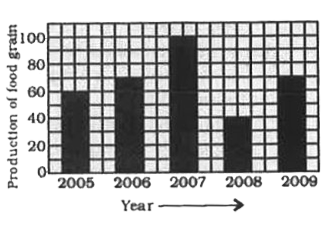
Study the above bar graph showing the production of food grains (in million tons). What is the ratio between the maximum production and the minimum production during the given period ?A1:2B2:3C3:4D5:2
The given Bar Graph presents the Export of Tea and Coffee (in million kg) for the years 2012 to 2016.
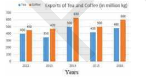
Total export of coffee is approximately what percent more than the total export of tea during the five years?
View SolutionThe given bar graph shows the imports and exports of steel by a country from 2013 to 2017.
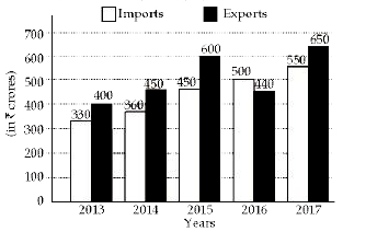
What is the ratio of the total imports in 2015 and 2017 to the total exports In 2013 and 2016.
View Solution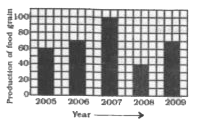
Study the bar graph showing the production of food grains (in million tons).
What is the ratio between the maximum production and the minimum production during the given period ?
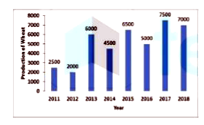
View SolutionThe Bar graph given below presents the production of wheat (in tonnes) by a big farm during the years 2011-2018. In how many of the given years was the production of wheat greater than the average production of the period?
View SolutionThe given Bar Graph presents the Export of Tea and Coffee (in million kg) for the years 2012 to 2016.
 Total export of coffee is approximately what percent more than the total export of tea during
the five years?
View Solution
