The following questions are based on the bar graph given below which represents the Jan Dhan accounts opened in different years 2010, 2011, 2012, 2013. (All the accounts opened data are in thousands)
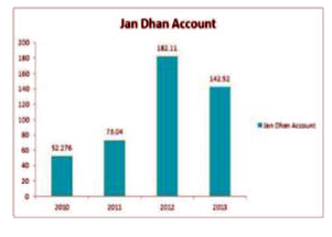
The total accounts opened in 2013 is decreased by how much percent to the total accounts opened in 2012.
19.5%
25%
23.7%
21.73%
The correct Answer is:D
Step by step video, text & image solution for The following questions are based on the bar graph given below which represents the Jan Dhan accounts opened in different years 2010, 2011, 2012, 2013. (All the accounts opened data are in thousands) The total accounts opened in 2013 is decreased by how much percent to the total accounts opened in 2012. by Maths experts to help you in doubts & scoring excellent marks in Class 14 exams.
Updated on:21/07/2023Similar Questions
The bar graph given below represents the circulation of newspapers in different languages in a town. Study the bar graph and answer the following questions:
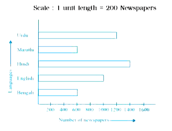
By how much is the circulation of newspaper in Hindi more than the newspaper in Bengali?
View SolutionThe bar graph given below represents the total population and male population (in '000) of a city, during to period of 2013 to 2016.
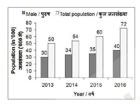
In 2014 female population is what percent of total population?
View Solution
Knowledge Check
Find the average of the Jan Dhan accounts opened in 4 years.
A112586.5B112386.5C112486.5D112286.5Find the difference between accounts opened in 2010 and 2011 to the total accounts opened in 2013.
 A56794B15000C16000D19200
If A can do a work in 5 days and B can do a same work in 6 days. if both work together find how many days they complete the work.?
A25/11 daysB28/11 daysC30/11 daysD11/30 days
Direction : Study the following bar diagram carefully and answer the four questions.
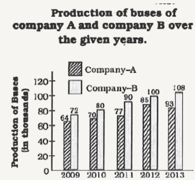
The average production (in thousand) of company A over the years 2010, 2011, 2012, 2013 is
View SolutionThe bar graph given below represents the total population and male population (in '000) of a city, during to period of 2013 to 2016.

Female population in 2015 is what percent of female population in 2014?
View SolutionThe bar graph given below represents the total population and male population (in 000) of a city, during the period of 2013 to 2016 .

In 2016 male population is how much percent more than the female population?
View SolutionThe given Bar graph presents the Export of Tea and Coffe ( in million kg ) for the years 2012 to 2016.
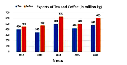
What is thr ratio of total export of tea in 2012 , 2014 and 2015 to the total export of coffee in 2013 and 2014 ?
View SolutionGiven here is a pie chart showing the cost of gold in 2010, 2011, 2012 and 2013. Study the chart and answer the following questions.
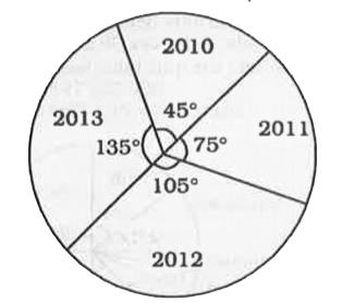
The ratio of the price of gold in the two years 2010 and 2013 is
View Solution
