A food chain company compares profit percentage from two zones for 5 years . Below is the line chart showing details :
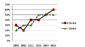
Which option best describes the information presented in the chart ?
For the last three consecutive years , Zone 2 has shown no improvement in the profit percentage
There is steady decrease in the profit over the years
No profit improvement in Zone 1 and Zone 2
Zone 2 shows increase drastically compared to zone 1
The correct Answer is:A
Step by step video, text & image solution for A food chain company compares profit percentage from two zones for 5 years . Below is the line chart showing details : Which option best describes the information presented in the chart ? by Maths experts to help you in doubts & scoring excellent marks in Class 14 exams.
Similar Questions
The given bar chart shows the sales of books in four metro branches of a company for the years 2014 and 2015.
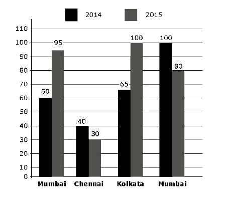
In the given bar chart, which branch has the highest increase in sale in 2015 as compared to 2014?View SolutionThe pie-chart represents the profits earned by a certain company in seven consecutive years. Study the pie-chart carefully and answer the question.
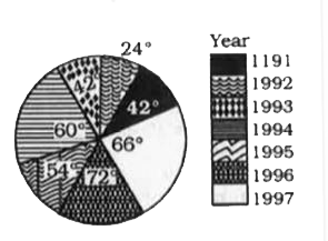
The year in which the profit is nearest to the average of the profits earned in all the given years isView Solution
Knowledge Check
- Question 1 - Select One
Study the following graph carefully and answer the given questions :-
The following graph shows the % profit of two companies over the years :-
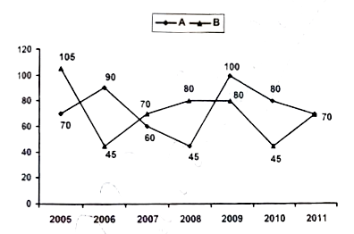
In which of the following years was the total income more than double the total expenditure in that year for company A ?A2010B2009C2006Dnone of these - Question 2 - Select One
Study the bar chart given below and answer the following questions :
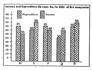
The company earning the maximum percentage of profit in the year 2001 is :AQBMCNDP - Question 3 - Select One
The line chart given below shows the profit (in crores) of a company for the years 2008 to 2015.
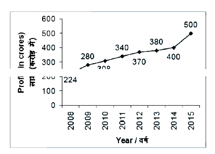
What is the percentage increase in profit in the year 2010 in comparison to the previous year ?Aa)20Bb)12Cc)10Dd)25
The bar-chart is showing the number of accidents in a city during the first six month of a year. Examine the bar chart and answer the following questions.
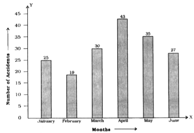
Compared to the month of January, what is the percentage of decrease in accidents in the month of February?View SolutionDirection: The following pie chart shows the percentage of production of books by different companies in a year. Read the chart and answers the following questions.
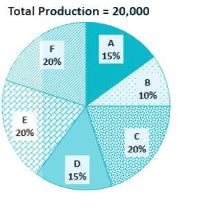
Find the average production of books by company B and C:View SolutionThe pie Chart given below presents the number of laptops as a percentage of the total number of laptops in an office delivered by six different companies.
The central angles shown in the Pie Chart are not as any chosen scale.
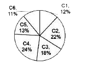
If the total number of laptops in the office is 3800, then what is the difference in number of laptops of Companies C2 and C5 ?View SolutionThe Pie Chart given below presents the number of laptops as a percentage of the total number of laptops in an office delivered by six different companies.
The central angles shown in the Pie Chart are not as any chosen scale.
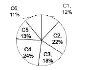
What is the ratio of the number of laptops of Company C1 to that of Company C3 ?View SolutionThe pie Chart given below presents the number of laptops as a percentage of the total number of laptops in an office delivered by six different companies.
The central angles shown in the Pie Chart are not as any chosen scale.
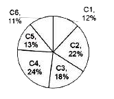
What is the central angle in degrees (correct up to one decimal place) corresponding to the laptops delivered by Company C6 ?View Solution
