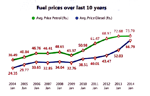
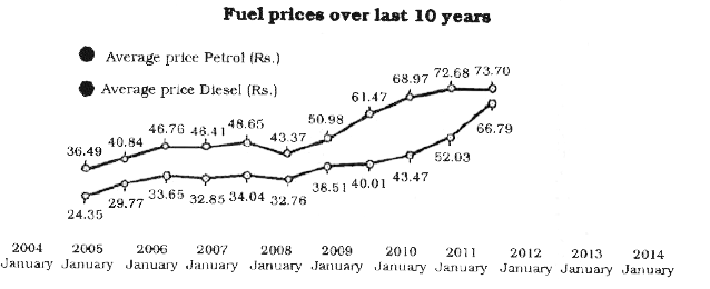
Observe the graph below and answer the following question.
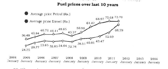
What is the approximate percentage difference in average price of petrol in 2004 and in 2014?
98%
100%
102%
105%
The correct Answer is:C
Step by step video, text & image solution for Observe the graph below and answer the following question. What is the approximate percentage difference in average price of petrol in 2004 and in 2014? by Maths experts to help you in doubts & scoring excellent marks in Class 14 exams.
Updated on:21/07/2023Topper's Solved these Questions
- STATISTICS AND DATA INTERPRETATIONBOOK - KIRAN PUBLICATIONCHAPTER - STATISTICS AND DATA INTERPRETATIONEXERCISE - TYPE-VII
363 Videos
- STATISTICS AND DATA INTERPRETATIONBOOK - KIRAN PUBLICATIONCHAPTER - STATISTICS AND DATA INTERPRETATIONEXERCISE - TYPE-VIII
8 Videos
- STATISTICS AND DATA INTERPRETATIONBOOK - KIRAN PUBLICATIONCHAPTER - STATISTICS AND DATA INTERPRETATIONEXERCISE - TYPE-V
38 Videos
- SIMPLIFICATIONBOOK - KIRAN PUBLICATIONCHAPTER - SIMPLIFICATIONEXERCISE - TEST YOURSELF
25 Videos
- TIME AND DISTANCEBOOK - KIRAN PUBLICATIONCHAPTER - TIME AND DISTANCEEXERCISE - Type -XI
74 Videos
Similar Questions
Knowledge Check
Observe the graph below and answer the following question.
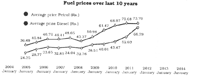
In which year the difference between average prices of petrol and Diesel is minimum?A2005B2009C2014D2004Observe the graph below and answer the following question.
What is the average of diesel prices over the years 2006-2012?A36.47B37.34C35.67D38.77The bar graph shows the number of males and females (in crores) in india during 1951-1991. Read the graph and answer the following questions
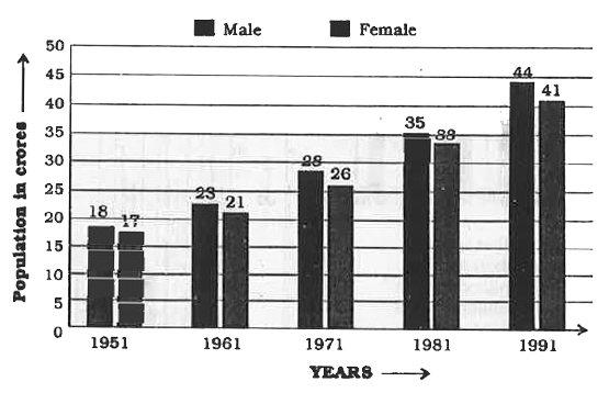
What was the approximate percentage of female population of female population in India during 1991 ?A48.23B48.02C48.03D48.33
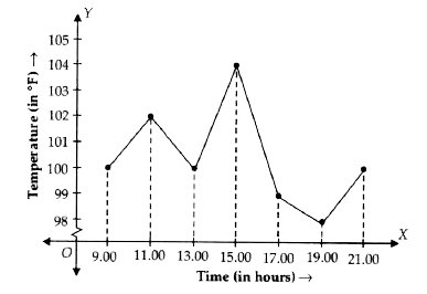
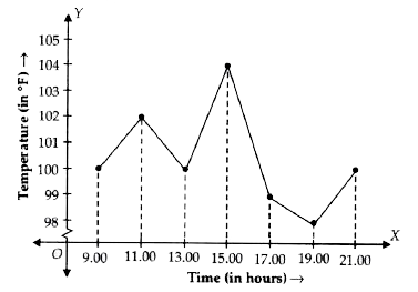
Observe the graph and answer the following questions.
The temperature is minimum at
View SolutionObserve the graph below and answer the following question
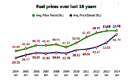
What is the average of diesel prices over the years 20062012?
View SolutionObserve the graph and answer the following questions.
The information given by the graph is:
View SolutionRead the bar graph given below and answer the following questions.
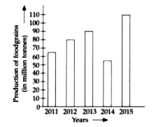
What is the ratio of the production of foodgrains in 2011 to that in 2014?
View SolutionAnswer the following questions below :
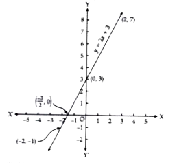
Name the shape of the graph.
View Solution

