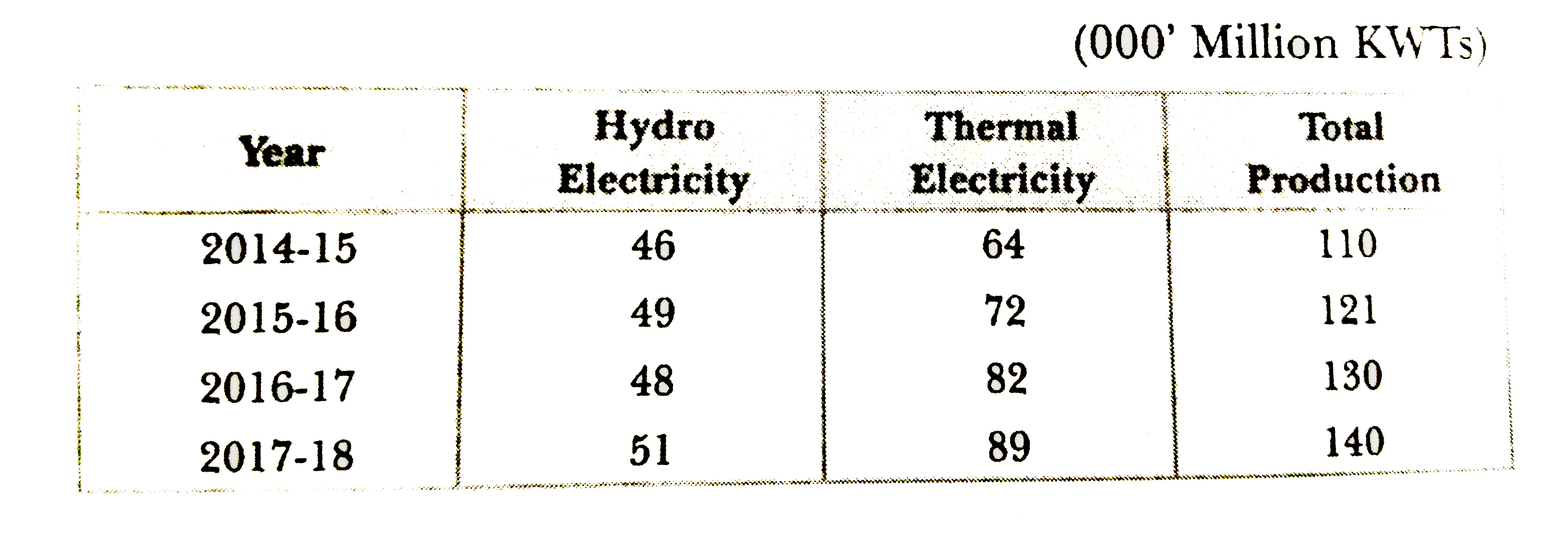
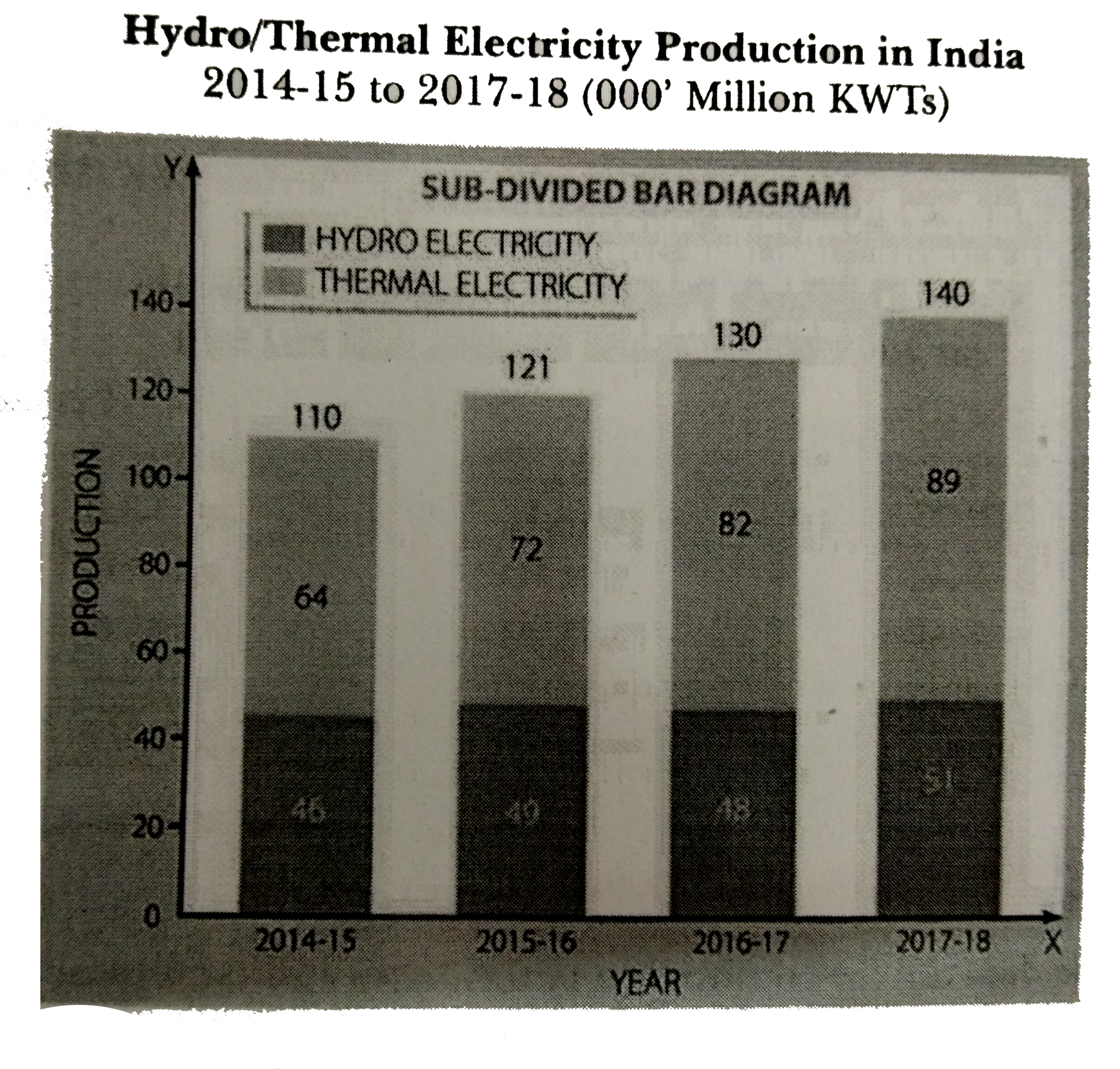
The following table shows Production of Electricity from different Sources in India during 2014-15 to 2017-18 (hypothetical data).
Present the data in a sub-divided bar diagram.

Similar Questions
The following table shows the daily supply of electricity to different places in a town. Show the information by a pie diagram.

View SolutionThe following table shows birth and death rate in India according to the Census Reports between 1931 - 40 to 2016-17 (hypothetical figures). Present the data in te form of a multiple bar diagram.

View Solution
Knowledge Check
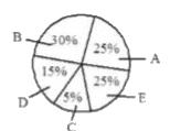
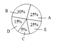
The following pie diagram shows information about tyres manufacturing data from various companies in India during 2017. If the total tyres produced in India during 2017 was 1,80,000 units, how many units of tyres were produced by company 'D'

(a)18000
(b)36000
(c)9000
(d)27000A18000B36000C9000D27000The following pie diagram shows information about tyres manufacturing data from various companies in India during 2017. If the total tyres produced in India during 2017 was 1,80,000 units, how many units of tyres were produced by company 'B' ? Options are (a) 25000 (b) 54000 (c) 15000 (d) 45000.
 A25000B54000C15000D45000
The following table shows the monthly expenditure of different families on different items :

Represent the data in the form of a sub-divided bar diagram.
View SolutionThe following table shows the percentage of buyers of four different brands of bathing soaps.

Represent the above data by a pie chart.
View SolutionFollowing tables shows estimates of cost of production of certain commodities. Present the data in the form of sub divided bar diagram:

View SolutionThe following table shows the interest of students of a school in different games :

Represent the data by using a simple bar diagram.
View SolutionPresent the following data in the form of horizontal bar diagram :

View SolutionThe following table shows the number of fruits in a fruit shop. Represent the above data by a bar graph
View Solution

